Ready For A Change 20 Kitchen Shades That Outshine Green Next Year
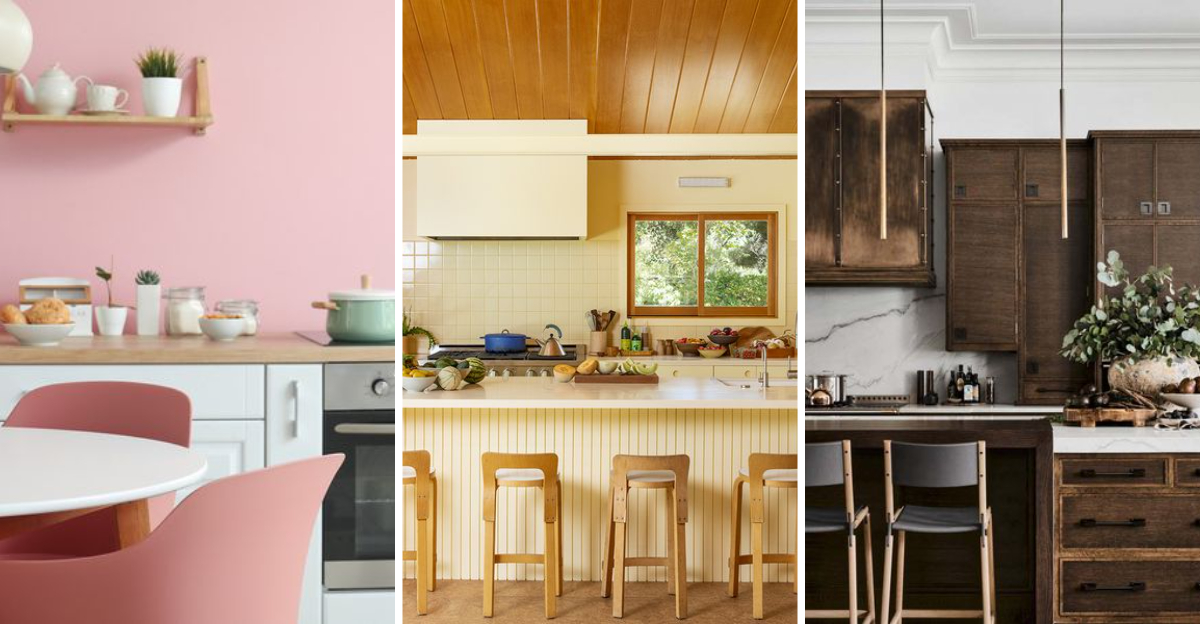
Kitchen colors can totally transform your cooking space and set the mood for your culinary adventures.
Green has dominated kitchen design lately, but exciting new shades are ready to take center stage.
Whether you’re planning a complete renovation or just a fresh coat of paint, these 20 kitchen colors will give your space the stunning makeover it deserves.
1. Warm Taupe
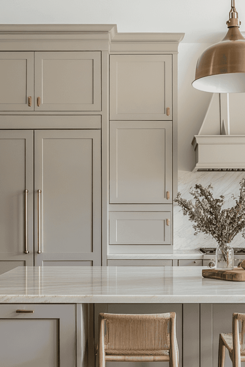
Warm Taupe brings cozy elegance to any kitchen space with its subtle blend of brown and gray undertones. This versatile neutral creates a welcoming atmosphere that pairs beautifully with both modern and traditional elements.
I’ve noticed how this shade adapts throughout the day, appearing slightly different as natural light shifts across your kitchen. It’s particularly stunning when paired with brass hardware or natural wood accents that highlight its earthy warmth.
Many homeowners love how this color hides minor imperfections while providing a perfect backdrop for colorful dishes and décor. Unlike stark whites that show every smudge, Warm Taupe forgives the little messes that happen in busy kitchens while maintaining a sophisticated look.
2. Soft Ivory
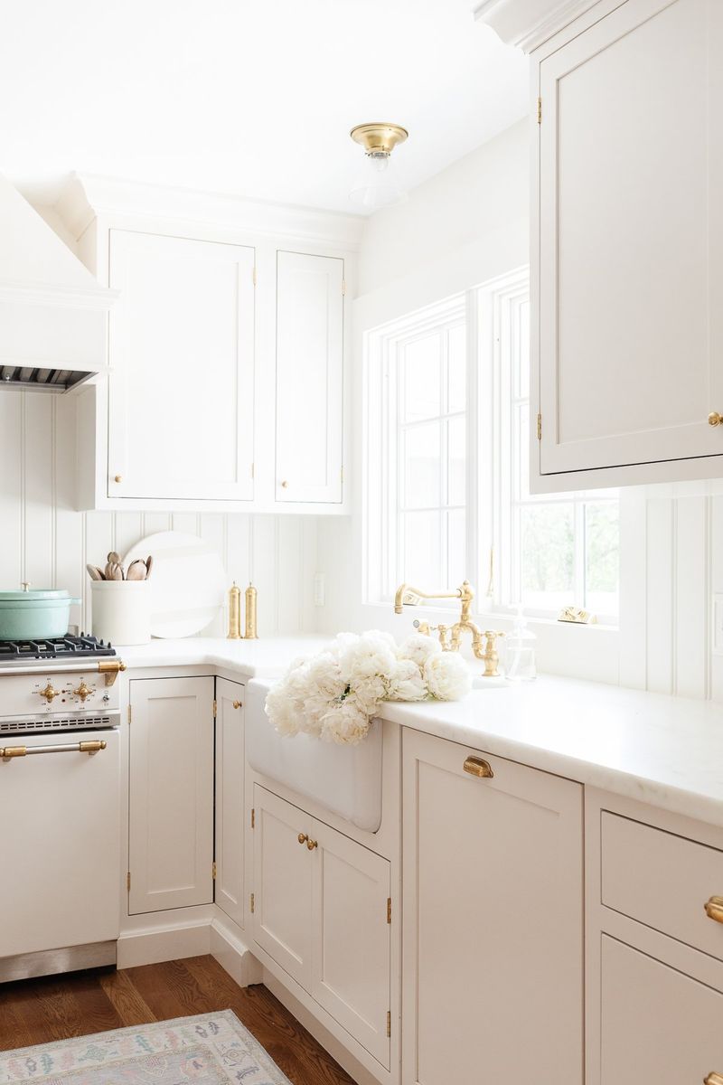
Soft Ivory offers timeless appeal without the harsh brightness of pure white. This gentle, creamy shade creates an airy feeling while adding subtle warmth that makes everyone feel instantly comfortable in your kitchen space.
When painting with Soft Ivory, you’ll notice how it enhances natural light, bouncing it around the room to create an inviting glow. My favorite thing about this shade is how it pairs with literally everything – from rustic elements to sleek modern appliances.
Kitchens dressed in this hue feel clean yet lived-in, striking that perfect balance between pristine and practical. The slight yellow undertone brings a sunny disposition to breakfast nooks and cooking areas without overwhelming the senses.
3. Dusty Rose
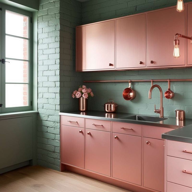
Dusty Rose introduces unexpected warmth to kitchens, breaking away from predictable neutrals with its subtle pink-gray personality. This muted blush tone creates a surprisingly sophisticated backdrop that feels both fresh and nostalgic at once.
What makes this color special is how it changes throughout the day cooler in morning light, warmer as evening approaches. I’ve found it pairs beautifully with copper cookware and matte black fixtures for a look that’s both feminine and strong.
Families particularly appreciate how this gentle hue creates a calming environment in busy kitchens. The subtle color adds character without overwhelming the space, making it perfect for smaller kitchens seeking personality without sacrificing the illusion of space.
4. Slate Blue
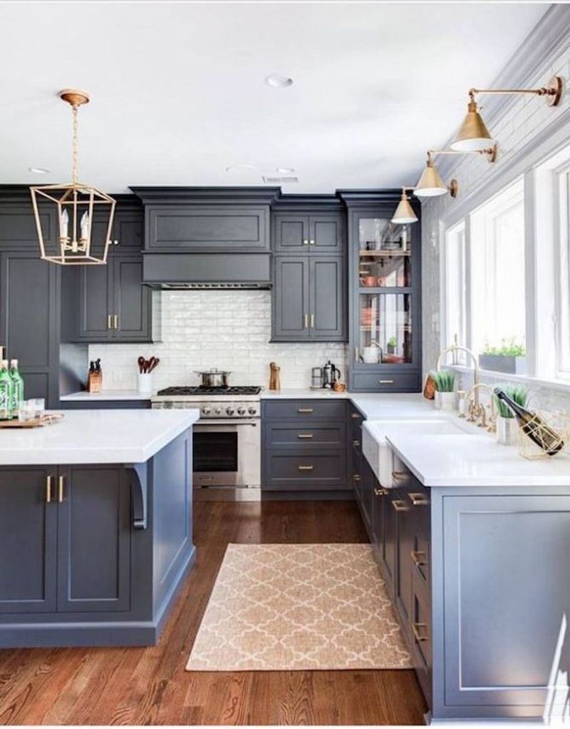
Slate Blue delivers sophisticated drama to kitchens without the heaviness of darker colors. This chameleon-like shade shifts between blue and gray, creating depth that changes subtly as light moves through your space throughout the day.
When used on cabinets, this color creates an anchor that grounds the room while still feeling fresh and contemporary. I’ve watched friends transform outdated kitchens with just this one color change, instantly modernizing the entire space.
The gray undertones make this blue incredibly versatile, playing well with everything from butcher block to white quartz countertops. Unlike trendy blues that quickly date themselves, Slate Blue has staying power because it references classic colors found in nature – think stormy skies and weathered stone.
5. Charcoal Gray
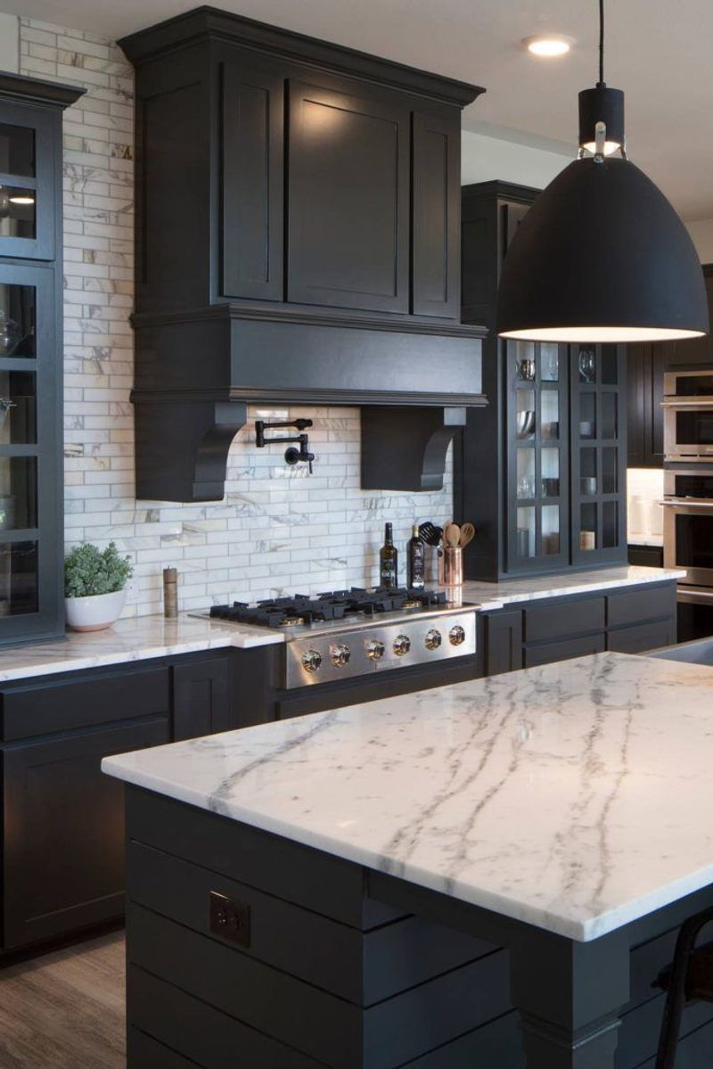
Charcoal Gray brings dramatic sophistication to kitchens, offering the boldness of black without its unforgiving darkness. This rich, deep neutral creates a stunning backdrop that makes colorful dishware and fresh produce pop with vibrant contrast.
If you’re worried about dark colors making spaces feel smaller, consider using this shade strategically on lower cabinets or a kitchen island. My clients are always surprised by how this color actually adds depth rather than closing in a space, especially when paired with good lighting.
The beauty of charcoal lies in its versatility it works equally well in rustic farmhouses and sleek modern spaces. Unlike lighter neutrals that show every mark, this forgiving shade hides cooking splatters and fingerprints, making it surprisingly practical for busy family kitchens.
6. Terracotta
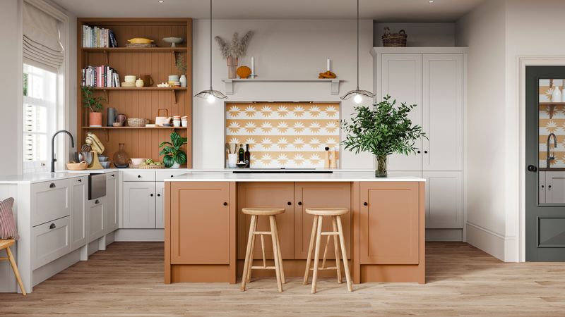
Terracotta infuses kitchens with earthy warmth reminiscent of Mediterranean villas and desert sunsets. This rich, clay-inspired hue brings instant character to spaces that feel too sterile or lack personality. What surprises most people is how well this seemingly bold color functions as a neutral in practice.
I’ve seen it pair beautifully with everything from crisp whites to deep blues, creating spaces that feel simultaneously timeless and on-trend. Beyond its aesthetic appeal, terracotta connects us to cooking traditions from around the world.
The color evokes handmade pottery and sun-baked tiles, bringing authenticity to modern kitchens. When used on walls or as a backsplash, it creates a warm glow that makes everyone look their best – like natural candlelight for your everyday cooking space.
7. Creamy White
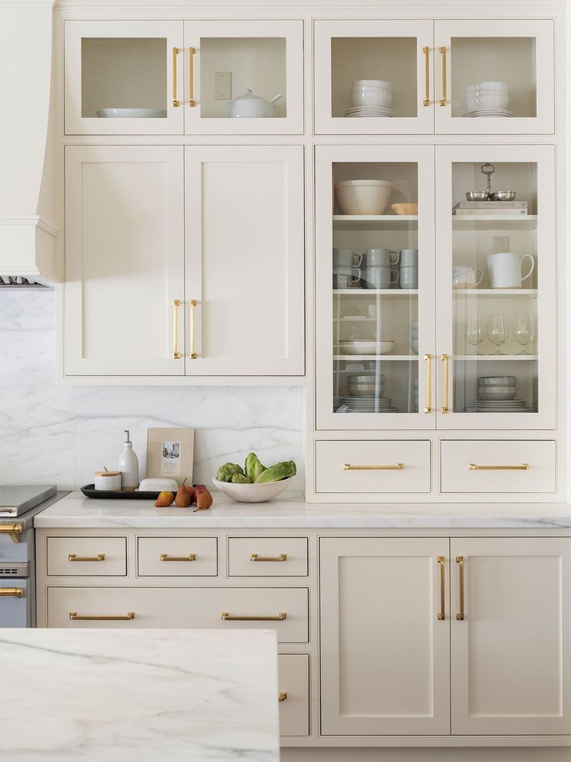
Creamy White offers timeless appeal with a softer edge than stark whites, creating spaces that feel fresh yet welcoming. This versatile shade carries subtle yellow undertones that add warmth without being obviously colored.
When painting cabinets this shade, you’ll notice how it forgives imperfections while highlighting beautiful hardware and architectural details. The gentle hue works magic in north-facing kitchens where cooler lights can make pure whites feel clinical and unwelcoming.
Many homeowners choose this color for its ability to make smaller kitchens feel more spacious without the harsh, institutional feel of bright white. Unlike pure whites that can feel stark and show every speck of dirt, Creamy White maintains its inviting appearance through daily use, hiding minor smudges and fingerprints that are inevitable in busy cooking spaces.
8. Misty Blue
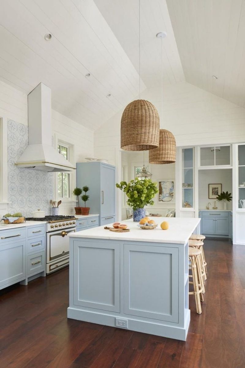
Misty Blue captures the ethereal quality of early morning fog, bringing serene tranquility to kitchen spaces. This pale, atmospheric blue has just enough gray to keep it sophisticated rather than childish or overly sweet. What makes this color special is its ability to expand visual space while adding subtle personality.
I’ve watched clients’ moods visibly lift when walking into kitchens painted this shade – there’s something inherently calming about its soft presence. This versatile hue pairs beautifully with natural elements like wooden open shelving and stone countertops.
Unlike some blues that can feel cold, Misty Blue maintains a welcoming atmosphere year-round. The color shifts subtly throughout the day, appearing more gray in shadows and more blue in direct light, creating a dynamic space that never feels static.
9. Smoky Quartz
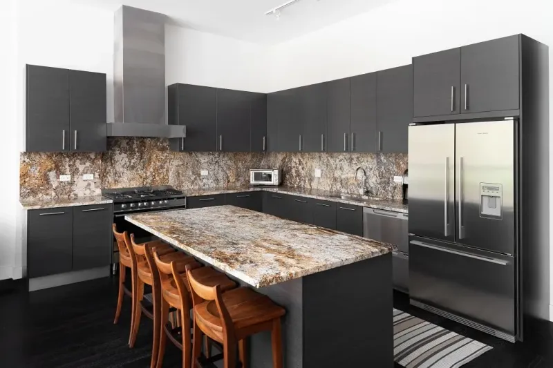
Smoky Quartz brings sophisticated depth to kitchens with its complex blend of brown, gray, and purple undertones. This mysterious neutral changes dramatically throughout the day, sometimes appearing almost taupe, other times leaning into its deeper brown personality.
When used on cabinets, this multidimensional color creates rich texture that flat paints can’t achieve. My clients are often surprised by how this seemingly dark color actually expands their space visually by adding depth rather than closing it in. The beauty of this shade lies in its versatility it pairs equally well with cool marbles and warm woods.
Unlike predictable grays that have saturated the design world, Smoky Quartz offers something fresh yet timeless. Its subtle mineral quality references natural elements, creating grounding energy in what’s often the busiest room in the house.
10. Pale Peach
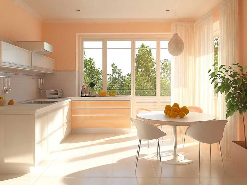
Pale Peach casts a flattering glow that makes everyone look their best in your kitchen space. This delicate hue brings subtle warmth without the intensity of orange or the predictability of beige, creating an unexpectedly sophisticated backdrop for both cooking and gathering.
Though it might seem bold at first glance, this color functions beautifully as a new neutral when applied to walls or cabinets. I’ve seen it transform sterile kitchens into inviting spaces that feel both fresh and timeless. Families particularly love how this color creates a cheerful atmosphere without being childish or overly feminine.
The subtle peachy tone pairs wonderfully with natural wood elements and plants, bringing a biophilic quality that connects indoor spaces with nature. Morning light enhances its warm undertones while evening light brings out its softer side.
11. Deep Navy
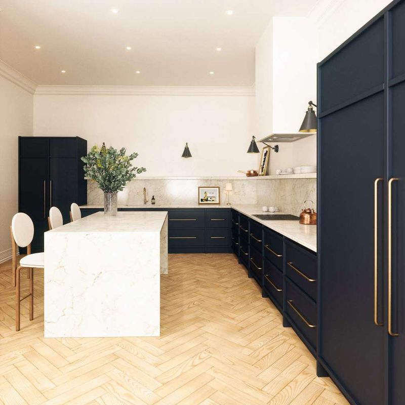
Deep Navy brings dramatic elegance to kitchens, creating a sophisticated backdrop that makes everything else pop. This rich, saturated blue feels both classic and current, with timeless appeal that won’t date your kitchen like trendy colors often do.
When used on kitchen islands or lower cabinets, this commanding color grounds the space while allowing lighter elements to float above. My favorite combinations pair this noble blue with warm metals like brass or copper that seem to glow against the deep background.
The psychology behind this color is fascinating navy creates a sense of authority and trustworthiness while still feeling approachable. Unlike black, which can feel stark, Deep Navy contains subtle complexity that reveals different undertones as light changes throughout the day. This forgiving shade also hides cooking splatters and fingerprints better than lighter colors.
12. Buttercream Yellow
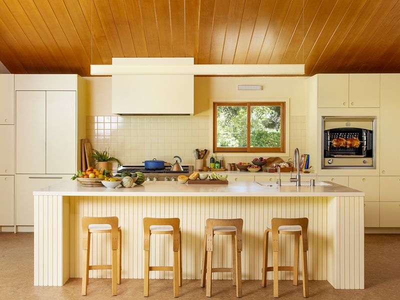
Buttercream Yellow infuses kitchens with sunshine energy that brightens even the dreariest mornings. This cheerful yet sophisticated shade carries the warmth of butter without the jarring brightness of primary yellows, creating spaces that feel both uplifting and elegant.
Unlike stark whites that can feel clinical, this gentle yellow creates a welcoming atmosphere that encourages lingering conversations over coffee. My clients often comment on how this color seems to physically warm their kitchen spaces, especially in homes with northern exposure or limited natural light.
The subtle creamy undertones make this yellow incredibly versatile, pairing beautifully with both cool grays and warm woods. For those hesitant about colored cabinets, this shade offers a perfect entry point – bold enough to have personality but restrained enough to function as a new neutral that won’t overwhelm your space.
13. Clay Beige
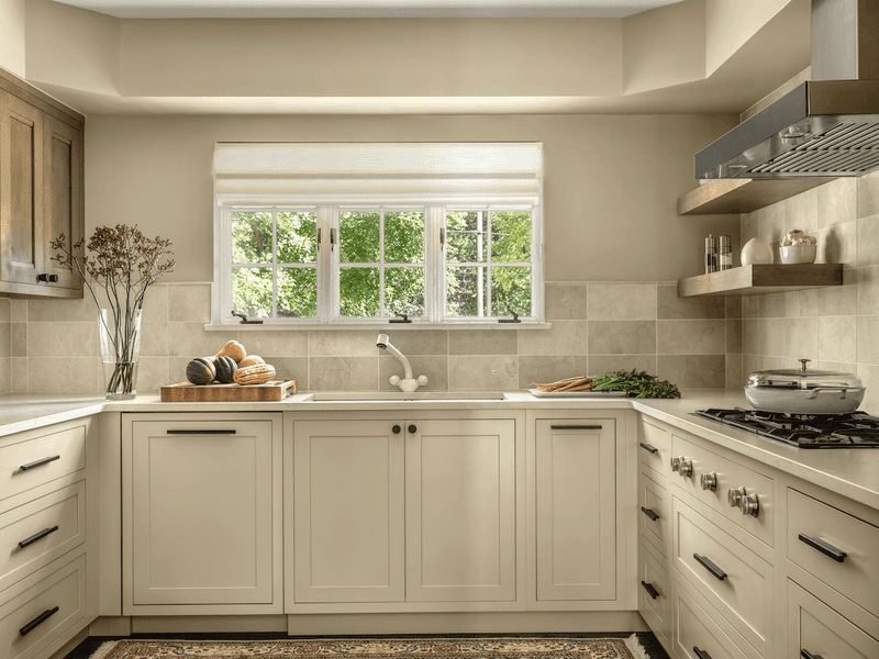
Clay Beige grounds kitchens with earthy sophistication, bringing natural warmth without the heaviness of darker browns. This complex neutral carries subtle red undertones that add depth and interest beyond what typical beiges offer.
What makes this shade special is its chameleon-like quality it shifts subtly throughout the day, sometimes appearing more taupe, sometimes warmer like terra cotta. I’ve found it particularly beautiful in kitchens with natural stone elements or handmade tiles that echo its organic quality. This forgiving color hides minor imperfections while creating a backdrop that makes both food and people look their best.
Unlike cooler neutrals that can sometimes feel sterile, Clay Beige creates an inherently welcoming atmosphere that connects to cooking traditions from around the world. The color’s natural associations make it especially suitable for kitchens focused on whole foods and plant-based cooking.
14. Cool Silver
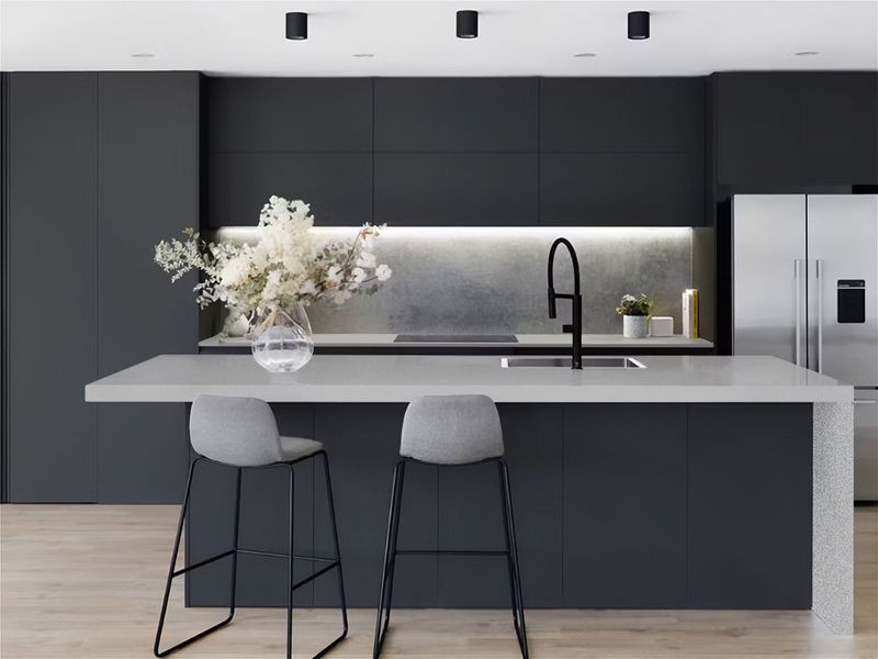
Cool Silver brings contemporary elegance to kitchens with its sophisticated metallic personality. This refined shade creates a sleek, modern atmosphere without the coldness often associated with industrial designs. When used on cabinets or as a backsplash, this reflective hue maximizes light, making smaller kitchens feel more spacious.
I’ve witnessed how this color transforms with changing light appearing almost white in bright daylight, then shifting to a deeper pewter as evening approaches. The subtle shimmer in this finish elevates everyday cooking spaces into something special. Unlike flat grays that can sometimes feel dull, Cool Silver maintains visual interest through its dimensional quality.
This versatile shade pairs beautifully with both warm woods for contrast and sleek black accents for a cohesive modern look. Its reflective properties also make it practical, visually expanding tight kitchen spaces.
15. Midnight Black
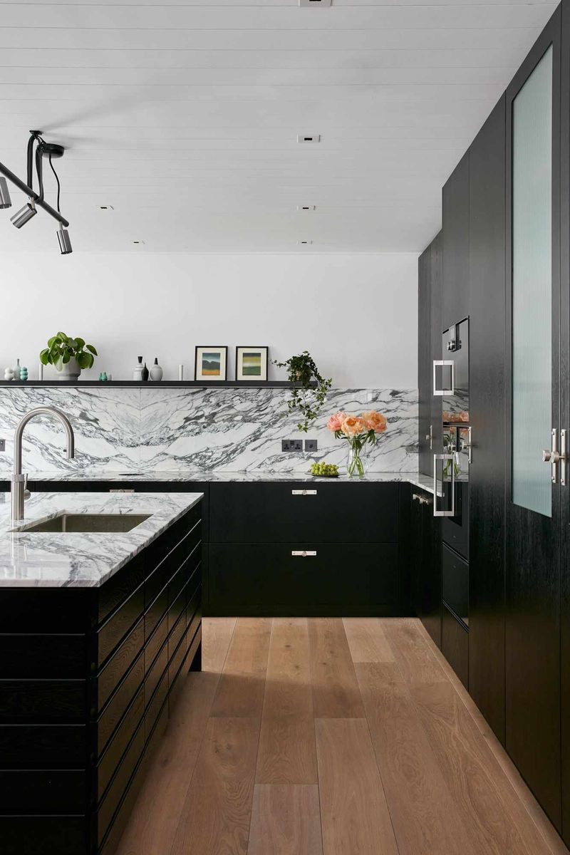
Midnight Black delivers dramatic luxury to kitchens, creating a bold statement that feels both modern and timeless. This deep, rich shade absorbs light rather than reflecting it, creating depth that makes other elements in your kitchen pop with striking contrast.
Though dark colors are often avoided in smaller spaces, this shade can actually create the illusion of expanded space by blurring visual boundaries. My clients are always surprised by how this color recedes, making walls seem to disappear rather than close in.
The key to successful black kitchens lies in balance pairing this powerful shade with lighter countertops, metallic accents, or natural wood elements prevents the space from feeling too heavy. Unlike lighter colors that show every speck, this forgiving shade hides imperfections and cooking splatters, making it surprisingly practical for busy family kitchens.
16. Sandy Beige
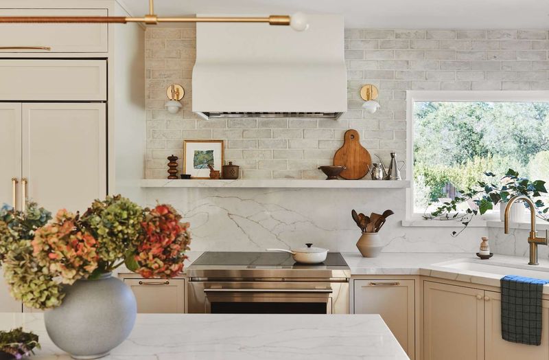
Sandy Beige captures the relaxed feeling of beach vacations, bringing that carefree coastal vibe into everyday kitchen spaces. This versatile neutral has warm golden undertones that create an instantly welcoming atmosphere without being obviously themed.
When painting with this shade, you’ll notice how it brightens corners while still providing enough depth to hide minor imperfections. I love how this color changes throughout the day cooler in morning light, warming to a golden glow by late afternoon. This adaptable hue pairs beautifully with both cool blues for a seaside feel or deeper browns for a more grounded, earthy palette.
Unlike stark whites that can feel clinical, Sandy Beige creates a lived-in comfort that encourages family gathering. The subtle warmth makes food photography look especially appetizing, perfect for home cooks who love sharing their culinary creations.
17. Coral Blush
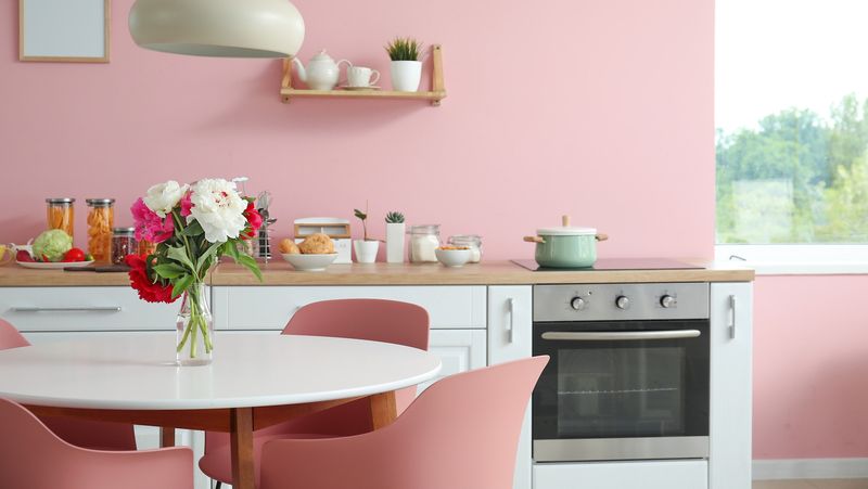
Coral Blush injects playful energy into kitchens with its happy medium between pink and orange tones. This cheerful color creates spaces that feel both sophisticated and fun perfect for homeowners who want personality without sacrificing style.
What makes this shade special is how it flatters everyone, casting a warm glow that makes people look healthy and vibrant. I’ve seen this color transform dull kitchens into the heart of the home, drawing family members in and encouraging longer conversations around meal prep. This versatile hue works beautifully as an accent wall or on kitchen islands, paired with neutral cabinets.
Unlike predictable neutrals, Coral Blush creates memorable spaces that guests comment on. The color has surprising staying power because it references natural elements like sunset skies and garden flowers, connecting indoor spaces with the outdoors.
18. Pewter Gray
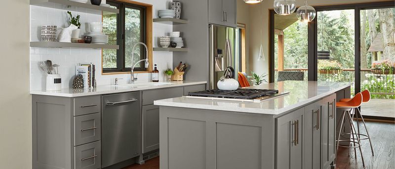
Pewter Gray brings sophisticated industrial charm to kitchens with its complex blend of silver and charcoal undertones. This versatile neutral bridges the gap between cool and warm grays, making it adaptable to nearly any design style.
The depth in this color comes from its subtle metallic quality that shifts throughout the day as light changes. I’ve found it particularly striking when paired with natural elements like wooden open shelving or stone countertops that provide organic contrast. Many homeowners appreciate how this shade creates a perfect backdrop for both colorful dishware and stainless steel appliances.
Unlike flat grays that can sometimes feel dull, Pewter Gray maintains visual interest through its dimensional quality. This practical shade also hides cooking splatters and fingerprints better than lighter colors, making it ideal for busy family kitchens.
19. Lavender Mist
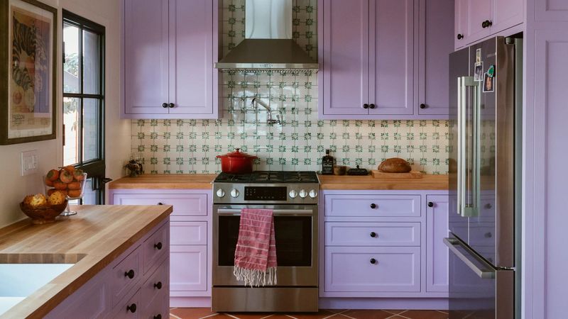
Lavender Mist introduces unexpected sophistication to kitchens with its subtle purple undertones that read almost neutral in certain lights. This ethereal shade creates spaces that feel both fresh and calming – like walking through a field of wildflowers on a misty morning.
Though purple might seem bold for kitchens, this diluted version functions beautifully as a new neutral that pairs with everything from warm woods to cool marbles. I’ve watched skeptical clients fall in love with this color once they see how it transforms with changing light sometimes appearing almost gray, other times revealing its gentle purple personality.
This versatile hue creates a perfect backdrop for both vintage and modern elements, bridging different design styles with ease. Unlike predictable whites and grays, Lavender Mist offers subtle personality that makes spaces feel thoughtfully designed rather than following trends.
20. Cocoa Brown
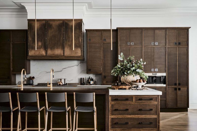
Cocoa Brown brings rich, velvety warmth to kitchens, creating spaces that feel simultaneously cozy and sophisticated. This deep, chocolate-inspired shade has enough complexity to avoid feeling flat or dated, with subtle red undertones that add dimension and life.
When used on lower cabinets or islands, this grounding color creates beautiful contrast with lighter elements while hiding inevitable kitchen spills and splatters. My clients are often surprised by how this seemingly dark color actually makes spaces feel more intimate and welcoming rather than smaller.
This timeless shade references natural materials like leather, wood, and stone, creating connections to the natural world. Unlike trendy colors that quickly date themselves, Cocoa Brown has staying power because it’s rooted in elements that have appealed to humans for centuries. The rich hue also makes metallic accents and hardware pop dramatically against its deep background.
