15 Retro Paint Shades Designers Are Loving Again
Remember those bold, distinctive paint colors from decades past? They’re making a spectacular comeback in today’s interior design world.
Designers are embracing these nostalgic hues to create spaces that feel both fresh and familiar, proving that what’s old truly becomes new again. Let’s explore the retro paint shades that are reclaiming their spotlight in modern homes.
1. Avocado Green
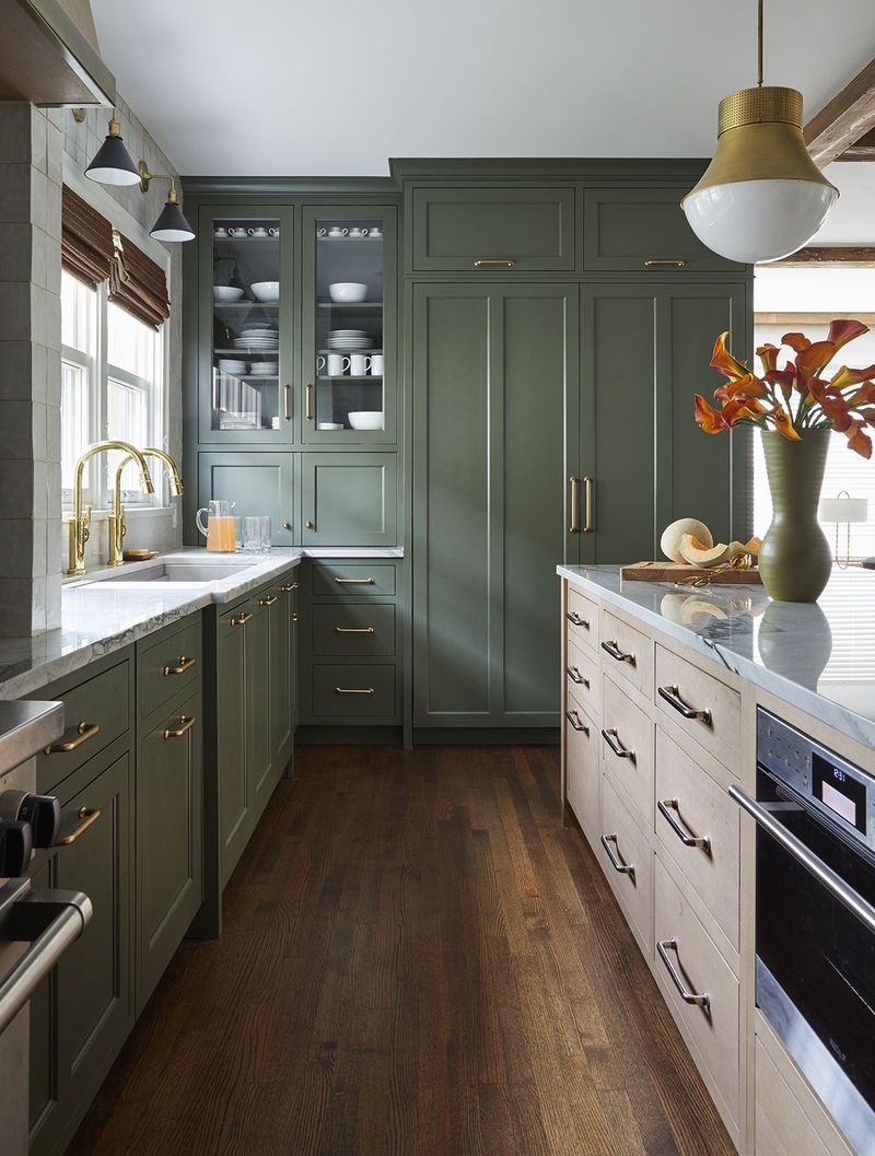
The infamous 70s kitchen staple is experiencing a sophisticated revival! Modern designers have refined this once-controversial shade into something surprisingly versatile and fresh. The key is using it strategically as an accent wall or paired with natural woods and crisp whites.
Today’s avocado green has evolved from its retro roots, offering more depth and subtlety than its predecessor. It brings organic warmth to spaces while connecting interiors to nature. Designers appreciate how it creates a perfect backdrop for brass fixtures and natural textiles.
For a contemporary take, try using avocado green in unexpected places like ceiling medallions or inside bookshelves rather than overwhelming entire rooms.
2. Burnt Orange
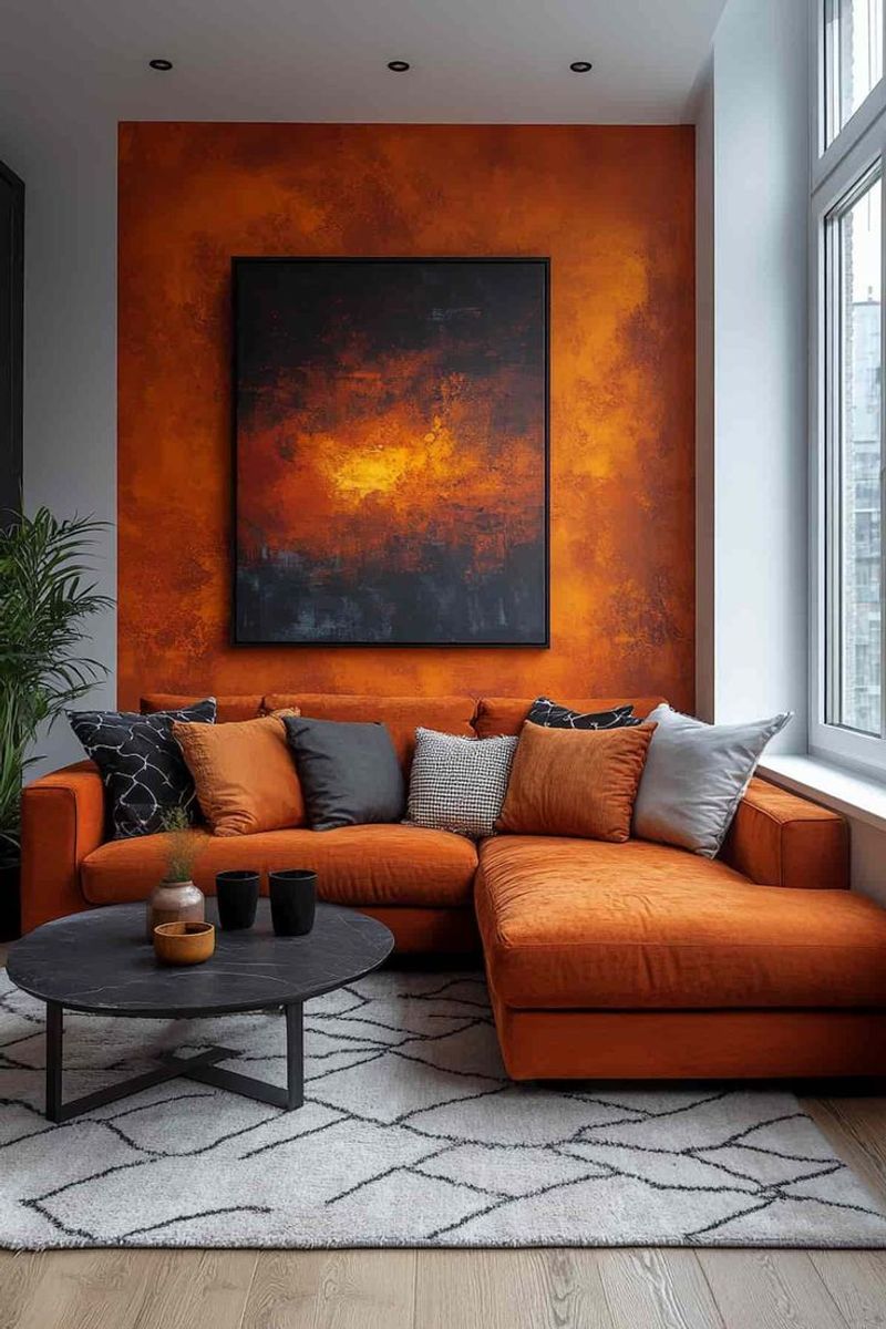
Nothing says retro glamour quite like burnt orange! This rich, earthy tone dominated homes in the 1960s and 1970s, and designers are rediscovering its incredible warmth and character.
Burnt orange creates instant coziness while delivering that punch of personality modern homeowners crave. What makes this comeback special is how designers are pairing it with contemporary elements. Instead of the heavy, dark pairings of yesteryear, today’s approach teams burnt orange with crisp whites, cool grays, and plenty of texture.
The result feels fresh rather than dated. Burnt orange works particularly well in spaces that need warming up think north-facing rooms or areas that feel a bit sterile without that touch of warmth.
3. Mustard Yellow
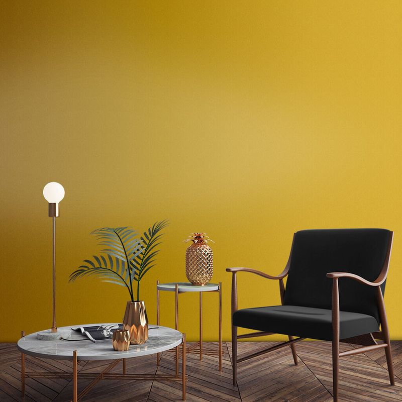
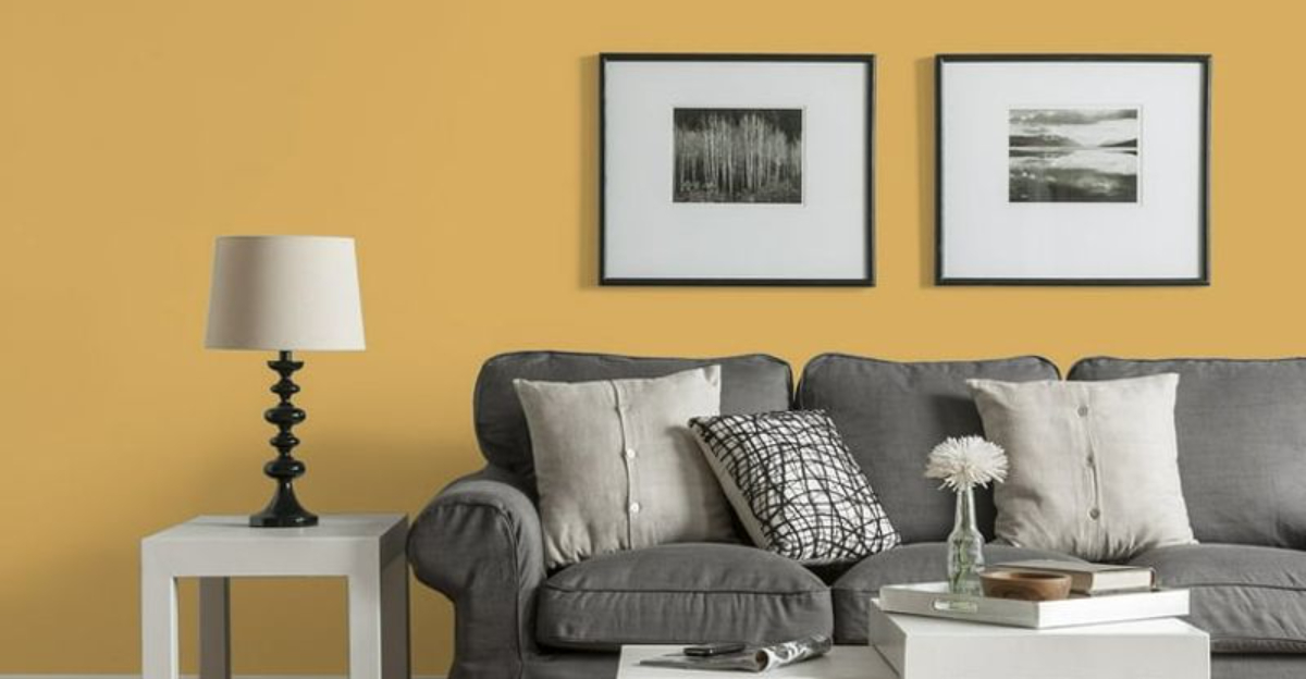
Mustard yellow has stormed back into designer portfolios with surprising versatility! This golden-yellow tone bridges retro charm and modern sophistication perfectly.
Unlike the overwhelming mustard of the 1970s, today’s version appears in thoughtful doses that energize spaces without dominating them. Designers love pairing mustard with cool blues and grays to create balanced, visually interesting rooms. The contrast creates a dynamic that feels both timeless and fresh.
I’ve noticed this shade works especially well in transitional spaces like hallways and entryways, where it creates an inviting first impression. For those hesitant about embracing such a bold color, mustard yellow furniture pieces or accessories offer a less permanent way to incorporate this cheerful retro tone.
4. Dusty Rose
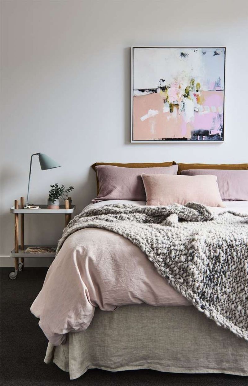
Dusty rose has shed its 1980s bathroom tile associations and emerged as a sophisticated neutral! This muted pink tone brings subtle warmth without the saccharine sweetness of brighter pinks. Many designers now treat it as a new neutral, pairing it with everything from charcoal grays to deep emeralds.
What makes today’s dusty rose different is its complexity modern formulations contain subtle gray or brown undertones that give it depth and maturity.
It creates spaces that feel both comforting and refined. The shade works beautifully in bedrooms and living spaces where a sense of calm is desired. If you’re hesitant about pink walls, consider dusty rose on ceiling details or built-ins for an unexpected touch that doesn’t overwhelm the space.
5. Teal Blue
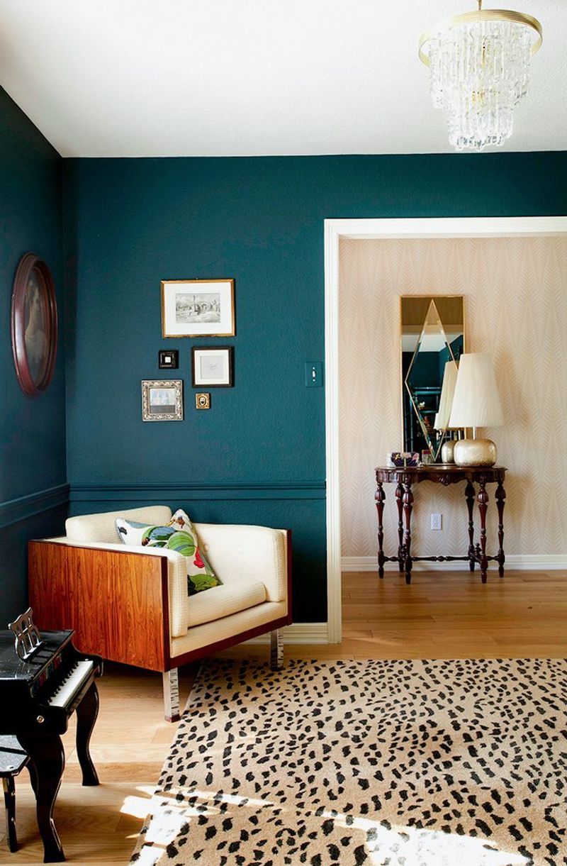
Teal blue captures the perfect balance between retro flair and contemporary sophistication! This jewel-toned blue-green dominated mid-century design before disappearing for decades. Now designers are celebrating its return for its remarkable ability to make spaces feel both lively and serene simultaneously.
Modern applications of teal have evolved significantly from its previous incarnations. Today’s designers pair it with crisp whites, warm woods, and metallic accents rather than the heavy color combinations of the past. Teal creates an excellent backdrop for artwork and statement furniture pieces.
Where this shade truly shines is in spaces that need both energy and calm home offices, creative studios, and gathering spaces benefit from teal’s unique ability to stimulate creativity while maintaining a sense of tranquility.
6. Harvest Gold
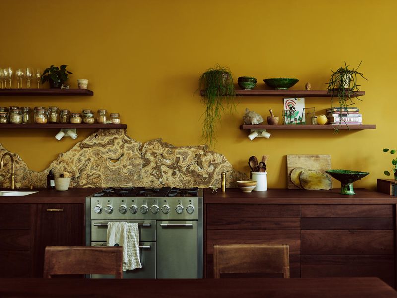
Harvest gold has undergone a remarkable transformation from dated to desirable! Once the defining color of 1970s appliances, this warm golden yellow has been refined for modern sensibilities. Designers now appreciate its sunny disposition and ability to create cheerful, welcoming spaces.
The key difference in today’s approach lies in application and pairing. Rather than overwhelming entire kitchens, harvest gold now appears as thoughtful accents against clean whites or deep navy blues. This strategic use prevents the heavy, dated feel of vintage applications.
Harvest gold particularly shines in spaces that need warmth and light north-facing rooms benefit from its sunny qualities, while spaces with abundant natural light see the color shift beautifully throughout the day, creating dynamic, ever-changing environments.
7. Olive Drab
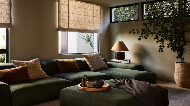
Olive drab has shed its military associations to become design’s favorite sophisticated neutral! This muted green offers incredible versatility, functioning almost like a neutral while still providing more character than standard beiges or grays.
Designers value its earthy quality and ability to connect interior spaces with nature. Today’s approach to olive differs dramatically from its utilitarian past. Modern designers pair it with rich textures like velvet and leather, and accent it with brass or copper for warmth and sophistication.
The color creates a perfect backdrop for both vibrant accents and natural elements. Olive particularly excels in spaces that benefit from a grounding influence living rooms and libraries gain a sense of permanence and stability, while bedrooms wrapped in olive create cocooning sanctuaries perfect for relaxation.
8. Mauve Mist
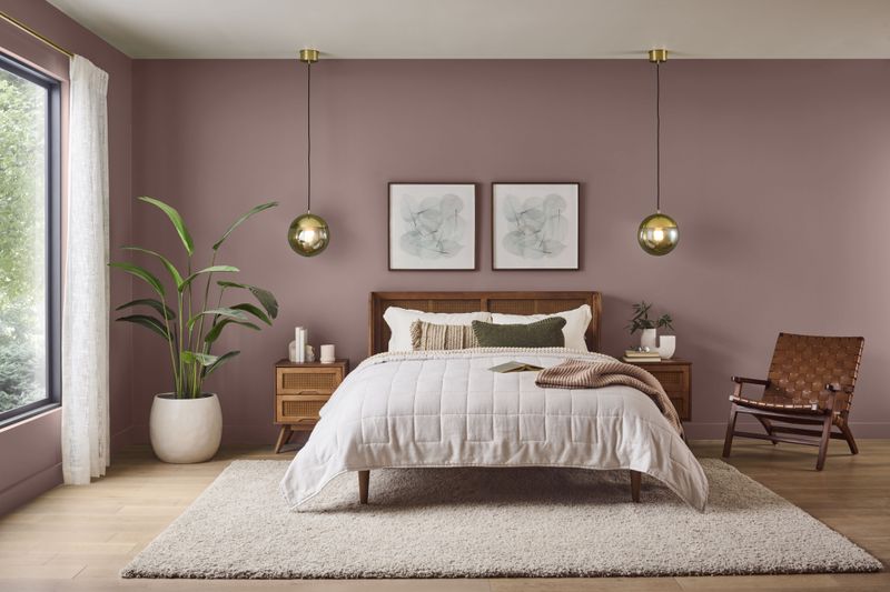
Mauve mist has finally escaped its 1980s bathroom prison! This subtle purple-gray tone has been reimagined for contemporary spaces with remarkable success. Designers appreciate its chameleon-like quality appearing more gray in some lights, more lavender in others creating spaces that feel dynamic and alive.
What distinguishes today’s mauve from its predecessor is its sophistication and restraint. Modern formulations contain more complex undertones that prevent the color from feeling dated or overly sweet. It pairs beautifully with natural woods, crisp whites, and even unexpected partners like mustard or olive.
Mauve mist creates particularly successful bedrooms and powder rooms where its softness promotes relaxation while its subtle color shift throughout the day keeps spaces feeling fresh and interesting rather than static.
9. Terracotta Clay
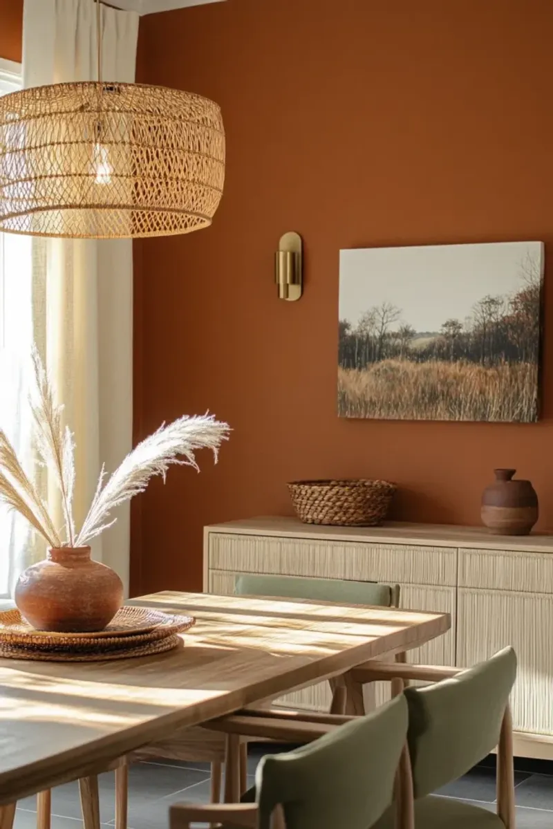
Terracotta clay brings Mediterranean warmth to modern homes with incredible versatility! This earthy orange-brown tone has ancient roots but feels surprisingly fresh in contemporary settings. Designers are embracing its natural warmth as an antidote to the cool gray trend that dominated the 2010s.
Modern applications of terracotta focus on balance pairing its warmth with cooling elements like white trim, natural greenery, and blue accents. This prevents spaces from feeling overwhelmingly warm or dated. The color creates instant coziness while maintaining sophistication.
Terracotta particularly shines in gathering spaces like dining rooms and kitchens, where its warmth encourages conversation and comfort. It also creates stunning accent walls in otherwise neutral spaces, adding depth and character without overwhelming the design.
10. Seafoam Green
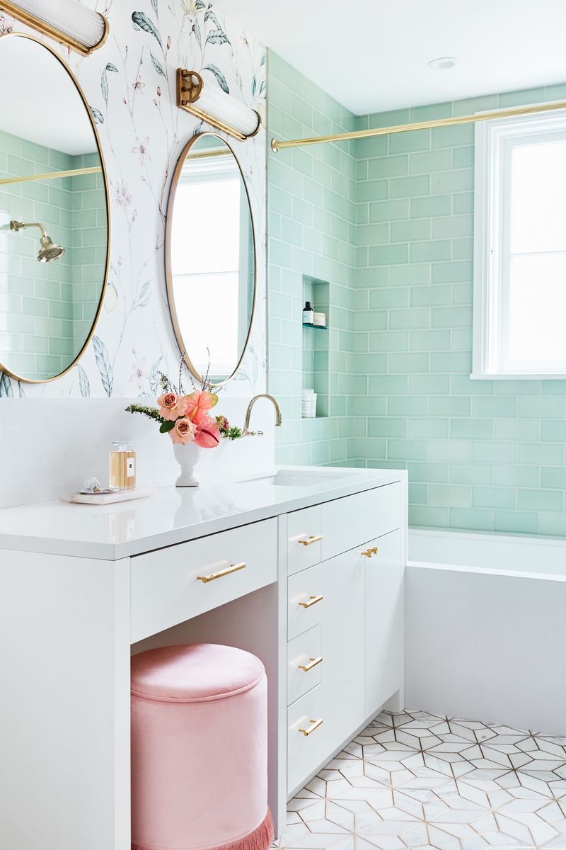
Seafoam green captures vintage beach house charm with modern sophistication! This pale blue-green shade dominated 1950s bathrooms and kitchens before fading from popularity. Designers have rediscovered its refreshing qualities and ability to create spaces that feel both clean and calming.
Today’s approach differs significantly from vintage applications. Modern designers use seafoam as part of a thoughtful palette rather than as the dominant color throughout a space. They pair it with crisp whites, natural woods, and touches of black for contrast and definition.
Seafoam green particularly excels in spaces where light and airiness are desired bathrooms transform into spa-like retreats, while bedrooms gain a sense of tranquility. The color’s subtle reference to nature creates connections to the outdoors even in urban settings.
11. Powder Blue
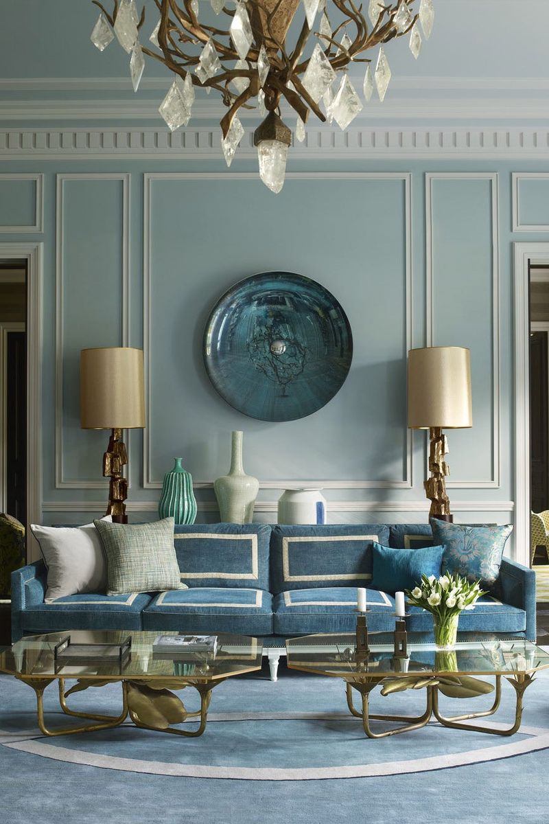
Powder blue has evolved from nursery staple to sophisticated design element! This soft, dreamy blue carries nostalgic charm while feeling surprisingly current in modern contexts. Designers appreciate its versatility – it can read as playful, elegant, or serene depending on its accompaniments.
The key to powder blue’s successful comeback lies in thoughtful application. Rather than covering every surface as in decades past, today’s approach uses it as a thoughtful accent or pairs it with unexpected elements like rich woods and metallic finishes.
These combinations prevent the color from feeling too juvenile or dated. Powder blue creates particularly successful bedrooms and reading nooks where its calming properties promote relaxation. It also works beautifully in home offices, where its serenity helps counterbalance work stress while remaining light enough to maintain focus.
12. Coral Pink
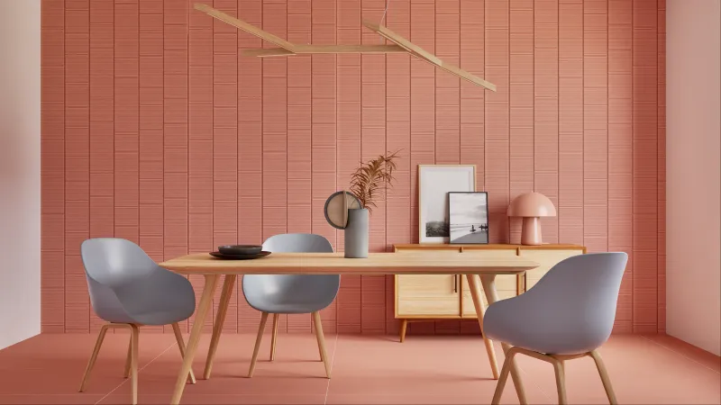
Coral pink delivers retro energy with remarkable contemporary appeal! This vibrant pink-orange hybrid brings immediate warmth and personality to any space. Designers are embracing its joyful quality after years of neutral-dominated interiors, using it to create spaces that feel alive and engaging.
What makes today’s coral different is its application rather than overwhelming entire rooms, it appears as strategic accents against neutrals or complementary colors like navy or olive. This balanced approach prevents the color from feeling dated or overwhelming.
Coral pink particularly shines in spaces that benefit from energy and optimism home gyms, creative studios, and children’s play areas gain vibrance without feeling childish. It also creates stunning dining rooms, stimulating conversation and appetite while wrapping guests in a flattering, rosy glow.
13. Butterscotch
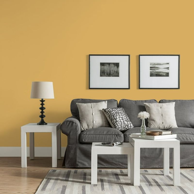
Butterscotch brings golden warmth to contemporary spaces with surprising sophistication! This amber-yellow tone dominated 1960s and 1970s interiors before disappearing for decades. Designers have rediscovered its remarkable ability to create spaces that feel simultaneously warm, inviting, and refined.
Modern applications of butterscotch differ significantly from its previous incarnations. Today’s approach pairs it with crisp whites, cool blues, and plenty of texture rather than the heavy brown combinations of the past. These thoughtful pairings prevent the color from feeling dated or overwhelming.
Butterscotch particularly excels in spaces that need warmth without darkness north-facing rooms transform from cold to cozy, while minimalist spaces gain character and depth without sacrificing their clean aesthetic. The color also creates stunning accent walls that glow like sunshine.
14. Cocoa Brown
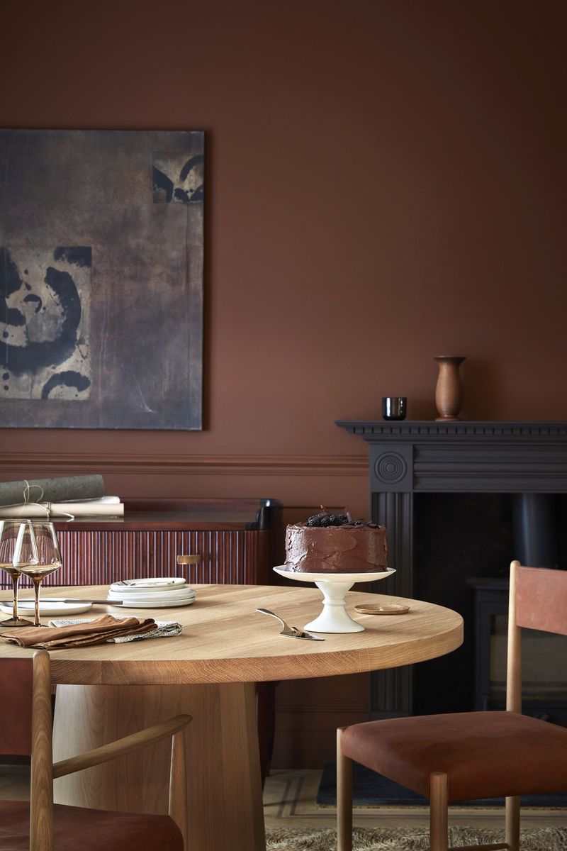
Cocoa brown delivers rich, chocolatey depth with surprising versatility! This deep neutral dominated 1970s interiors before being replaced by cooler tones. Designers have rediscovered its remarkable grounding properties and ability to create spaces that feel both dramatic and comforting.
The key to cocoa’s successful revival lies in balance and application. Rather than covering entire rooms as in decades past, today’s approach uses it as an accent wall or pairs it with plenty of light elements to prevent heaviness.
Modern designers combine it with crisp whites, soft creams, and textural elements for depth. Cocoa brown creates particularly successful libraries and media rooms where its depth promotes focus and immersion. It also works beautifully in bedrooms, where its cocooning quality promotes restful sleep while its richness adds undeniable sophistication.
15. Soft Peach
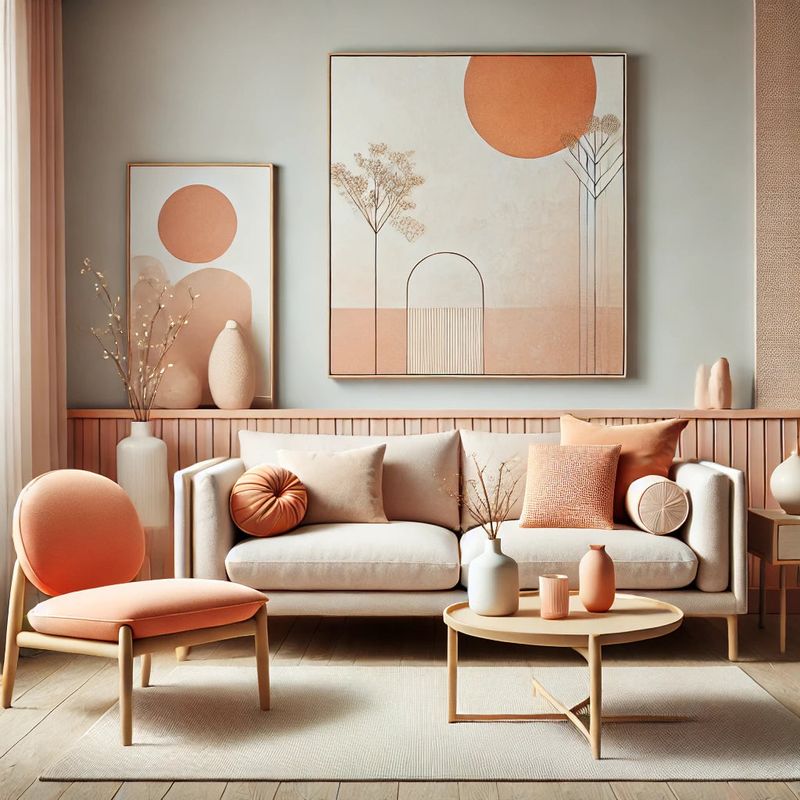
Soft peach has transformed from 1980s bathroom tile to designer’s favorite warm neutral! This gentle orange-pink tone brings immediate warmth and flattering light to any space. Designers appreciate its chameleon-like quality reading more pink in some lights, more orange in others creating dynamic, ever-changing environments.
Modern applications of soft peach differ dramatically from its dated predecessors. Today’s approach treats it almost like a neutral, pairing it with crisp whites, natural woods, and even unexpected partners like olive green or navy blue. These combinations prevent the color from feeling overly sweet or feminine.
Soft peach particularly excels in spaces where people gather living rooms and dining areas benefit from its flattering glow that makes everyone look their best. It also creates stunning bedrooms that feel both energizing in morning light and soothing in evening hours.
