18 Sherwin-Williams Paint Colors Interior Designers Can’t Stop Using
Paint colors can transform any space from drab to fab with just a few brush strokes.
Interior designers have their go-to hues that consistently deliver stunning results for their clients. Sherwin-Williams offers an impressive range of colors that professionals trust for creating beautiful, timeless spaces that homeowners love.
1. Rhythmic Blue
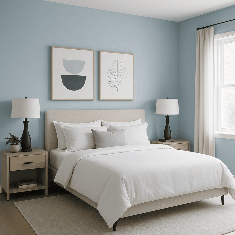
Rhythmic Blue creates a peaceful sanctuary in any room with its gentle, calming presence. This versatile hue falls somewhere between a true blue and a subtle gray, giving it sophisticated versatility that designers adore.
Many decorators pair it with crisp whites for a fresh coastal vibe or rich woods for a more traditional feel. The color shifts beautifully throughout the day as natural light changes. This shade works wonders in bedrooms where its tranquil nature promotes relaxation, but it’s equally striking in living spaces or home offices.
Its balanced undertones prevent it from feeling too cold or overwhelming, making it a foolproof choice for clients who want color without commitment to something too bold.
2. Basque Green
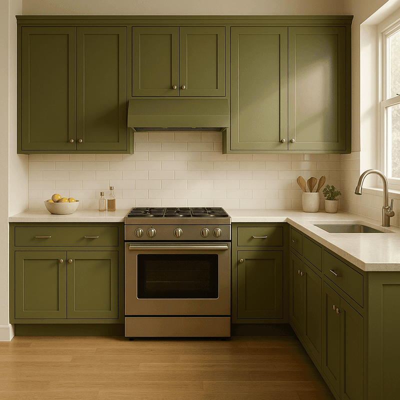
Basque Green brings the outdoors inside with its rich, earthy character that somehow feels both timeless and fresh. Interior designers gravitate toward this verdant hue when creating spaces that feel grounded yet sophisticated.
The color’s subtle gray undertones keep it from being too vibrant, allowing it to function almost as a neutral in many design schemes. It pairs beautifully with natural materials like leather, rattan, and brass fixtures. For kitchen cabinets, this green creates a stunning focal point without overwhelming the space.
In living rooms or studies, it wraps the room in a comforting embrace that feels both elegant and welcoming. Its versatility across different lighting conditions makes it a reliable choice for any home.
3. Jasper
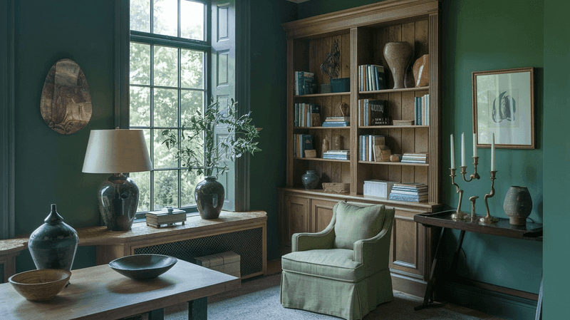
Jasper delivers dramatic impact with its deep, mysterious teal-green personality that designers can’t resist. This moody hue creates instant sophistication in dining rooms, libraries, and accent walls where its rich depth can truly shine.
What makes Jasper special is its chameleon-like quality sometimes reading more blue, sometimes more green depending on your lighting and surrounding colors. It pairs magnificently with gold accents, which make the color absolutely glow.
The velvety finish of this paint creates a cozy, enveloping feeling that’s perfect for spaces where you entertain or unwind. Though dark, it never feels gloomy thanks to its subtle vibrancy. Designers often use it in smaller spaces to create jewel-box rooms that feel intentional and luxurious.
4. Armory
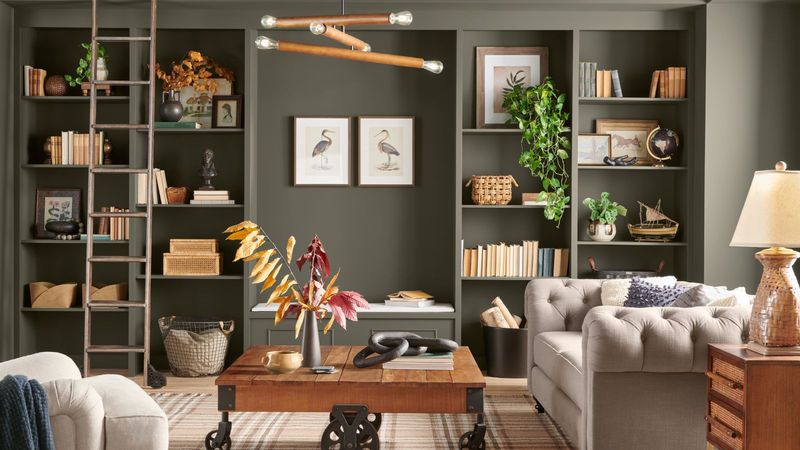
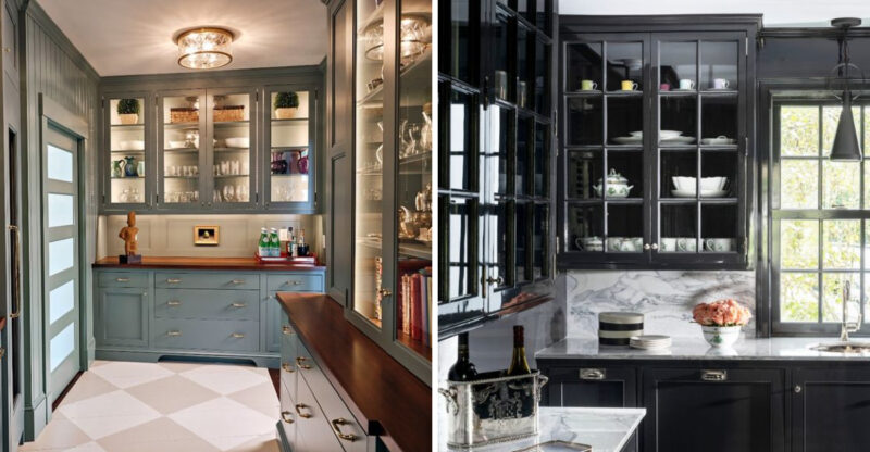
Armory captivates designers with its perfect balance between gray and green, creating spaces that feel sophisticated yet approachable. This military-inspired hue brings a masculine edge that works beautifully in home offices, dens, and modern living spaces.
The subtle green undertones prevent it from feeling flat or lifeless like some grays can. Instead, it creates a rich backdrop that complements both warm and cool accent colors with equal ease. Designers love pairing Armory with natural textures like leather, wool, and wood to enhance its organic quality. When used on cabinetry or built-ins, it creates architectural interest without overwhelming the space.
This versatile color transitions seamlessly between traditional and contemporary design styles, making it a reliable choice for clients with evolving tastes.
5. Iron Ore
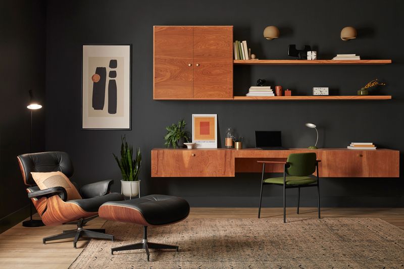
Iron Ore delivers dramatic impact as a near-black that never feels harsh or overwhelming. This deep charcoal shade has subtle blue undertones that give it remarkable depth and sophistication that designers constantly reach for.
When used on interior doors, window frames, or as an accent wall, it creates architectural interest that elevates the entire space. The color works equally well in modern minimalist settings or traditional homes looking for a contemporary edge. Many designers pair Iron Ore with warmer neutrals to balance its coolness and create a harmonious palette.
It’s particularly striking in rooms with abundant natural light, which reveals the color’s subtle complexity. For exterior applications, it creates a stunning modern facade that stands out from typical neutrals without being too unconventional.
6. Lightweight Beige
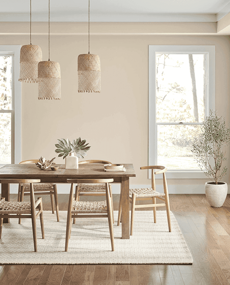
Lightweight Beige offers the perfect solution for designers seeking a warm neutral that never feels bland or boring. This versatile hue strikes the ideal balance between beige and greige, with just enough warmth to feel inviting without veering into yellow territory.
What makes this color special is its chameleon-like ability to adapt to different lighting conditions and complementary colors. In north-facing rooms, it maintains its warmth, while in sunny spaces, it reads as a soft, sophisticated neutral. Designers frequently choose this shade for open-concept living areas where color continuity matters.
Its subtle depth creates a beautiful backdrop for artwork and furnishings without competing for attention. The color’s timeless quality ensures it won’t feel dated as design trends evolve, making it a safe yet stylish choice.
7. Alabaster
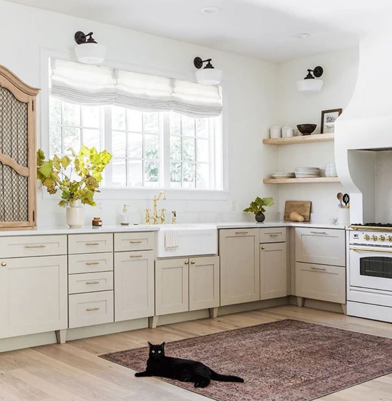
Alabaster stands as the perfect not-quite-white that designers reach for when pure white feels too stark. This soft, creamy shade carries just enough warmth to feel inviting without the yellow undertones that can make some whites look dated.
The versatility of Alabaster makes it ideal for entire homes, creating a cohesive backdrop that shifts subtly throughout the day as light changes. It pairs beautifully with virtually any accent color or wood tone, making it incredibly adaptable to different design styles.
Designers particularly love using it in spaces with architectural details like crown molding or wainscoting, where its subtle depth highlights craftsmanship without overwhelming it. In kitchens and bathrooms, it creates a clean, timeless look that won’t feel trendy in a few years a quality that both designers and homeowners value.
8. City Loft
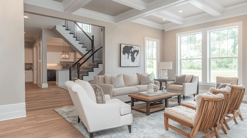
City Loft creates the perfect backdrop for both traditional and contemporary spaces with its sophisticated greige personality. This color sits beautifully between gray and beige, leaning slightly warmer without feeling too yellow or pink.
Designers appreciate how this versatile neutral adapts to different lighting conditions throughout the day. In morning light, it appears more beige, while evening light brings out its subtle gray undertones. The color works wonderfully in open floor plans where it creates continuity without feeling monotonous.
Many decorators pair it with crisp white trim for a clean, tailored look or with darker accents for more drama. Its urban sophistication makes it especially popular for city apartments and modern homes where a neutral palette needs to feel intentional rather than bland.
9. Sunbleached
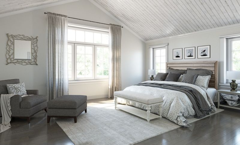
Sunbleached captures the essence of weathered driftwood with its subtle, sun-washed quality that designers adore for creating laid-back yet sophisticated spaces. This warm greige has just enough pink undertone to feel cozy without becoming too feminine.
The color’s versatility shines in living areas and bedrooms where it creates a soft, enveloping atmosphere that changes beautifully throughout the day. In morning light, it appears warmer and more beige, while evening brings out its subtle gray notes. Designers frequently pair Sunbleached with natural linens, weathered woods, and textural elements to enhance its organic quality.
It’s particularly effective in coastal homes where it references beach tones without resorting to obvious blues. The color’s depth provides enough interest to stand alone while remaining neutral enough to complement virtually any accent color.
10. Accessible Beige
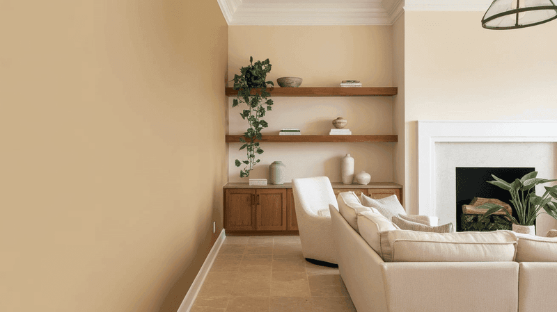
Accessible Beige lives up to its name as perhaps the most versatile neutral in the Sherwin-Williams lineup, beloved by designers for its remarkable adaptability. This perfect greige balances warm and cool undertones so masterfully that it works in virtually any lighting condition or design style.
What makes this color special is its chameleon-like quality it can read more beige or more gray depending on surrounding colors and light exposure. This adaptability makes it ideal for open floor plans where light varies throughout the space.
Designers frequently choose this shade for homes going on the market, as it creates a neutral backdrop that appeals to the widest range of buyers. Yet it never feels like a compromise, offering enough depth and character to feel intentional rather than bland. Its timeless quality ensures it won’t look dated as trends evolve.
11. Agreeable Gray
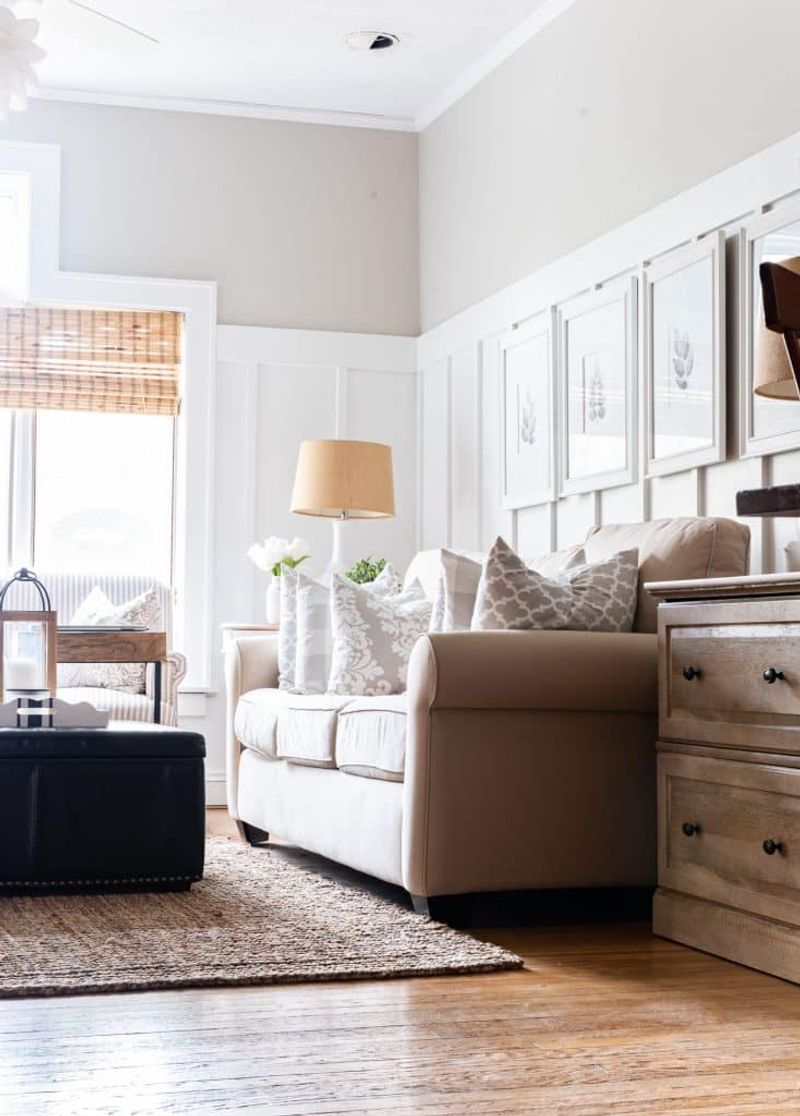
Agreeable Gray has earned its reputation as the perfect greige that designers turn to again and again for foolproof results. This balanced neutral sits precisely between gray and beige, with warm undertones that prevent it from feeling cold or sterile.
The versatility of this color makes it ideal for whole-home color schemes, creating a cohesive flow from room to room. It adapts beautifully to different lighting conditions, maintaining its warmth even in north-facing spaces where cooler grays can appear drab. Designers love pairing Agreeable Gray with crisp white trim for a clean, contemporary look or with deeper accent colors for more drama.
Its chameleon-like nature allows it to complement both cool and warm color schemes with equal ease. For clients hesitant about color, it provides enough depth to feel intentional without any risk of being too bold.
12. Pure White
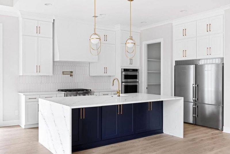
Pure White delivers exactly what its name promises a clean, bright white that designers choose when they want crispness without harshness. Unlike stark whites that can feel clinical, this shade carries just enough warmth to feel inviting and livable.
Designers particularly value this color for its versatility across different lighting conditions. In north-facing rooms, it maintains its brightness without appearing dingy, while in sunny spaces, it doesn’t wash out or glare.
The perfect trim color for virtually any wall shade, Pure White also stands beautifully on its own for a clean, gallery-like backdrop that makes artwork and furnishings pop. Many designers use it for kitchen cabinets where its clean appearance creates a timeless look that won’t date quickly. Its versatility across traditional and modern spaces makes it a true design workhorse.
13. Snowbound
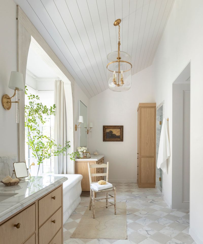
Snowbound offers designers a sophisticated white with subtle depth that elevates any space beyond basic. This versatile shade carries the faintest hint of gray undertone, giving it a soft, refined quality that pure whites often lack.
What makes this color special is its ability to read as a clean white without appearing stark or sterile. The subtle warmth prevents it from feeling cold even in spaces with limited natural light. Designers frequently choose Snowbound for trim, cabinets, and full rooms where they want a bright, airy feel with just a touch more sophistication than pure white provides.
It pairs beautifully with virtually any accent color while creating a perfect backdrop for artwork and architectural details. In bathrooms and kitchens, it creates a fresh, clean appearance that feels timeless rather than trendy.
14. Sea Salt
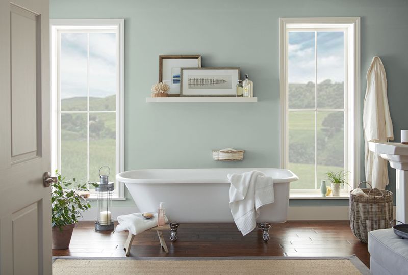
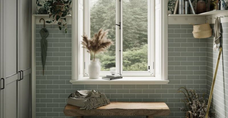
Sea Salt captures the essence of coastal living with its delicate balance of soft green and subtle gray that designers can’t resist. This chameleon-like color shifts throughout the day, sometimes appearing more green, sometimes more gray, but always maintaining its serene quality.
The versatility of Sea Salt makes it perfect for spaces where you want color without commitment to a bold statement. It pairs beautifully with natural woods, linens, and blues for a coastal vibe, or with crisp whites for a fresh, spa-like atmosphere.
Designers particularly love this shade for bathrooms, bedrooms, and sunrooms where its tranquil nature creates an instant sense of calm. Though it references the coast, it never feels themed or kitschy – instead, it brings a sophisticated subtlety that appeals to clients who want their spaces to feel connected to nature.
15. Clary Sage
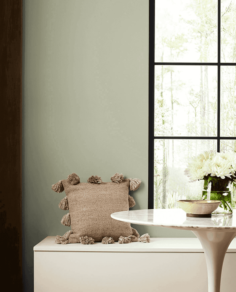
Clary Sage brings the perfect muted green to spaces where designers want to incorporate nature without overwhelming the senses. This sophisticated sage has gray undertones that give it remarkable versatility and prevent it from feeling too trendy or seasonal.
The earthy quality of this color makes it ideal for creating calming bedrooms and living spaces that feel connected to the outdoors. It pairs beautifully with natural materials like leather, linen, and various wood tones. Designers appreciate how this color can serve as a subtle neutral with just enough personality to create interest.
In kitchens, it creates stunning cabinetry that feels both current and timeless. Its muted quality allows it to complement both cool and warm color schemes, making it an exceptionally versatile choice for clients who want color beyond basic neutrals.
16. Retreat
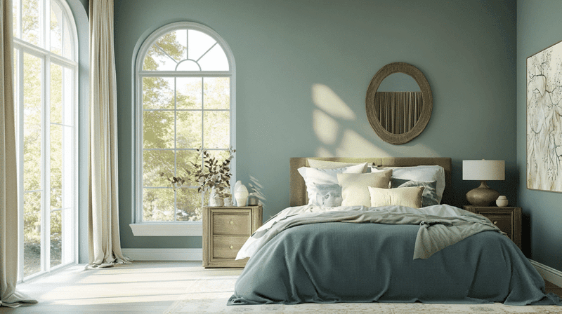
Retreat lives up to its name by creating spaces that feel like a peaceful getaway from the busy world. This sophisticated blue-gray carries subtle green undertones that give it remarkable depth and versatility across different lighting conditions.
Designers love this color for bedrooms and bathrooms where its tranquil nature promotes relaxation and calm. The color shifts beautifully throughout the day, sometimes appearing more blue, sometimes more gray, creating subtle interest that never feels boring. When paired with crisp whites, Retreat creates a fresh, coastal vibe without feeling themed.
With warmer neutrals and woods, it takes on a more organic, grounded quality. Its balanced undertones make it compatible with both cool and warm accent colors, giving designers flexibility to create various moods while maintaining the color’s inherent serenity.
17. Grizzle Gray
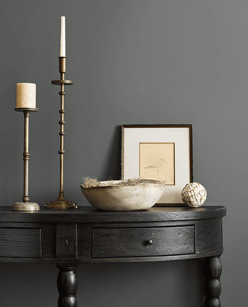
Grizzle Gray delivers sophisticated drama without the heaviness of charcoal or black, making it a designer favorite for creating focal points. This medium-toned gray carries subtle blue undertones that give it depth and prevent it from feeling flat or boring.
Designers frequently choose this versatile shade for kitchen islands, built-ins, or accent walls where they want to create visual interest without overwhelming the space. It pairs beautifully with lighter neutrals, creating a balanced contrast that feels intentional rather than stark.
The color takes on different personalities depending on surrounding elements with brass or gold accents, it feels luxurious and traditional; with chrome or black fixtures, it leans more contemporary. This adaptability makes it perfect for transitional spaces where clients want to bridge traditional and modern elements for a timeless look.
18. Waterloo
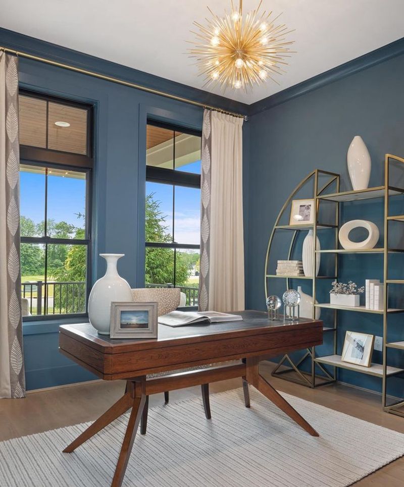
Waterloo brings moody sophistication with its deep blue-gray personality that designers turn to when they want to create dramatic, cocooning spaces. This rich hue carries enough gray to keep it sophisticated rather than bright, yet enough blue to give it distinctive character.
The versatility of this color shines in dining rooms, libraries, and powder rooms where its enveloping depth creates instant atmosphere. It pairs beautifully with brass accents, which pop against its cool tones, creating a luxurious contrast. Designers appreciate how this color can transform ordinary spaces into memorable ones with minimal effort.
Though dark, it never feels gloomy thanks to its subtle vibrancy. In rooms with abundant natural light, it reveals complex undertones that shift throughout the day, while in spaces with limited light, it creates a cozy, intimate feeling that’s perfect for evening entertaining.

