Small Living Room Don’ts 13 Design Fails And The ‘Fixes’ That Make It Worse
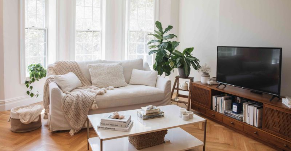
Decorating a small living room can feel like solving a puzzle with too many pieces. We all want our compact spaces to feel cozy yet spacious, stylish yet functional.
Unfortunately, some common design choices can make your already limited space feel even more cramped.
Even worse, the supposed ‘fixes’ people often try can actually compound these problems rather than solve them. Let’s explore these design fails and their counterproductive solutions.
1. Oversized Furniture (Design Fail)
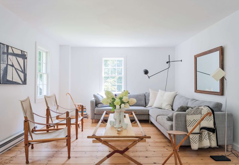
That massive sectional sofa might be perfect for movie nights, but it’s suffocating your small living room. Large furniture pieces gobble up valuable floor space and create an obstacle course instead of a living area. They force awkward traffic patterns and make the room feel smaller than it actually is.
I’ve seen countless homeowners fall in love with showroom pieces without considering scale. Your furniture should be proportional to your space, not dominating it. Consider the breathing room around each piece can you move freely without bumping into things?
Instead of that bulky three-seater, try a loveseat or apartment-sized sofa with exposed legs. This creates visual space underneath, helping the room feel more open while still providing comfortable seating.
2. Dark Wall Colors in Small Spaces (Design Fail)
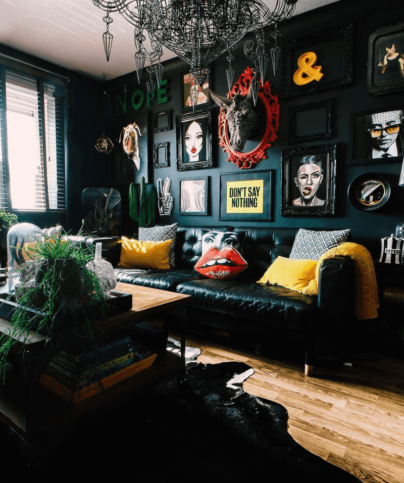
Painting your tiny living room charcoal gray or navy blue might seem sophisticated, but these dark hues actually shrink your space visually. Deep colors absorb light rather than reflect it, making walls appear to close in and ceilings feel lower than they actually are.
Many homeowners believe the dramatic look will add character, only to find themselves feeling claustrophobic afterward. Without ample natural light to balance the darkness, these colors create a cave-like atmosphere that feels oppressive rather than cozy.
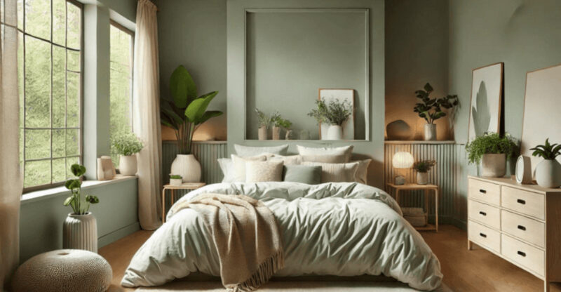
Light colors aren’t your only option, though. If you crave color, consider dusty blues, soft sages, or warm terracottas that add personality without the shrinking effect. Save those dramatic dark tones for accent pieces or a single feature wall instead of the entire room.
3. Too Many Throw Pillows (Design Fail)
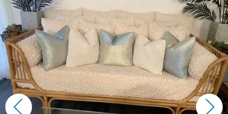
Are your throw pillows multiplying faster than you can count them? That mountain of decorative cushions might look plush in theory, but it’s actually creating visual chaos in your small space. When pillows take up half your seating area, you’ve crossed the line from decorative to impractical.
I’ve watched friends continuously add “just one more cute pillow” until their sofas became unusable. Each additional pillow adds visual weight and clutter to your room. Plus, where do they all go when you actually want to sit down?
Limit yourself to 2-3 statement pillows that complement your color scheme. This gives you the decorative pop you want without overwhelming your furniture or creating extra items to store. Quality over quantity wins every time in small spaces.
4. Low Lighting (Design Fail)
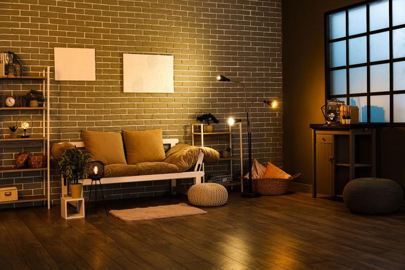
Relying on a single overhead light fixture is the fastest way to make your small living room feel like an interrogation room. Poor lighting creates shadows that make spaces feel smaller, gloomier, and less inviting than they could be.
This common mistake happens when people think one bright ceiling light will efficiently illuminate everything. In reality, it creates harsh shadows and leaves corners dark, making the room feel unbalanced and unwelcoming. Your space needs layers of light to feel properly proportioned.
Add lighting at different heights table lamps, floor lamps, and wall sconces to create depth and dimension. Aim for at least three light sources in different areas of your room. This layered approach opens up the space visually while creating a warm, inviting atmosphere that a single overhead light never could.
5. Wall-to-Wall Rugs That Clash (Design Fail)
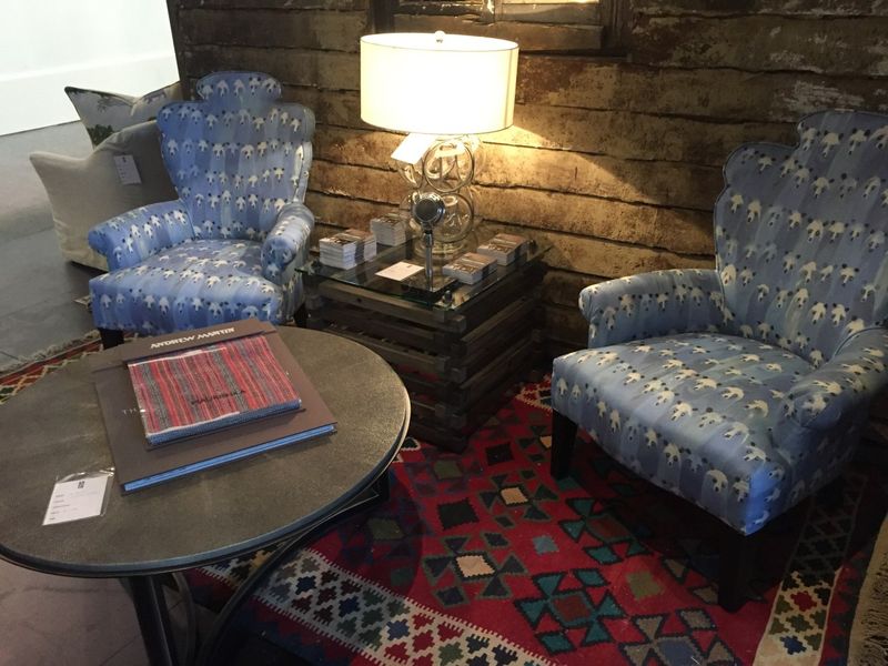
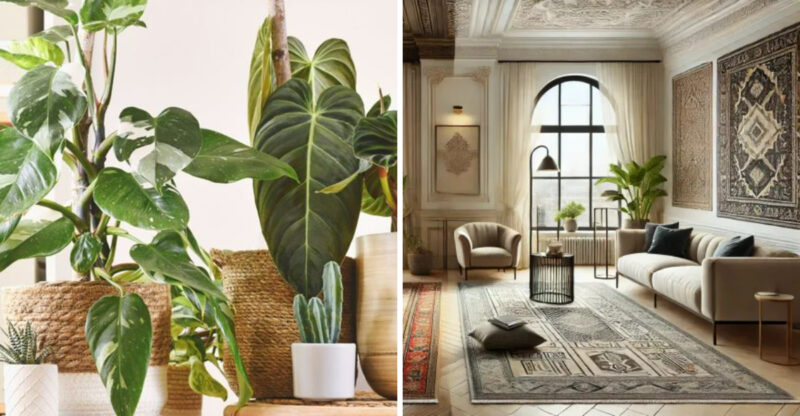
That boldly patterned area rug might have caught your eye online, but when it fights with every other element in your small living room, it’s doing more harm than good. Clashing rugs create visual tension that makes your space feel chaotic and disjointed rather than harmonious.
When selecting a rug, consider it as the foundation of your room’s design, not just an afterthought. Bold patterns work best when they complement your existing color scheme and when the rest of the room is relatively simple. If your furniture and walls already make strong statements, a busy rug will create visual competition.
Choose a rug that either subtly echoes colors from your existing decor or provides a neutral foundation. The right rug should feel like it belongs in the space, not like it’s shouting for attention over everything else.
6. Cluttered Gallery Walls (Design Fail)
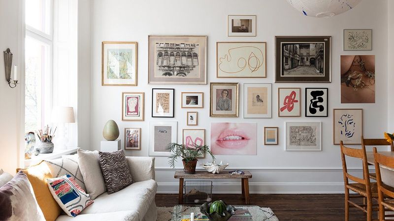
While Pinterest might have convinced you that covering every inch of wall space with framed art creates character, overcrowded gallery walls can overwhelm a small living room. When there’s no visual breathing room between frames, your walls start to feel busy and chaotic rather than curated.
Homeowners often fall into this trap gradually, adding “just one more” frame until suddenly their walls feel like a jumbled art store. This visual noise makes your room feel smaller and more cluttered, even if the rest of the space is tidy.
Edit your collection down to a thoughtful arrangement with proper spacing between pieces. Consider a salon-style hanging with a cohesive color scheme or matching frames. Remember that negative space between art is just as important as the art itself it gives the eye places to rest and makes your chosen pieces stand out more.
7. Furniture Pushed Against Every Wall (Design Fail)
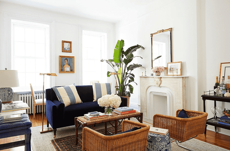
Shoving all your furniture against the walls doesn’t magically create more space it actually makes your small living room feel like a waiting room. This common arrangement creates an awkward empty zone in the middle while making conversation difficult and the room feel stiff.
People instinctively push furniture to the perimeter thinking it opens up the floor plan. What actually happens is you create an unnatural layout that feels unwelcoming and highlights how small the room truly is. Your furniture arrangement should facilitate how you actually use the space, not just maximize empty floor.
Try floating your sofa away from the wall with a slim console table behind it, or angle a chair in the corner rather than pressing it flat against two walls. These small adjustments create depth and interest while making the room feel more intentionally designed rather than just a collection of furniture pieces.
8. Bulky Coffee Tables (Design Fail)
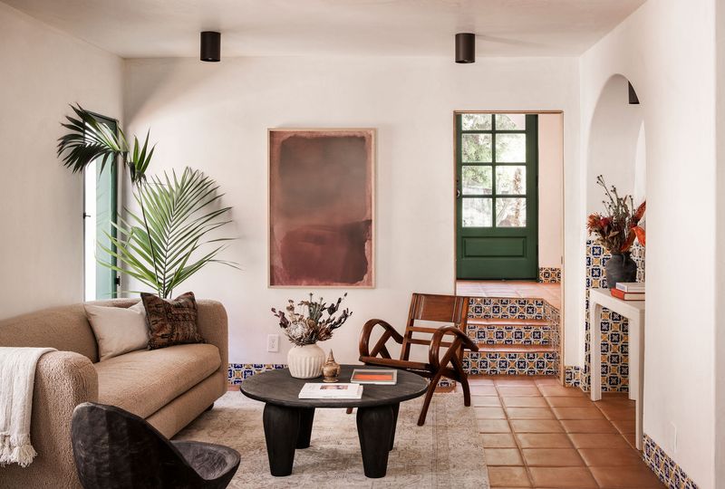
That gorgeous chunky coffee table might work beautifully in a spacious showroom, but in your compact living area, it’s a space-hogging obstacle. Heavy, solid coffee tables create visual weight that anchors down the center of your room, making everything feel more cramped.
When shopping for furniture, it’s easy to fall in love with substantial pieces without considering how they’ll function in your actual space. A bulky table forces awkward pathways around it and dominates the room visually, throwing off your entire layout balance.
Opt for coffee tables with slender profiles, glass tops, or open bases that let your eye travel through them. Nesting tables offer flexibility, allowing you to expand when needed and tuck away when not in use. Remember that in small spaces, visual lightness is just as important as physical footprint when selecting furniture.
9. Overuse of Pattern (Design Fail)
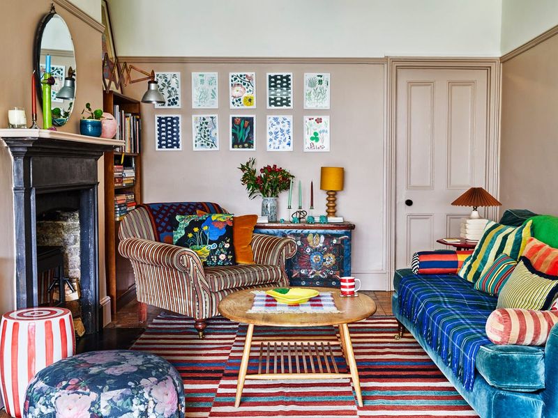
Mixing florals, geometrics, stripes, and animal prints might showcase your eclectic taste, but in a small living room, pattern overload creates visual chaos. When every surface competes for attention, your eye has nowhere to rest, making the space feel smaller and more cluttered than it actually is.
This common mistake happens when decorating piece by piece without considering the overall composition. Each individual patterned item might be beautiful on its own, but together they create a disjointed, busy environment that can actually feel stressful rather than welcoming.
Limit yourself to 2-3 complementary patterns in a cohesive color palette, and balance them with solid-colored pieces. If you love that bold geometric rug, pair it with solid upholstery rather than patterned pillows. This strategic approach lets you incorporate patterns you love without overwhelming your limited space.
10. Floating Shelves Stuffed with Decor (Design Fail)
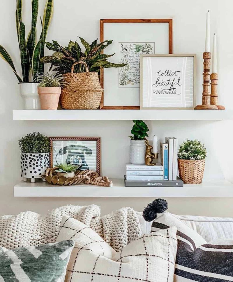
Those Pinterest-perfect floating shelves look amazing with their carefully curated items, but overcrowding them turns your small living room into a cluttered display case. When every inch of shelf space is crammed with knickknacks, books, and frames, you create visual noise that makes your room feel smaller and more chaotic.
Many homeowners install floating shelves as a storage solution, then defeat their purpose by overloading them. The result is a wall that feels heavy and imposing rather than light and airy. Dusting becomes a nightmare, and nothing stands out as special among the clutter.
Follow the rule of negative space leave at least 30% of your shelf surface empty. Group similar items together, vary heights and textures, and be ruthlessly selective about what earns a spot on display. Remember that what you leave off your shelves is just as important as what you put on them.
11. “Fix”: Hanging Mirrors Without Purpose (Makes It Worse)
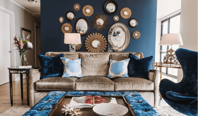
You’ve probably heard that mirrors make small spaces feel larger, so you hung mirrors everywhere only to create a funhouse effect that’s more disorienting than spacious. Randomly placed mirrors don’t automatically expand your space; they can actually make it feel more chaotic.
When mirrors are positioned without thought, they often reflect unattractive views like cluttered corners or blank walls, defeating their purpose entirely. They can also create confusing sight lines and double the visual of your design mistakes rather than enhancing your space.
Place mirrors strategically to reflect light sources or attractive views. A mirror across from a window multiplies natural light, while one reflecting a pretty vignette adds depth. Size and placement matter – one well-positioned larger mirror often works better than several smaller ones scattered around without purpose.
12. “Fix”: Adding More Small Furniture Instead of Editing (Makes It Worse)
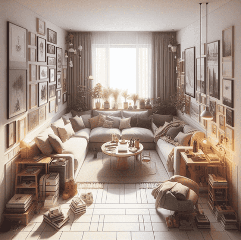
When faced with a cramped living room, many people mistakenly replace larger pieces with multiple smaller ones, thinking it will free up space. Unfortunately, this “fix” often backfires spectacularly, creating more visual clutter than before.
Five small tables, three tiny chairs, and a couple of ottomans actually take up more visual and physical space than fewer, appropriately-scaled pieces would. Each item adds another obstacle to navigate around and another visual stop for your eye, making the room feel busier and more crowded.
Focus on editing down to fewer, better pieces instead of multiplying furniture items. One proper-sized sofa works better than two cramped loveseats. Quality over quantity applies to furniture just as much as accessories. Remember that empty space is an essential design element in small rooms not something to be filled with more stuff.
13. “Fix”: Transparent Furniture Overload (Makes It Worse)
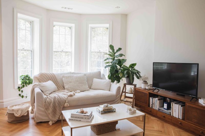
After reading that clear acrylic furniture “disappears” in small spaces, you’ve filled your living room with ghost chairs, glass tables, and lucite consoles. Now your space resembles a furniture showroom specializing in see-through pieces hardly the cozy living area you envisioned.
While transparent furniture can work wonderfully in moderation, too many clear pieces create a cold, impersonal atmosphere lacking warmth and texture. These pieces also show every fingerprint, dust particle, and smudge, requiring constant cleaning to maintain their “invisible” effect.
Limit yourself to one or two transparent statement pieces mixed with traditional materials. A glass coffee table paired with an upholstered sofa creates balance, while a room full of acrylic furniture feels sterile. Remember that visual lightness can also come from furniture with slim profiles and raised legs not just transparent materials.

