9 Underrated Paint Colors Designers Always Use In Kitchens (And 9 They Say To Stay Away From)
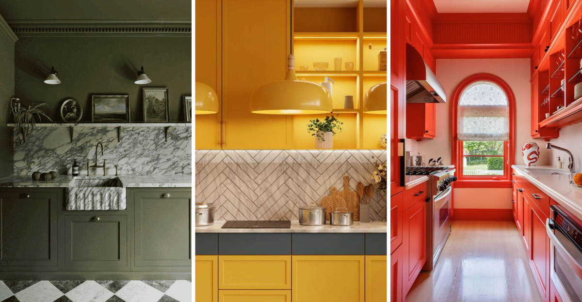
Staring at your kitchen walls and feeling uninspired? The right paint color can completely change the vibe of your space but not all hues are created equal.
I’ve dug into designer go-tos and uncovered nine underrated shades that quietly work magic in kitchens, along with nine colors the pros say to leave behind.
Whether you’re craving warmth, energy, or a fresh dose of personality, this guide will help you pick a color that feels just right and steer clear of ones you might regret. Let’s dive into the bold, the beautiful, and the surprisingly tricky.
1. Sage Green
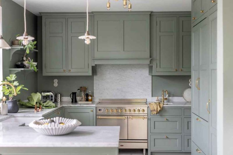
How a simple shade like sage green can utterly change the feeling in a kitchen still amazes me. The soft, natural hue brings calm energy, almost like a morning stroll through a garden after rain. It’s not just a color; it’s a mood that feels timeless and fresh.
Did you know some designers call sage green the new neutral? When used on cabinets or even a kitchen island, it instantly updates the space without overwhelming it.
This shade works perfectly for cozy breakfast nooks or open, airy layouts.
2. Dusty Blue
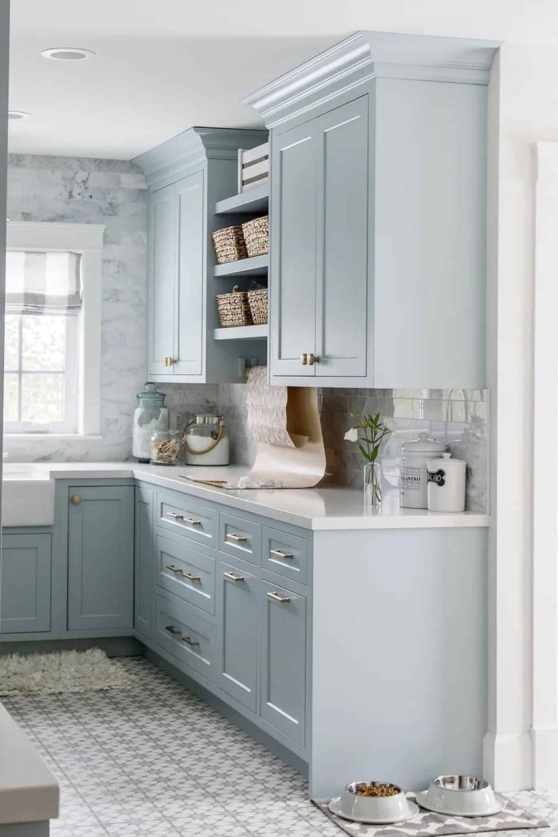
If you’re longing for a kitchen that feels tranquil without being cold, dusty blue could be your secret weapon. The muted tone doesn’t shout for attention, but it quietly creates a relaxing atmosphere. Sometimes, I think of it as the gentle sigh of the color world.
Designers often use dusty blue to complement marble counters or warm metallics. It feels both modern and classic at the same time, which is harder to achieve than you’d expect.
This shade makes breakfast routines feel just a tad more special.
3. Warm Taupe
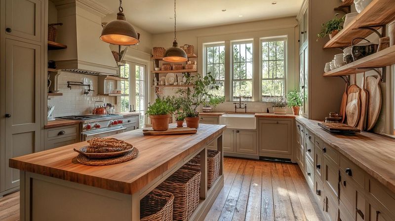
Where can you find a color that feels as cozy as a sweater, but as polished as a showroom? Warm taupe does exactly that. The rich undertones add sophistication without making the space feel heavy or closed-in.
Some designers use this shade to tie together stainless steel and wood finishes. I love how it works with nearly any style—farmhouse, modern, even traditional.
Warm taupe can be a backdrop that lets your personality shine through while keeping things inviting for guests.
4. Soft Black
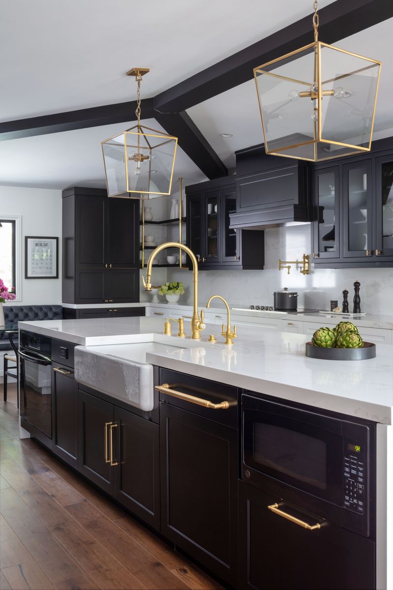
It’s bold, but not brash—soft black is that rare color which feels daring and safe at the same time. I always notice how it grounds a kitchen, making every other color sing.
This tone isn’t the harsh black of chalkboards or ink; it brings depth and warmth. If you’re worried about darkness, pair it with light counters or plenty of natural light.
Designers like using it on lower cabinets or a statement wall for that effortlessly cool vibe.
5. Creamy Off-White
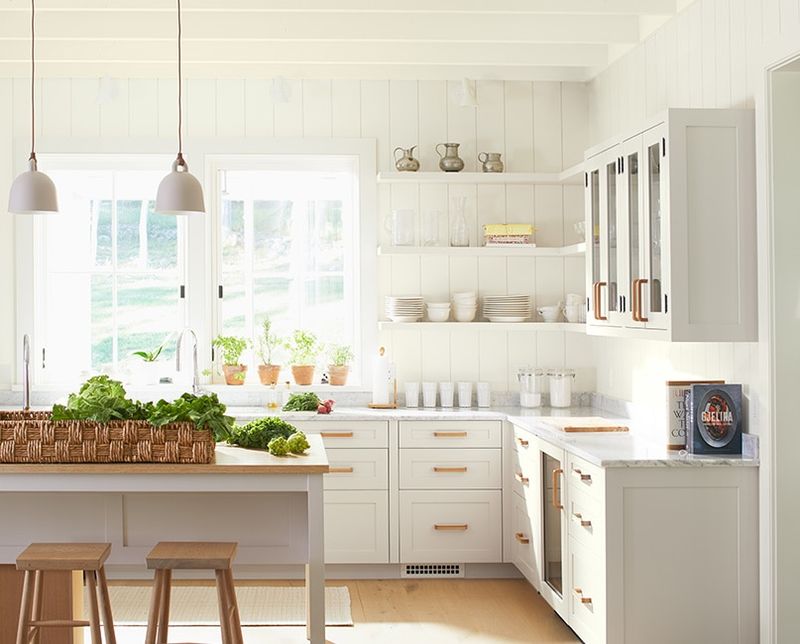
When was the last time you looked at off-white and thought it could be anything but basic? Creamy off-white proves otherwise. The subtle warmth makes kitchens feel welcoming, never sterile.
Designers love it for small spaces or where you want the light to bounce beautifully. I’ve seen it paired with bold accents or left to create a sunlit glow all on its own.
This shade fits every mood—from lively family mornings to quiet midnight snacks.
6. Muted Terracotta
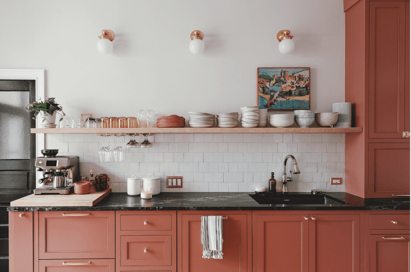
Why settle for another white kitchen when you could embrace the earthy embrace of muted terracotta? The warmth feels like a kitchen at golden hour, even on gray days.
Designers who love global inspiration often turn to this shade for depth and coziness. I enjoy the way terracotta brings in energy without feeling overwhelming.
It’s a nod to tradition that still feels refreshingly different, especially paired with natural stone or wood.
7. Pale Olive
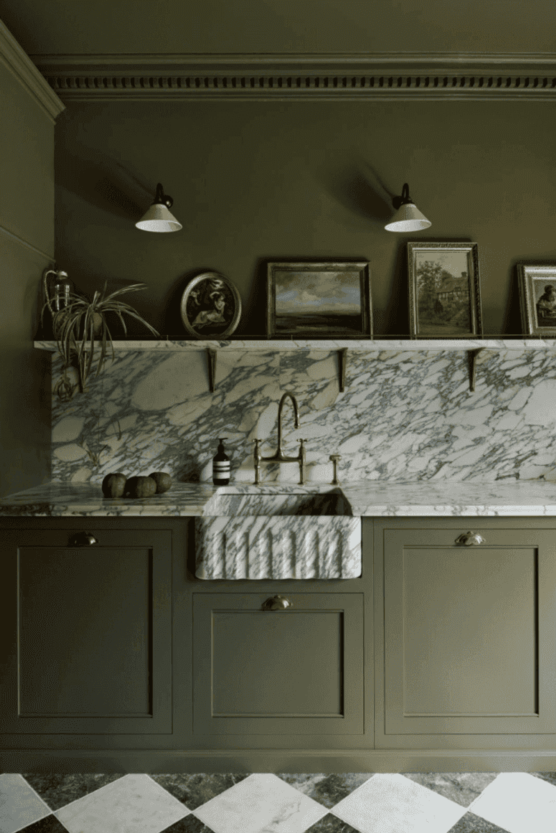
Ever walked into a kitchen that just felt restful, like an indoor retreat? Pale olive has that power. The subtle greenish tint reads sophisticated and soothing, not overpowering.
Designers use it to add interest without veering into vibrant territory. I’ve found pale olive to be unexpectedly versatile, pairing well with brass, copper, or even bold patterned tiles.
It’s the color equivalent of a fresh sprig of rosemary on your counter.
8. Slate Gray
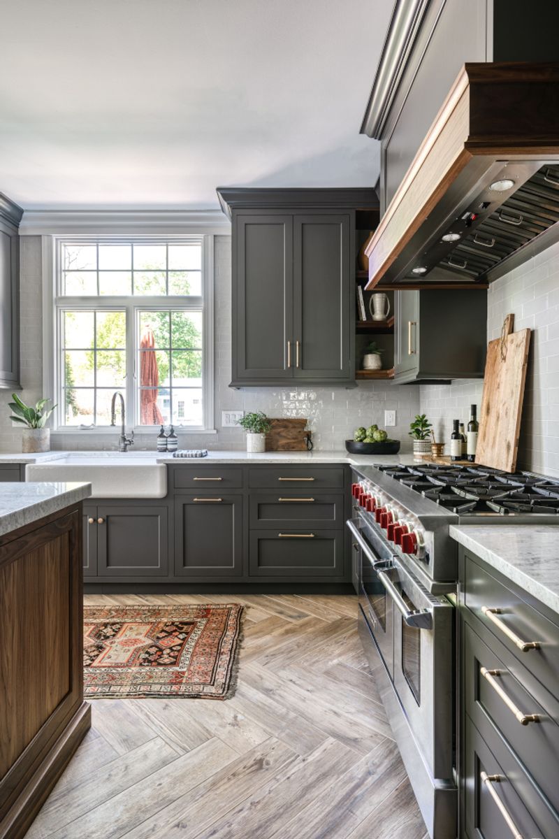
Did you know slate gray is a favorite among designers for its adaptability? It’s moody but not somber, offering a strong, steady base for colorful accessories or artwork.
Used on cabinets or walls, slate gray manages to feel both modern and timeless. I always think it makes kitchens look more expensive, even when the budget isn’t sky-high.
Plus, it plays nicely with both cool and warm tones in your decor.
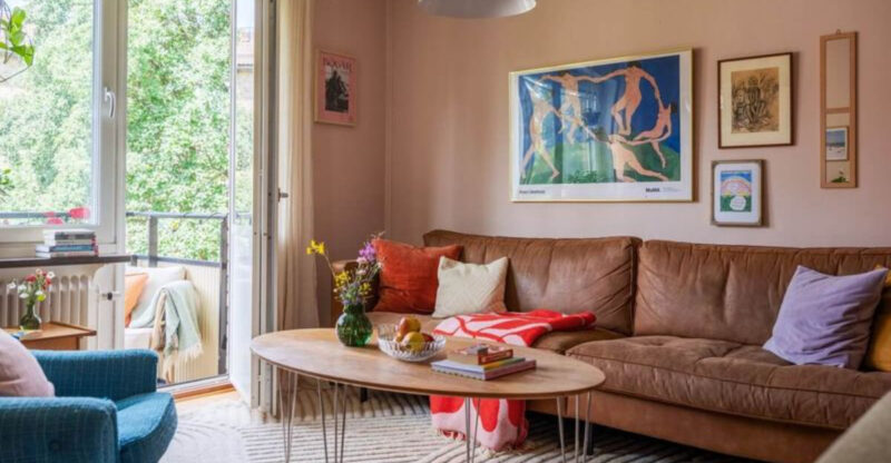
9. Warm Blush
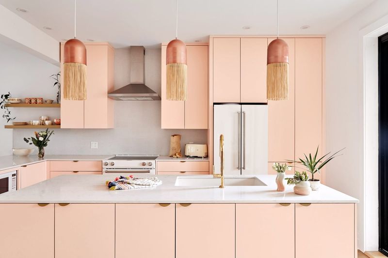
Where does all that kitchen cheer come from? Sometimes, it’s the unexpected glow of a warm blush paint. The hint of pink isn’t childish—it radiates joy and warmth.
Designers often use blush for breakfast nooks or accent walls. I find it softens stark lines and makes every meal feel like a little celebration.
Pair with natural woods or crisp whites for a space that feels friendly and fresh.
10. Neon Yellow (Stay Away)
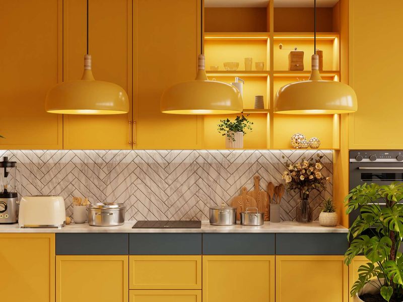
Are you tempted by bold, trending colors? Neon yellow in kitchens can quickly become fatiguing. The bright, electric shade overpowers everything, leaving the space feeling chaotic and uncomfortable.
Designers say it’s too harsh for a room where you want harmony and appetite. I’ve seen kitchens where neon yellow seemed fun at first, but within weeks, everyone wanted to repaint.
If you want yellow, consider a softer, buttery tone instead.
11. Bright Red (Stay Away)
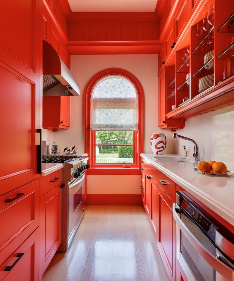
If you think red will energize your mornings, think twice. Bright red in kitchens usually does more harm than good. The color stimulates appetite, but in a way that can feel aggressive and stressful over time.
Designers warn that red easily clashes with most appliances and fixtures. I find it’s rarely worth the risk, as it can quickly date a space or make it uncomfortable for long gatherings.
Choose muted reds for warmth, not intensity.
12. Stark White (Stay Away)
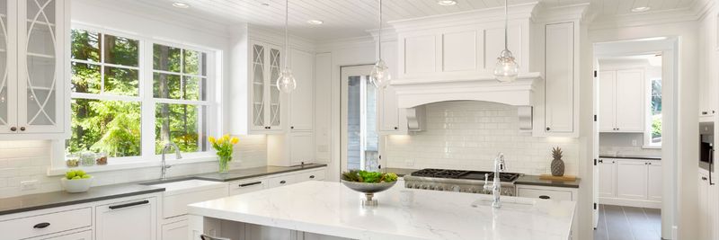
It’s tempting to go pure white for that clean look, but stark white can backfire. The result often feels more like a laboratory than a home. I’ve felt the chill in all-white kitchens, where the lack of warmth makes it hard to relax.
Designers prefer warmer off-whites or creams to avoid this sterile vibe.
If you crave brightness, go for a softer white that flatters both your food and your mood.
13. Flat Beige (Stay Away)
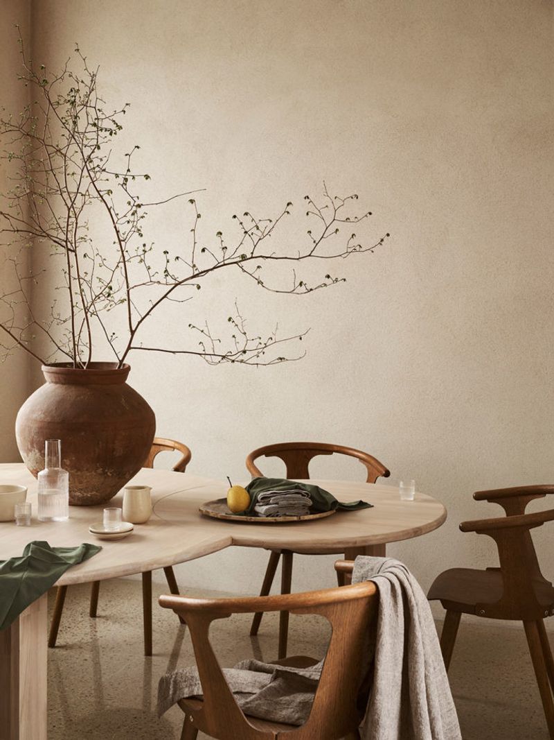
Where’s the personality in flat beige? This color often drains all energy from a kitchen, leaving it looking dated and lifeless.
I’ve seen homes where beige was supposed to be safe, but the effect was underwhelming.
Designers say modern kitchens deserve more depth or contrast. If you want neutrality, pick a shade with richer undertones for a more dynamic and interesting backdrop.
14. Cool Gray with Blue Undertones (Stay Away)
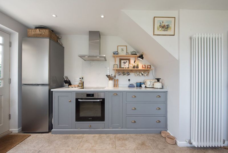
When gray turns icy, kitchens start to feel unwelcoming. Cool gray with blue undertones can sap warmth from your space, especially under certain lighting. I’ve noticed how these shades can make food look less appealing, too.
Designers usually reach for warmer grays to keep kitchens comfortable and inviting.
If you enjoy gray, look for versions with taupe or beige undertones instead.
15. Lime Green (Stay Away)
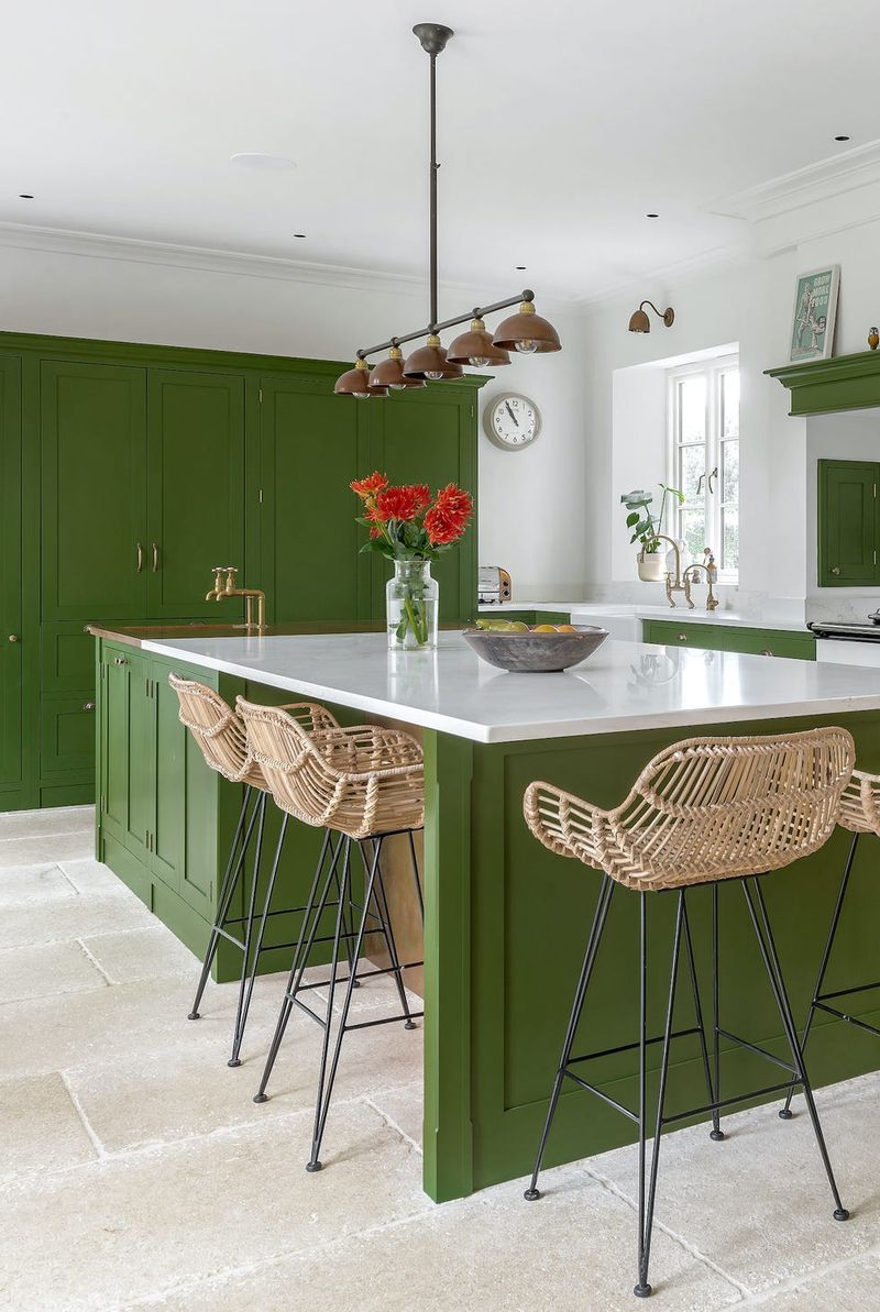
Are you drawn to lively greens? Lime green in kitchens feels more like a punch than a gentle touch. The brightness dominates, making it hard to relax or find focus while cooking.
Designers caution that lime green quickly loses its charm and can even make the room feel smaller.
Go for softer, earthier greens if you want freshness without visual chaos.
16. Eggplant Purple (Stay Away)
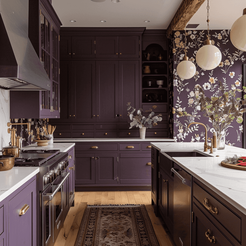
Though purple can be regal, eggplant purple often overwhelms a kitchen. The deep, dark shade eats up light and can make the space feel cramped.
Designers rarely use strong purples in kitchens, preferring lighter or more muted tones. I’ve seen eggplant quickly age a space, making it harder to update with simple changes.
Try gentle lilacs or blushes for a more open, airy feeling.
17. High-Gloss Black (Stay Away)
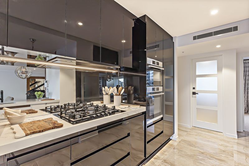
How does a color so chic become so impractical? High-gloss black turns every smudge and fingerprint into a focal point. I’ve talked to designers who regret recommending this for kitchens maintenance is a nightmare.
The glare from glossy surfaces can also make the room feel harsh and unwelcoming.
If you love black, opt for matte or soft finishes that absorb light and add depth instead.
18. Baby Pink (Stay Away)
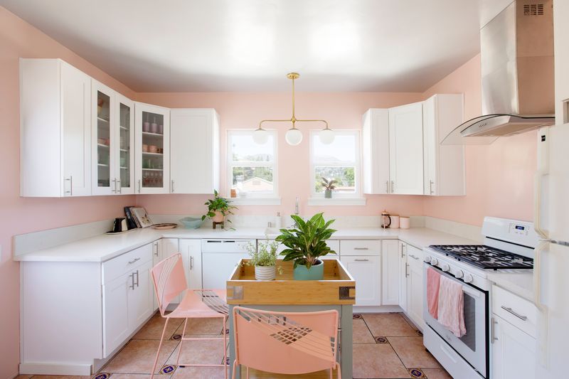
When does cute become too much? Baby pink in kitchens usually tips toward childish rather than chic. The color can dominate the space and make it feel off-balance, especially in adult homes.
Designers steer clear because it’s tough to style and easy to outgrow.
If you crave a hint of pink, warm blush offers sophistication without sacrificing playfulness.

