We Asked Designers What Color To Paint A Small Kitchen To Make It Look Bigger And We’re Obsessed
Small kitchens can feel cramped and cluttered, making cooking feel like a chore rather than a joy. I’ve been on a mission to find solutions for my own tiny cooking space, so I reached out to professional designers for their expert advice.
They shared their top color recommendations that create the illusion of space while keeping your kitchen stylish and inviting.
1. Crisp White Magic
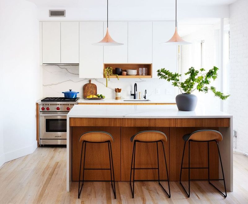
Nothing opens up a tiny kitchen quite like a pristine coat of white paint! Professional designers consistently recommend this classic choice because it reflects light beautifully, making walls appear to recede.
I was skeptical at first, worried it might feel too clinical, but designers suggest balancing with wood accents or colorful accessories. The transformation is remarkable – my friend’s galley kitchen doubled in perceived size with Benjamin Moore’s ‘Simply White.’
2. Soft Sky Blue Expanse
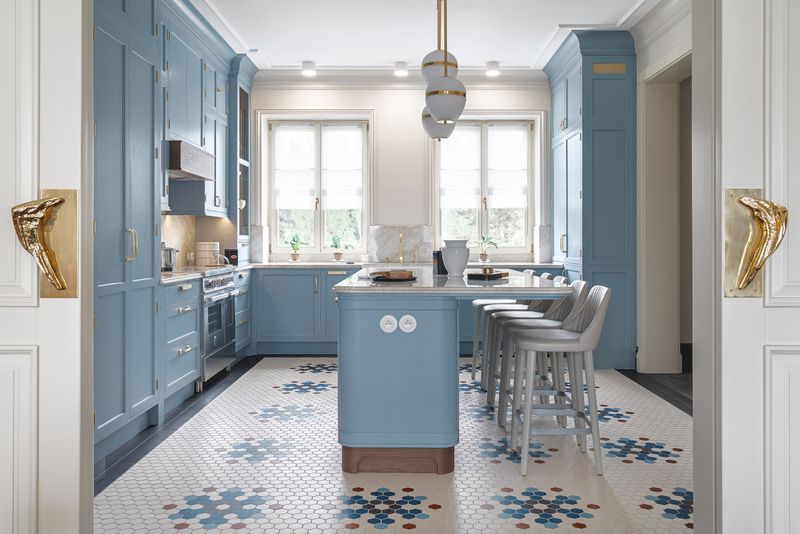
The gentle pull of sky blue creates an instant feeling of openness in confined cooking spaces. When I painted my sample board this shade, I was amazed at how it seemed to lift the ceiling higher!
Many designers favor pale blues with subtle gray undertones like Sherwin-Williams’ ‘Rainwashed.’ These hues trick the eye into seeing more depth while creating a calm atmosphere. Plus, blue psychologically signals cleanliness and freshness – perfect qualities for any kitchen.
3. Greige: The Perfect Compromise
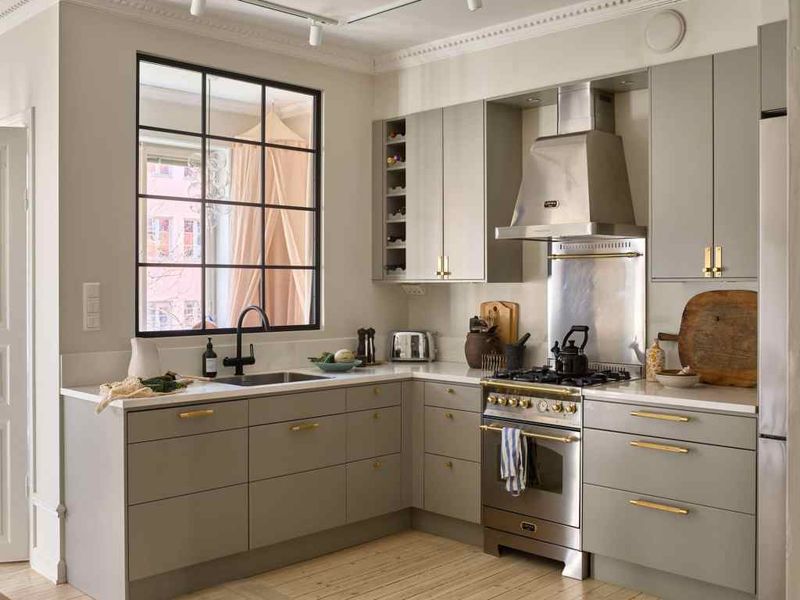
Greige has taken the design world by storm, and for good reason! This magical blend of gray and beige offers warmth without the heaviness of traditional beige tones.
My conversation with NYC designer Melissa Torres revealed her secret weapon for tiny apartment kitchens is Behr’s ‘Wheat Bread.’ The color creates a neutral backdrop that visually expands the space while complementing both warm and cool accents. Unlike stark whites, greige forgives the occasional splatter, making it practical for busy cooking spaces.
4. Minty Fresh Perspective
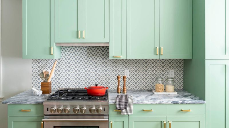
Mint green brings unexpected spaciousness to compact kitchens! This refreshing hue falls into the cool color family, which naturally recedes from the eye, creating depth where there isn’t any.
Award-winning designer James Chen shared how he transformed a claustrophobic 8×10 kitchen using Farrow & Ball’s ‘Teresa’s Green.’ The results were astonishing – the space felt twice as large! What makes mint particularly special is its ability to brighten dark corners while adding personality that sterile whites sometimes lack.
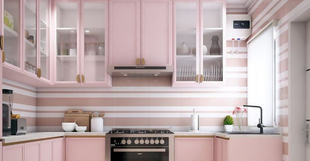
5. Barely-There Blush
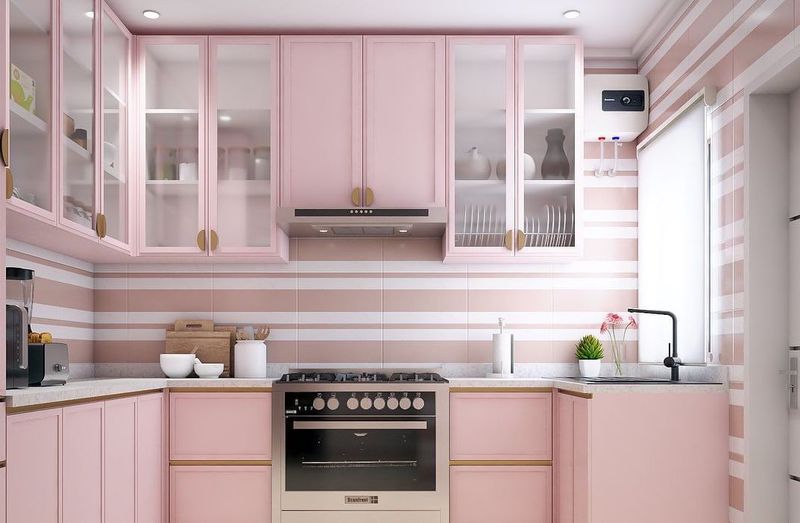
Surprised to see pink on this list? I was too until designer Olivia Wright showed me photos of a Manhattan studio kitchen painted in Benjamin Moore’s ‘First Light.’ The soft blush created an incredible sense of airiness!
The key is choosing an extremely diluted pink with warm undertones – almost a neutral with just a whisper of color. This unexpected choice reflects light beautifully while adding warmth that pure whites lack. Several clients reported their kitchens not only looked bigger but also felt more inviting for morning coffee and casual gatherings.

