12 Kitchen Colors Designers Say You Should Try In 2025 Instead Of Many Shades Of Green (Plus 6 More Gorgeous Shades)
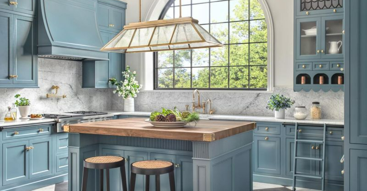
Kitchen colors are shifting away from the greens that have ruled for a while. Designers in 2025 are picking fresh shades that bring character and warmth to cooking spaces without overwhelming them.
Whether you’re tackling a full remodel or just refreshing the walls, these colors offer a simple way to make your kitchen feel new and inviting. Ready to give your space a fresh vibe?
1. Terracotta Blush
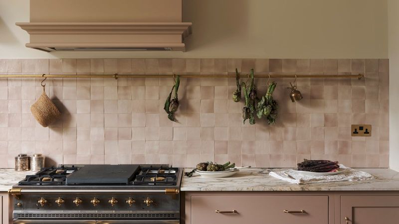
The earthy warmth of terracotta blush brings Mediterranean vibes straight to your kitchen. I’ve noticed this color creates a cozy atmosphere that makes everyone want to linger a little longer after meals.
When paired with natural wood accents and brass fixtures, terracotta blush truly shines. The subtle pink undertones add just enough softness to prevent the space from feeling too rustic or heavy.
Did you know? This shade has historical roots in Italian villas, where it naturally kept spaces cool while adding visual warmth.
2. Midnight Navy
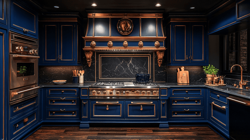
Dark and dramatic, midnight navy delivers sophistication that green simply can’t match. Your kitchen will instantly feel more anchored and intentional with this rich hue on cabinets or walls. Pairing it with marble countertops and gold hardware creates a luxurious contrast that elevates the entire space.
I especially love how this color looks different throughout the day, shifting from almost black to deep blue as natural light changes. For smaller kitchens, consider using midnight navy on just lower cabinets to prevent the space from feeling cramped.
3. Creamy Buttermilk
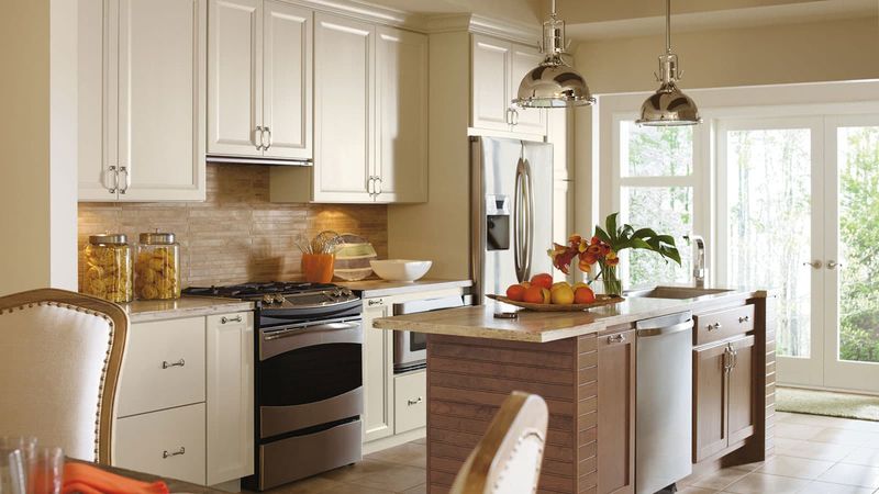
Forget stark whites! Creamy buttermilk offers the brightness designers love without the clinical feel. What makes this shade special is its subtle yellow undertone that adds warmth without being obviously yellow. Many of my clients are surprised by how this color makes their kitchen feel simultaneously clean and inviting.
When sunlight hits buttermilk walls, the entire room glows with a gentle warmth that green tones simply can’t achieve. This versatile neutral pairs beautifully with almost any accent color or wood tone you might choose.
4. Dusty Mauve
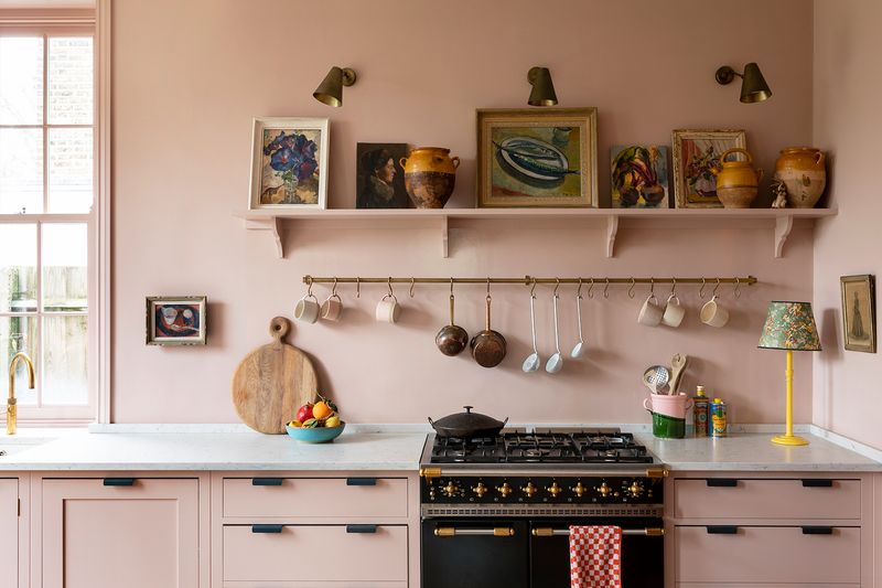
Subtle yet statement-making, dusty mauve offers a sophisticated alternative to traditional neutrals. I find this color particularly magical in north-facing kitchens where it maintains its warmth even in cooler light. The gray undertones keep this pink-purple shade from feeling too feminine or trendy.
Many designers are calling this the new “it” neutral for 2025, replacing the endless sea of sage green we’ve seen in recent years.
5. Smoky Charcoal
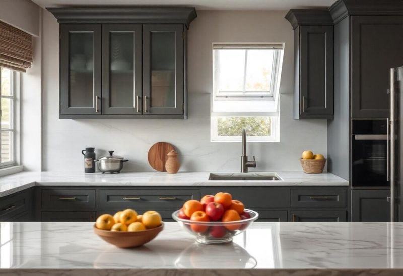
More nuanced than pure black, smoky charcoal brings dramatic flair without overwhelming your space. The subtle blue-gray undertones create depth that flat black simply can’t match. When used on kitchen islands or lower cabinets, this shade grounds the space while allowing other elements to shine.
I’ve found that natural wood accents and plenty of texture prevent charcoal kitchens from feeling too stark or masculine. Lighting plays a crucial role with this color – under-cabinet lights and strategic pendants will highlight the rich complexity of smoky charcoal throughout the day.
6. Terracotta Orange
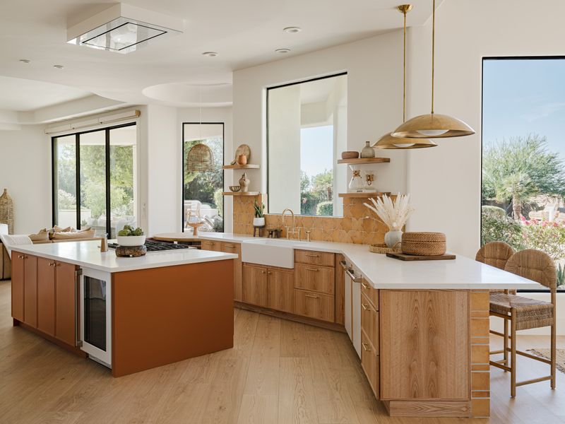
Bold and earthy, terracotta orange infuses kitchens with southwestern warmth that’s impossible to ignore. Unlike the overused greens, this shade makes a confident statement while still feeling connected to nature.
The key to making terracotta work is balancing it with plenty of white space and natural textures like rattan or unfinished wood. For the color-shy, even small doses – like a painted kitchen island or backsplash – can transform your space with this rich, desert-inspired hue.
7. Powder Blue
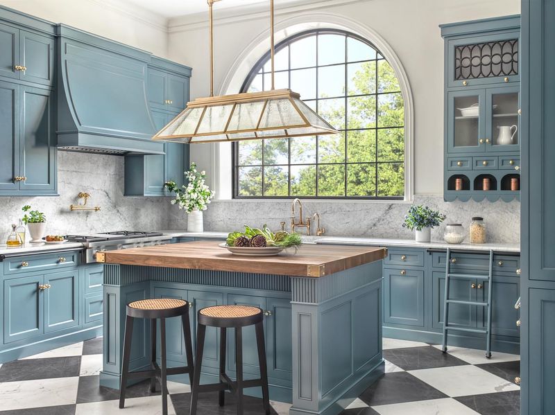
Soft yet impactful, powder blue brings a refreshing calmness to kitchens that green simply can’t match. I’ve watched this color transform chaotic cooking spaces into serene sanctuaries where people actually want to spend time.
The subtle gray undertones keep this blue firmly in the sophisticated category, avoiding any nursery-room associations.
Morning light particularly enhances this color, making breakfast time feel especially peaceful and uplifting.
8. Warm Caramel
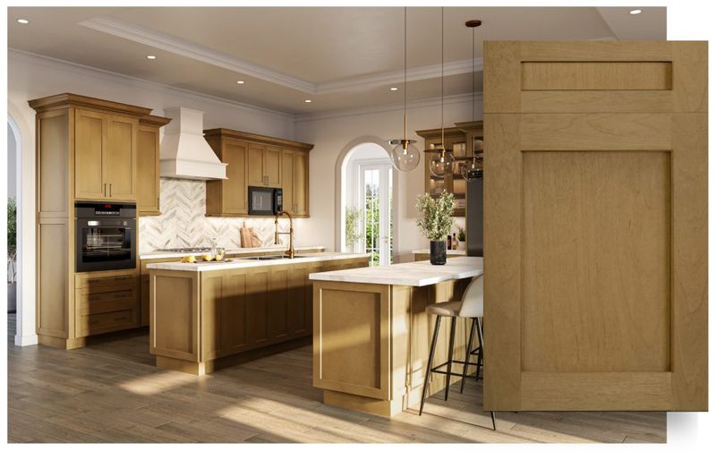
Rich and inviting, warm caramel creates an atmosphere of cozy sophistication that makes everyone feel at home.
The amber undertones add depth that flat browns lack, creating a sense of warmth without feeling heavy. When used on cabinets alongside cream walls and natural stone, caramel creates a timeless palette that won’t feel dated in a few years.
This shade particularly shines in kitchens with lots of natural light, where it seems to glow from within.
9. Muted Coral
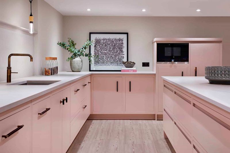
Playful yet sophisticated, muted coral brings personality to kitchens without overwhelming the space. The toned-down version of this traditionally bright hue offers warmth that feels fresh rather than trendy. I love how this color creates a happy atmosphere without screaming for attention.
When paired with white countertops and natural wood accents, coral takes on an almost neutral quality while still adding character that green simply can’t match. For those hesitant to commit, coral cabinet interiors or a painted ceiling can introduce this joyful shade without dominating the entire space.
10. Clay Taupe
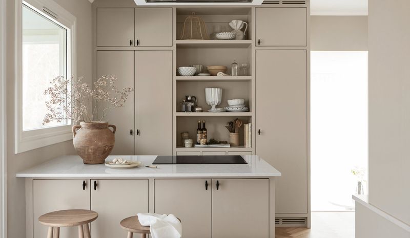
Sophisticated and grounding, clay taupe offers the perfect balance between warm and cool tones. I’ve found this chameleon-like color changes subtly throughout the day, creating visual interest without being distracting. The earthy quality of clay taupe connects your kitchen to nature without relying on predictable greens.
Many designers consider this the ultimate “new neutral” for 2025 – sophisticated enough for modern spaces yet warm enough for traditional homes.
11. Mustard Yellow
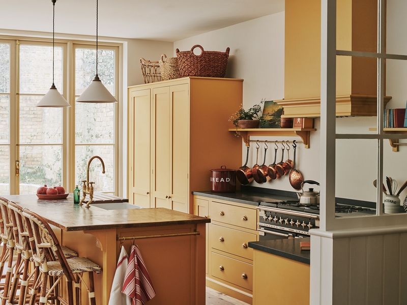
Energetic and unexpected, mustard yellow brings sunny optimism to kitchen spaces. The earthy undertones make this bold color surprisingly livable, especially when balanced with plenty of neutrals. I’ve noticed how this shade instantly warms up north-facing kitchens that might otherwise feel cold and uninviting.
When used on kitchen islands or lower cabinets, mustard creates a focal point that draws people into the heart of the home. This color pairs beautifully with navy blue, charcoal, or warm woods – creating combinations that feel both fresh and timeless.
12. Slate Blue-Gray
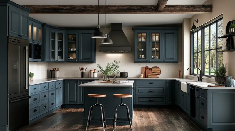
Sophisticated yet approachable, slate blue-gray offers depth that plain grays simply can’t match. I’ve watched this chameleon color shift beautifully throughout the day, sometimes appearing more blue, sometimes more gray.
The versatility makes it perfect for open-concept spaces where your kitchen needs to harmonize with adjacent rooms. This color works especially well in kitchens with lots of natural light, where its subtle undertones can truly shine.
13. Soft Plum
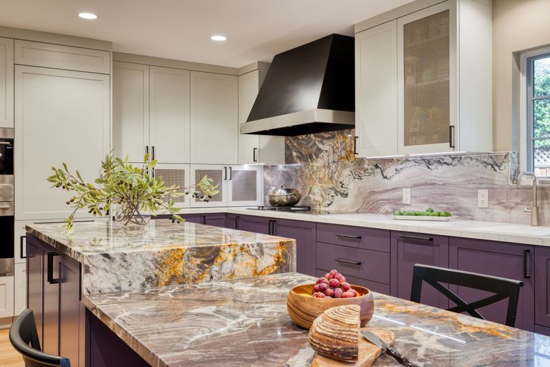
Unexpected yet surprisingly versatile, soft plum adds subtle drama without overwhelming your space. I’ve found this color creates a sophisticated atmosphere that makes everyday cooking feel more special. The gray undertones keep this purple firmly in the neutral territory, making it more livable than you might expect.
Evening light particularly enhances this color, making dinner preparation feel especially magical as the kitchen takes on a gentle glow.
14. Misty Sage
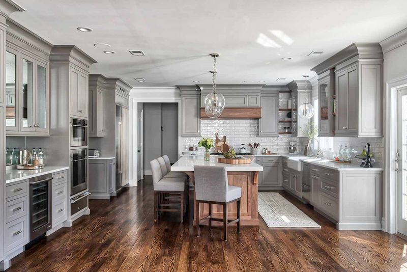
While we’re moving beyond the sage green trend, this misty, grayed-out version offers a fresh take worth considering. I find this subdued shade creates a serene atmosphere that makes cooking feel less chaotic and more intentional.
The heavy gray undertones differentiate this from typical sage, creating a sophisticated neutral that works in virtually any lighting condition. This color particularly excels in kitchens that face harsh afternoon sun, where it maintains its calming presence.
15. Deep Teal
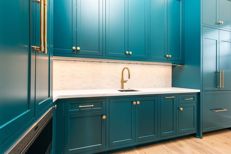
More sophisticated than turquoise but more vibrant than navy, deep teal offers the perfect balance of drama and livability. I’ve watched this color transform ordinary kitchens into extraordinary spaces that guests can’t stop complimenting. The blue-green depth creates a jewel-box effect that feels both cozy and luxurious.
When paired with brushed gold hardware and light countertops, teal cabinets create a stunning contrast that elevates the entire room. For maximum impact, consider using this color on all cabinetry in a well-lit kitchen, or just on a statement island in smaller spaces.
16. Blush Pink
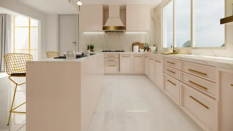
Soft yet statement-making, blush pink brings unexpected warmth to kitchen spaces. I’ve found this color creates a joyful atmosphere that makes even mundane cooking tasks feel more pleasant. The key to keeping blush sophisticated is pairing it with plenty of white space and matte black accents for contrast.
Morning light particularly enhances this color, making breakfast time feel especially cheerful and uplifting.
17. Charred Orange
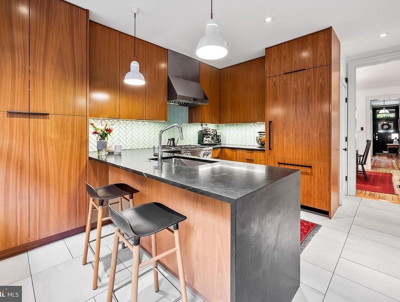
Bold and unexpected, charred orange brings energy and warmth that basic greens simply can’t match. This sophisticated burnt shade feels simultaneously vintage and modern, making it perfect for eclectic or mid-century inspired kitchens.
I’ve noticed how this color instantly makes a space feel more designed and intentional. The brownish undertones keep it from feeling too bright or childish, while still providing that energizing pop of color that makes a kitchen memorable.
Pairing this shade with walnut woods and cream accents creates a harmonious palette that feels curated rather than trendy.
18. Stormy Blue
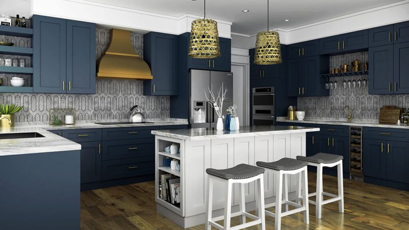
Moody and mysterious, stormy blue creates depth and drama that makes your kitchen feel like a destination rather than just a functional space. The gray undertones keep this color firmly in the sophisticated category, avoiding any beachy or nautical associations.
I’ve found this shade particularly effective in kitchens with lots of natural light, where it creates a beautiful contrast without darkening the space. When paired with warm woods and brushed brass, stormy blue cabinets feel both grounding and uplifting. This color creates an especially cozy atmosphere in evening light, making dinner parties feel more intimate and special.
