10 Old-Fashioned Couch Colors That Are Aging Your Living Room, And 10 To Pick Instead
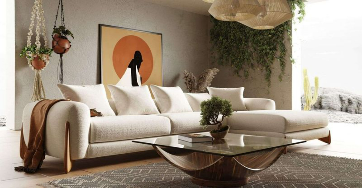
Your couch sets the tone for your entire living room, but some once-popular colors are now doing more harm than good. What used to feel stylish might now make your space look dull or stuck in the past. If your living room’s starting to feel a little off, the culprit could be right under you.
This guide breaks down the outdated couch colors dragging down your vibe, and offers fresh, modern shades that can turn the whole room around.
1. Hunter Green: A 90s Flashback
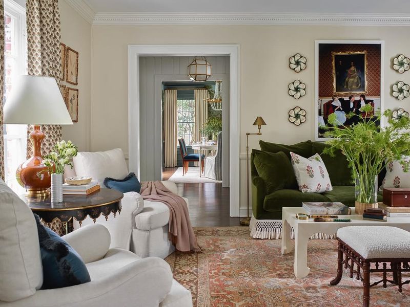
Remember those dark green couches everyone had in the 90s? This deep, forest-inspired shade screams outdated the moment you walk into a room. Combined with oak furniture and floral patterns, hunter green creates a time capsule effect that’s hard to overcome.
The heaviness of this color makes spaces feel smaller and more cramped. Plus, it tends to fade unevenly over time, leaving you with patchy upholstery that looks worn even when it’s clean.
2. Burgundy: The Formal Dining Room Escapee
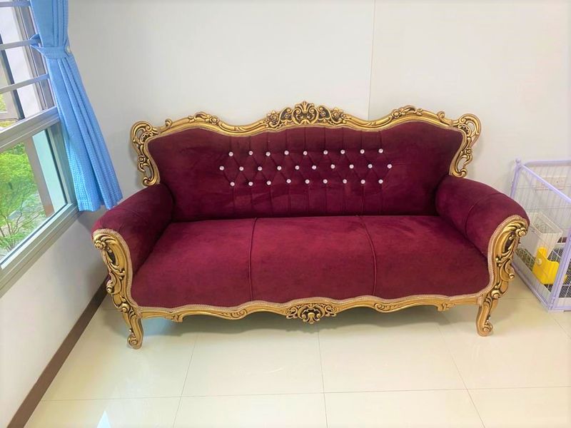
This deep wine-red shade once dominated formal living spaces but now feels stuffy and overly traditional. Burgundy couches often remind visitors of grandma’s plastic-covered furniture that nobody was allowed to sit on.
When paired with gold accents (as they often were), these sofas create a heavy, old-world atmosphere that feels disconnected from modern living. The rich tone tends to dominate the room, making it difficult to update without completely replacing the centerpiece.
3. Chocolate Brown: The Early 2000s Mistake
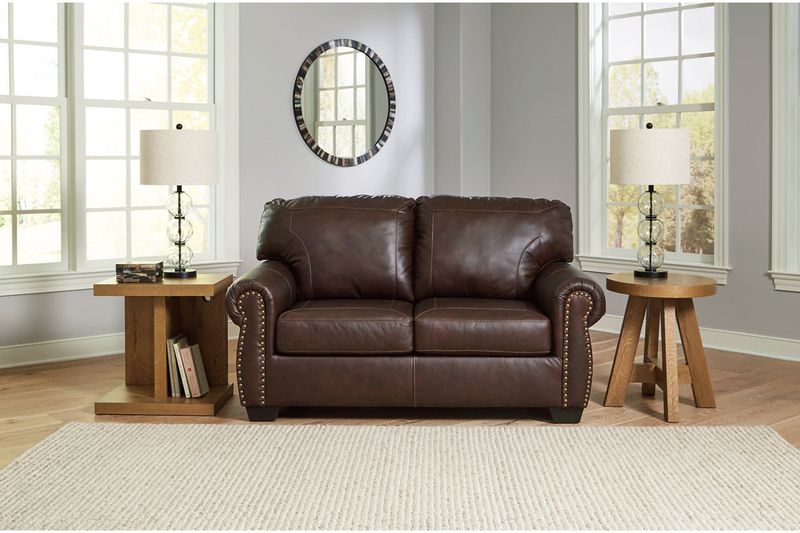
Though it seemed like a practical choice at the time, those dark chocolate brown couches have not aged well. Initially marketed as “hide-everything” family-friendly options, they’ve become the calling card of uninspired early 2000s decorating.
These sofas often look heavy and create a visual black hole in your living room. Worse yet, they show dust more visibly than almost any other color, requiring constant maintenance to avoid looking grimy and neglected.
4. Mauve: The 80s Called…
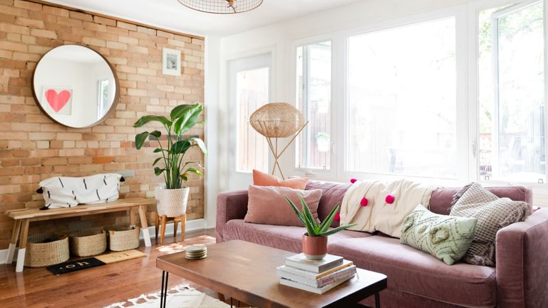
If your couch is sporting this dusty pinkish-purple hue, you’re definitely holding onto a relic from the past. Mauve was everywhere in the 80s, from bathroom tiles to living room furniture, and it now reads as distinctly outdated.
This color tends to look faded and tired even when new. Combined with its associations with dusty rose and country-style decor, a mauve couch immediately ages your living space by several decades. Even worse, it clashes with most modern color schemes.
5. Olive Green: The Military Surplus Look
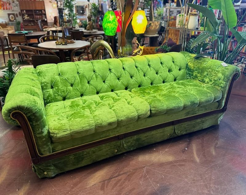
While avocado green dominated the 70s, its muddier cousin olive has lingered far too long in living rooms. This drab, army-inspired tone lacks the vibrance needed for a focal piece in your home. It often looks dingy even when brand new.
Many olive couches were paired with heavy, dark wood furniture, creating cave-like rooms that feel perpetually stuck in the past. The yellowish undertones in this shade can also make your space feel sickly rather than inviting.
6. Peach: Miami Vice No More
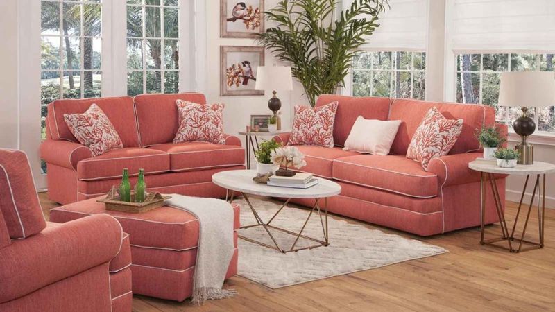
Once the darling of 80s Miami-inspired decor, peach couches now look painfully dated. This soft orange-pink hybrid often fades to an even less flattering shade over time, resembling old bandages more than stylish furniture.
Peach was frequently paired with seafoam green or country blue accents, creating a pastel explosion that’s instantly recognizable as retro, and not in a good way. The warm undertones can also make your skin look sallow when you’re sitting on it, an unflattering effect nobody needs.
7. Tan Microfiber: The Apartment Special
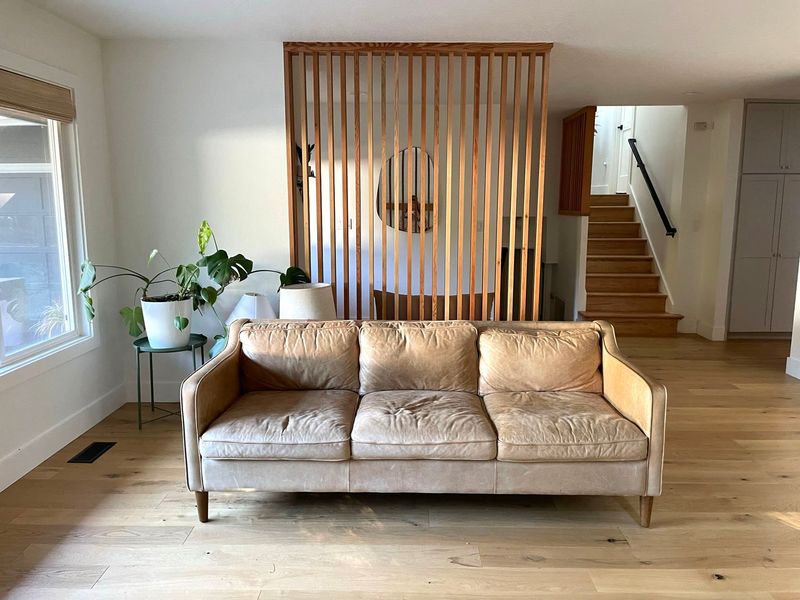
You know exactly the couch I’m talking about, that nondescript tan microfiber sofa that came with practically every apartment in the early 2000s. This uninspired neutral was chosen for its inoffensiveness, but ended up being offensive in its sheer boringness.
These couches show every stain, despite being marketed as practical. The texture collects dust and pet hair like a magnet. After a few years, they develop a shiny patina in all the wrong places, highlighting every area where someone has sat repeatedly.
8. Navy Blue with Brass Nailheads: The Corporate Castoff
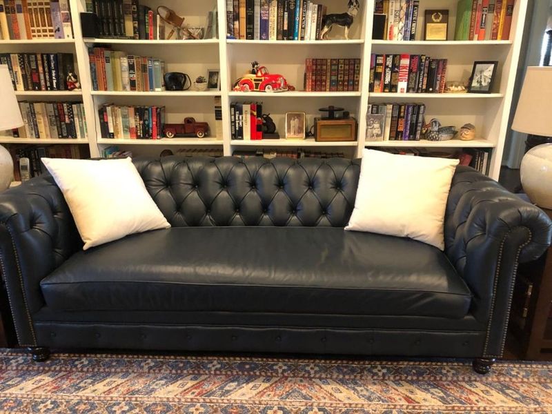
These dark blue sofas with their regimented rows of brass nailhead trim scream “office waiting room” more than “welcoming home.” Popular in the 90s and early 2000s, they were meant to convey traditional elegance but now just look formal and uninviting.
The combination of dark fabric and shiny metal details creates a stiff, corporate feel that’s out of place in modern casual living. Many of these couches feature rolled arms and button tufting, adding to their outdated, overly formal appearance.
9. Jewel-Toned Damask: The Hotel Lobby Look
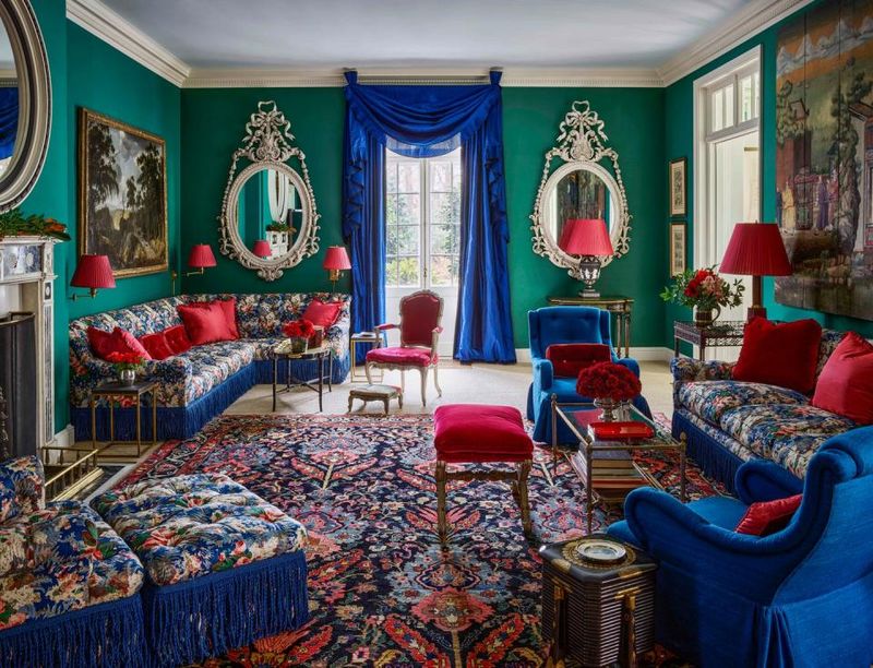
Those ornate sofas upholstered in shimmery jewel-toned damask fabrics, think ruby red, emerald, or sapphire blue, have no place in today’s homes. Often featuring swirling patterns and a slight sheen, these couches were popular in the 90s for those seeking a “luxurious” look.
Unfortunately, they now read as gaudy and overwrought. The busy patterns fight with other elements in your room. Many of these sofas were also overstuffed and bulky, taking up visual and physical space without providing modern comfort.
10. Beige Leather: The Executive Decision
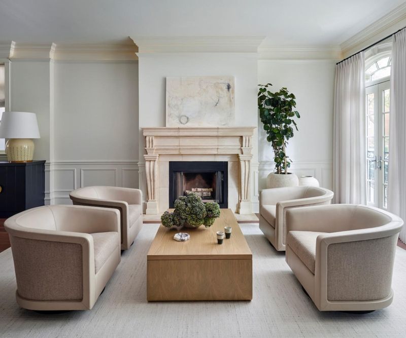
Those putty-colored leather sofas that were all the rage in executive homes during the 90s and early 2000s have not stood the test of time. Often paired with cherry wood and brass accents, they were meant to signal success but now just signal dated taste.
Beige leather shows every scuff and stain, quickly developing a patchy appearance. The color itself isn’t inherently bad, but that specific flat, yellowish beige tone has become shorthand for “outdated luxury.” Many of these sofas also featured overstuffed cushions and chunky proportions that look clunky today.
11. Sage Green: Fresh and Versatile
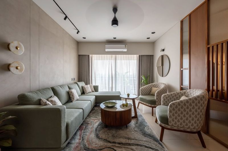
Unlike its dated cousin olive, sage green offers a sophisticated yet approachable alternative that works in nearly any space. This soft, muted green has gray undertones that keep it from feeling too trendy or specific to one era.
I love how sage green acts as a neutral while still providing color and life to a room. It pairs beautifully with natural elements like wood and stone. The earthy quality makes it perfect for creating calm, grounded spaces that feel connected to nature without screaming “forest theme.”
12. Charcoal Gray: The New Neutral
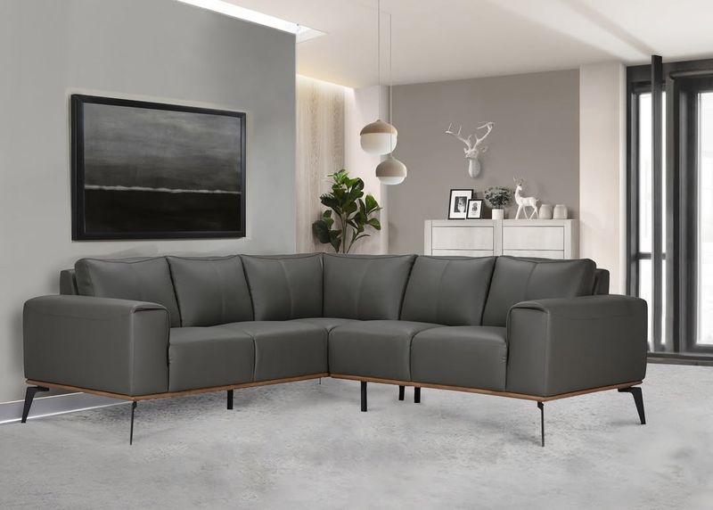
Forget beige, charcoal gray has become the sophisticated neutral that works with virtually any design style. This deep, rich shade provides drama without the heaviness of black, creating a perfect foundation for your living space.
What makes charcoal so versatile is how it pairs with both cool and warm accents. You can dress it up with metallic pillows for glamour or keep it casual with natural textures. Unlike its darker cousin black, charcoal shows less dust and pet hair while still providing that sleek, modern look.
13. Terracotta: Earthy Sophistication
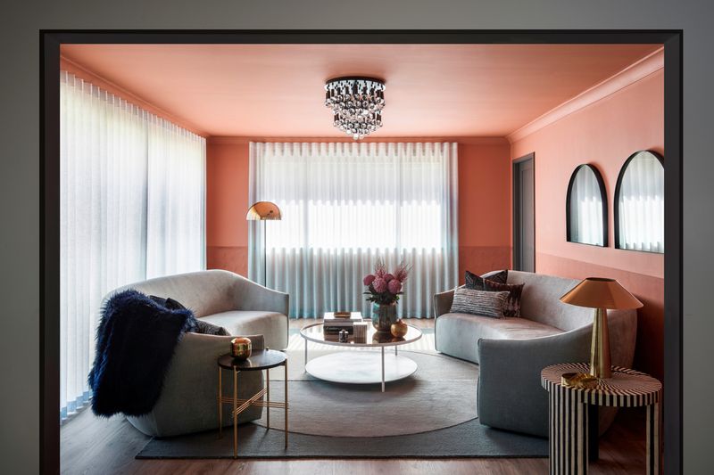
This warm, earthy orange-brown is making a huge comeback, but in a much more sophisticated way than its 70s predecessor. Modern terracotta has richer depth and pairs beautifully with contemporary elements for a look that’s both timeless and current.
I’ve noticed how this color instantly warms up a space without feeling heavy. It works especially well with brass accents and plenty of textural elements like linen and jute. The natural clay color creates a perfect backdrop for plants, making your space feel alive and connected to the earth.
14. Emerald Green: Bold and Timeless
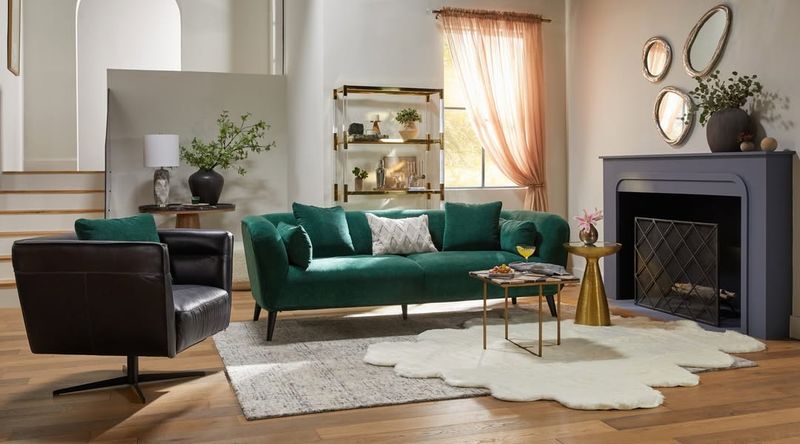
Don’t confuse this vibrant jewel tone with the dated hunter green of the past. Modern emerald sofas have a cleaner, brighter quality that feels both luxurious and fresh. This rich color adds instant personality to any space.
What works about emerald is its ability to be both a statement and a long-term choice. Unlike trendy colors that quickly date themselves, this classic jewel tone has staying power. The key is pairing it with contemporary lines and lighter surroundings to keep it from feeling heavy.
15. Camel Leather: Warm Minimalism
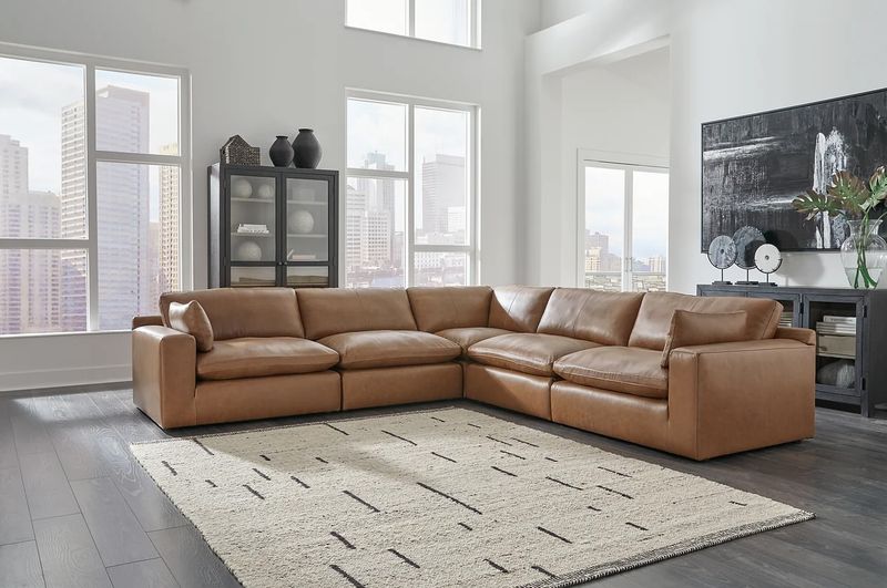
This rich tan leather has replaced those dated beige versions with a warmth and character that ages beautifully. Unlike its yellowish predecessor, camel leather has reddish-brown undertones that feel natural and sophisticated.
The beauty of camel leather is how it develops a gorgeous patina over time, actually improving with age. It works in both modern and traditional spaces, bridging different styles with ease. I particularly love how it pairs with nearly any accent color, from navy blue to emerald green to blush pink.
16. Cream: Lightened Up Luxury
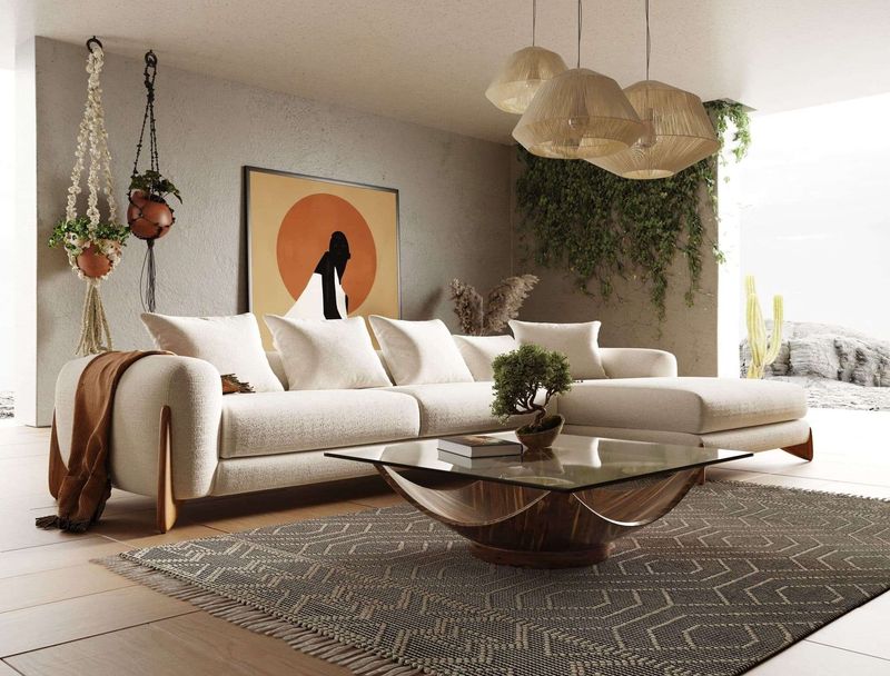
Forget stark white that shows everything, cream offers a softer, more forgiving alternative that still brightens your space. This warm off-white creates an airy, open feeling without the clinical vibe pure white can sometimes give.
Modern performance fabrics have made cream sofas actually practical, even for families with kids and pets. The key is choosing textured fabrics like bouclé or tweed that add visual interest. These textures hide minor marks while creating a rich, layered look that flat fabrics can’t achieve.
17. Navy Blue (Without the Brass): Modern Classic
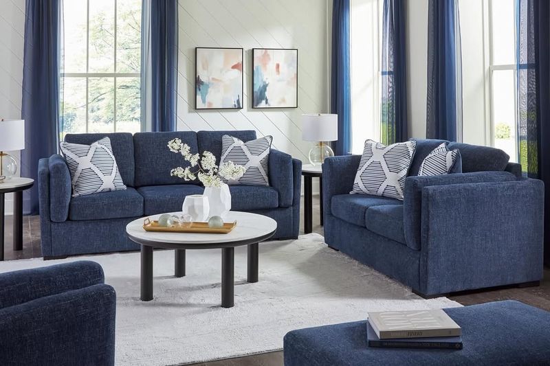
Navy has been reinvented for modern living rooms, ditching the brass nailheads and formal shapes for cleaner lines and contemporary styling. This deep blue creates a sophisticated foundation that’s both timeless and current.
What makes today’s navy sofas different is their more relaxed silhouettes and casual fabric choices. Think linen blends rather than stiff damasks. I love how navy functions as a neutral while still providing rich color and depth to a space, allowing you to pair it with almost any accent shade.
18. Blush Pink: Subtle Softness
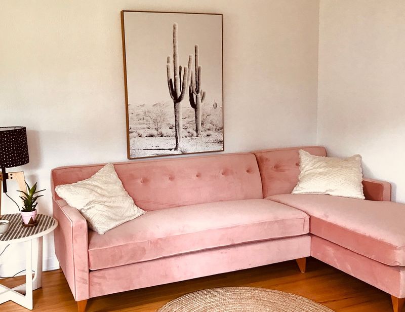
This isn’t your grandmother’s pink sofa! Modern blush has gray undertones that make it surprisingly sophisticated and versatile. It’s soft enough to act almost as a neutral while still adding warmth and personality to your space.
What I love about blush is how it creates an inviting atmosphere without overwhelming the room. It pairs beautifully with brass, black, and natural wood tones. For those worried about committing to pink, blush is actually one of the most livable, adaptable colors, far more versatile than most people expect.
19. Olive Green (Reimagined): The New Neutral
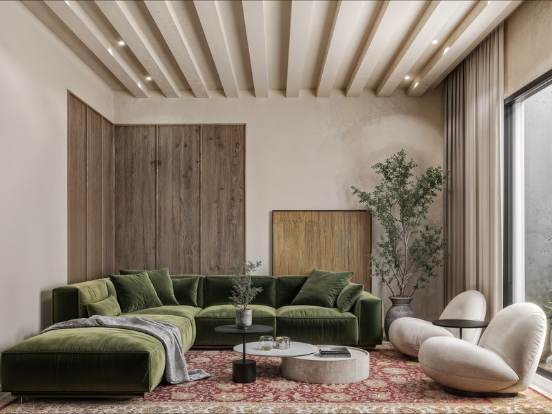
Today’s olive green is not your parents’ drab army surplus shade. The modern version has been refreshed with more life and depth, transforming it into a sophisticated earth tone that works as a new kind of neutral.
The key difference is in the undertones, contemporary olive has more complexity and richness. It pairs beautifully with natural materials like wood, leather, and stone. I’ve found this updated olive creates a grounded feeling while still allowing a room to feel current and fresh.
20. Ochre Yellow: Sunny Sophistication
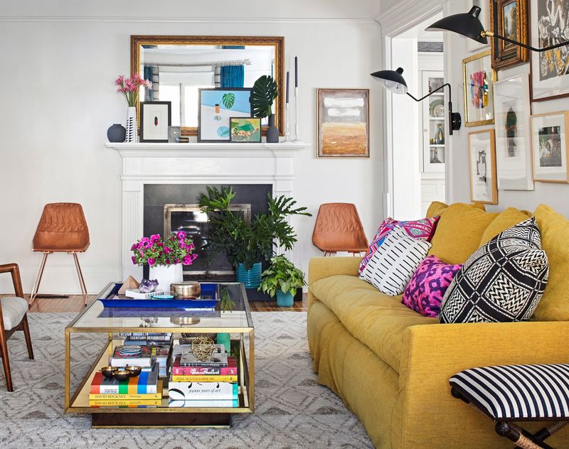
This golden-yellow shade brings warmth and energy to living spaces without the intensity of bright primary yellow. With its mustard undertones, ochre creates a sophisticated pop of color that still feels grounded and livable.
What works about ochre is its historical pedigree, it’s been used in interiors for centuries, giving it staying power beyond typical trends. It pairs beautifully with blues, greens, and neutrals. I particularly love how it brightens a room during dreary winter months while still feeling appropriate year-round.

