17 Kitchen Colours That Are Officially Out Of Style In 2025 (Plus 5 That Have Been Out For A While)
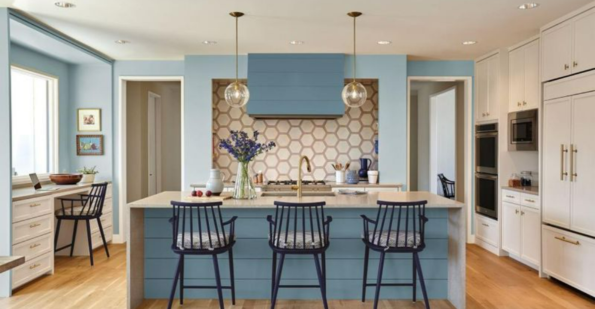
Your kitchen’s color scheme sets the tone for your entire home. As we head into 2025, design experts are waving goodbye to certain shades that once dominated our cooking spaces. I’ve rounded up 17 colors falling out of favor this year, plus 5 that designers have been avoiding for some time now.
Whether you’re planning a renovation or just curious about current trends, this guide will help you avoid dated design choices.
1. Cherry Red
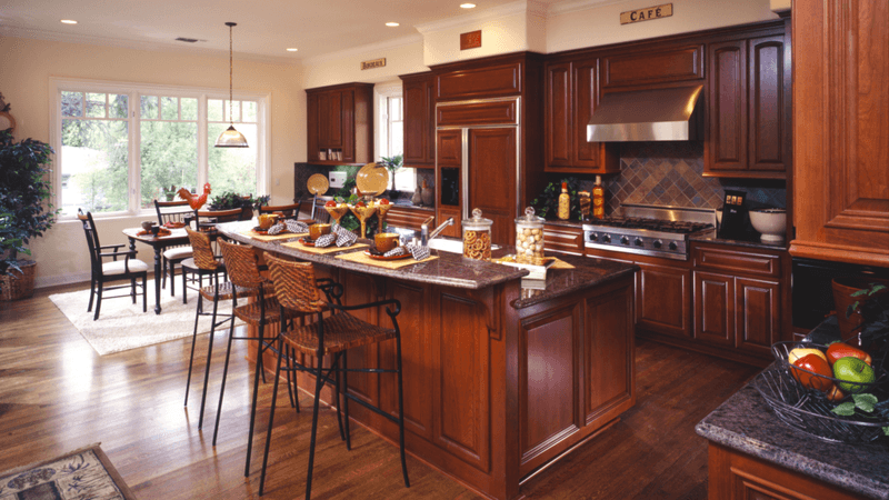
Remember those bold cherry red cabinets that made a splash in the early 2000s? They’re definitely on their way out now. The vibrant shade that once signaled passion and energy now reads as overwhelming and dated in modern kitchen spaces.
Designers are shifting toward more subtle expressions of red, like terracotta or muted rust tones. These offer warmth without dominating the entire visual experience of your kitchen. If you still love red, try using it as an accent rather than the main event.
2. Stark White
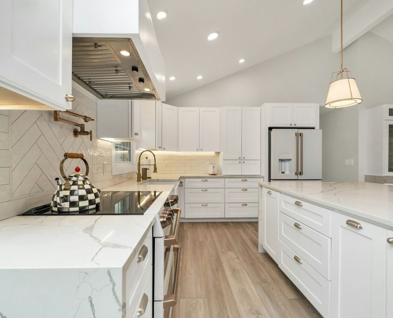
The clinical, ultra-bright white kitchen is losing its appeal fast. This once-popular minimalist choice now feels cold, sterile, and frankly, a bit boring to today’s homeowners who crave more personality in their spaces.
Maintenance is another factor in its decline – those pristine surfaces show every speck of dirt and fingerprint. Instead, warmer whites with subtle undertones of cream, beige, or gray offer the clean look without the harsh feel. These softer variations create a more inviting atmosphere while still maintaining that timeless quality.
3. Builder Beige
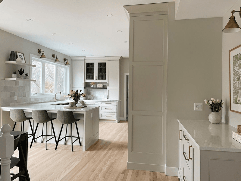
The infamous “builder beige” – that safe, neutral shade that developers slapped on everything in the 1990s and early 2000s – has officially worn out its welcome. This flat, uninspiring tone lacks character and makes kitchens feel instantly dated.
What’s especially problematic is how it often takes on a yellowish cast over time. Modern neutrals have more depth and undertones that respond beautifully to light. If you’re sticking with neutrals, look for greige (gray-beige hybrids), warm taupes, or soft stone colors that bring dimension and subtle sophistication to your cooking space.
4. Tuscan Gold
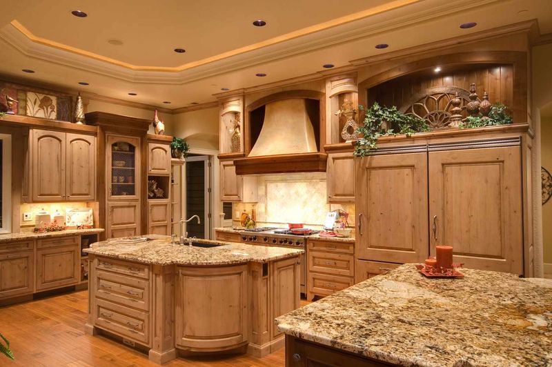
Once the cornerstone of the Mediterranean-inspired kitchen trend, Tuscan gold has lost its luster. The yellowish-orange hue that dominated the early 2000s now feels heavy and artificial in today’s homes, especially when paired with dark cherry cabinets and granite countertops from that era.
The color has become a symbol of dated design choices. Modern Mediterranean-style kitchens now lean on more authentic, muted tones like olive green, terracotta, and creamy white. Updated palettes still create a warm, inviting atmosphere – just without the golden glow that screams “2005 renovation.”
5. Forest Green
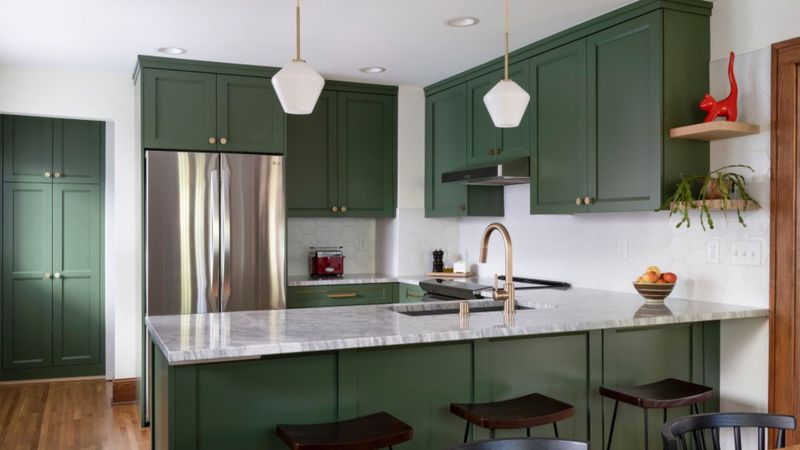
The deep forest green that paired with brass fixtures in the 1990s is definitely showing its age. This heavy, dark shade tends to make kitchens feel smaller and more closed-in, a direct contrast to today’s preference for open, airy spaces.
While green remains popular, the outdated forest variety is being replaced by softer, more natural green tones. Sage, olive, and muted eucalyptus offer the connection to nature without the heaviness. These contemporary greens pair beautifully with today’s preferred wood tones and create a more sophisticated, updated look.
6. Burgundy
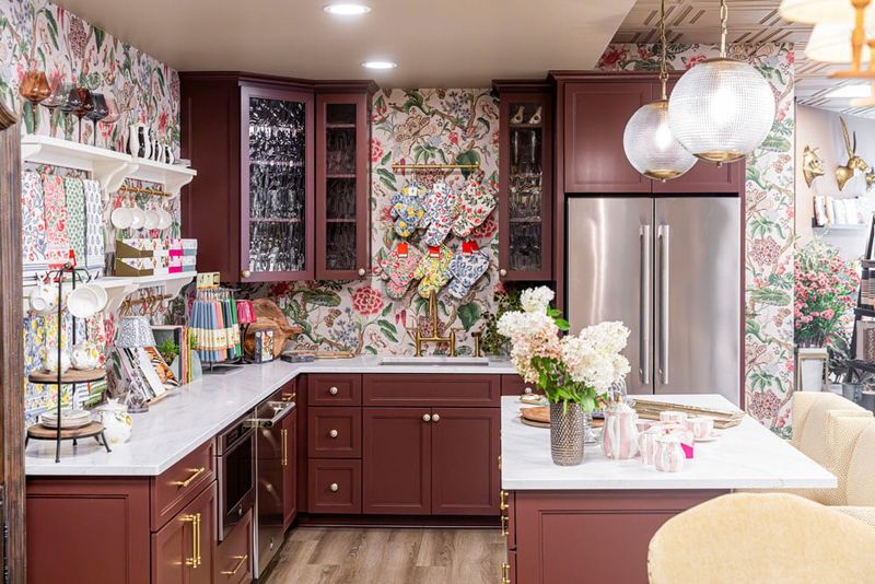
The rich burgundy that once graced many a 1990s kitchen has finally reached its expiration date. This deep, purple-red tone often paired with oak cabinets and brass accents now looks distinctly outdated and heavy.
The color tends to absorb light rather than reflect it, creating a darker atmosphere. Modern kitchens favor colors that enhance natural light and create a sense of spaciousness. If you still love rich, wine-inspired hues, consider using them sparingly as accents rather than primary colors, or opt for updated versions like merlot or mulberry that have more vibrancy.
7. Primary Yellow
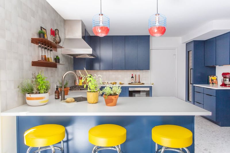
The sunny, crayon-box yellow that brightened many kitchens in the early 2000s is now considered too intense and childlike for sophisticated kitchen design. The primary shade can be visually overwhelming and tends to show dirt and discoloration more easily than other colors.
Yellow isn’t completely out, but designers now lean toward more complex, muted versions. Buttercream, pale gold, or mustard tones offer warmth without the harshness. Updated yellows bring sunshine into the kitchen in a more refined, contemporary way that won’t feel dated after just a few years.
8. Chocolate Brown
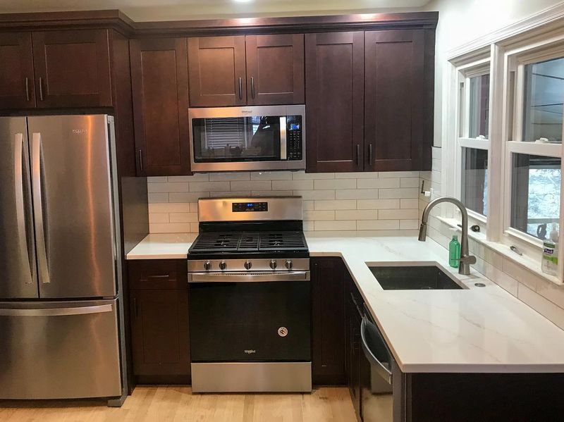
The ultra-dark chocolate brown that dominated kitchens in the late 2000s is rapidly falling from favor. Often paired with beige or cream, these dark brown cabinets and walls now feel heavy, somber, and light-absorbing in an era that prizes brightness and visual spaciousness.
Brown hasn’t disappeared entirely from kitchen design, but it’s evolved. Today’s browns are lighter, with more complexity and warmth – think walnut, caramel, or taupe with red undertones. These updated versions bring warmth without the cave-like feeling that characterized those chocolate brown kitchens of years past.
9. Terra Cotta Orange
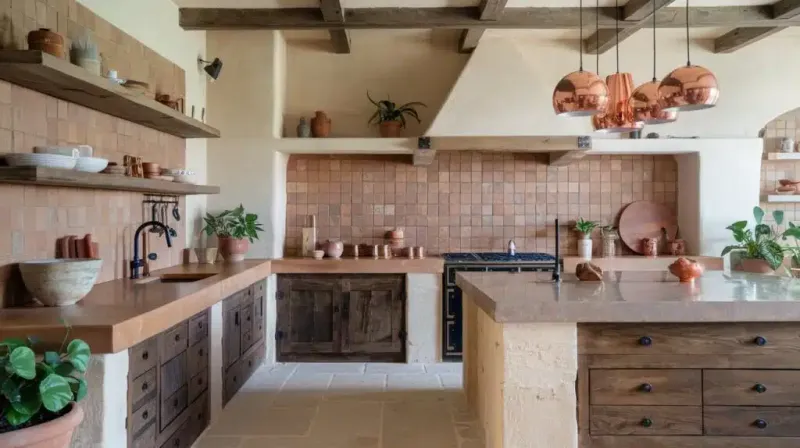
The burnt orange terra cotta that dominated Southwest-inspired kitchens is rapidly falling out of fashion. This intense, reddish-orange often feels dated, especially when paired with the turquoise accents and yellow undertones that frequently accompanied it.
The color tends to overwhelm a space and can make a kitchen feel smaller than it is. If you love the warmth of orange, consider more contemporary versions like soft coral or peachy tones that offer warmth without the heavy Southwest association. These updated hues bring in the desired warmth while feeling fresh and current.
10. Hunter Green
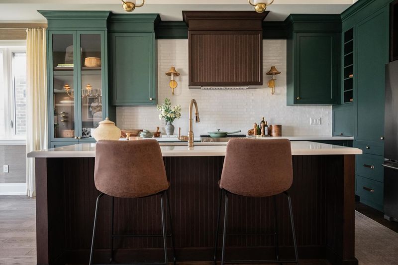
Hunter green, once a staple of 1990s kitchen design, is officially past its prime. This deep, slightly bluish-green often paired with brass hardware and cream countertops now looks decidedly outdated and heavy in modern homes.
Green continues to be popular, but in more natural, organic shades. Sage, olive, and eucalyptus offer the nature-inspired feel without the heaviness of hunter green. These updated greens create a more sophisticated connection to the outdoors and pair beautifully with today’s preferred materials like light woods and natural stone.
11. Peacock Blue
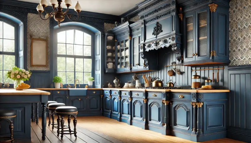
The vibrant, jewel-toned peacock blue that made a splash in the 2010s is rapidly losing favor. This intense, saturated color that once seemed bold and fashion-forward now feels overwhelming and dated, especially when used on all cabinets or walls.
Today’s blue preferences have shifted toward more livable, timeless variations. Navy, slate blue, and dusty blue offer sophistication without the trendy feel of peacock. If you still love that vibrant blue, consider using it as an accent color on a kitchen island or backsplash rather than dominating your entire cooking space.
12. Millennial Pink
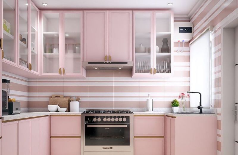
The blush-toned phenomenon that took over Instagram around 2016 is officially on its way out of kitchens. This dusty, muted pink that seemed fresh and different a few years ago now reads as a very specific time stamp of the late 2010s.
Pink isn’t entirely banished from kitchens, but its application has evolved. More sophisticated terracotta pinks or deeper rose tones offer warmth without the trendy association. If you’re still drawn to soft pinks, consider using them as subtle accents rather than dominant colors to avoid dating your kitchen to a specific design moment.
13. Eggplant Purple
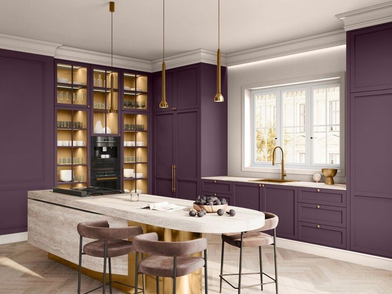
The deep eggplant purple that appeared in high-end kitchens in the early 2010s has lost its appeal. This dramatic, intense shade that once seemed sophisticated now feels heavy and dated, especially when used on all cabinetry.
Purple hasn’t disappeared entirely from kitchen design, but it’s evolved toward more subtle expressions. Lavender-grays and muted plums offer the complexity of purple without the overwhelming darkness. These updated purple tones create interest while maintaining a more timeless quality that won’t feel dated within a few years.
14. Cobalt Blue
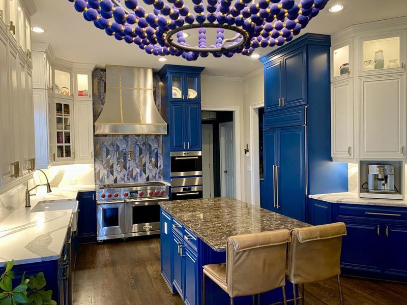
The electric cobalt blue that made a splash in contemporary kitchens is quickly becoming dated. This intense, primary blue often reads as too bold and artificial in today’s more nature-inspired color schemes.
Blue remains extremely popular in kitchen design, but in more sophisticated, complex variations. Navy, slate, and dusty blue offer timeless appeal without the jarring quality of cobalt. These more subtle blues pair beautifully with natural materials and create a more elegant, less trend-driven aesthetic that will stand the test of time.
15. Lemon Yellow
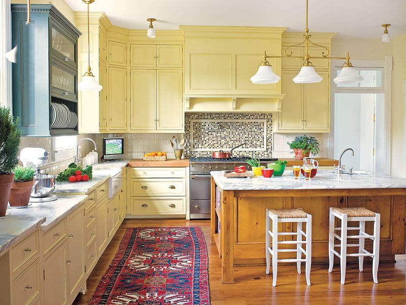
The bright, citrusy yellow that once created cheerful kitchens is now considered too intense and artificial for today’s homes. This vibrant shade tends to be visually overwhelming and shows dirt and discoloration more readily than other colors.
Yellow isn’t completely out of style, but designers now prefer more complex, muted versions. Buttercream, pale gold, or mustard tones offer warmth without the visual intensity. These updated yellows bring sunshine into your kitchen in a way that feels intentional rather than like you’ve preserved a 1970s time capsule.
16. Mint Green
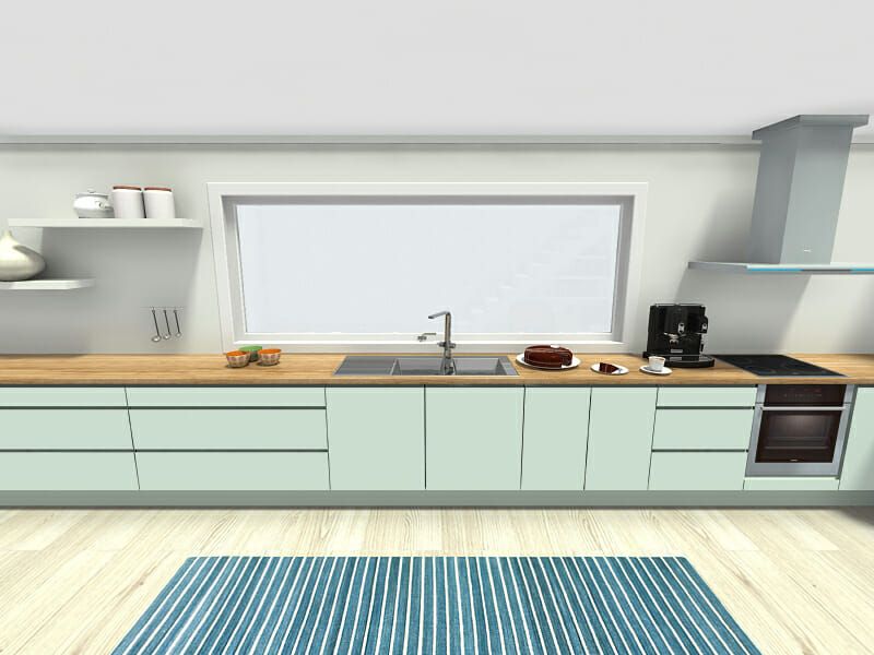
The pastel mint green that recalled 1950s kitchens has lost its retro charm. Once seen as nostalgic and fun, the sweet, light shade now feels too theme-y and dated – especially when paired with retro elements like black and white checkerboard floors.
Green remains extremely popular in kitchens, but in more sophisticated variations. Sage, olive, and muted eucalyptus bring a nature-inspired feel without the saccharine tone of mint. Updated greens create a more timeless connection to the outdoors without evoking a deliberate throwback to another era.
17. Burnt Orange
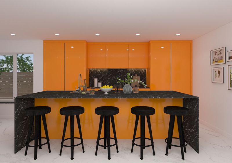
The burnt orange that dominated 1970s kitchens and made a brief comeback in the early 2000s is firmly out of favor again. The intense, brownish-orange often feels dated and heavy, especially when paired with dark wood tones or avocado green accents.
Orange hasn’t disappeared from kitchen design completely, but it has evolved. Softer coral or peachy tones offer warmth without the heavy retro association. Updated hues bring in the desired warmth while feeling fresh and current, not like a deliberate throwback to the disco era.
18. Teal
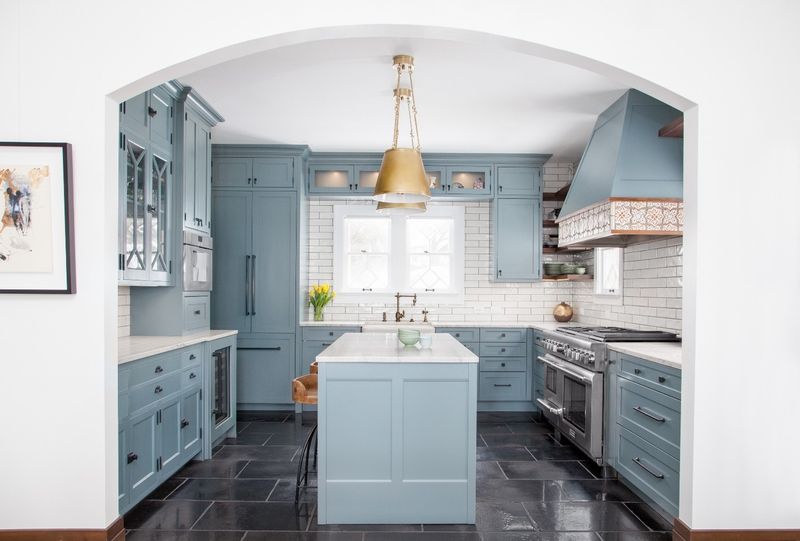
The vibrant teal that made a splash in the 2010s is quickly falling out of fashion. The bold blue-green that once felt fresh and different now seems tied to that decade, especially when used on all cabinetry or walls.
Blue-greens haven’t disappeared from kitchen design, but the look has shifted toward more subtle expressions. Soft sage, muted aqua, or dusty blue-greens bring a refreshing feel without the trendy association. Updated colors still create interest while offering a more timeless quality that won’t instantly date your kitchen to the 2010s.
19. Harvest Gold
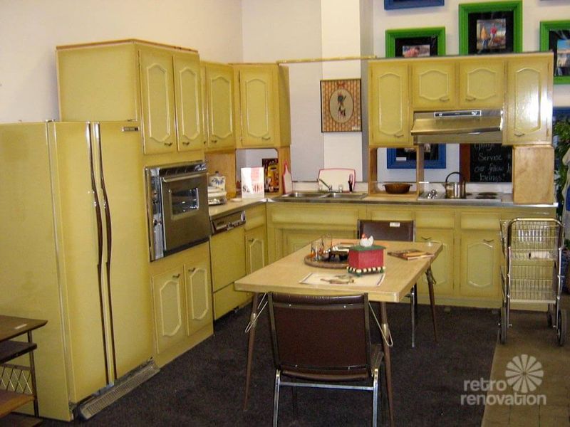
Harvest gold, the yellowish-orange hue that dominated 1970s kitchens alongside avocado green, has been out of favor for decades. The muddy, mustard-adjacent shade instantly dates a kitchen and often makes the space feel dark and dreary by today’s standards.
Yellow still works in kitchens, but in cleaner, more sophisticated variations. Buttercream, pale gold, or rich mustard tones offer warmth without the strong retro association. Updated yellows bring sunshine into the space in a way that feels intentional – not like you’re holding onto a 1970s time capsule.
20. Mauve
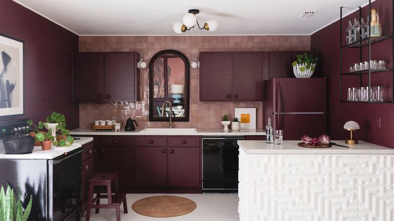
The dusty pink-purple known as mauve that dominated 1980s kitchens has been out of style for years. This muted, somewhat muddy shade often paired with teal accents and oak cabinets instantly dates a kitchen to the era of big hair and shoulder pads.
Purple tones haven’t disappeared from kitchen design, but they’ve evolved significantly. Soft lavender-grays or rich plums offer the complexity of purple without the distinct 80s association. These updated purple tones create interest while maintaining a more timeless quality that won’t make your kitchen look like it’s straight out of a vintage sitcom.
21. Country Blue
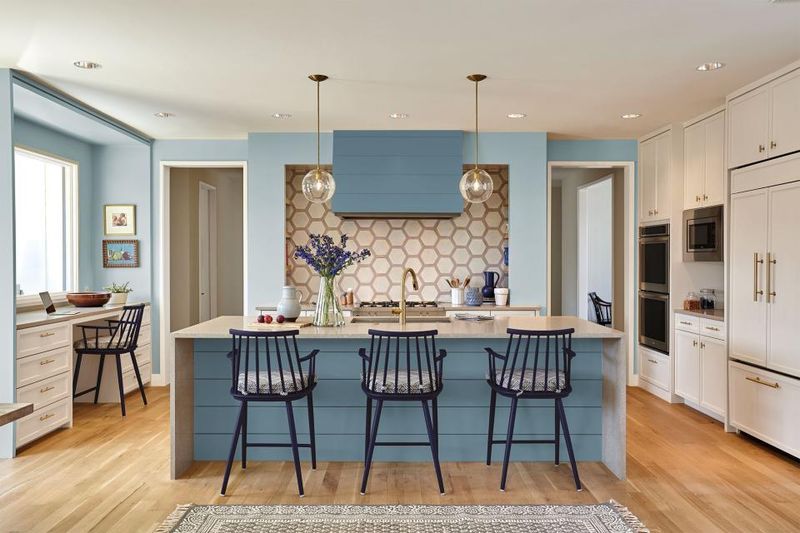
The dusty country blue that dominated farmhouse kitchens in the 1980s and early 1990s has been out of style for quite some time. The muted, somewhat grayish blue, often paired with mauve, geese decorations, and oak cabinets, instantly dates a kitchen.
Blue is still extremely popular in kitchen design, but in more refined variations. Navy, slate, and even sky blue bring timeless appeal without the country kitchen feel. Updated blues work well with contemporary materials and create a more elegant look that doesn’t feel stuck in a past decade.
22. Peach
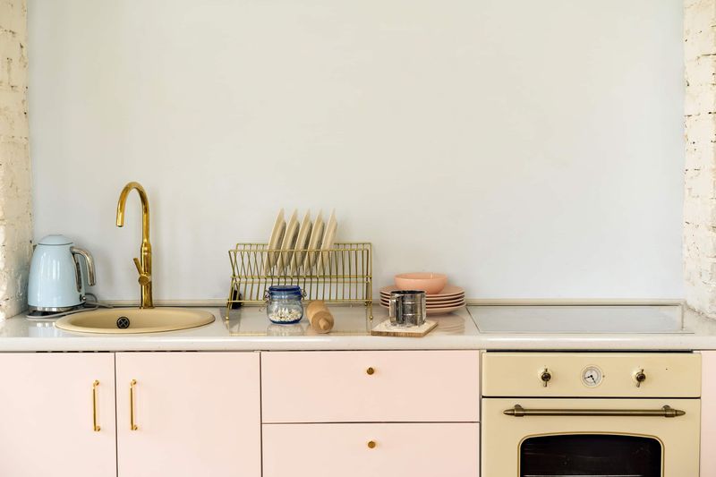
The soft peach that was everywhere in the late 1980s and early 1990s has been out of fashion for decades. This pastel orangey-pink often paired with seafoam green accents and oak cabinets instantly dates a kitchen to that specific era.
Warm tones haven’t disappeared from kitchen design, but they’ve evolved significantly. Terracotta, coral, or even soft salmon offer warmth without the distinct late 80s/early 90s association. These updated warm tones create a welcoming atmosphere while maintaining a more timeless quality that won’t make your kitchen look like it’s frozen in time.
