You’re Styling Your Gallery Wall Wrong, Here’s How To Get It Right According to Experts
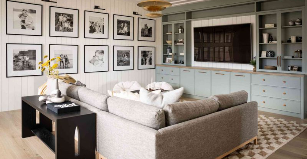
Gallery walls have the power to turn a boring blank space into a show-stopping story of you. But let’s be real, plenty of us are turning what could be a masterpiece into a hot mess.
I’ve teamed up with top interior designers to uncover the biggest gallery wall mistakes, and exactly how to fix them. Let’s be honest, crooked frames and random chaos aren’t doing you any favors.
Ready to upgrade from “what is that?” to “wow, who designed that?” Let’s rescue your wall and make it magazine-worthy!
1. Forgetting To Plan Before Hanging

Ever jumped straight into hammering nails without a game plan? Been there! Interior designers cringe when they see haphazard gallery walls with random spacing and misaligned frames.
The fix is simpler than you’d think. Lay everything on the floor first and play with arrangements until it feels right. Then snap a photo for reference.
For perfectionist vibes, cut paper templates of each frame and tape them to the wall with painter’s tape. This method lets you visualize the final result and make adjustments before committing to nail holes.
Your future wall (and landlord) will thank you!
2. Sticking To Only One Frame Style

Matchy-matchy is so yesterday! When all your frames look identical, your gallery wall loses its personality faster than my houseplants lose their leaves.
Mix it up with different frame styles, colors, and even materials. The secret sauce? Maintain one unifying element. You can use all black frames but in varying widths, or a consistent color palette with different textures. This creates cohesion without monotony.
My own living room wall combines vintage gold frames with modern white ones, and visitors always ask who my interior designer is! (Plot twist: it’s just me and my thrift store addiction.)
3. Hanging Everything At Eye Level
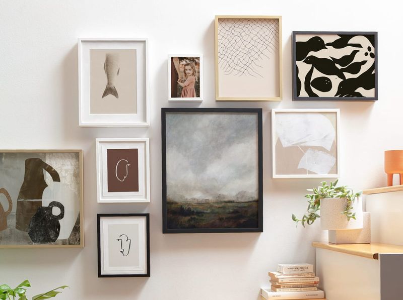
If your gallery wall sits perfectly at your eye level, you might be missing the bigger picture! This common mistake creates a horizontal line effect that lacks visual interest and makes your ceiling appear lower.
Instead, think of your gallery as a growing organism. Start from a central anchor piece, then build outward and upward. The bottom of your arrangement should sit about 8-10 inches above furniture, while the top can stretch toward the ceiling.
This approach draws the eye upward, making your space feel taller and more dynamic. I learned this trick after three sad attempts at gallery walls that felt strangely confined!
4. Ignoring Scale And Spacing

Whoa! Those tiny frames swimming in a sea of wall space or pictures crammed together like sardines? That’s where many gallery walls go south. Scale and spacing make or break your display.
The golden rule from design pros: maintain consistent spacing between frames (2-3 inches is ideal) and vary the scale of your art. Mix larger statement pieces with smaller complementary ones for rhythm and balance.
During my last apartment makeover, I used painters tape to mark spacing first, total game-changer! The consistent breathing room between pieces created that polished, professional look I’d been missing.
5. Neglecting The Ceiling-To-Floor Approach
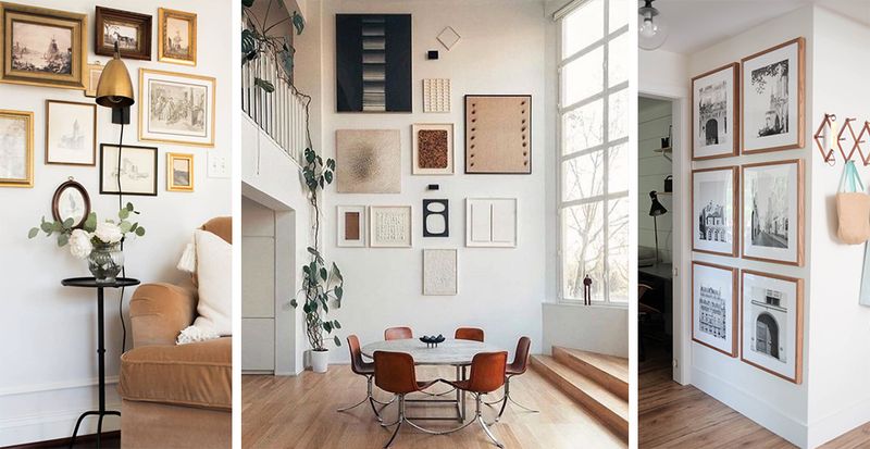
Most homeowners limit their gallery displays to eye level, missing out on dramatic vertical possibilities. Consider extending your art collection from ceiling to floor for a bold statement that draws the eye upward and creates the illusion of higher ceilings.
I’ve seen stunning transformations when clients embrace this floor-to-ceiling technique. The key is varying piece sizes, larger works anchor the middle while smaller pieces float toward the ceiling.
Did you know? This approach originated in 17th-century European salons where aristocrats displayed art this way to maximize limited wall space in their grand homes.
Today’s designers love how it adds unexpected drama to even the most ordinary rooms.
6. Incorporating Living Elements Among Artwork
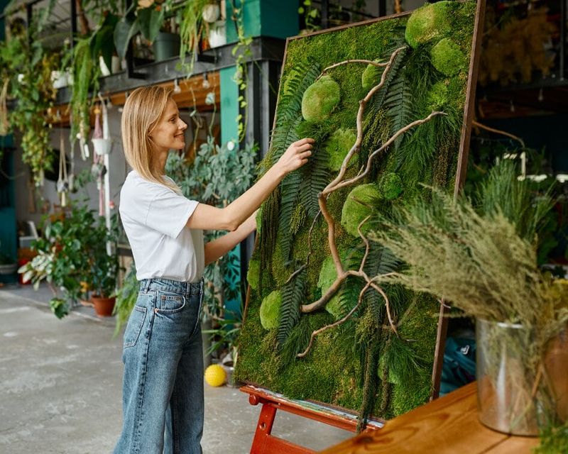
Who says gallery walls must be limited to flat, framed pieces? Bizarre as it might sound, adding living elements like air plants in wall-mounted holders or preserved moss displays creates unexpected texture and movement.
Living elements breathe life into static arrangements. Try alternating traditional framed photos with small hanging terrariums or mounted staghorn ferns for a gallery that literally grows with you.
The contrast between organic shapes and geometric frames creates visual tension that draws visitors in. Even artificial plants work if maintenance concerns you. Though, the fact is, nothing beats the conversation-starting power of actual growing things emerging from your carefully curated wall.
7. Using Unconventional Lighting Techniques
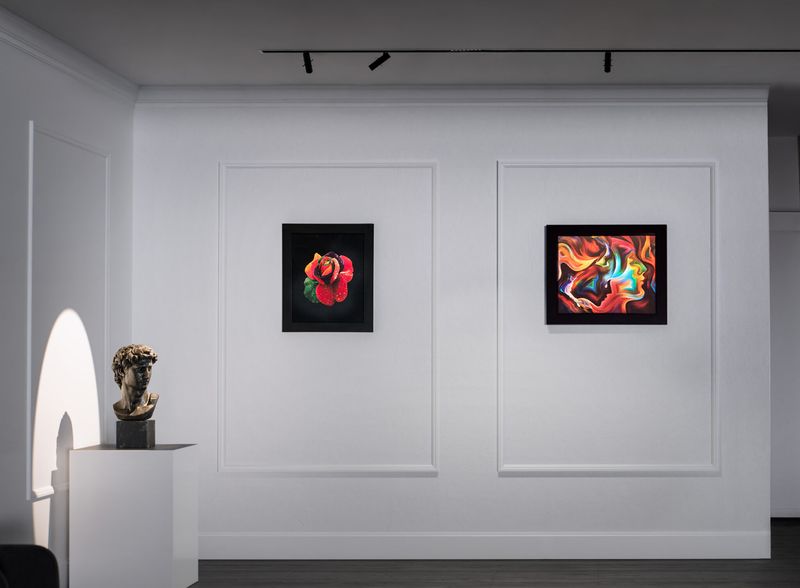
Forget standard picture lights! Battery-operated micro LED strips hidden behind select frames create a floating effect that transforms your gallery wall after dark. This unexpected lighting approach turns static daytime displays into dramatic nighttime features.
Color-changing options allow you to match the mood for different occasions, warm amber for intimate gatherings, cool blues for movie nights.
The surprise element when visitors notice your illuminated art makes this technique worth the extra effort.
Installation is simpler than you’d think. Magnetic or adhesive LED strips require no wiring and can be controlled via remote or smartphone apps. This theatrical lighting approach originated in high-end galleries but now works beautifully in home settings.
8. Breaking The Frame Barrier With Dimensional Objects
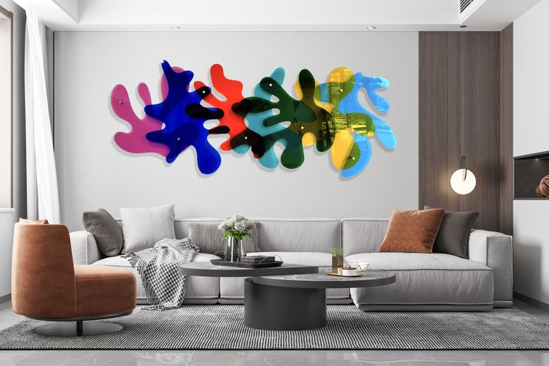
Radical gallery walls break free from flat frames entirely! Vintage musical instruments, antique kitchen tools, or sculptural pieces create unexpected visual rhythm and storytelling opportunities.
My favorite client installation featured a saxophone, wooden spoons, and a child’s antique toy car interspersed among family photos. The dimensional objects created shadows that changed throughout the day, adding another layer of visual interest.
If committing to permanent installation feels daunting, start with lightweight items on removable hooks. The three-dimensional approach transforms ordinary walls into museum-worthy installations. It’ll reflect your personality far better than matching frames ever could.
9. Playing It Too Safe With Content
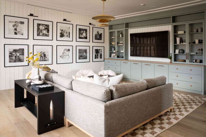
Family photos are sweet, but an entire wall of nearly identical portraits? Total yawn-fest. Your gallery wall should show off your personality, not just every school picture since 2003.
Designers suggest the 70/30 rule: 70% art (think paintings, prints, illustrations), and 30% pieces that feel personal but still pack visual interest. This mix adds layers and invites curiosity.
When done right, a gallery wall becomes a conversation starter, not just a photo archive.


