In My Experience, These 10 Sofa Colors Don’t Work Well In Oregon Here’s What Looks Fresh Instead
Living in Oregon’s unique climate and natural surroundings has taught me a lot about home decor.
I’ve discovered that certain sofa colors just don’t harmonize with our Pacific Northwest vibe, while others bring a perfect balance of warmth and style to our homes.
After years of helping clients redecorate and refreshing my own living space, I’ve compiled this list of sofa colors to avoid and what to choose instead for that quintessential Oregon feel.
1. Dark Brown Leather: Too Heavy for Our Cloudy Days
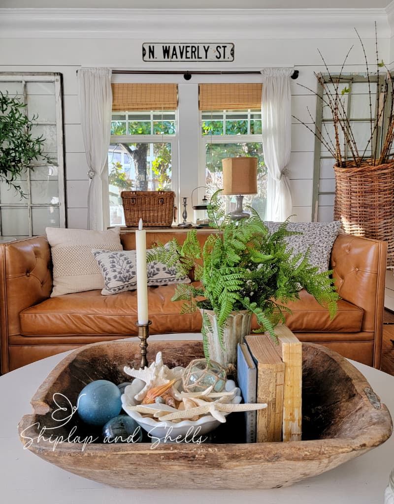
Dark brown leather sofas create an overwhelming heaviness in Oregon homes. Our already limited natural light gets swallowed up by these massive dark pieces, making living rooms feel cave-like during our long, gray winters.
I’ve watched clients’ spaces transform from gloomy to inviting simply by swapping out these light-absorbing behemoths. While these sofas work beautifully in sunny Southwest homes, they fight against our natural environment here.
The maintenance also becomes problematic with our damp climate – leather needs regular conditioning to prevent cracking, and muddy paw prints from post-hike dogs show up dramatically on dark surfaces. Trust me, there are better options for our evergreen state!
2. Deep Burgundy: Clashes With Our Natural Landscape
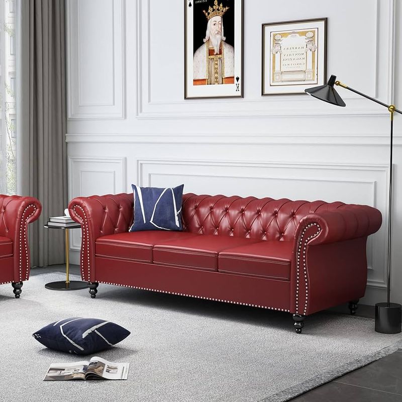
Burgundy sofas create an odd visual tension against Oregon’s lush green backdrop. Looking through my living room windows at Douglas firs while sitting on a deep red couch produces a Christmas-like color clash that feels seasonally confused year-round.
Many homeowners select this color hoping for richness, but it often reads as dated and formal in our casual Pacific Northwest aesthetic. The color’s heaviness competes with rather than complements our natural surroundings.
When paired with our typical gray skies, burgundy can take on a muddy, somber quality that doesn’t reflect the fresh, clean feeling most Oregonians want in their homes. I’ve found it’s best to work with our landscape rather than against it.
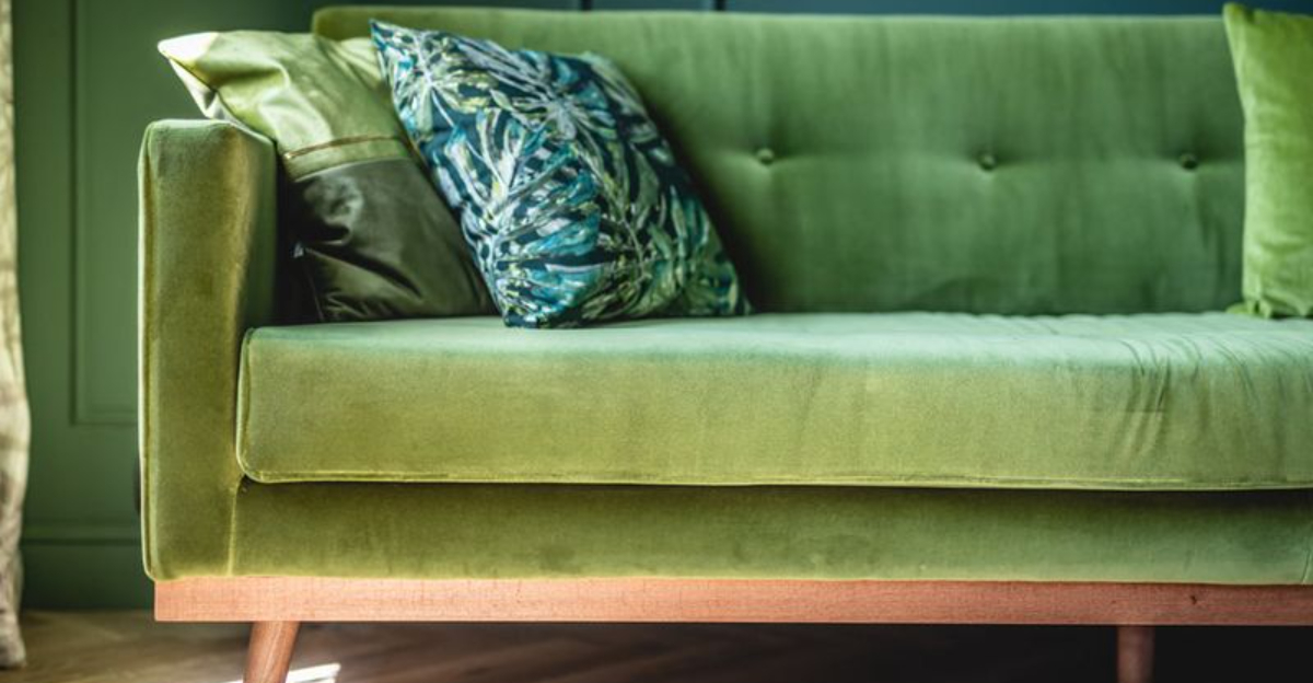
3. Forest Green Velvet: Surprisingly Overwhelming Indoors
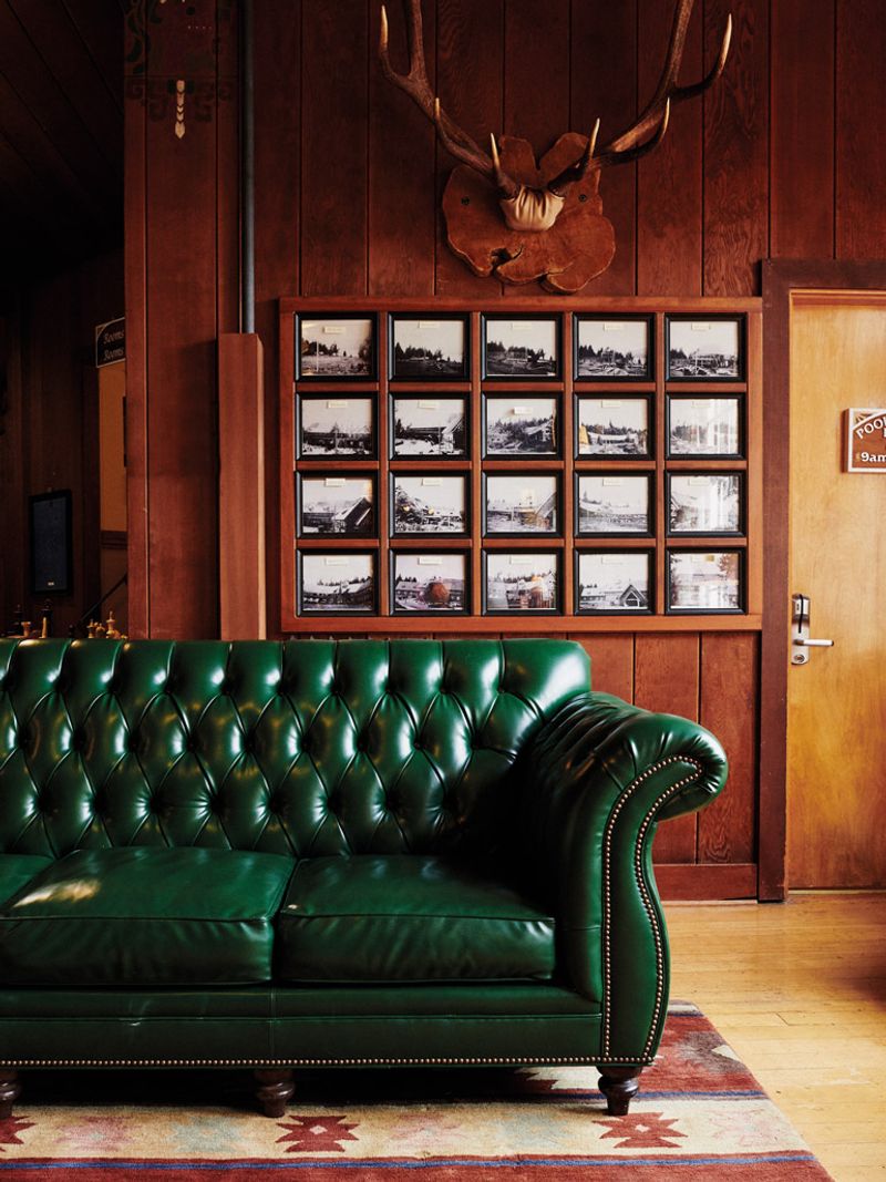
Forest green velvet sounds perfect for Oregon on paper – matching our beautiful evergreens – but brings too much of the outdoors inside. I’ve witnessed numerous clients struggle with these sofas feeling like camouflaged lumps in their living rooms, creating a visual heaviness that’s hard to overcome.
The velvet texture traps dust and pet hair, a significant drawback in our active, outdoor-loving culture where dogs frequently join hiking adventures. This rich color also shows every water spot from our frequent rainy days when kids or pets jump on furniture.
Though well-intentioned as a nod to our natural surroundings, forest green becomes overwhelming when used on large furniture pieces. It works better as an accent color in smaller doses that won’t dominate your space.
4. Mustard Yellow: Fights Against Our Cool-Toned Light
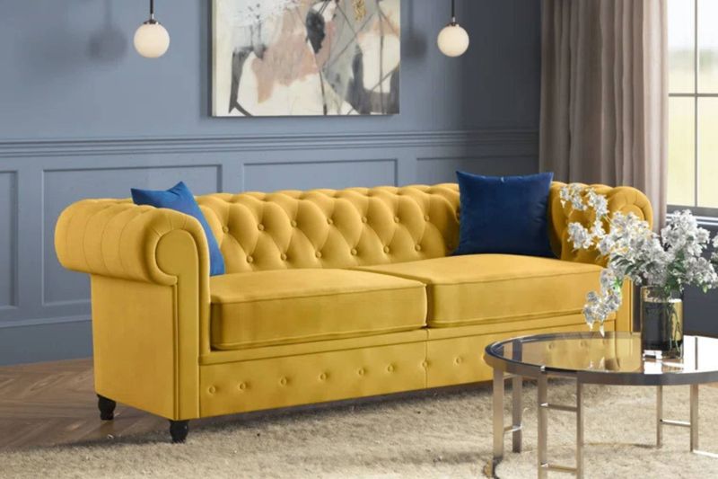
Mustard yellow creates a jarring visual experience in Oregon homes. Our natural light has a cool, blue-gray quality for much of the year, which clashes with mustard’s warm undertones in an unpleasant way that makes the color appear dingy rather than vibrant.
When I’ve helped clients replace their mustard sofas, they’re always surprised by how much more harmonious their spaces instantly feel. The color works beautifully in desert climates with warm light, but fights against our Pacific Northwest ambiance.
Another practical issue – mustard shows every stain from our outdoor adventures. Those muddy hiking boots or wet raincoats create visible marks that are nearly impossible to hide. It’s simply not suited to our lifestyle or light conditions here in Oregon.
5. Plum Purple: Creates a Perpetual Winter Mood
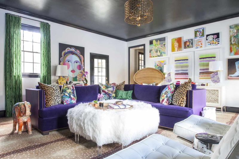
Plum purple sofas trap Oregon homes in a permanent winter atmosphere. During our already gray months (which can stretch from October through May), these deep purple tones amplify the seasonal darkness rather than providing a cheerful counterpoint.
I’ve noticed clients with these sofas tend to use their living rooms less during winter. The psychological effect is subtle but real – the deep, cool-toned purple reinforces rather than balances our seasonal light patterns.
From a design perspective, plum also limits your decorating flexibility. The distinctive color forces everything else in the room to coordinate with its strong personality, creating decorating challenges with each season. For our variable Oregon climate, we need more adaptable, uplifting choices that work year-round.
6. Bright Red: Too Stark Against Our Subdued Palette
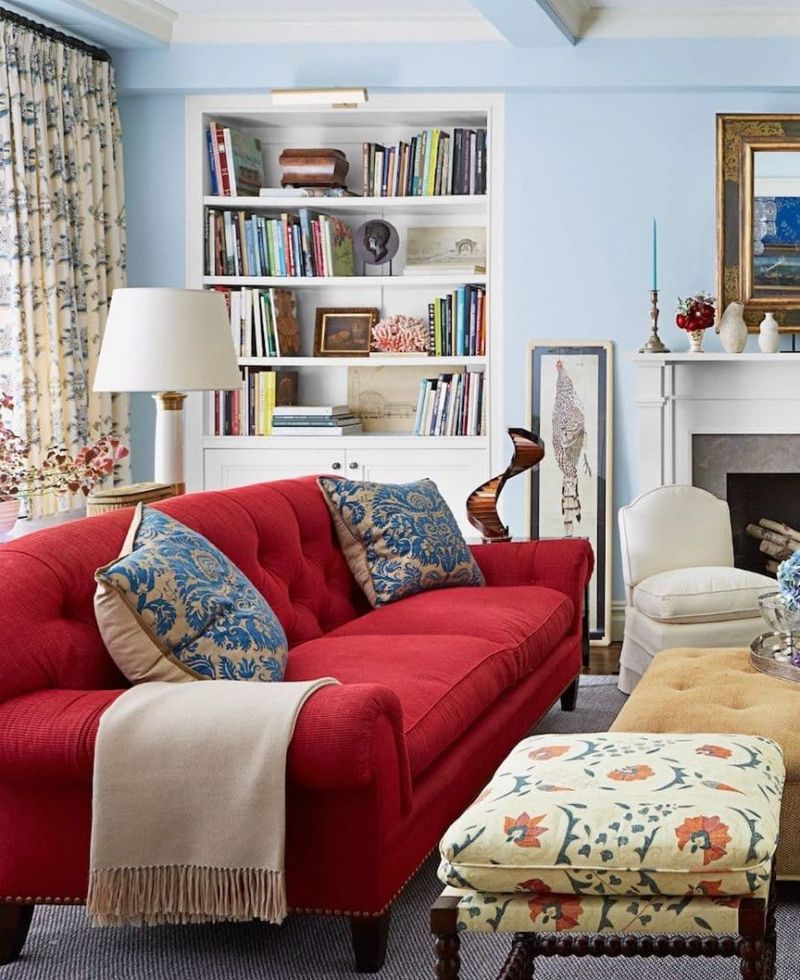
Bright red sofas create visual chaos in Oregon’s naturally subdued environment. Our state’s signature muted greens, soft grays, and gentle earth tones clash dramatically with fire-engine red furniture, making these pieces feel like they’re shouting in a quiet room.
When clients ask about red sofas, I often bring them to the window and point out our landscape colors. The disconnect becomes immediately apparent – that vibrant red simply doesn’t exist in our natural surroundings except as tiny berry accents.
Beyond aesthetics, bright colors show every bit of fading from our strong summer sun streaming through windows. The contrast between faded and unfaded areas becomes particularly noticeable on red upholstery. I’ve found embracing our region’s natural color harmony creates more peaceful, cohesive living spaces.
7. Charcoal Black: Absorbs Our Already Limited Light
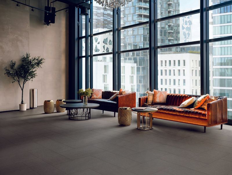
Charcoal black sofas act like light-sucking black holes in Oregon homes. During our many overcast days, these dark pieces absorb what little natural illumination filters through our windows, creating spaces that feel perpetually dim and smaller than they actually are.
I’ve had numerous clients who thought black would be sophisticated and modern, only to find their living rooms feeling cave-like and uninviting. The psychological effect is real we need our indoor spaces to feel bright and uplifting during our long, gray winters.
The practical drawbacks are equally problematic. Every speck of dust, pet hair, and crumb shows vividly against the dark background. For our active, outdoor-oriented lifestyle where hiking gear and wet dogs are common household features, this maintenance nightmare creates unnecessary stress in what should be a relaxing space.
8. Navy Blue: Creates a Perpetual Rainy Day Feeling
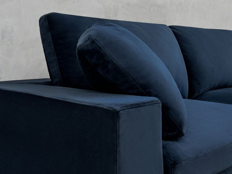
Navy blue sofas extend our rainy season indoors all year long. While this color has classic appeal, in Oregon homes it reinforces rather than balances our frequently overcast skies, creating living spaces that feel perpetually evening-like even during daylight hours.
I’ve noticed a pattern with clients who choose navy – they often end up adding excessive lighting to compensate for the heavy feeling. The color absorbs natural light similar to charcoal, but with a cool undertone that amplifies our already blue-tinted Pacific Northwest light.
Did you know color psychology shows blue tones can actually lower perceived room temperature? In our already cool climate, navy sofas can make spaces feel chillier than they are. For our environment, we need colors that bring warmth and lightness rather than reinforcing our abundant moisture and cloud cover.
9. Olive Green: Muddies Our Indoor-Outdoor Connection
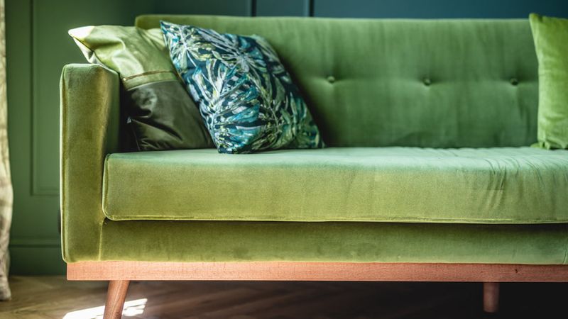
Olive green sofas create a murky, indistinct feeling in Oregon interiors. Though seemingly aligned with our natural surroundings, this particular green has muddy undertones that read as dingy rather than fresh, especially under our gray skies.
When clients have these sofas, their spaces often feel visually confused – the olive neither contrasts with nor complements our verdant views. Instead, it creates a middle-ground that lacks definition or purpose, making rooms feel unintentionally bland.
The color’s yellowish undertones also tend to clash with the blue-green hues of our Douglas firs and Western hemlocks visible through windows. I’ve found that either embracing clearer greens or creating deliberate contrast works much better for maintaining that crucial indoor-outdoor connection we Oregonians value in our homes.
10. Rust Orange: Competes With Our Seasonal Beauty
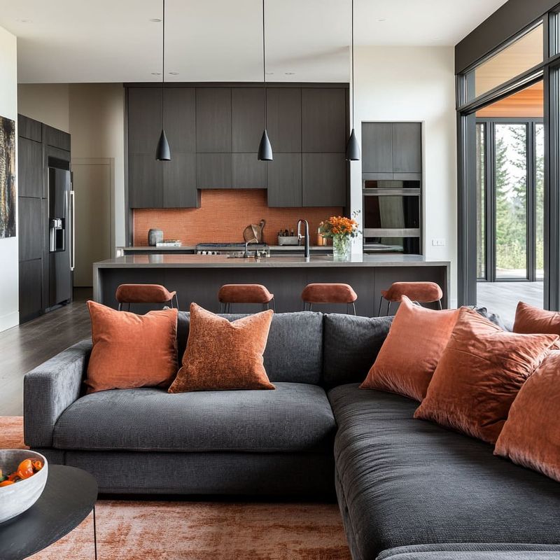
Rust orange sofas fight against Oregon’s seasonal color shifts. While seemingly warm and cozy, this color creates an awkward competition with our spectacular fall foliage when viewed through windows, and feels jarringly out of place against summer’s vibrant greens or winter’s soft gray palette.
I’ve helped several clients replace rust sofas that never quite settled into their homes. The color demands too much attention, preventing that seamless indoor-outdoor flow that makes Oregon living special.
From a practical standpoint, rust orange also shows fading dramatically when exposed to our strong summer sun. Those window-facing sections quickly develop a two-toned effect that’s impossible to fix without reupholstering. For our variable climate and changing seasonal views, more adaptive neutral options create a better foundation.

