8 Home Exterior Mistakes That Designers Want You To Quit Making
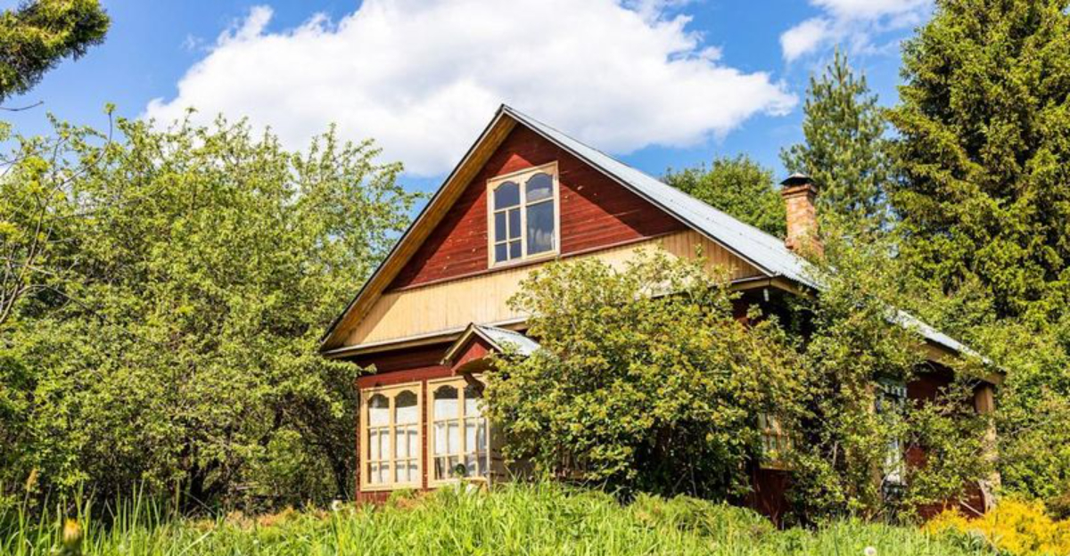
Your home’s first impression? It’s all about curb appeal, but so many homeowners unknowingly trip themselves up!
As a designer who’s seen every oops, I’m always amazed these mistakes keep sneaking back. Ready to uncover the eight exterior design blunders that make pros cringe, and how you can fix them fast to make your home shine like a superstar? Get ready to glow up your curb appeal!
1. Mismatched Architectural Elements
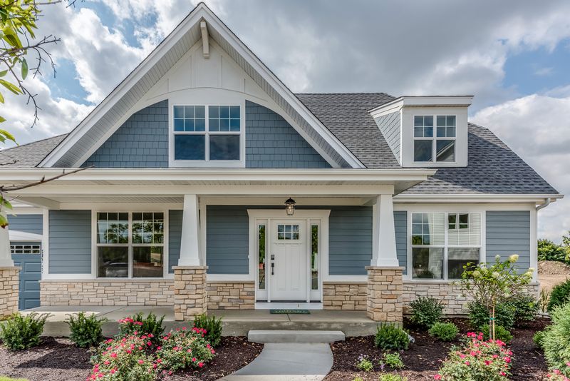
Nothing screams “design disaster” louder than mixing Tudor-style windows with Mediterranean columns! Your home should tell one cohesive story, not a confusing architectural jumble.
When renovating, always honor your home’s original style. Research similar houses in architectural magazines or historical references before making changes. The elements should complement each other like members of the same family.
Moreover, avoid trendy additions that will look dated within a few years. Classic choices aligned with your home’s authentic character will stand the test of time.
2. Garage Door Neglect
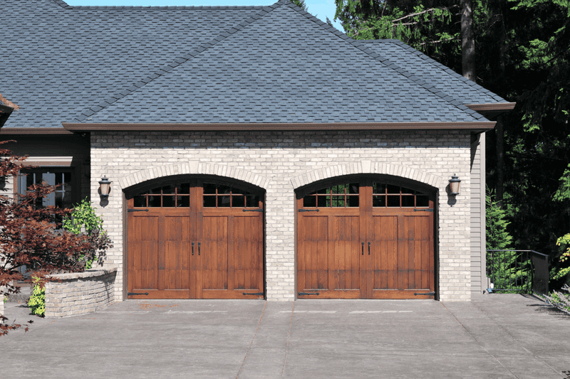
Garage doors often occupy up to 30% of your home’s façade, yet homeowners treat them as afterthoughts! This massive visual element deserves your attention and investment.
Consider upgrading to a carriage-style door with decorative hardware for traditional homes. Modern homes benefit from sleek, minimalist designs with clean lines. Whatever style you choose, the door should complement your home’s architecture.
Furthermore, regular maintenance prevents that shabby, neglected look. A fresh coat of paint or stain every few years works wonders for your curb appeal.
3. Chaotic Color Schemes
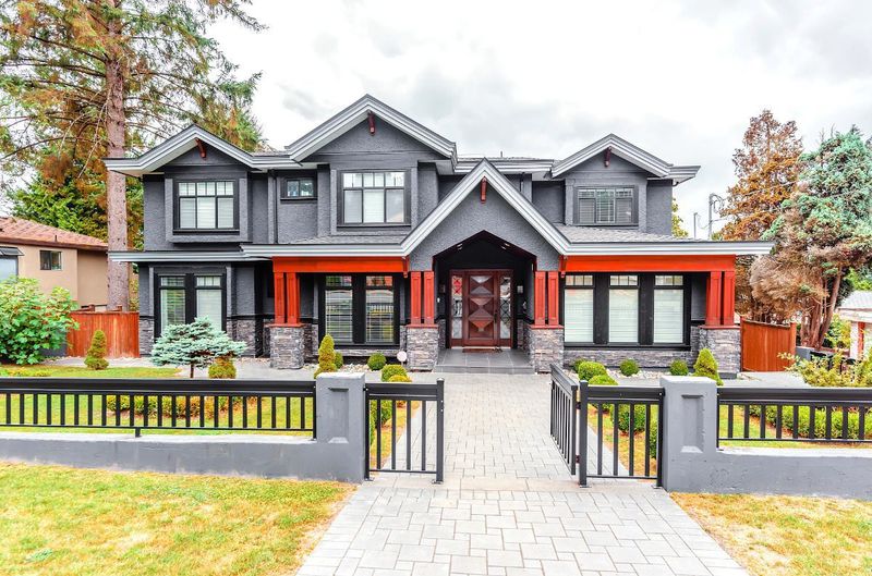
Honestly, your rainbow-colored exterior makes my design soul weep! Too many competing colors create visual chaos rather than harmony.
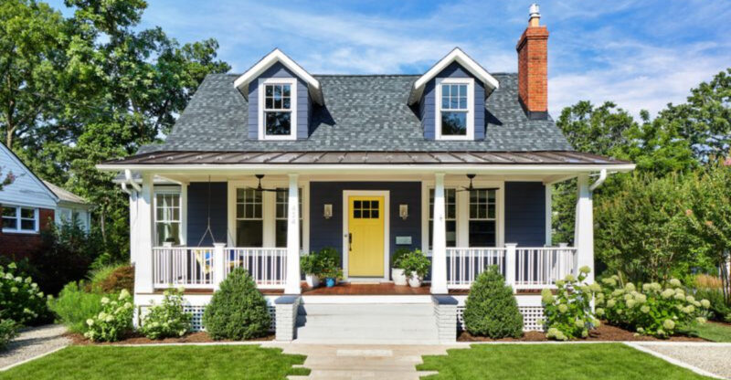
Limit your palette to three coordinated colors: one for siding, one for trim, and an accent for doors and shutters. Historical color schemes often work beautifully, especially for traditional architectural styles.
Remember, neighboring houses matter too. Your home should stand out tastefully, not clash with the entire street. Test paint samples on different sides of your house to see how light affects them throughout the day.
4. Proportionally Challenged Lighting
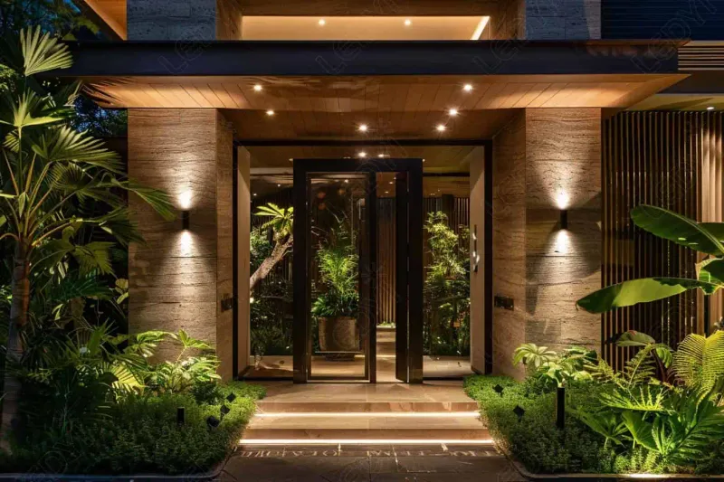
Ever notice how tiny lanterns beside a grand front door look more like dollhouse décor than statement lighting? Size definitely lights up the design game!
When it comes to outdoor fixtures, getting the scale right is no small feat. A good rule of thumb? Measure your door’s height, divide by three, and voilà, that’s your perfect lantern height.
For grand entrances, go bigger, but remember, balance is the real bright idea. After all, what looks charming up close might disappear in the curb appeal spotlight!
5. Hardware Horror Shows
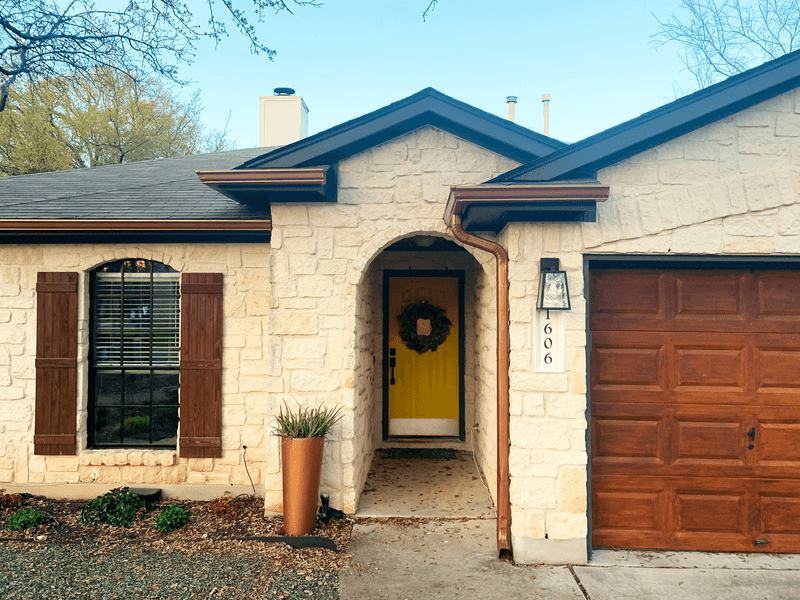
Mismatched metals across your exterior create visual static. That brass doorknob, silver house numbers, and bronze light fixtures are having an identity crisis together.
Choose one metal finish for all exterior hardware elements, doorknobs, knockers, mail slots, house numbers, and lighting fixtures. Black, oil-rubbed bronze, and satin nickel offer timeless appeal that works with most architectural styles.
Quality matters more than you think. Cheap hardware deteriorates quickly in outdoor conditions, while investment pieces develop beautiful patinas over time. This small detail makes a surprisingly significant impact on your home’s overall impression.
6. Front Door Disappointment
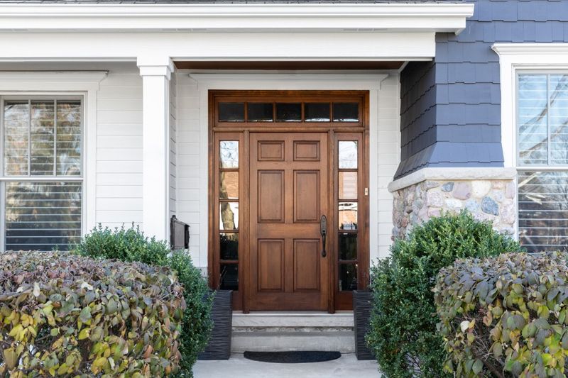
Your front door should be the jewelry of your home, not that sad, faded rectangle I see too often. This focal point deserves special attention.
Bold color choices make stunning statements. Navy blue, deep red, forest green, or even black can transform your entrance dramatically. Quality matters, solid wood or high-grade fiberglass doors offer superior aesthetics and insulation.
Hardware should be substantial and proportional. Tiny doorknobs on large doors look strangely comical. Consider the complete entrance composition, including sidelights, transom windows, and surrounding trim for a cohesive look.
7. Landscaping That Fights Your House
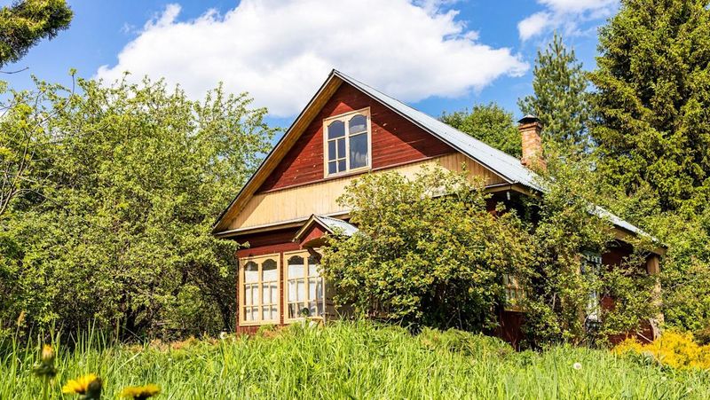
Are your overgrown shrubs turning your house into a jungle hideout? Remember, plants should frame your home, not swallow it whole.
Landscaping is all about teamwork with your architecture. Colonial beauties love symmetrical, formal plantings, while contemporary homes thrive with sleek, minimalist greens.
Size does matter here, foundation plants should top out at about two-thirds the height of your first-floor windows. Giving your plants some elbow room keeps pesky moisture and pests from moving in uninvited!
8. Roof Material Mismatch
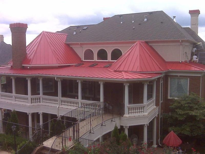
Your roof accounts for nearly 40% of your home’s visible exterior, yet many homeowners select materials with zero consideration for architectural harmony. This oversight baffles me completely.
Spanish tile on a Colonial-style home looks jarringly wrong. Asphalt shingles on a Tudor cottage miss the mark. Research materials historically used with your architectural style.
Beyond style, consider color carefully. Your roof should complement, not compete with, your siding and trim colors. Subtle variations in shingle coloration often look more sophisticated than single-tone options. This investment lasts decades, so choose wisely!


