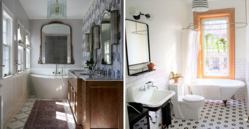
5 Fresh Kitchen Shades Katy Designers Recommend Over Last Year’s Go-To Colors
The right kitchen color does more than follow a trend – it shapes how the space feels every time you walk in. In Katy, designers are turning away from last year’s overused neutrals and embracing deeper, richer tones that feel both current and enduring.
These fresh shades don’t just update your kitchen – they elevate it, adding character without sacrificing comfort. It’s a shift toward palettes that feel lived-in, layered, and effortlessly refined.
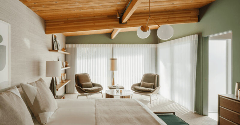
1. Dusty Olive Replaces Sage Green
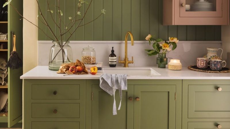
Gone are the days when basic sage dominated kitchen spaces. The dusty olive trend offers a more sophisticated alternative with its earthy undertones and versatile appeal.
This shade pairs beautifully with brass hardware and natural wood elements. Many Katy homeowners appreciate how it creates a calming atmosphere while still making a subtle statement in their cooking spaces.
2. Muted Clay Takes Over From Terracotta
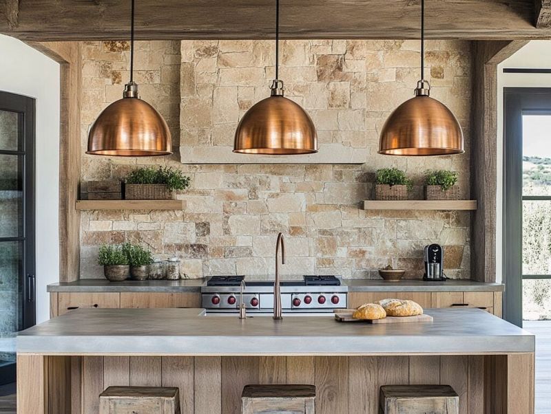
While terracotta had its moment, designers now gravitate toward the softer appeal of muted clay tones. This gentle hue brings warmth without overwhelming your space.
Muted clay creates an inviting atmosphere that feels both contemporary and timeless. Katy designers particularly recommend this shade for island cabinetry or as an accent wall color that complements white or cream perimeter cabinets.
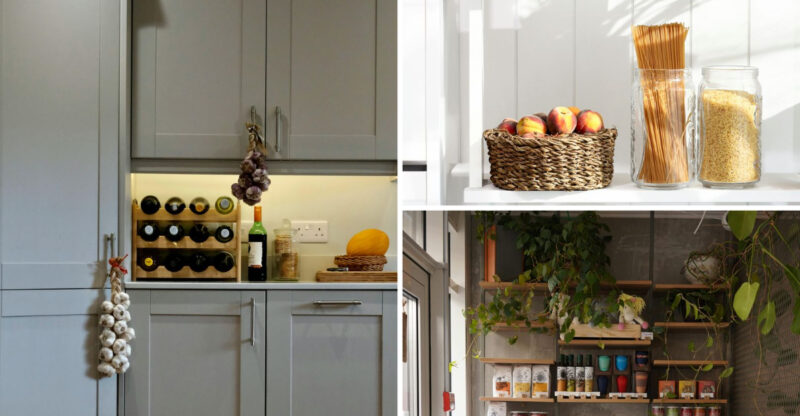
3. Smoky Blue-Gray Edges Out Navy
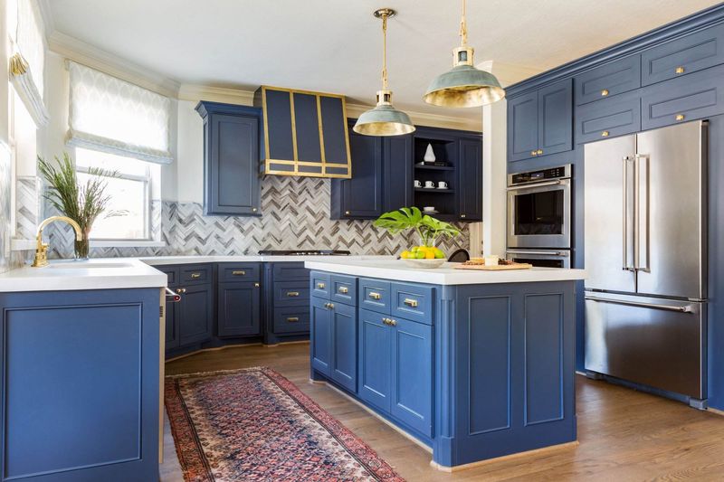
Navy kitchens enjoyed significant popularity, but the smoky blue-gray palette offers a refreshing update. This multidimensional hue shifts subtly throughout the day as lighting changes.
The smoky shade works wonderfully in various kitchen styles from modern farmhouse to contemporary. Katy design experts note how this versatile color creates depth while maintaining an airy feel that navy sometimes lacks.
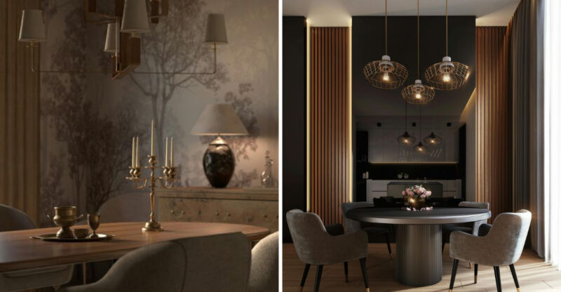
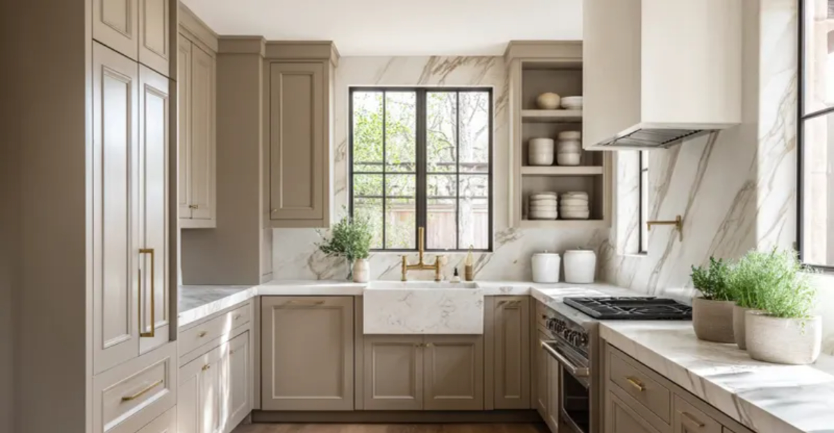
4. Warm Taupe Surpasses Greige
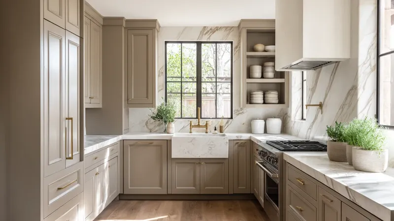
Farewell to the ubiquitous greige that dominated recent years! Warm taupe brings a cozier vibe with its rich undertones that feel both sophisticated and welcoming.
This shade creates an elegant foundation for any kitchen style. Many Katy homeowners appreciate how warm taupe cabinets complement both cool and warm accent colors, making it incredibly versatile for seasonal decor changes.
5. Soft Black Outshines Charcoal Gray
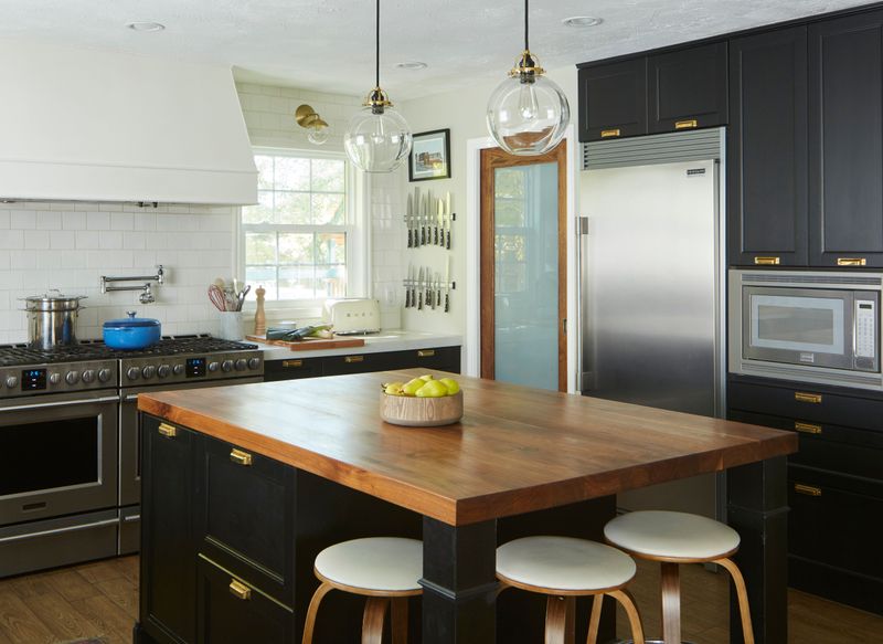
Move over, charcoal gray – soft black is capturing hearts in Katy kitchens everywhere. Unlike harsh pure black, this gentler variation adds drama without overwhelming smaller spaces.
The sophisticated tone creates stunning contrast with light countertops and backsplashes. Katy designers particularly love soft black for kitchen islands or lower cabinets paired with lighter upper cabinetry for a balanced, contemporary look.

