The 7 Worst Front Door Colors For Curb Appeal, According To Designers
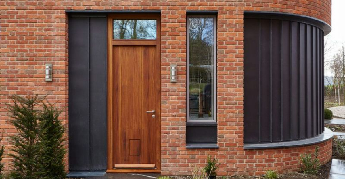
Your front door makes a powerful first impression when people visit your home. It’s like the smile on your home’s face, setting the tone for what’s inside. Picking the right color can boost your property’s value and curb appeal, while the wrong shade might leave visitors feeling unwelcome or confused.
I’ve talked with professional designers to identify the worst front door color choices that could be hurting your home’s look.
1. Stark White
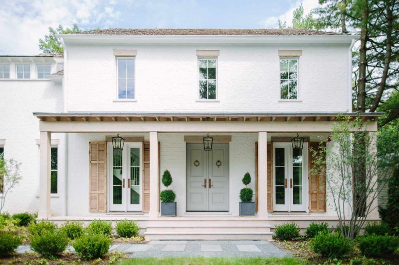
White doors show every speck of dirt and fingerprint, turning your entryway into a maintenance nightmare. I’ve seen pristine white doors look dingy and neglected after just one rainy season.
The color also lacks personality and fades into the background, especially on homes with light-colored exteriors. Your entrance should make a statement, not disappear!
Most designers agree white doors look institutional rather than inviting – more like a hospital than a home where memories are made.
2. Neon Green
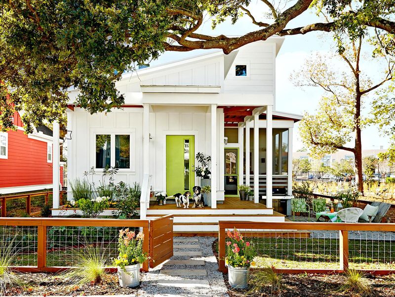
Walking up to a neon green door feels like being slapped in the face with color. This electric shade creates visual chaos rather than harmony with your landscaping and exterior paint.
One designer told me that neon green doors actually decreased home values in her neighborhood by creating what she calls “color conflict” with the natural environment.
While bold colors can work wonderfully, this particular shade tends to look cheap and trendy rather than timeless and sophisticated.
3. Pure Black
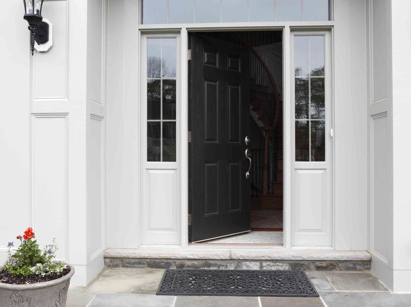
Black doors absorb heat like nobody’s business, making them uncomfortable to touch during summer months. The hardware often becomes too hot to handle, literally!
Many homeowners don’t realize black doors fade unevenly in direct sunlight, developing patchy, grayish areas that look worn and tired. The maintenance is constant if you want it looking fresh.
While black can look sophisticated in some settings, designers warn it often creates a forbidding, unwelcoming vibe that subconsciously tells visitors to stay away.
4. Bubble Gum Pink
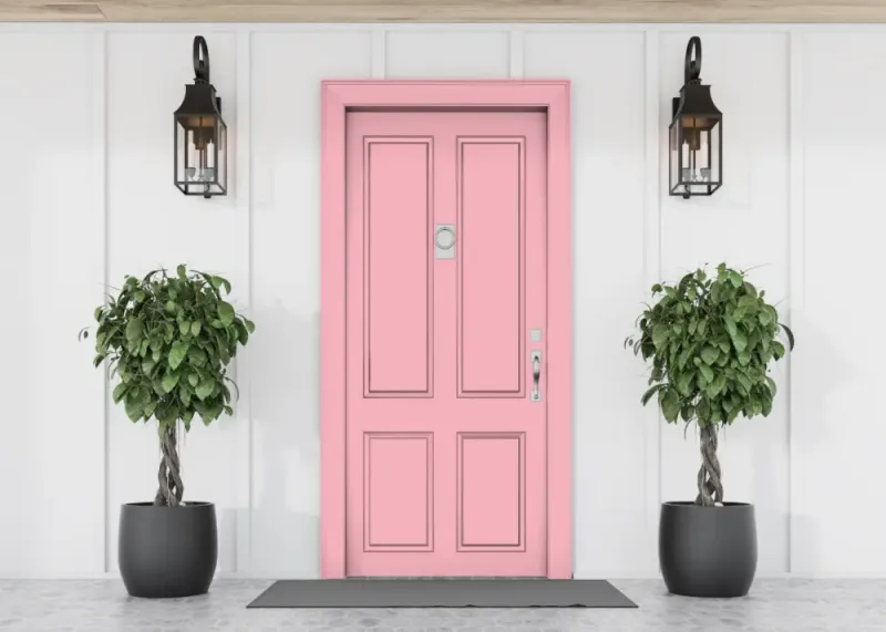
Unless you’re living in a dollhouse or Miami’s Art Deco district, bubble gum pink screams “I make impulsive decisions!” to potential buyers. The color tends to clash with nearly every exterior palette and natural setting.
Real estate agents report that pink doors can actually deter serious buyers who struggle to envision themselves living there. It’s too personal and specific to your taste.
Even pink-lovers should consider softer, more sophisticated blush tones that complement rather than compete with the rest of your home’s exterior.
5. Muddy Brown
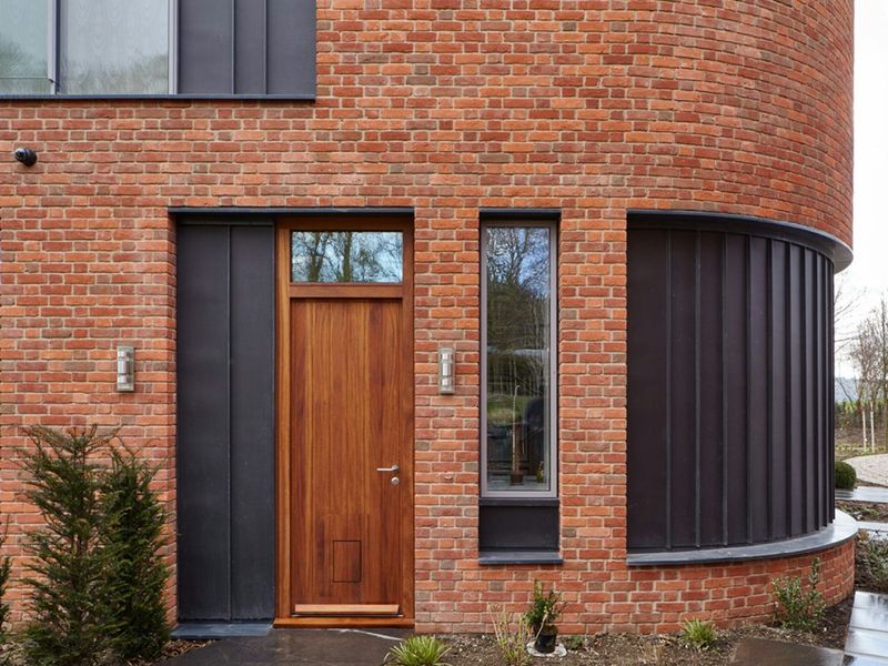
Dull, muddy brown doors create an impression of neglect rather than warmth. I’ve noticed this color often looks like it was chosen by default rather than with intention.
The problem with muddy brown is that it tends to disappear against brick exteriors and blend too much with natural wood elements. Your front door should stand out as a focal point!
Designers recommend avoiding browns with gray or yellow undertones that can make your entrance look dated and dreary instead of rich and inviting.
6. Bright Orange
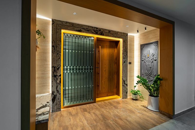
Orange doors create a polarizing effect that can overwhelm visitors before they even step inside. The color is so energetically charged that it can make people feel anxious rather than welcomed.
Home stagers consistently report that orange doors limit buyer appeal and create a distraction from the home’s architectural features. The eye gets stuck on the door instead of appreciating the whole property.
Even orange enthusiasts should consider toned-down terracotta or burnt orange shades that offer warmth without the visual shock factor.
7. Primary Yellow
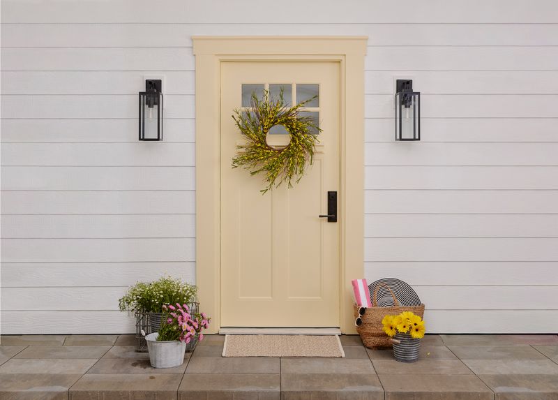
Bright yellow doors fade dramatically in sunlight, often turning a sickly greenish hue within just a year or two. The maintenance cycle is frustrating and expensive for homeowners trying to maintain curb appeal.
Many designers note that yellow creates an unintentional “caution” signal that psychologically puts visitors on alert rather than at ease. It’s simply too stimulating for an entrance.
If you love yellow, consider softer butter or mustard tones that age more gracefully and create a welcoming glow rather than a visual warning sign.
