Scandinavian Color Palettes Aren’t Always Muted And Monochrome Here Are The Combinations Experts Choose
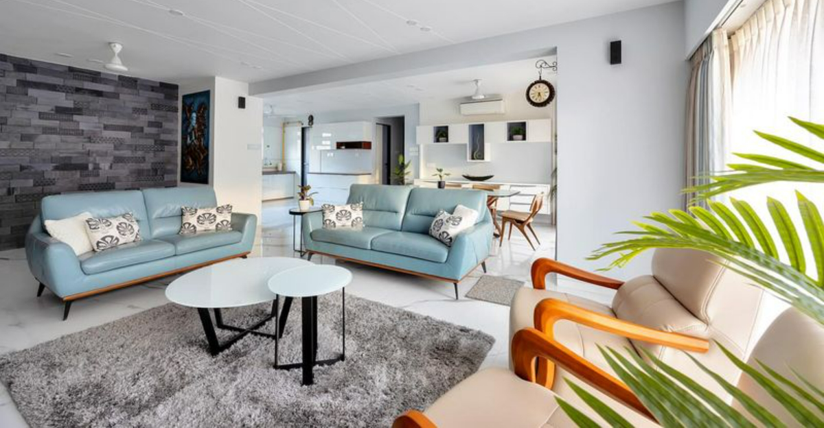
When you think of Scandinavian design, you probably picture whites, grays, and minimalist spaces. But Nordic interiors aren’t always stuck in neutral territory! Many Scandinavian designers embrace vibrant color combinations that still maintain that distinctive Nordic feel.
I’ve talked with interior design experts who revealed their favorite Scandinavian color palettes that break the monochrome stereotype while preserving the region’s signature style.
1. Forest Green with Dusty Pink
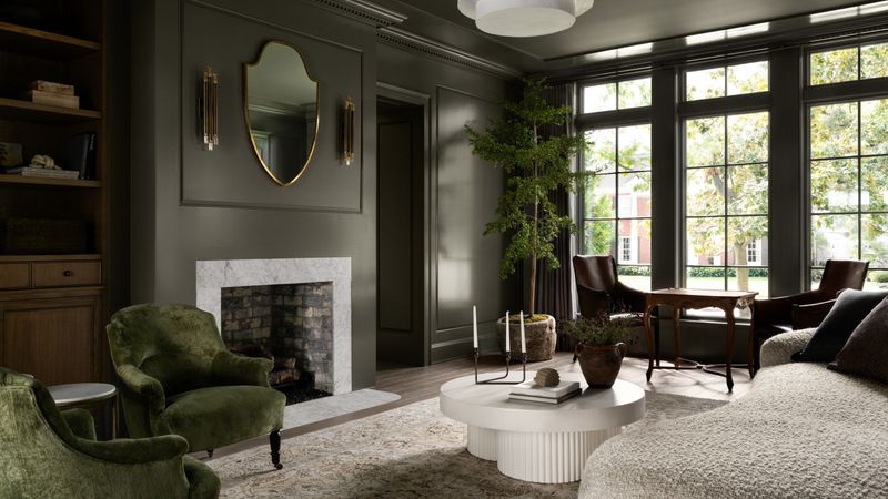
Nature-inspired yet unexpected! This combination brings the lush Scandinavian forests indoors while adding a touch of warmth through soft pink tones. The contrast feels sophisticated without being overwhelming.
Rather than using these colors equally, designers recommend an 80/20 approach. Deep forest green as your main color with dusty pink accents through textiles and small decor pieces creates a cozy yet refined atmosphere. The pairing works beautifully in living rooms and bedrooms.
2. Burnt Orange with Creamy White
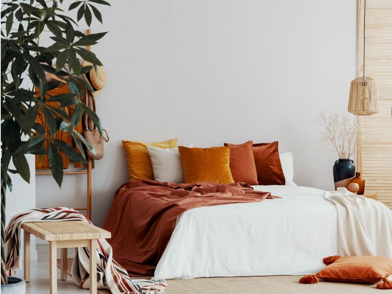
The burnt orange tones found in traditional Norwegian folk art have made their way into modern Scandinavian interiors! This warm, earthy hue pairs beautifully with creamy whites to create spaces that feel both grounded and airy.
What makes this combination special is how it captures the glow of Nordic sunsets. Designers often incorporate burnt orange through statement furniture pieces while keeping walls and larger surfaces in soft whites. Natural wood elements bridge these colors perfectly, creating a cohesive look that feels quintessentially Scandinavian.
3. Midnight Blue with Copper Accents
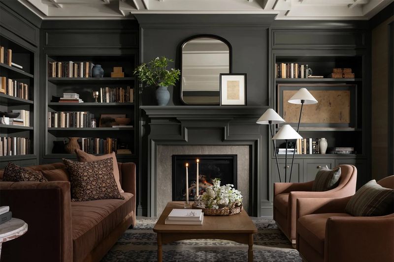
Bold and dramatic! This combination draws inspiration from the Nordic night sky and traditional metalwork. The depth of midnight blue creates a cozy cocoon effect that’s perfect for northern climates.
Finnish designers particularly love this pairing for creating intimate spaces like home offices or dining nooks. The key is balancing the intensity of the blue with warm copper lighting fixtures, hardware, or decorative objects. Adding light wood tones prevents the space from feeling too heavy or dark.
4. Sunshine Yellow with Slate Blue
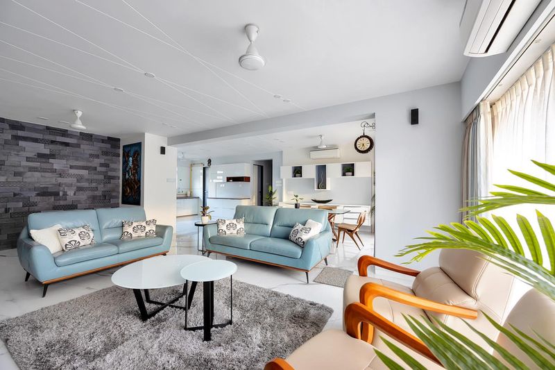
I was amazed to learn this cheerful combination has deep roots in traditional Swedish homes. The contrast between warm yellow and cool blue creates a balanced energy that fights off those long Nordic winters.
Many designers pair a sunshine yellow accent wall with slate blue furniture pieces. The result feels both fresh and timeless. This combination works especially well in kitchens and dining areas where the yellow stimulates appetite and conversation.
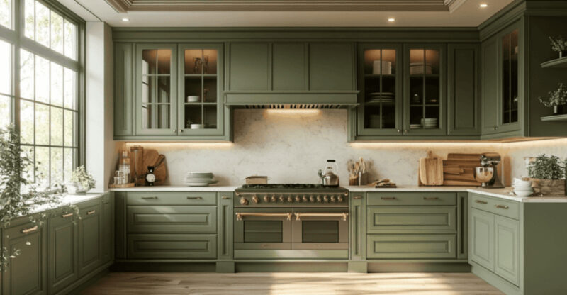
5. Sage Green with Terracotta and Cream
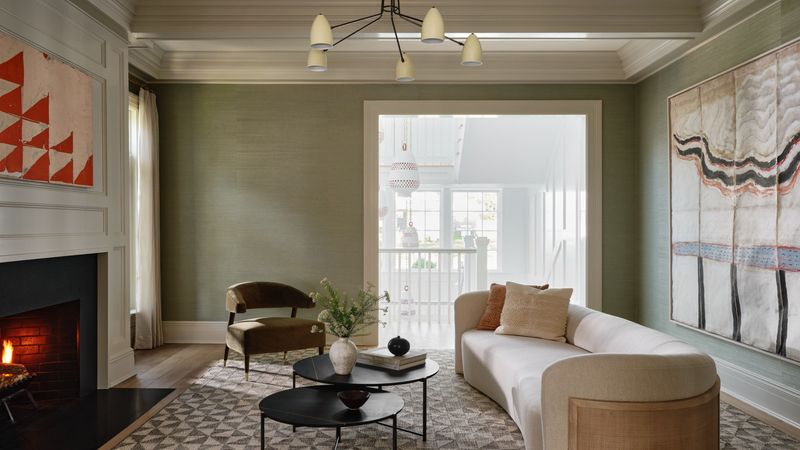
This earthy trio captures the essence of Danish design philosophy – natural, warm, and inviting. The muted sage provides a calming backdrop while terracotta elements add warmth and visual interest.
Danish experts recommend introducing this palette through textural elements like linen curtains, ceramic vases, and natural fiber rugs. The combination feels especially harmonious in spaces that transition between indoors and out, like sunrooms or open-plan living areas. Small doses of black provide definition without disrupting the palette’s organic feel.
