20 Color-Drenched Kitchens That Prove This Paint Trend Is Totally Timeless When Used Right
Color-drenched kitchens are making a bold comeback in home design. Instead of playing it safe with whites and neutrals, homeowners are embracing rich, saturated hues that transform cooking spaces into vibrant sanctuaries.
This approach isn’t just about making a statement – it’s about creating rooms with personality that stand the test of time when executed properly.
1. Midnight Blue Cabinetry with Brass Accents
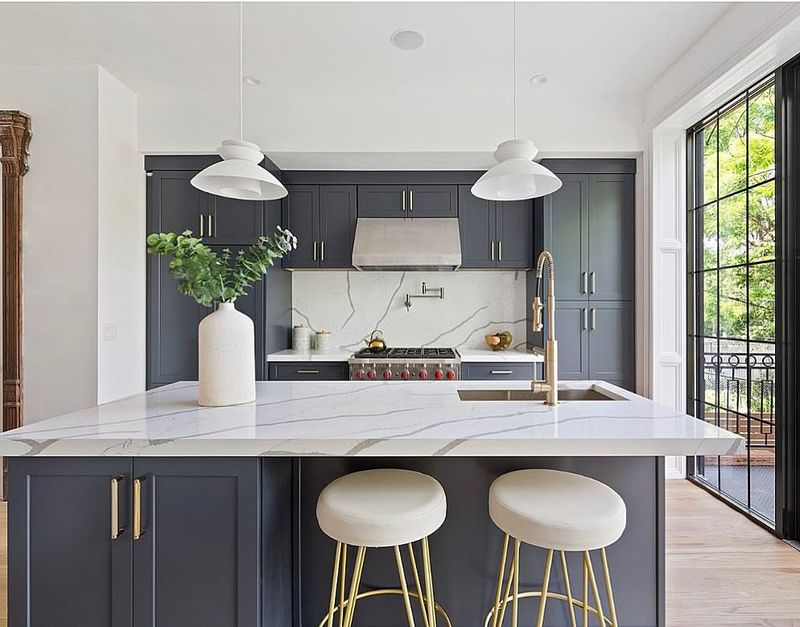
Navy blue cabinets paired with warm brass hardware create a sophisticated yet approachable kitchen. The deep blue adds drama without overwhelming the space.
I’ve found this combination works beautifully in both traditional and modern homes. The contrast between the cool blue and warm metallic tones brings balance while creating visual interest that keeps drawing your eye around the room.
2. Emerald Green Island Paradise
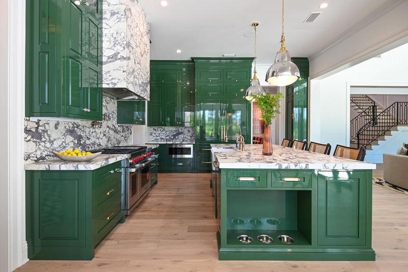
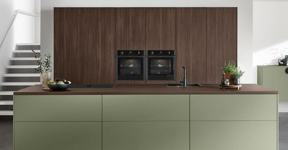
An emerald green kitchen island serves as a stunning focal point while neutral perimeter cabinets keep the look grounded. The jewel tone adds luxury without overwhelming your senses.
You’ll find this approach particularly effective in open-concept spaces. By containing the bold color to the island, you get to enjoy the visual impact without committing to a fully green kitchen.
3. Sunny Yellow All-Over Charm
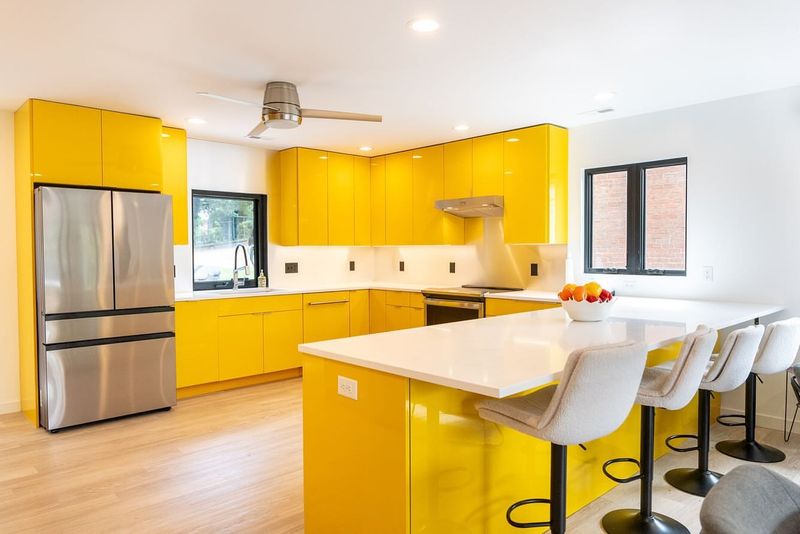
Yellow kitchens radiate warmth and happiness, especially when paired with classic white countertops and backsplash. The cheerful hue transforms morning coffee into a sunshine experience.
For best results, I recommend choosing a slightly muted yellow rather than a neon shade. This creates a timeless look that won’t feel dated next season, while still delivering that mood-boosting color therapy we all crave.
4. Terracotta Magic for Earthy Appeal
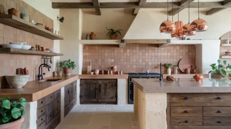
Terracotta brings the warmth of Mediterranean landscapes indoors, creating a kitchen that feels both grounding and inviting. The earthy orange-red tone pairs beautifully with natural wood accents and plants.
What makes this color work so well is its connection to nature. Unlike trendy colors that come and go, terracotta has been used in homes for centuries, giving it staying power that more faddy choices simply don’t have.
5. Sage Green Serenity
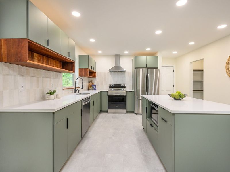
Sage green creates a peaceful atmosphere that connects indoor and outdoor spaces seamlessly. The soft, muted tone works as a versatile neutral while still offering more personality than beige or gray.
I’ve seen this color transform even the smallest kitchens into serene retreats. When paired with natural materials like wood and stone, sage green kitchens feel effortlessly elegant without trying too hard – exactly what makes a design truly timeless.
6. Bold Red Statement Walls
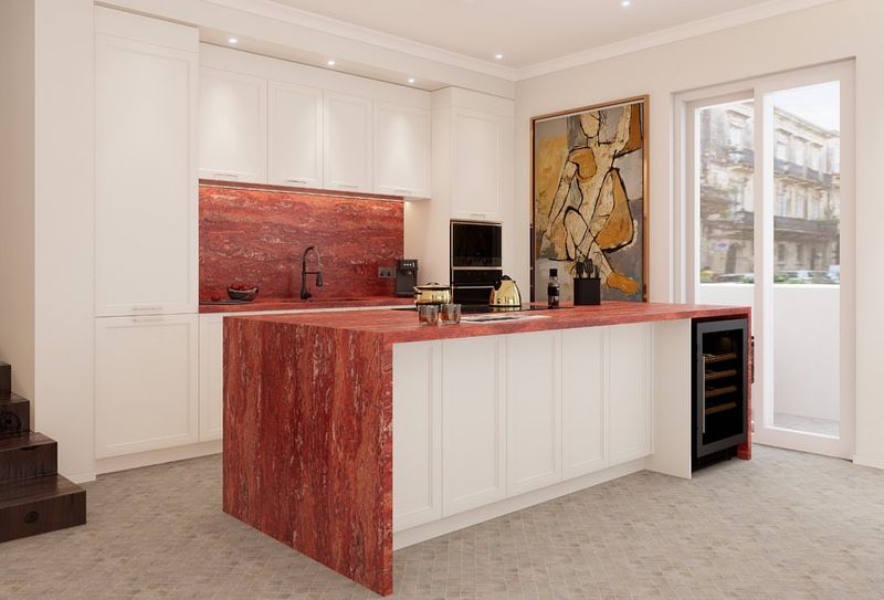
Red walls make a dramatic statement while white cabinets keep the space from feeling overwhelming. This classic color combination has roots in traditional farmhouse kitchens but feels equally at home in contemporary spaces.
The key to making red work is balance. By limiting the strong color to walls rather than cabinetry, you create impact without commitment. This approach lets you change your mind more easily down the road.
7. Aubergine Purple Sophistication
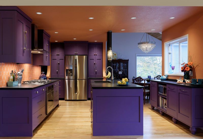
Aubergine purple cabinetry exudes luxury and unexpected sophistication in the kitchen. This deep, complex color changes throughout the day as light shifts, creating a space that feels alive.
What surprises most people is how versatile this rich hue can be. Far from feeling trendy, aubergine has the depth and complexity of a neutral when paired with simple white countertops and minimal hardware. The result feels both bold and timeless.
8. Teal Drama with Light Accents
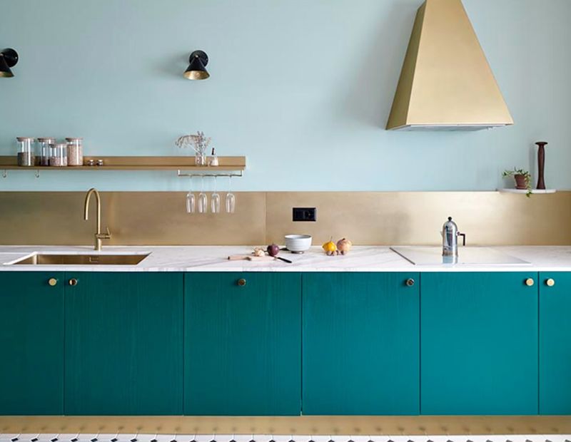
Teal cabinetry creates dramatic impact while maintaining a classic feel, especially when balanced with light countertops and backsplash. The blue-green hue feels fresh yet rooted in tradition.
My favorite thing about teal kitchens is their chameleon-like quality. They can lean coastal when paired with white, feel moody and sophisticated with brass, or take on an eclectic vibe with colorful accessories. This versatility ensures your kitchen won’t feel dated.
9. Burnt Orange Warmth
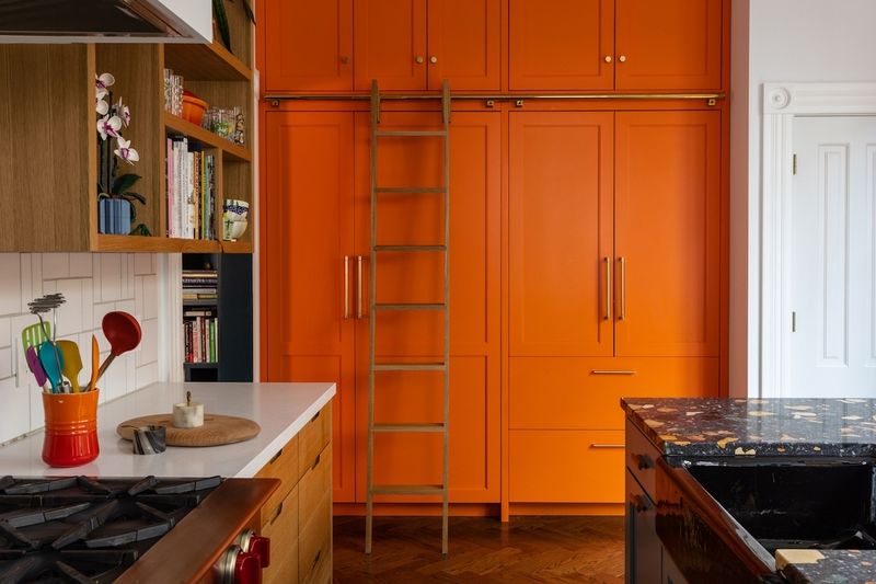
Burnt orange infuses kitchens with sunset warmth that feels both contemporary and timeless. The earthy undertones make this bold choice surprisingly livable for everyday use.
You’ll find this color particularly effective in north-facing kitchens that need warming up. The terracotta-adjacent hue brings instant coziness to spaces that might otherwise feel cold, creating a welcoming atmosphere that makes people want to gather and linger.
10. Forest Green Traditional Appeal
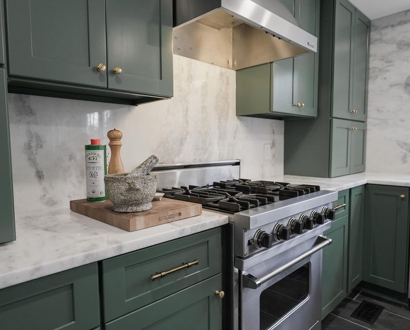
Forest green kitchens channel the timeless elegance of historic homes while feeling utterly contemporary. The deep, saturated color creates a cozy atmosphere that invites gathering.
What makes this shade work so beautifully is its connection to nature. Like the enduring forests it’s named for, this color has staying power beyond fleeting trends. When paired with brass hardware and natural stone, forest green creates a kitchen that feels both grounded and luxurious.
11. Mustard Yellow Vintage Vibes
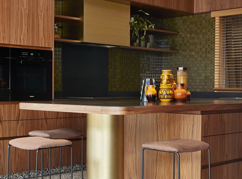
Mustard yellow brings retro charm and unexpected sophistication to modern kitchens. The earthy undertones make this bold choice surprisingly versatile across design styles.
I love how this color references mid-century design while feeling fresh for today’s homes. The warm yellow-gold hue pairs beautifully with wood tones and plants, creating spaces that feel lived-in and collected rather than straight from a showroom.
12. Dusty Pink Unexpected Neutrality
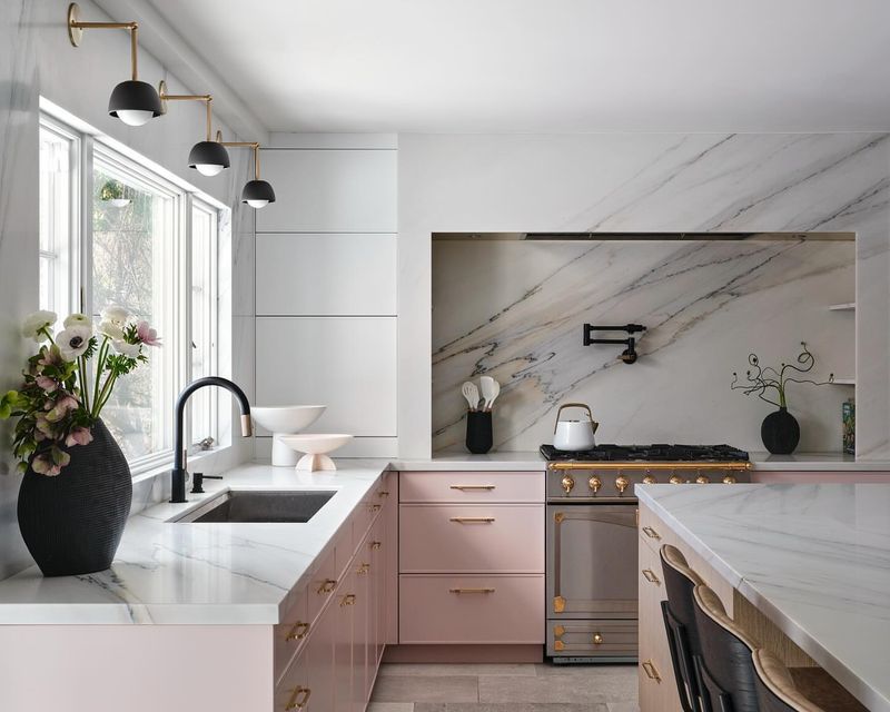
Dusty pink functions as a sophisticated neutral that adds warmth without overwhelming the space. This subtle hue has surprising staying power because it’s neither too feminine nor too bold.
The key to making pink work in kitchens is choosing a muted, dusty shade with gray undertones. This approach creates a subtle color statement that pairs beautifully with marble, brass, and wood for a kitchen that feels both fresh and timeless.
13. Charcoal Gray Moody Elegance
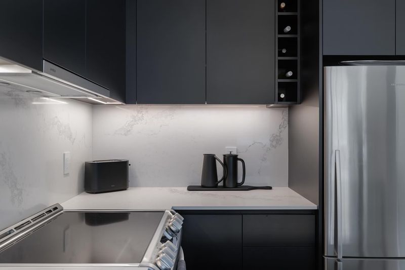
Charcoal gray creates a sophisticated backdrop that makes everything else in your kitchen pop. The nearly-black hue adds drama without the starkness of true black.
You might be surprised how versatile this dark neutral can be. I’ve seen it work equally well in traditional spaces with classic molding and in sleek modern kitchens with minimal detailing. The rich depth provides a timeless foundation that lets other elements shine.
14. Olive Green Mediterranean Influence
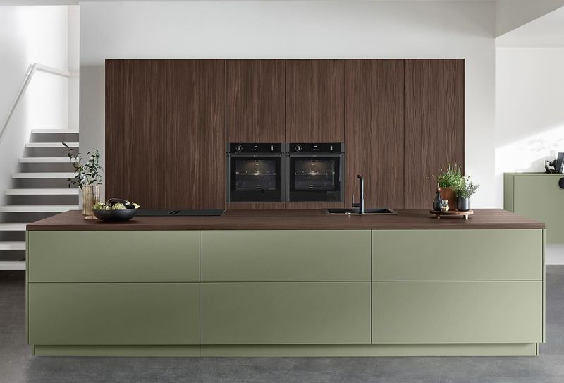
Olive green brings Mediterranean warmth and natural elegance to kitchens of all sizes. The earthy, muted tone creates a welcoming atmosphere that never feels trendy or forced.
What makes olive particularly special is its chameleon-like quality. It can read as a neutral in some lights and as a more definitive green in others. This subtle shifting creates visual interest that keeps the kitchen feeling fresh and engaging year after year.
15. Sky Blue Coastal Freshness
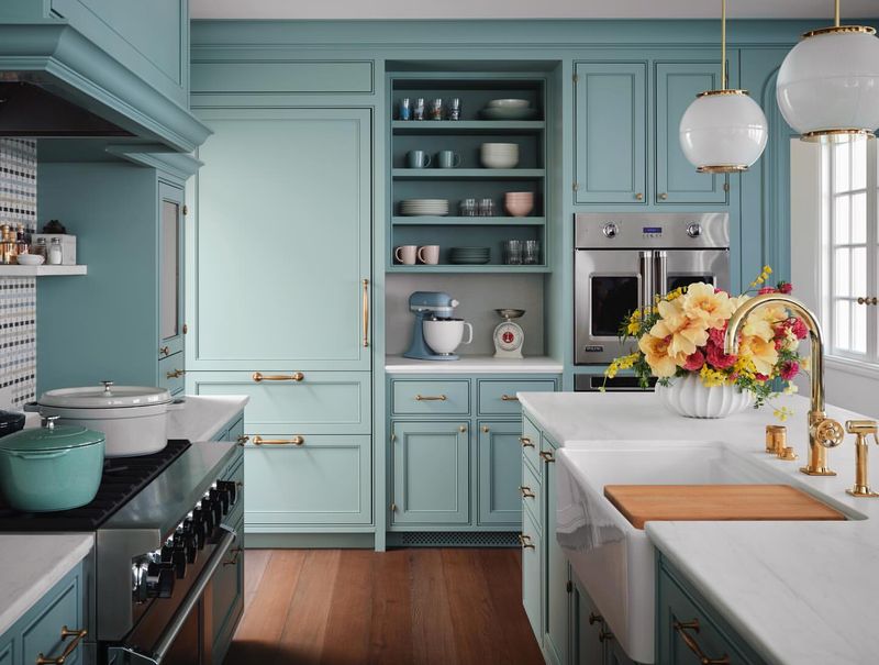
Sky blue cabinetry creates a fresh, airy feeling reminiscent of coastal getaways. The soft color brings the outdoors in while maintaining a classic, timeless appeal.
I find this shade particularly effective in smaller kitchens that need brightening. The light blue opens up the space visually while adding more personality than plain white. When paired with natural woods and whites, the result feels simultaneously relaxing and uplifting.
16. Black and White Graphic Contrast
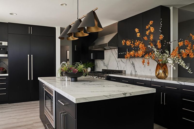
Black cabinets paired with crisp white walls create dramatic contrast that never goes out of style. This graphic approach feels both contemporary and classic simultaneously.
The beauty of this combination lies in its versatility. You can lean traditional with classic hardware and subway tile, or push it modern with sleek handles and minimal detailing. Either way, the strong contrast creates a kitchen with architectural interest that stands the test of time.
17. Turquoise Playful Energy
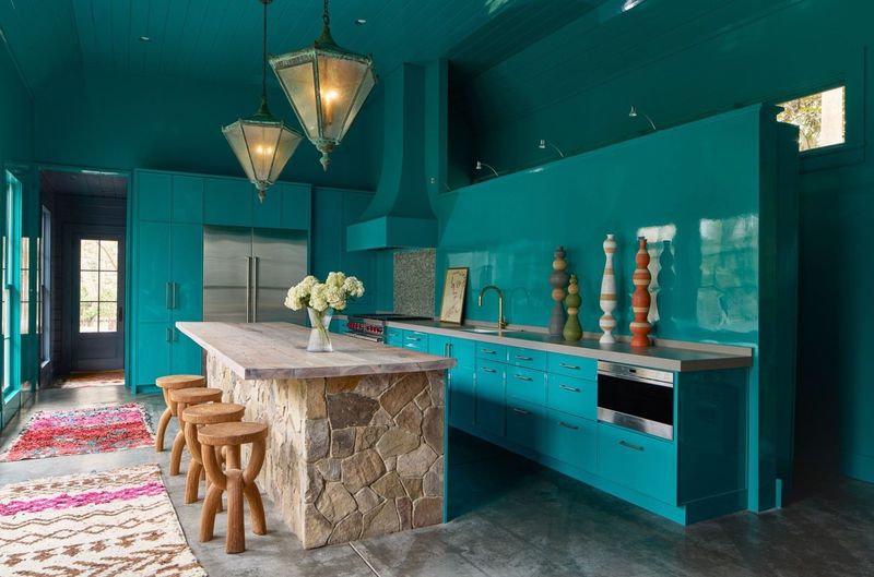
Turquoise injects playful energy while maintaining a connection to classic design through its ties to historic pottery and textiles. The vibrant blue-green creates an uplifting atmosphere.
Despite its boldness, turquoise has remarkable staying power. When chosen in a slightly muted shade and paired with natural materials, it creates a kitchen that feels simultaneously fresh and grounded. The color’s association with water gives it a timeless quality.
18. Oxblood Red Vintage-Inspired Depth
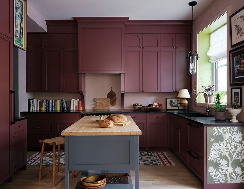
Oxblood red brings rich, historic depth to contemporary kitchens. This deep burgundy-red feels simultaneously classic and unexpected in today’s homes.
What makes this color truly timeless is its connection to historic design. Reminiscent of leather-bound books and traditional libraries, oxblood carries cultural associations that give it staying power beyond typical trends. The depth and complexity ensure it won’t feel dated next season.
19. Soft Mint Retro Charm
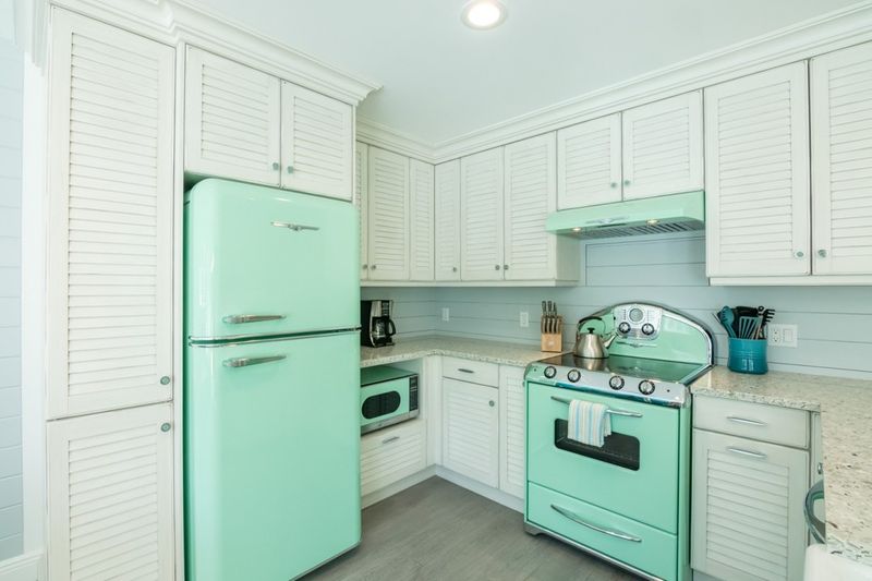
Mint green cabinets bring retro charm with a fresh twist, especially when paired with vintage-inspired appliances and details. The soft color adds personality without overwhelming the space.
I love how this color references 1950s kitchens while feeling completely at home in contemporary settings. The key to making mint work is choosing a softened, slightly muted version rather than a candy-bright tone. This subtle approach ensures longevity beyond passing trends.
20. Plum Purple Unexpected Luxury
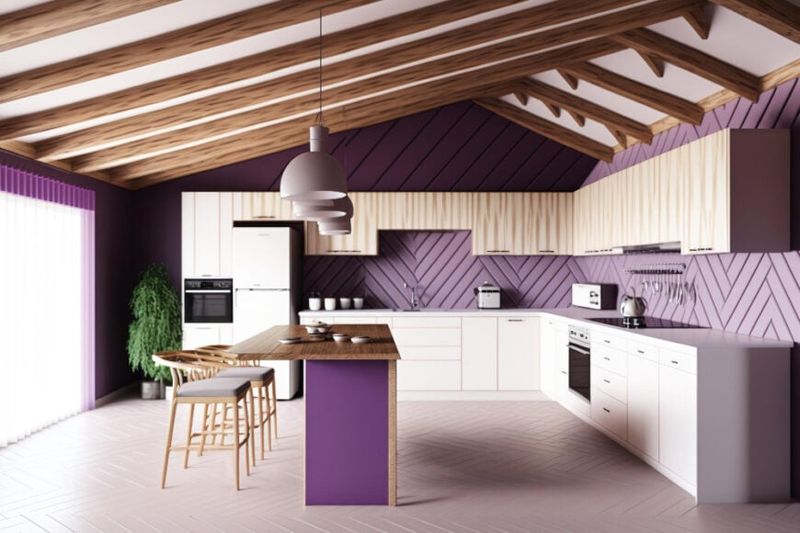
Plum purple creates unexpected luxury in the kitchen, especially when used on an island or accent wall. The rich jewel tone adds depth without overwhelming the space.
You might be surprised by how well this color ages. Unlike trendy purples that come and go, plum has a richness and depth that connects to historic textiles and royal traditions. This heritage gives it staying power that more faddy purples simply don’t have.
