17 Colors You Should Never Pair With White, According To Interior Designers
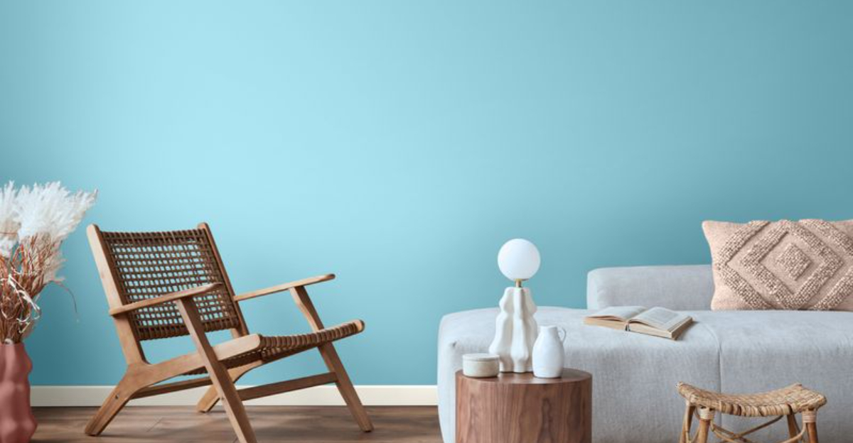
White walls and furniture have become a staple in modern homes, offering a clean canvas for personal style. However, not every color plays nicely with white!
Even though white seems like a safe choice, pairing it with the wrong color can make your room feel like a design dare gone wrong. Some combos scream “oops” louder than a toddler with a marker.
As a designer who’s seen my fair share of color disasters, I’m here to save you from the mistakes that make me wake up in cold sweats.
1. Muddy Brown
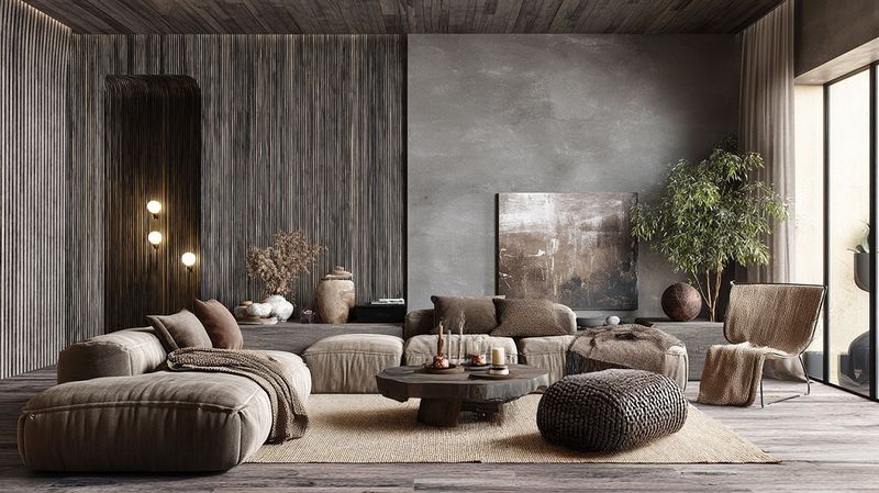
Muddy brown against white creates a jarring contrast that screams “unintentional mess” rather than “deliberate design choice.” The combination often reads as dirty rather than earthy.
While brown can work with white in certain contexts, the specific muddy undertones create a visual imbalance that makes spaces feel haphazard and unfinished.
Trust me, I’ve had clients who insisted on this pairing, and I still have nightmares about the results!
2. Neon Yellow
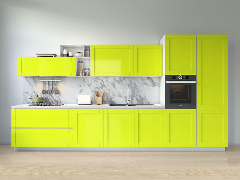
Is your living room starting to look like a construction zone? Neon yellow paired with white creates an eye-watering combo better suited to caution tape than cozy interiors.
The harsh vibration between these two can literally cause visual fatigue! While some aim for “energetic,” the result often screams hazard zone.
Your guests shouldn’t need sunglasses indoors. There’s a fine line between vibrant and visually exhausting.
3. Burgundy Red
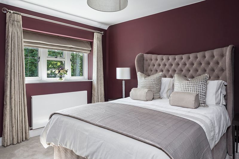
Red alert: Burgundy and white might be a code blue for your décor.
What sounds like a bold, refined palette often ends up looking more like a throwback to a ’90s dentist’s office than a stylish, modern home. The richness of burgundy can weigh heavily on a space, and when paired with stark white walls, the contrast doesn’t elevate, it sterilizes.
Instead of crisp and clean, the white reads cold and clinical, while the burgundy looms like a velvet curtain that never got the memo about minimalism.
It’s a combo many reach for in hopes of elegance, but too often it just feels dated and off-key.
4. Pastel Mint
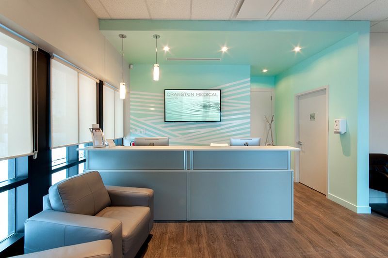
Pairing white with pastel mint might sound charming, but the result often feels more “dental waiting room” than design-forward retreat. It’s a combo that tends to chill rather than refresh, less spa day, more sterile tray.
Even though mint has its nostalgic moments, next to white it usually falls flat. Sage green, on the other hand, brings that same airy vibe without the clinical cold shoulder.
5. Mustard Yellow
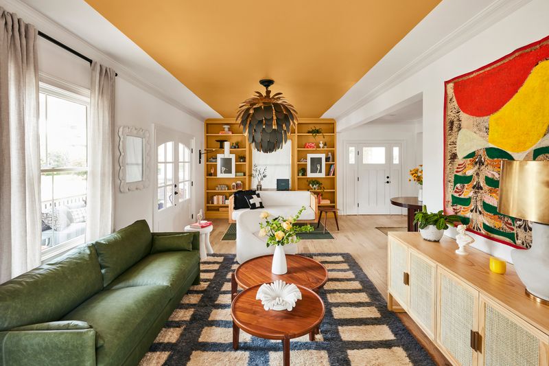
Mustard yellow against white creates a jarring visual experience that recalls fast food branding more than sophisticated design. The combination tends to cheapen spaces instantly.
While mustard can be stunning with other neutrals, against white it often appears jaundiced and sickly. I’ve witnessed countless clients regret this choice after living with it for just a week.
The yellow dominates so aggressively that the white begins to look dingy rather than clean.
6. Baby Blue
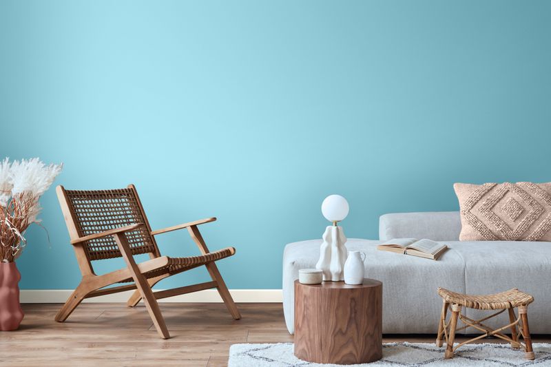
The combo of baby blue and white creates an overly saccharine nursery effect that’s difficult to escape, regardless of the room’s purpose. It lacks sophistication and maturity.
However tempting for its supposed serenity, this pairing often reads as indecisive rather than intentional. The softness of baby blue makes white look harsh in comparison, creating an unintended tension.
Navy or indigo offer similar refreshment without the infantilizing effect that makes guests wonder where you’ve hidden the crib.
7. Salmon Pink
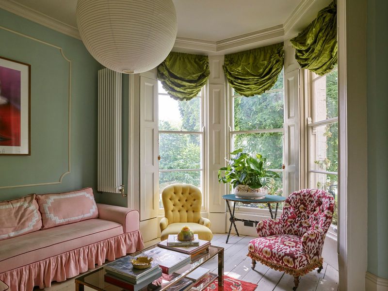
Wondering why your white walls suddenly feel like they belong in a vintage soap commercial? Pair them with salmon pink, and you’ve time-traveled straight to a 1980s bathroom.
While some call it “retro charm,” this combo usually ends up at the top of the renovation hit list.
Salmon’s warm undertones make crisp white look tired, and your space even more so.
8. Olive Green
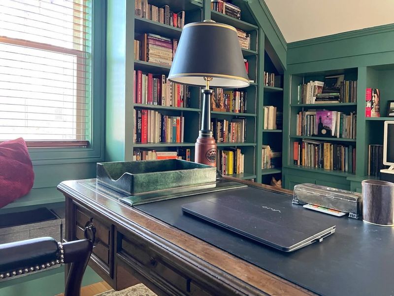
A clash of warmth and sterility can quickly turn a well-intentioned palette into something unintentionally austere.
What’s meant to evoke nature and calm often ends up feeling cold and institutional. Pairing a muted, earthy tone with stark white creates a visual tension that rarely softens with time.
The murky undertones of one seem at odds with the crisp sharpness of the other. Unfortunately, it ends resulting in a space that feels more like a government office than a serene retreat.
Many homeowners aim for organic and inviting, but instead land somewhere between utilitarian and unwelcoming.
9. Electric Purple
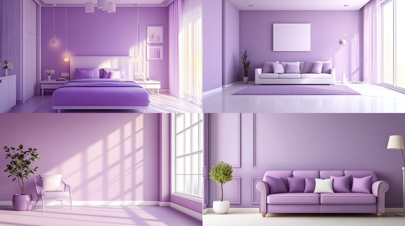
Pairing white with electric purple can turn any sophisticated space into a teenage bedroom disaster. Just think lava lamps and loud posters.
The intense purple overwhelms the crispness of white, making it look cheap and flat. Many who try this combo quickly regret it.
The glaring contrast isn’t just an eyesore; it can actually make spending time in the room uncomfortable. So, if you want a space that feels fresh and welcoming, skip the electric purple and save your eyes (and sanity).
10. Beige
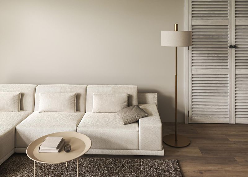
Beige paired with white creates a wishy-washy, indecisive look that fails to commit to either warmth or crispness. The combination often appears accidental rather than intentional.
Though seemingly safe, this pairing creates a flat, dimensionless space that lacks visual interest or depth. The subtle undertone differences between beiges and whites fight each other in ways visible only subconsciously.
Whenever clients suggest this combo, I urge them to either embrace true white or commit fully to warmer neutrals.
11. Bright Orange
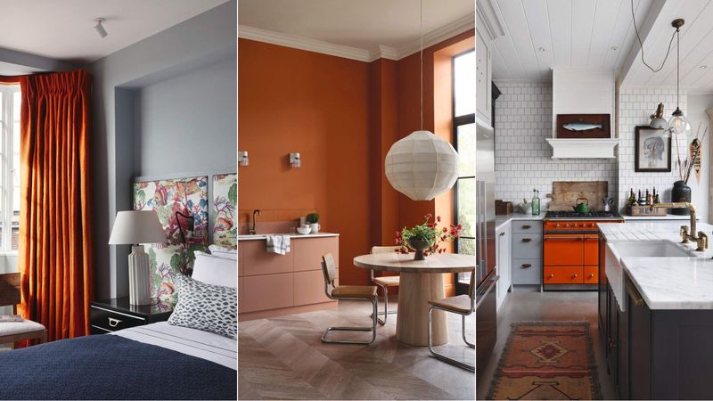
Ever wonder why bright orange and white make your home feel more like a fast-food joint than a cozy retreat? This combo screams “temporary promo space” instead of thoughtful design.
Popular in corporate settings, it rarely works in homes. The color clash creates visual tension that quickly becomes exhausting, not energizing.
Your home should be a sanctuary, not a place where someone might suddenly take your order.
12. Forest Green
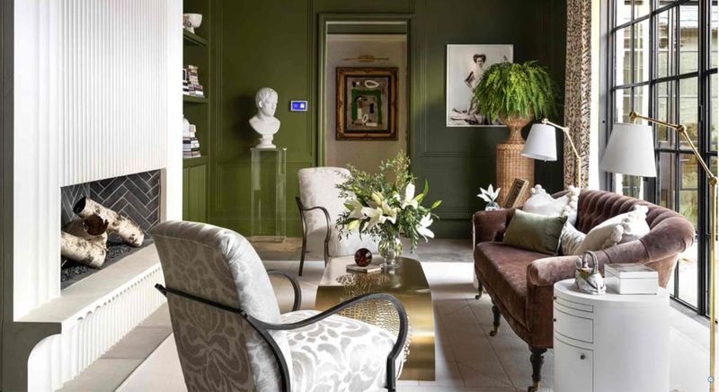
Pairing deep green with white often results in a year-round holiday vibe that’s hard to shake.
Though individually beautiful, these colors together create a holiday-specific look that feels appropriate roughly one month annually. The depth of forest green makes white appear excessively stark and artificial.
Clients who choose this combination often find themselves explaining to guests that, no, they’re not particularly festive people.
13. Taupe
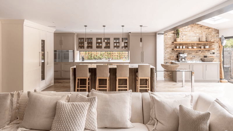
Taupe with white creates an uncertain, murky aesthetic where neither color achieves its potential. The combination often looks like a mistake rather than a choice.
The undertones in taupe frequently clash with white in subtle ways that read as unintentional. What should feel sophisticated instead feels confused.
I’ve witnessed countless clients struggle to articulate why their taupe-white spaces feel “off” despite using “designer-approved” colors. The answer lies in the fundamental incompatibility of their undertones.
14. Hot Pink
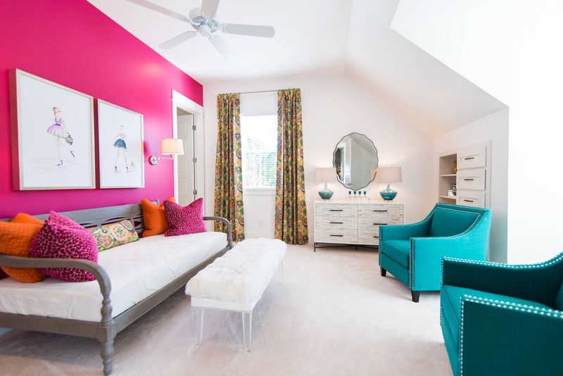
Hot pink and white together give off major kid’s playroom vibes. It definitely isn’t the sophisticated look most adults want in their homes.
Though trendy in short bursts, this pairing quickly becomes visually exhausting. The intensity of hot pink makes white look increasingly stark and clinical rather than clean and fresh.
Trust me, if you select this combination after all, you’ll find yourself repainting within a year. You’ll be tired of living in what feels like a life-sized dollhouse.
15. Lemon Yellow
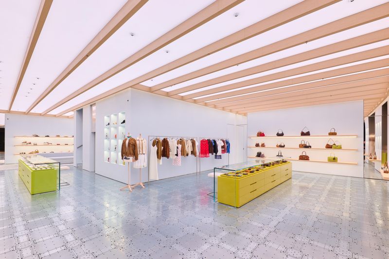
Looking to brighten up your space? Lemon yellow paired with white might actually send it straight back to the 1970s public school or government office vibe.
Though it promises cheerfulness, this combo often feels cheap and outdated. The sharp lemon yellow can even make white look dull and dingy.
Many who try this pairing find their initial joy fades fast into visual exhaustion.
16. Maroon
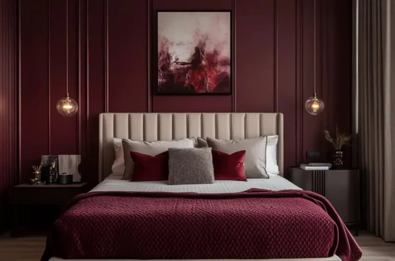
When maroon meets white, the result often echoes the vibe of a college dorm room rather than a polished living space.
Despite attempts to make it sophisticated, this pairing frequently reads as institutional rather than residential. The depth of maroon makes white look increasingly stark and utilitarian.
Whenever clients suggest this combination, I gently remind them that their home shouldn’t remind them of exam week.
17. Teal
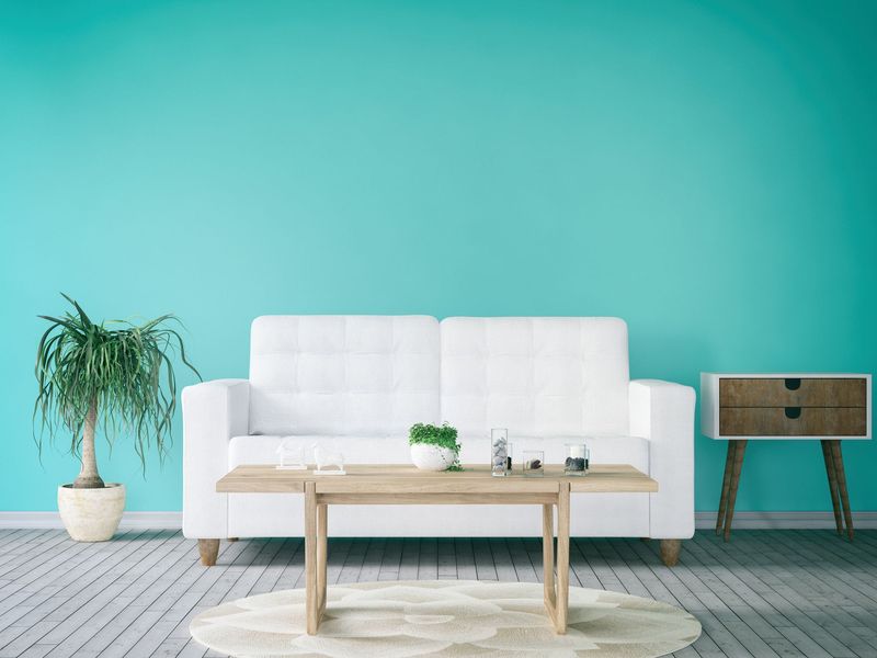
When paired together, teal and white often create a dated 1990s aesthetic that instantly ages a space. This combination evokes dentist offices and commercial interiors from decades past.
Though periodically revived, this pairing quickly reveals itself as trend-specific rather than timeless. The particular brightness of teal makes white appear flat and uninteresting.
Many clients who insist on this combination find themselves redecorating sooner than planned, tired of living in what feels like a time capsule.

