10 Furniture Colors To Ditch In 2025 And 10 That Should’ve Never Happened
2025 is staging a color intervention, and your furniture might be first in line. If you’re still clinging to that avocado green dresser or mauve microfiber sectional, it’s time for a reality check (and maybe a paintbrush).
I’ve seen it all, burnt orange bookcases, neon chairs, even couches that look like highlighters in distress. Consider this your stylish wake-up call.
I’m naming names, tossing tasteful shade, and spotlighting the colors that should actually be in your home. Ready to ditch the duds and fall for hues that won’t haunt you later? Let’s color-correct your furniture future ASAP.
1. Glossy All-White Everything
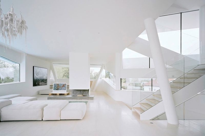
Stark, clinical all-white furniture is heading out the door. Those glossy white entertainment centers and dining sets that once signaled ‘modern’ now feel sterile and unwelcoming.
White shows every fingerprint, coffee spill, and dust particle with merciless clarity. Plus, the lack of warmth makes spaces feel like a laboratory rather than a home.
Warmer whites with texture or soft creams paired with natural elements will give you that clean look without the cold shoulder effect. Your living room should feel lived-in, not like an untouchable showroom.
2. Generic Gray Overload
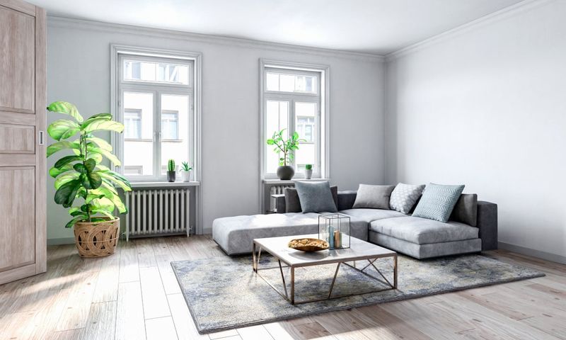
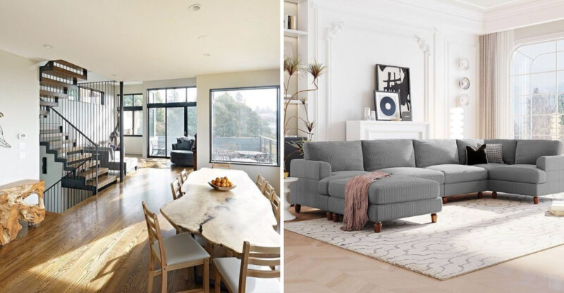
Gray had its moment as the go-to neutral, but the pendulum has swung too far. Those identical medium gray sofas in every apartment complex lobby and starter home have become the beige of our generation.
What started as sophisticated now reads as safe, boring, and lacking personality. Gray furniture blends into gray walls, creating spaces that feel flat and uninspired.
Instead, warm neutrals like camel, oatmeal, or even greige (gray-beige) offer more dimension and life. Make your furniture stand out, not blend into the wallpaper.
3. Aggressive Neon Accent Pieces
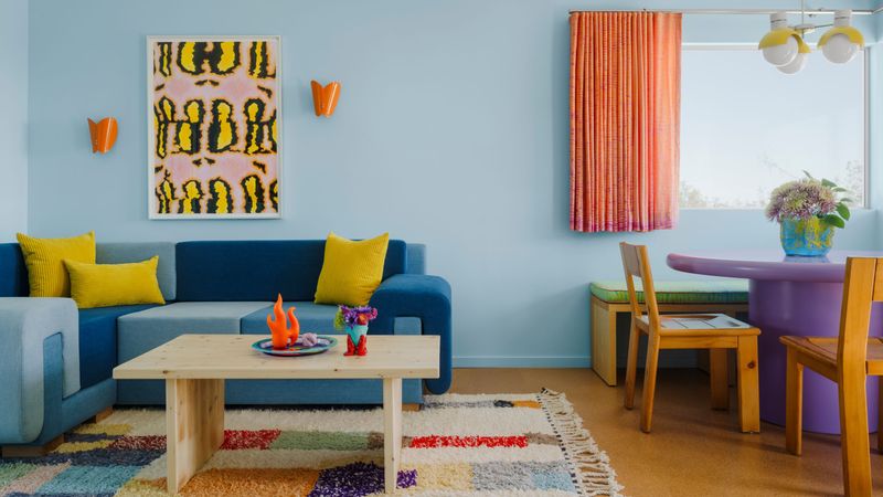
Those shocking neon orange chairs and electric lime green tables that were supposed to add “personality” are heading straight to the donation pile. Neon furniture creates visual fatigue rather than the energizing effect manufacturers promised.
Living with these pieces becomes exhausting. The initial wow factor quickly transforms into an eyesore that dominates every conversation and design choice in the room.
For bold color that won’t hurt your eyes, jewel tones like emerald, sapphire, or amethyst bring rich depth without shouting. The pieces should enhance your space, not steal the spotlight.
4. Chocolate Brown Leather Overload
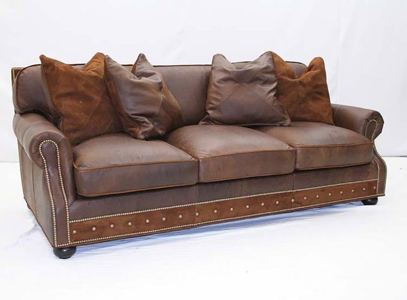
That dark chocolate brown leather sectional that dominated living rooms in the early 2000s hasn’t aged well. Heavy, masculine, and often paired with brass nailhead trim, these pieces create a dated man-cave aesthetic.
Brown leather absorbs light rather than reflecting it, making spaces feel smaller and darker. The color often clashes with today’s brighter, more versatile palettes.
Cognac, camel, or even deep olive leather offers the same durability with a fresher look. These warmer, more versatile hues play nicely with other colors while still providing that classic leather appeal.
5. Espresso Everything
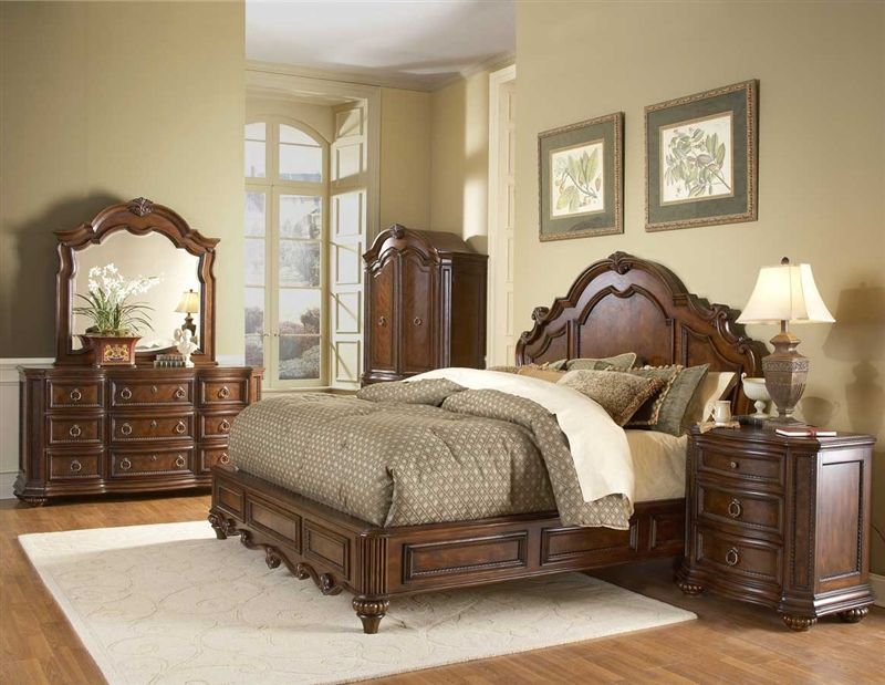
Ever feel like those matching espresso-stained bedroom sets are taking over your space? Nearly black and ultra-dark, this wood tone creates heavy, imposing silhouettes that dominate rather than complement.
Rooms filled with espresso furniture pieces feel perpetually dark and smaller than they actually are. The uniformity also removes any character or variation that makes wood special.
Natural wood tones with visible grain celebrate the material’s inherent beauty. Medium walnut, honey oak, or even ash bring warmth without the visual weight of those oppressive espresso pieces.
6. Pastel Blue Nursery Furniture
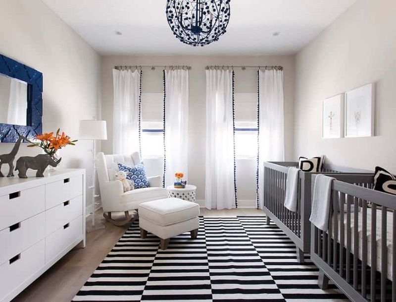
The automatic assignment of baby blue to boys’ rooms needs to end. These pastel blue cribs, dressers, and rocking chairs feel stuck in a bygone era of rigid gender norms and limited imagination.
Beyond gender stereotypes, these pieces rarely transition well as children grow. Parents end up replacing perfectly good furniture simply because the color feels too “babyish.”
Natural woods, whites, or even bold primary colors offer more versatility and longevity. Modern nurseries embrace furniture that grows with children rather than pigeonholing them into blue or pink boxes from birth.
7. Unicorn-Inspired Iridescent Pieces
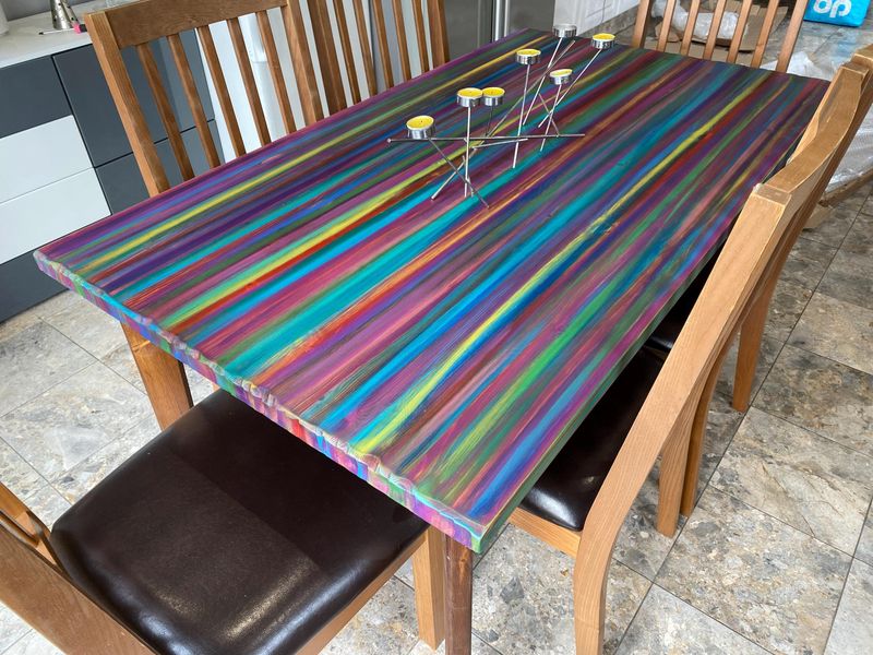
The unicorn and mermaid trend spawned furniture with color-shifting iridescent finishes that looked magical in photos but cheap in person. These holographic chairs and tables promised fantasy but delivered tacky nightclub vibes instead.
The shimmery surfaces show every fingerprint and scratch. Plus, the novelty wears off quickly, leaving you with statement pieces that no longer spark joy.
For magical quality without the kitsch, subtle mother-of-pearl inlays or furniture with genuine opalescent materials bring sophisticated shimmer. True luxury whispers rather than shouts about its presence.
8. Cherry Red Lacquer
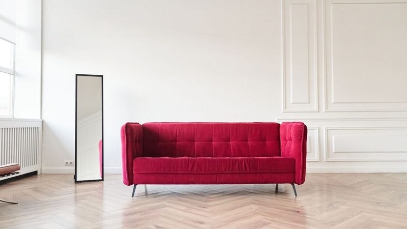
Remember the glossy cherry red lacquered pieces that were supposed to wow? Now they just scream early 2000s design fail. The intense color overwhelms rooms and fights with nearly every other design element.
Red creates psychological intensity that can feel agitating in living spaces. The high-gloss finish amplifies this effect while showing every speck of dust.
For impact without the visual assault, consider deeper burgundy or terracotta with matte finishes. The earthy reds bring warmth without dominating the conversation in your living space.
9. Chevron-Patterned Upholstery
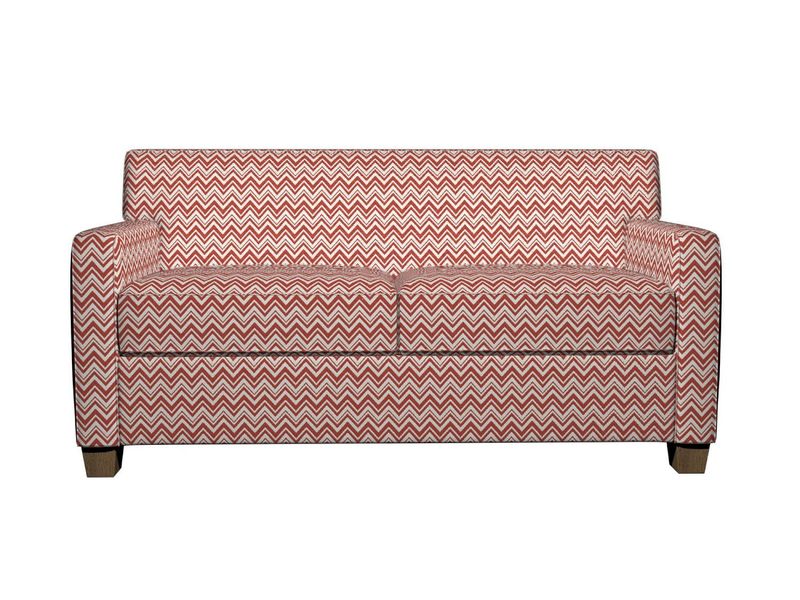
Chevron patterns in black and white or gray dominated furniture upholstery for years. Now, they’ve become the unmistakable timestamp of 2010s design, making otherwise good furniture pieces look instantly dated.
The zigzag pattern creates visual busyness that fights with other elements in your space. Once you notice it, you can’t unsee the optical illusion effect that can actually cause eye strain.
Subtle geometric patterns or textural solids offer more staying power. Your upholstery should enhance comfort and style without becoming the design equivalent of a bad tattoo you can’t easily remove.
10. Avocado Green Appliances
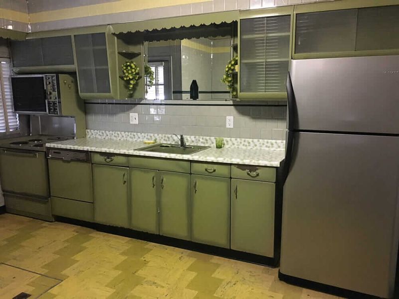
The 1970s avocado green has attempted several comebacks but should remain firmly in the past. This muddy, yellowish green made refrigerators and stoves look sickly rather than stylish.
Modern kitchens demand clean, fresh colors that enhance appetite and create a sense of cleanliness. Avocado green manages to make even brand-new appliances look second-hand and grimy.
If you’re a green lover, sage, mint, or forest green offer more sophisticated alternatives that won’t date your kitchen. These cleaner hues bring nature indoors without the unfortunate associations of their vintage predecessor.
11. Harvest Gold Everything
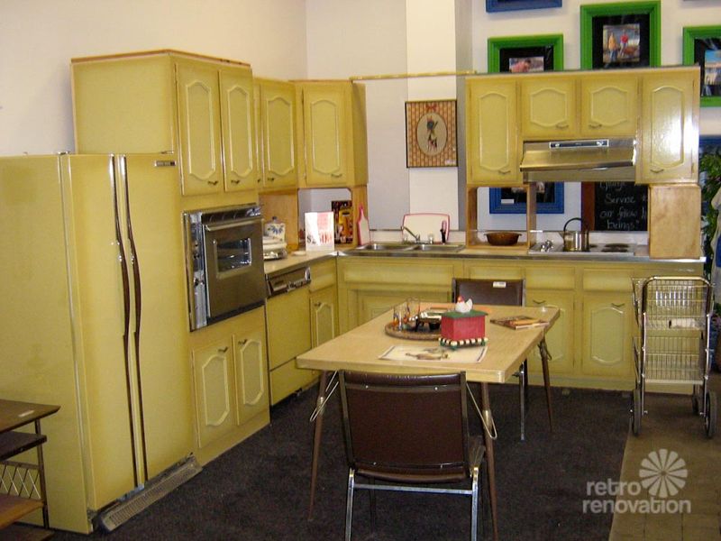
Harvest gold was the 1970s’ go-to color for furniture and appliances, but thankfully, it’s stuck in the past. This dull yellow-orange shade tends to look grimy and clashes hard with today’s sleek, modern palettes.
Gold can be gorgeous, but this particular shade managed to make even luxury materials look cheap. The color has strong associations with outdated design that are impossible to shake.
Warm metallics like brass or copper offer that golden glow without the time-capsule effect. Modern golds lean either more yellow or more bronze, avoiding that distinctive vintage mustard undertone that screams “vintage in a bad way.”
12. Overly Distressed Turquoise
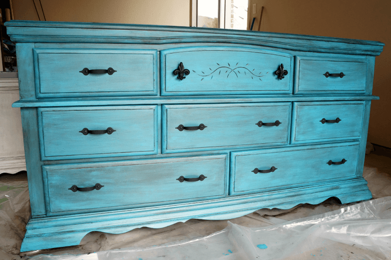
The shabby chic craze birthed countless turquoise dressers and tables with aggressive distressing that now look more shabby than chic. These pieces, with their deliberately chipped paint and artificially aged appearance, read as craft projects rather than quality furniture.
Mass-produced distressed furniture lacks the authenticity of genuinely aged pieces. The uniform “weathering” patterns look calculated rather than naturally developed over time.
Genuine vintage pieces or quality new items in solid colors have more staying power. If you love turquoise, choose a clean application of this beautiful color rather than the faux-aged version that dominated Pinterest boards circa 2012.
13. Burgundy And Hunter Green Combo
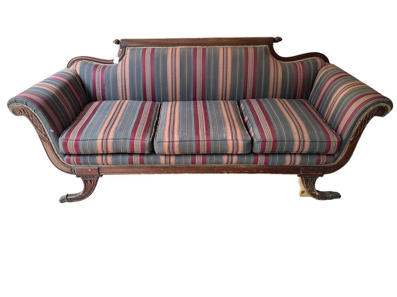
This combo dominated 1990s furniture, often appearing together on plaid upholstery with gold accents. It instantly dates a room, creating a time capsule effect rather than a timeless look.
These colors in their specific 90s incarnations have a heaviness that makes spaces feel formal and stuffy. The palette evokes country clubs and hotel conference rooms rather than modern living.
Both burgundy and green can work beautifully when updated to current versions like wine or emerald. Just avoid using them together with brass accents unless you’re specifically aiming for 90s nostalgia.
14. Millennial Pink Fatigue
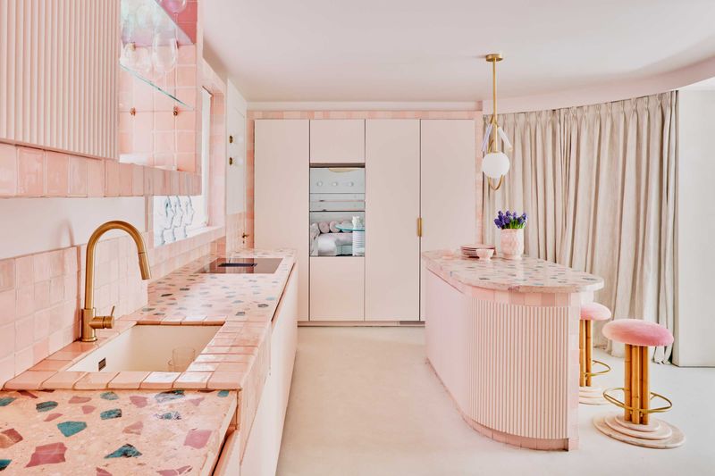
Remember when everything was bathed in that dusty blush tone? We’ve reached peak saturation with millennial pink furniture.
The once-fresh hue now reads as tired and predictable in living spaces.
Though it had a good run since 2016, this rosy shade has lost its charm. Manufacturers churned out so many pink sofas and chairs that what was once special became ordinary.
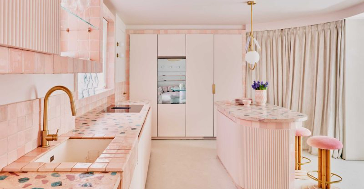
Time to embrace more sophisticated alternatives that won’t date your space so quickly. Consider sage green or terracotta for that soft vibe without the played-out feel.
15. Mauve And Dusty Blue Pairing
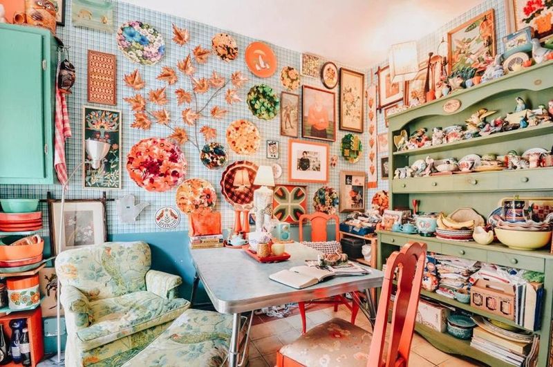
Mauve paired with dusty blue created the quintessential 1980s furniture palette that should have stayed there. These muted, slightly grayed pastels appeared on everything from sofas to bedroom sets, creating spaces that now feel depressingly dated.
The colors themselves aren’t terrible, but their specific dusty incarnations have strong associations with outdated design. They create a washed-out appearance even when brand new.
Modern purples and blues have more clarity and intensity. Lavender or navy bring similar color families into the present without the time-warp effect of their dusty predecessors.
16. Banana Yellow Laminate
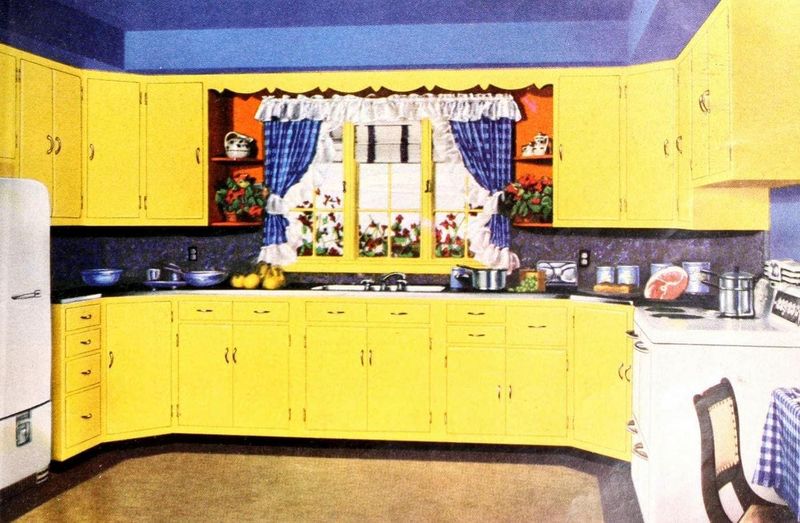
Bright banana yellow laminate countertops and furniture from the 1960s and 70s should remain firmly in vintage stores. This aggressive shade of yellow creates an overwhelming visual experience that dominates any space.
Yellow stimulates appetite and energy, but this particular tone crosses into anxiety-inducing territory. The color also shows stains and discoloration more prominently than almost any other shade.
Softer buttery yellows or rich mustards offer warmth without the visual assault. For those who crave yellow’s sunny vibe, go for a classy shade that brightens without hijacking the room!
17. Peach And Mint Combination
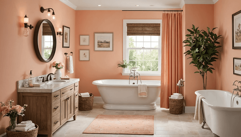
Who thought peach and mint green were a winning combo for ’80s bathrooms and bedrooms? Spoiler: it’s a pastel time capsule you might want to skip!
These specific tones have become so strongly associated with their era that they can’t escape their dated connotations. The colors themselves aren’t bad, but their particular 80s incarnations feel stale.
Modern versions of these colors lean either more saturated or more neutral. Coral instead of peach, sage instead of mint create similar effects without the throwback vibe.
18. Country Blue With Heart Motifs
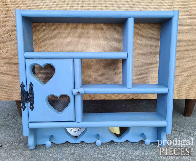
Country blue furniture adorned with heart cutouts and stenciled motifs represents a particularly unfortunate chapter in American design history. This specific shade of medium blue paired with cutesy decorative elements creates a dated farmhouse look.
The combination feels overly precious and theme-y rather than stylish. These pieces often came as matching sets that transformed entire rooms into country-kitsch wonderlands.
Modern farmhouse style uses cleaner lines and more sophisticated blues. Want a true country vibe? Choose simpler silhouettes and skip heart cutouts that scream “1990s craft fair.”
19. Salmon Pink Bathroom Fixtures
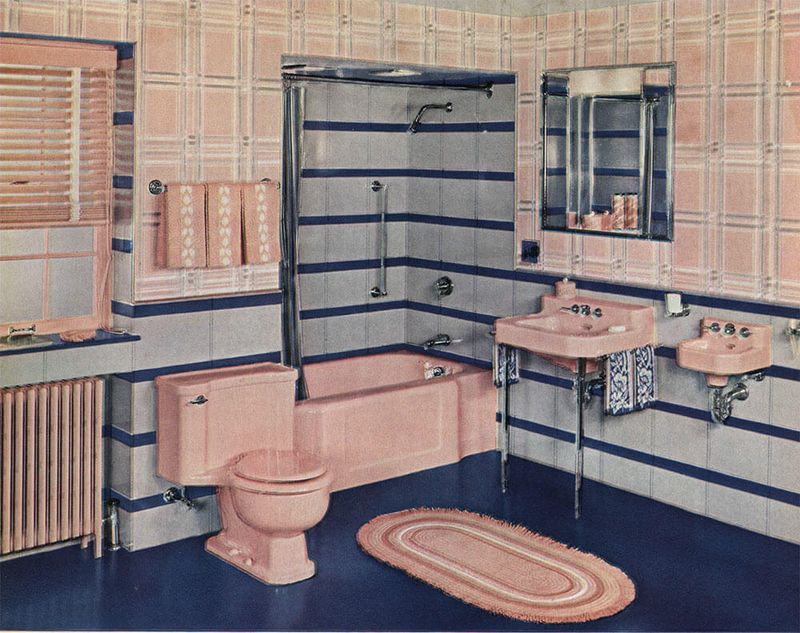
Going pink in the wrong way? Salmon pink toilets and tubs from the ’50s belong in vintage museums, not modern bathrooms!
Unlike some vintage colors that can look intentionally retro-cool, salmon bathroom fixtures just look like they haven’t been replaced in 70 years. The color shows every water stain and discoloration.
White fixtures provide timeless simplicity, while true statement colors like navy or matte black offer modern drama. Salmon manages to be simultaneously statement-making and dated, achieving the worst of both worlds.
20. Orange-Brown Wood Paneling
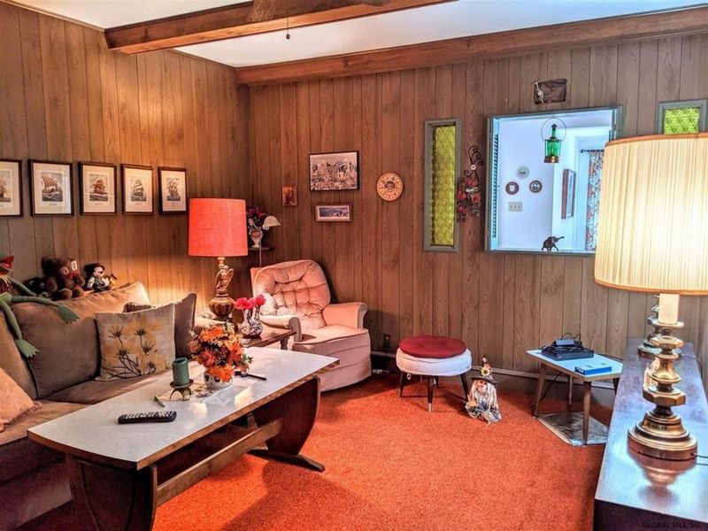
That distinctive orange-brown wood paneling that covered walls and furniture throughout the 1970s remains one of design’s greatest regrets. This specific tone managed to make even real wood look fake and dated.
The color has an artificial warmth that reads as cheap rather than cozy. When used on furniture, it creates heavy pieces that dominate rooms in the worst possible way.
Natural wood tones with visible grain patterns offer timeless appeal. If you inherit pieces in this distinctive orange-brown, consider refinishing or painting them to break free from their dated origins.

