9 Guidelines To Help You Use Color Harmony In Your Home Design
Have you ever painted a room, only to realize the colors you chose don’t look as good together as you imagined? Finding the right balance between shades, tones, and accents can feel tricky, but mastering color harmony is the key to creating spaces that feel both stylish and inviting.
With a few simple guidelines, you can choose colors that complement each other, flow naturally from room to room, and reflect your personal style. In this article, we’ll walk through nine practical tips to help you bring color harmony into your home design with confidence.
These guidelines are for general design purposes and should be adjusted to fit your personal taste, lighting, and home layout.
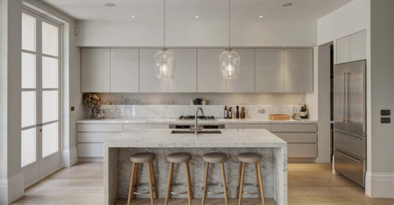
1. Choose A Cohesive Color Palette
Start with colors that naturally complement each other rather than fighting for attention. A cohesive palette creates the foundation for your entire space, making furniture and décor selections infinitely easier.
I always recommend looking at color wheel relationships, complementary, analogous, or triadic schemes work wonders. My clients who begin with a thoughtful palette avoid costly mistakes and endless paint sample testing.
2. Follow The 60-30-10 Rule
This classic designer trick never fails! Dedicate 60% of your space to a dominant color (walls, large furniture), 30% to a secondary color (accent furniture, curtains), and 10% to an accent color (accessories, artwork).
The 60-30-10 rule provides balance while preventing any single color from overwhelming the space. When clients struggle with proportions, I sketch their room with these percentages marked and suddenly everything clicks into place!
3. Consider Undertones When Pairing Colors
Hidden undertones can make or break your color scheme! That “perfect white” might actually have yellow, pink, or blue undertones that clash with other elements in your room.
Hold samples against a pure white background to reveal their true undertones. Yesterday I saved a client from pairing a creamy yellow-undertone white with cool blue furniture, disaster averted! Remember that natural light exposes undertones more clearly than artificial lighting.
4. Use Neutrals As A Grounding Base
Neutrals aren’t boring, they’re your best friends! Whites, beiges, grays, and blacks provide breathing room for your eyes and prevent color overload.
Strong colors need neutral companions to shine without competing. I once transformed a chaotic rainbow-colored living room by introducing a sophisticated gray sofa and white shelving. The colorful accessories suddenly looked intentional rather than overwhelming.
5. Add Contrast With Accent Colors
Where’s the fun without a little pop? Accent colors inject personality and create focal points that draw the eye exactly where you want it.
Choose accent colors that contrast with your main palette but still harmonize. For a recent beach house project, we used a serene blue-gray scheme with unexpected coral accents that perfectly captured that sunset-over-water magic. Limit yourself to 2-3 accent colors to maintain cohesion.
6. Repeat Colors Throughout The Space For Flow
Think of color as a conversation between rooms! When colors from one space echo in another, your home feels cohesive rather than chopped up into disconnected boxes.
Take your accent color from the living room and use it as a secondary color in the adjoining dining area. Last month, I connected a client’s disjointed rooms by threading a specific shade of teal through throw pillows, artwork, and a statement chair. Suddenly her home had a story to tell!
7. Factor In Natural And Artificial Lighting
Colors shape-shift throughout the day! That perfect gray can look purple at sunset or green under fluorescent lights.
Test paint samples on different walls and check them at various times. I always remind clients that north-facing rooms receive cooler light while south-facing rooms get warmer light.
One homeowner almost abandoned her dream blue because it looked too green until we swapped her light bulbs from cool to warm white.
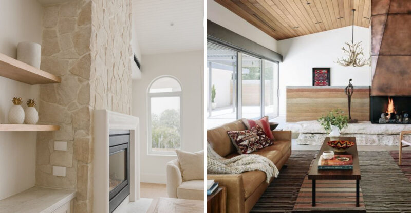
8. Balance Warm And Cool Tones
Mixing temperature creates dynamic, inviting spaces! Warm colors (reds, yellows, oranges) bring energy while cool colors (blues, greens, purples) add calmness.
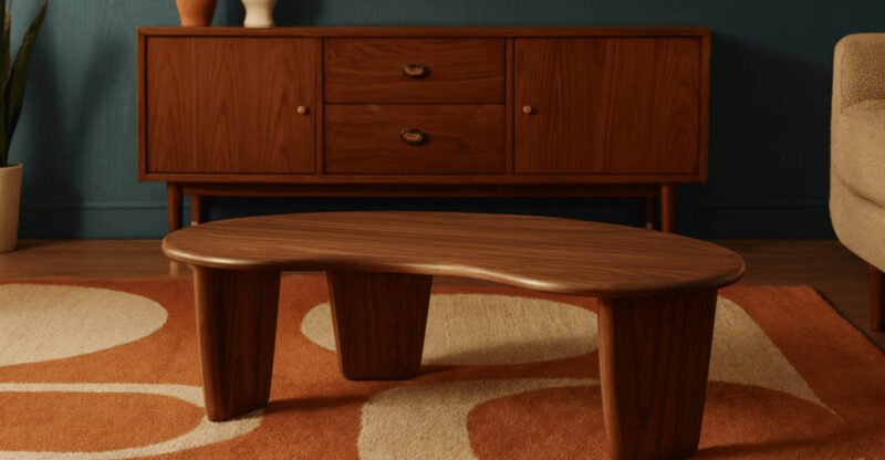
Too much of either extreme makes rooms feel unbalanced. My favorite transformation was adding warm wood furniture and amber lighting to a predominantly blue bedroom.
The client called it “finally feeling right” after years of something being “off.” Your eye naturally seeks this temperature balance.
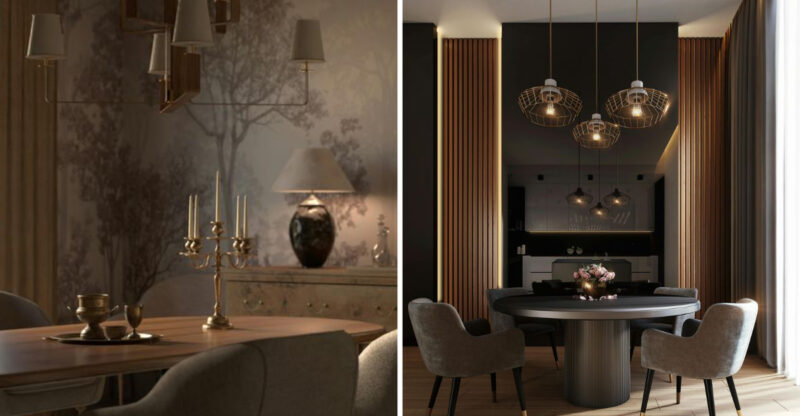
9. Incorporate Texture And Pattern To Enhance Color Depth
Flat color is just the beginning! Textures and patterns add dimension that transforms simple color schemes into rich, layered experiences.
Even monochromatic rooms come alive with varied textures. My favorite trick is mixing a velvet sofa, woven throw, and glossy ceramic lamp in the same color family.
Pattern scale matters too, pair large-scale patterns with medium and small ones for balance without overwhelming the eye.

