9 Interior Color Ideas That Could Dominate Design In 2026 And Later
Color trends in interior design are constantly evolving, reflecting our changing lifestyles and cultural shifts.
Looking ahead to 2026 and beyond, we’re seeing exciting new palettes emerging that combine sustainability, technology, and emotional wellbeing. These upcoming color trends aim to create spaces that support mental health, foster a connection with nature, and adapt to flexible living arrangements.
Keep in mind that personal preference, lighting, and room function can influence how these colors appear and feel in your home.
1. Warm Beige Tones
After years of cool grays dominating interiors, warm beige is making a spectacular comeback with a modern twist. These earthy neutrals create a sense of comfort that people are craving in an increasingly digital world.
What makes these new beiges special is their versatility they pair beautifully with both vibrant accents and other neutrals. I’ve noticed how these tones create a perfect backdrop for natural textures like wood, rattan, and linen.
Did you know beige actually stimulates the production of oxytocin, the ‘feel-good hormone’? This neurological connection explains why spaces with warm beige feel instantly welcoming and calming something we’ll all need more of in our hectic future lives.
2. Soft Sage Green
Soft sage green represents our growing desire to bring the healing power of nature indoors. This gentle, muted green has evolved beyond trend status to become a new neutral that works in virtually any room.
Biophilic design principles suggest that connection with nature improves our wellbeing, and sage green delivers this benefit without overwhelming the senses. I recommend pairing it with natural woods, cream textiles, and hints of brass for a balanced look that feels both timeless and forward-thinking.
Though sage has been around for centuries, its resurgence speaks to our collective need for spaces that feel grounding and restorative qualities we’ll seek even more as technology continues advancing in our daily lives.
3. Muted Terracotta
Muted terracotta is rapidly gaining popularity as people seek authentic connections to earth and history in their homes. This subdued reddish-brown tone brings immediate warmth without the intensity of brighter oranges or reds.
If you’re looking to incorporate this color, consider it for kitchen cabinets, accent walls, or textiles. The beauty of modern terracotta lies in its versatility it works equally well in minimalist spaces and more eclectic, layered interiors.
Ancient civilizations across the globe used terracotta in their homes and art, giving this color a timeless quality that transcends passing trends. Its cultural significance combined with its natural warmth makes it particularly appealing for our increasingly digital future where authentic materials provide welcome contrast.
4. Deep Navy Blue
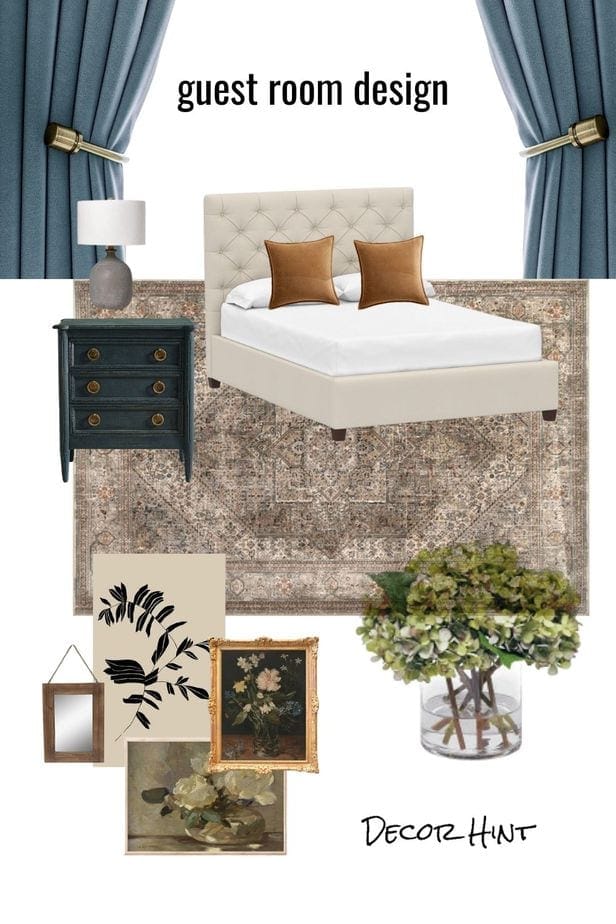
Deep navy blue offers a sophisticated alternative to black that brings dramatic depth without the heaviness. This rich, timeless hue creates instant elegance while providing a perfect backdrop for both neutrals and metallics.
Where could you use navy? I’ve seen stunning applications on kitchen islands, bathroom vanities, and statement walls. The key to working with this bold color is balance pair it with lighter elements and plenty of texture to keep spaces feeling dynamic rather than dark.
Navy’s historical connections to maritime traditions and military precision give it an inherent sense of authority and calm. As we move toward more intentional design choices, this blue’s ability to impart confidence while remaining versatile will cement its place in future-forward interiors.
5. Dusty Rose
Dusty rose has evolved from its millennial pink predecessor into something more sophisticated and enduring. This muted, slightly grayish pink brings unexpected warmth without feeling overly feminine or trendy.
Many designers are using dusty rose as a new neutral, pairing it with charcoals, creams, and natural woods for balance. I particularly love this color in textiles and upholstery where it adds subtle interest without dominating the space.
Research shows that certain shades of pink can have a calming effect on our nervous systems perhaps explaining why this color feels so comforting. As we continue seeking emotional resonance from our spaces, dusty rose offers a perfect blend of nostalgia and forward-thinking sophistication that will carry it well into the next decade.
6. Charcoal Gray
Charcoal gray has transcended its status as just another neutral to become a sophisticated foundation color for forward-thinking interiors. Unlike the cooler grays of previous decades, today’s charcoal has rich undertones that create depth and visual interest.
When using charcoal, consider it for architectural elements like window frames or built-ins rather than entire walls. This approach creates dramatic contrast without overwhelming the space. I’ve found that pairing charcoal with natural elements like wood, leather, and plants creates a perfect balance of urban sophistication and organic warmth.
Are you worried about charcoal feeling too dark? The key is thoughtful lighting incorporate multiple light sources at different heights to create layers of illumination that highlight the nuanced beauty of this complex color.
7. Crisp White
Crisp white is evolving beyond its minimalist associations to become more nuanced and intentional. The whites gaining traction have subtle undertones barely-there hints of green, blue, or yellow that shift with changing light throughout the day.
How do you choose the right white? Consider your room’s natural light sources and existing elements like flooring. North-facing rooms benefit from whites with warm undertones, while south-facing spaces can handle cooler whites without feeling sterile.
Did you know that different cultures associate white with different meanings? In Western traditions it represents purity, while in some Eastern cultures it symbolizes mourning. This cultural richness adds depth to what might seem like a simple color choice. As technology increasingly fills our homes, white’s ability to provide visual rest will make it more valuable than ever.
8. Golden Yellow
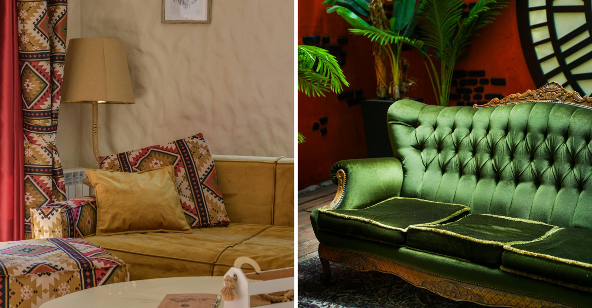
Golden yellow is emerging as the perfect antidote to years of safe, neutral interiors. This rich, amber-tinged hue brings immediate warmth and optimism to spaces without the intensity of brighter yellows.
Where should you use this bold color? I recommend starting with smaller applications a painted door, kitchen cabinets, or upholstered furniture before committing to larger areas. Golden yellow pairs beautifully with deep blues, forest greens, and warm neutrals for a balanced palette.
Historically, yellow pigments were among the most expensive and difficult to produce, making them symbols of prosperity in many cultures. This heritage adds a subtle layer of luxury to spaces featuring golden yellow. As we seek more emotional connection from our homes, this color’s inherent joyfulness will make it increasingly desirable.
9. Rich Emerald Green
Rich emerald green brings luxurious depth and natural connection to interiors. This jewel tone has evolved from accent status to become a statement color that works surprisingly well as a new neutral when paired thoughtfully.
If you’re hesitant about using such a bold hue, start with velvet upholstery or textiles before committing to painted surfaces. The dimensional quality of emerald creates different effects throughout the day as light changes, keeping spaces feeling dynamic and alive.
Ancient cultures associated emerald with abundance, renewal, and prosperity meanings that resonate powerfully today. As biophilic design principles become more mainstream, emerald’s direct connection to lush plant life makes it particularly appealing. This color satisfies our desire for spaces that feel both grounded in nature and distinctly sophisticated.
