31 Kitchen Elements That Designers Wish Would Disappear For Good
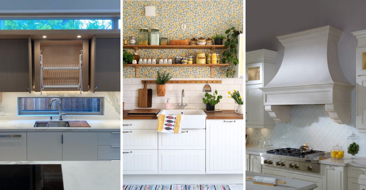
Kitchens have evolved dramatically over the years, but some design elements refuse to fade away gracefully.
Interior designers constantly battle against outdated features that compromise both functionality and aesthetics in what should be the heart of your home.
From impractical materials to awkward layouts, these kitchen elements not only look dated but often make cooking and cleaning unnecessarily difficult.
1. Popcorn Ceilings
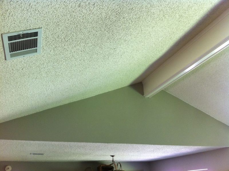
Remember those bumpy, cottage-cheese-looking ceilings that were all the rage in the 70s? They’re still lurking in kitchens across America, collecting grease, dust, and spider webs with alarming efficiency.
Professional designers cringe at these textured nightmares because they’re nearly impossible to clean properly in a kitchen environment. Cooking steam and grease particles cling to every little bump, gradually turning the once-white surface into a dingy, yellowed mess.
Beyond the practical issues, popcorn ceilings instantly date your kitchen and create visual heaviness overhead. Modern kitchen design favors clean, smooth ceiling surfaces that reflect light and create an airy, open feeling.
2. Fluorescent Tube Lighting
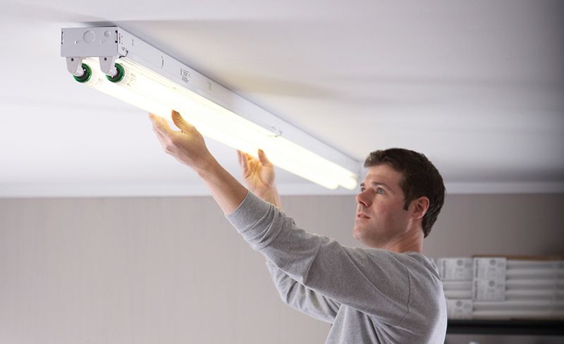
Harsh, buzzing fluorescent tubes cast an unflattering greenish glow that makes even the freshest ingredients look unappetizing. These institutional-style fixtures were once popular for their brightness and efficiency, but they’ve become the lighting equivalent of nails on a chalkboard for designers.
The cold, clinical light they produce creates harsh shadows and distorts colors, making your beautiful granite countertop look dull and your fresh produce appear lifeless. Plus, the constant flickering and humming can trigger headaches and eye strain.
Modern kitchens benefit from layered lighting a mix of recessed cans, pendant fixtures, and under-cabinet LEDs that provide both task lighting and ambiance without the institutional feel of fluorescent tubes.
3. Busy Granite Patterns
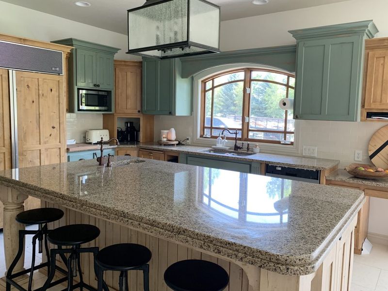
Those speckled, multi-colored granite countertops that exploded in popularity during the early 2000s are now giving designers serious headaches. While granite itself remains a quality material, those particular busy patterns with gold, brown, and black specks create visual chaos in kitchens.
When paired with patterned backsplashes or detailed cabinetry, these busy surfaces fight for attention and make spaces feel cluttered even when they’re perfectly tidy. Food crumbs and spills also become nearly impossible to spot against the busy background.
Today’s designers prefer cleaner, more uniform countertop materials like honed granite in solid colors, quartz with subtle veining, or even butcher block that complement rather than compete with other kitchen elements.
4. Overly Themed Backsplashes
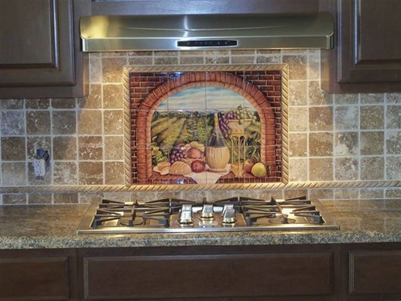
Those fruit basket motifs and Tuscan vineyard scenes splashed across kitchen backsplashes are making designers reach for the sledgehammer. Once considered charming and personalized, these overly themed tile murals now read as dated and kitschy rather than classic.
Beyond their aesthetic issues, these busy backsplashes tend to visually shrink your kitchen space and quickly become overwhelming. The detailed imagery often clashes with other design elements and makes the kitchen feel less cohesive.
Most concerning to designers is how quickly these themed elements become tiresome unlike a simple, timeless backsplash that you can live with for decades. Replacing a backsplash is messy and expensive, making this trend particularly problematic when homeowners inevitably tire of looking at the same scene day after day.
5. Drop Ceilings
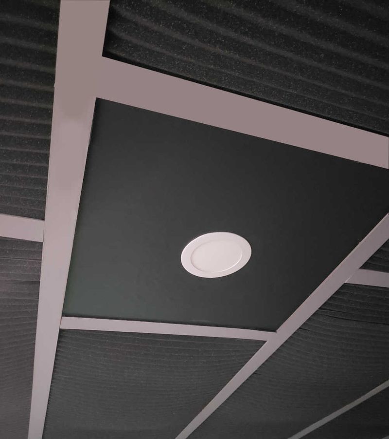
Nothing screams “office building from 1985” quite like drop ceilings with their telltale grid pattern and stained acoustic tiles. Yet somehow, these commercial fixtures found their way into residential kitchens, where they continue to lower both ceiling heights and property values.
Designers particularly hate how these systems collect cooking grease in their porous surfaces and develop unsightly water stains over time. The metal grid lines create artificial boundaries that chop up the visual flow of your kitchen, making even spacious rooms feel confined and dated.
While they may have once seemed practical for hiding pipes or wiring, modern kitchen design embraces architectural details rather than concealing them. Today’s designers prefer to work with the home’s structure, incorporating exposed beams or creating coffers rather than installing these commercial-looking systems.
6. Dark Wood Cabinets Throughout
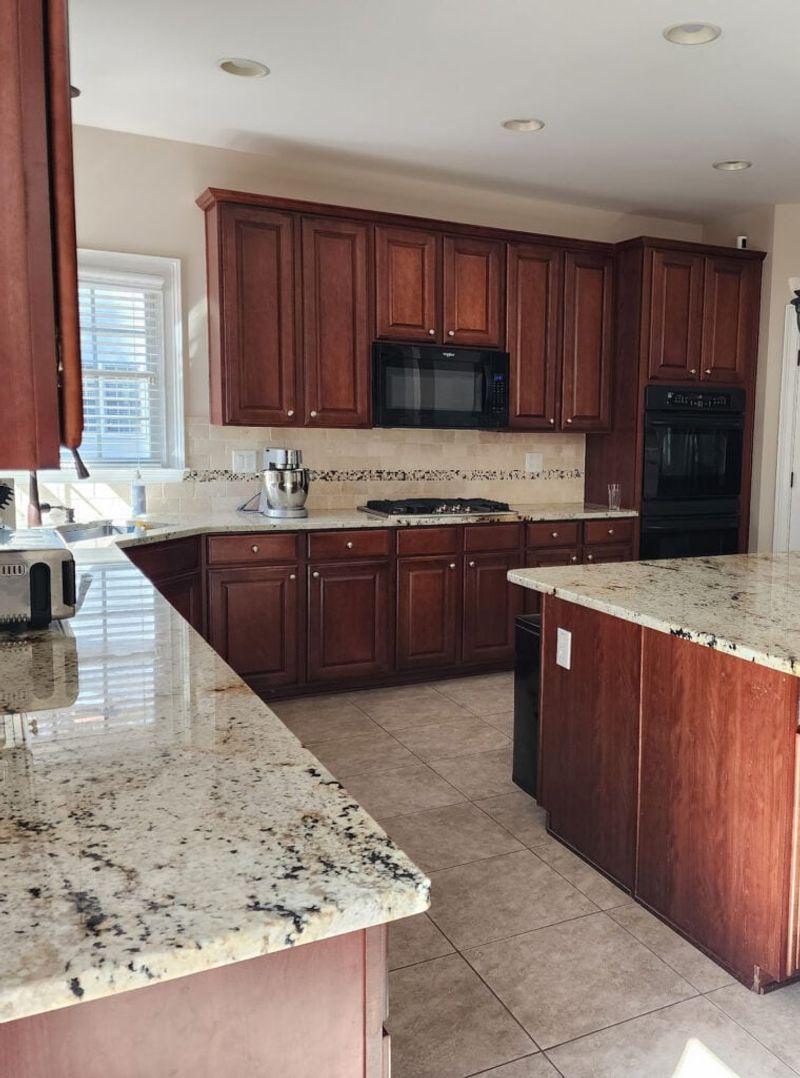
Heavy, dark wood cabinets that stretch from floor to ceiling are the kitchen equivalent of wearing a black wool suit to the beach. They absorb light rather than reflect it, creating a cave-like atmosphere that makes even spacious kitchens feel cramped and gloomy.
What frustrates designers most is how these cabinets dominate the visual weight of the room, especially when installed on every wall. The overwhelming darkness makes it difficult to create balance with other elements and often requires excessive artificial lighting to compensate for the light-sucking effect.
Modern kitchen design favors a more thoughtful approach to cabinetry, perhaps using darker tones as accents on a kitchen island while keeping perimeter cabinets lighter. This creates depth and interest without the dungeon-like feel of all-dark cabinetry.
7. Vinyl Countertops
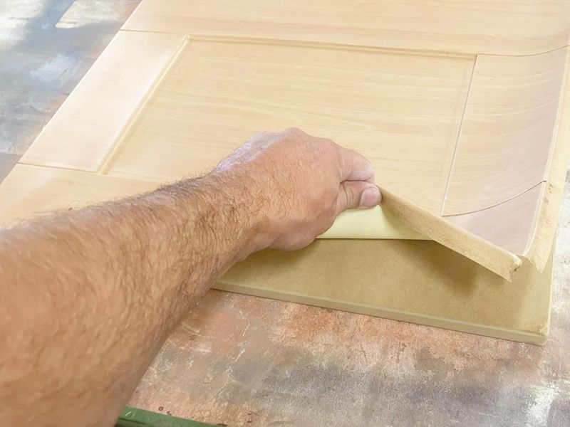
Those roll-out vinyl countertops with the fake wood grain or speckled pattern are the polyester leisure suits of kitchen design. Popular in the 1970s for their affordability, they’ve stubbornly persisted in kitchens despite their numerous practical and aesthetic shortcomings.
Designers particularly dislike how these surfaces bubble and peel near seams and sink edges, creating not just an eyesore but a haven for moisture and bacteria. The material scratches easily, burns on contact with hot pans, and often sports those telltale black scorch marks near the stove.
Even worse, the visible seams where pieces meet create an inevitable weak point that eventually fails, allowing water to penetrate and damage the substrate. Modern alternatives like laminate have improved dramatically in quality and appearance, making vinyl countertops truly obsolete.
8. Carpeted Floors
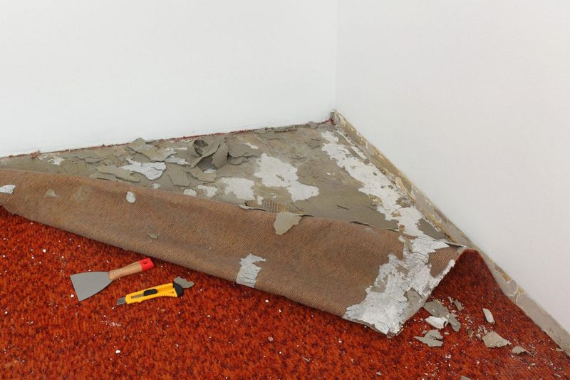
Yes, carpet in kitchens was actually a thing—and unfortunately still exists in some homes today. This puzzling design choice ranks among designers’ top kitchen nightmares for obvious reasons: spills, crumbs, and moisture are inevitable in cooking spaces.
Food particles work their way deep into carpet fibers, creating breeding grounds for bacteria and attracting pests no matter how diligently you vacuum. Liquids that inevitably spill during cooking and dining quickly penetrate to the padding and subfloor, potentially causing mold and structural damage.
Beyond the practical nightmare, carpeted kitchens create a visual disconnect that feels jarring in modern homes. Today’s designers favor hard surfaces like tile, hardwood, or luxury vinyl plank that can withstand kitchen activities while providing both beauty and practicality.
9. Mismatched Appliance Finishes
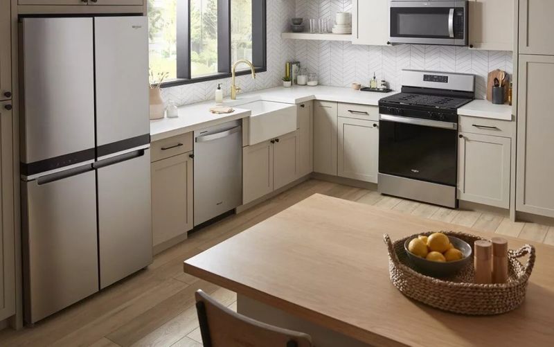
Walking into a kitchen with a stainless steel refrigerator, a black dishwasher, and a white stove makes designers visibly wince. This hodgepodge approach to appliance finishes creates visual chaos and instantly signals a kitchen that’s been updated piecemeal rather than thoughtfully designed.
The lack of cohesion draws attention to individual appliances rather than allowing them to recede into a harmonious overall design. Each time an appliance fails, homeowners face the dilemma of matching existing pieces (which may no longer be available) or adding yet another finish to the mix.
Modern kitchen design treats appliances as a cohesive suite rather than individual purchases. Even budget-friendly kitchens benefit enormously from consistent finishes that create a pulled-together look, whether that’s all stainless, all black, or integrated behind cabinet panels.
10. Plastic Drawer Pulls
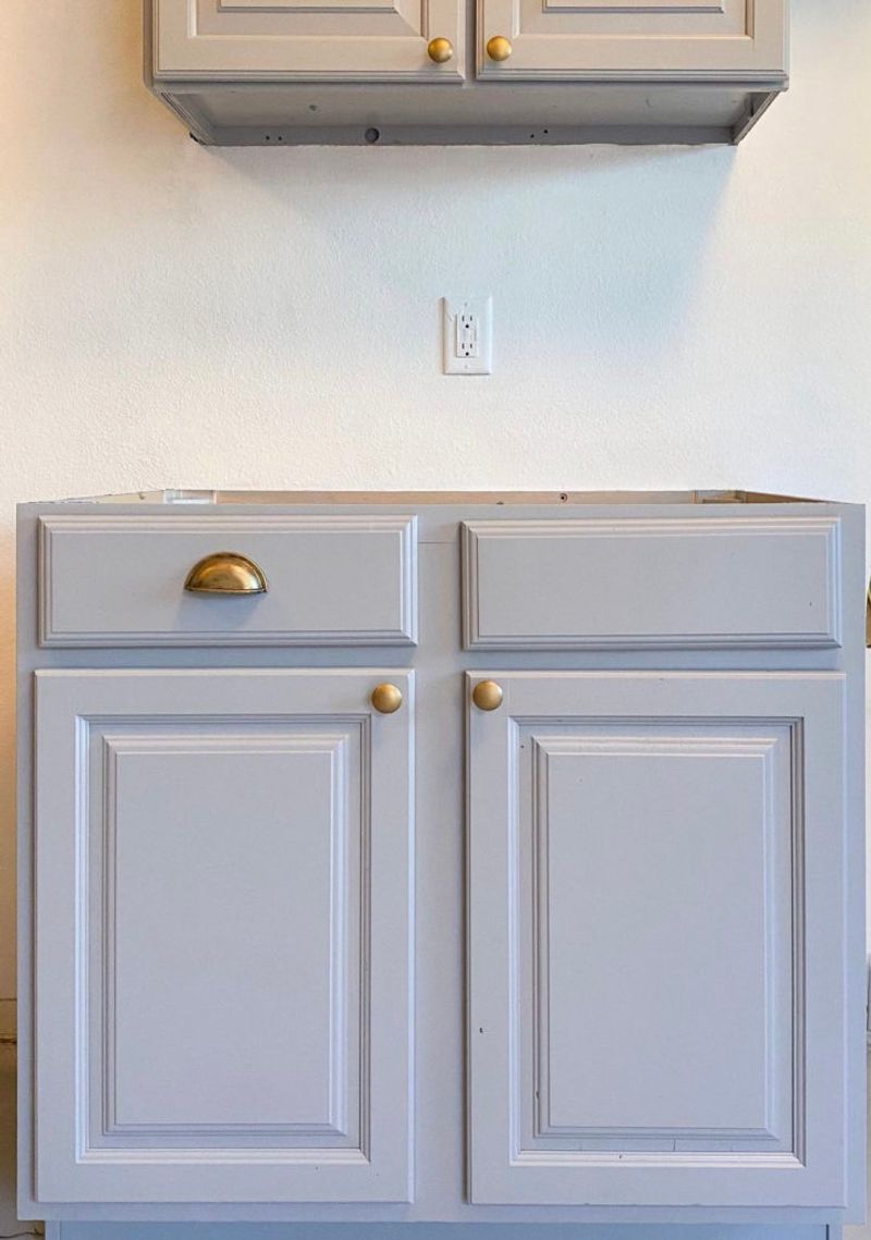
Those flimsy, yellowing plastic drawer pulls and cabinet knobs that come standard with budget cabinetry make designers cringe on sight. Often installed as temporary hardware that somehow became permanent, these lightweight pieces instantly cheapen the appearance of even well-made cabinets.
Beyond their unappealing looks, plastic pulls typically develop an unpleasant tackiness over time as cooking grease and hand oils penetrate the porous material. Many develop hairline cracks or break entirely after years of use, leaving homeowners with the challenge of finding matching replacements for an outdated style.
Hardware functions as the jewelry of your kitchen, and designers know that swapping out these plastic pieces for metal, ceramic, or glass alternatives is one of the most affordable yet impactful upgrades possible. Even basic cabinets look significantly more upscale with quality hardware.
11. Wall-to-Wall Open Shelving
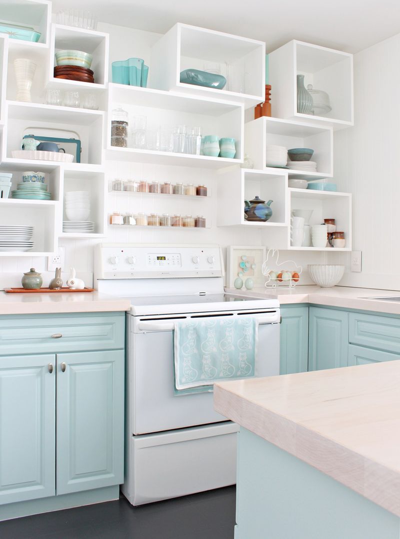
The Instagram-fueled trend of replacing all upper cabinets with open shelving has become a practical nightmare that designers increasingly advise against. While a limited section of open shelving can add display space and visual interest, the all-open approach quickly becomes problematic in real-life kitchens.
Everyday dishes and glasses collect dust and cooking grease when constantly exposed, requiring frequent washing even when unused. The visual clutter of seeing every mug, plate and bowl can quickly overwhelm a space, especially in smaller kitchens or for those without perfectly coordinated dishware collections.
Most frustrating to designers is the significant storage loss compared to traditional cabinets, forcing homeowners to store overflow items elsewhere or maintain a minimalist collection that may not meet their actual needs. A balanced approach with some closed storage remains far more practical.
12. Faux-Timber Posts
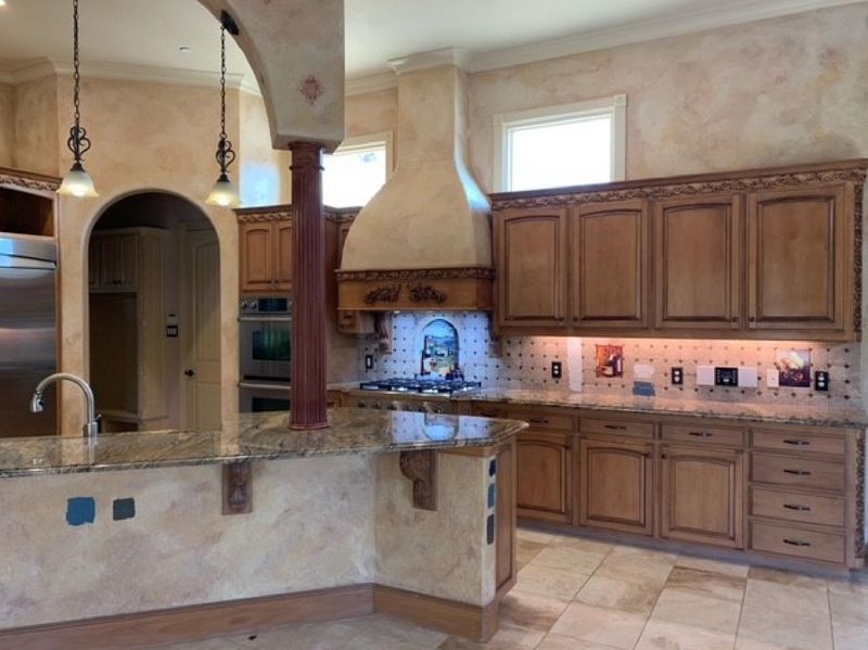
Those hollow, fake wood columns that don’t actually support anything structural make professional designers visibly wince. Often installed during 1990s kitchen renovations to create a vaguely Tuscan or Mediterranean feel, these purely decorative elements eat up valuable floor space while serving no practical purpose.
What makes these features particularly egregious is how obviously fake they appear, with their perfectly uniform “grain” patterns and hollow sound when tapped. Many are installed in locations that make no architectural sense, like randomly placed along a kitchen island or awkwardly protruding from a wall.
Modern kitchen design favors authentic structural elements when support is needed or clean, uninterrupted sight lines when it’s not. If architectural interest is desired, designers now incorporate actual wooden beams or genuine materials rather than these unconvincing imitations.
13. Mirrored Backsplashes
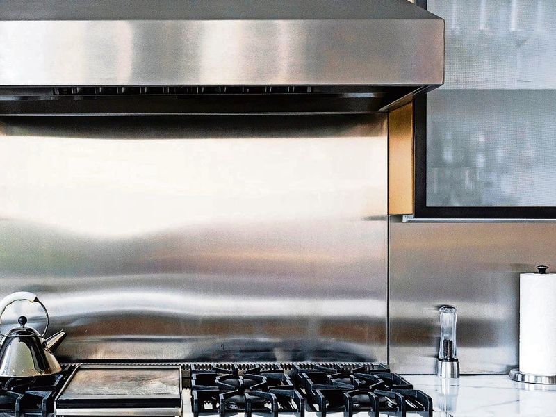
Mirrored backsplashes behind stoves and countertops create a special kind of maintenance nightmare that designers universally condemn. Popular in the 1980s for their perceived ability to make small kitchens look larger, these reflective surfaces quickly become the most high-maintenance feature in the home.
Every fingerprint, water spot, and grease splatter shows with merciless clarity on mirrored surfaces. The area behind the stove becomes particularly problematic, with cooking splatters requiring constant attention to prevent a permanently streaked appearance.
Beyond the practical issues, the harsh reflectivity creates uncomfortable glare when under-cabinet lighting is installed. Modern designers favor backsplash materials that offer both beauty and practicality—like ceramic tile, stone, or even tempered glass—that won’t turn your cooking area into a full-time cleaning project.
14. Ultra-Gloss Cabinet Finishes
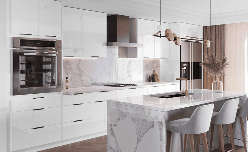
Those high-gloss, super-shiny cabinet finishes that reflect light like a mirror might look sleek in showrooms but quickly become a maintenance nightmare in real kitchens. Every fingerprint, water droplet, and dust particle shows with crystal clarity on these unforgiving surfaces.
Designers particularly dislike how these finishes amplify even minor imperfections in the cabinet doors themselves. Any slight warping, joint separation, or surface irregularity becomes glaringly obvious under the reflective finish, problems that would be nearly invisible with a more forgiving satin or matte surface.
While briefly popular for their contemporary look, these finishes have proven impractical for family kitchens where constant cleaning becomes necessary to maintain their intended appearance. Modern design increasingly favors more subtle finishes that look beautiful without requiring obsessive maintenance.
15. Corner Lazy Susan Overload
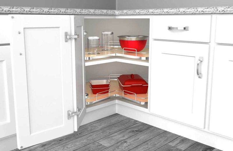
Corner lazy Susans seemed like storage genius when they first appeared, but designers now view these spinning nightmares as outdated kitchen solutions. The circular shelves waste significant space with their round shape in square corners, and items frequently fall off the back, creating a graveyard of forgotten spice bottles and cake mixes.
Most frustrating is how these mechanisms inevitably break down over time. The spinning mechanism sticks, the bearings wear out, or the shelves tilt at awkward angles, making access more difficult than helpful. Items stored toward the center become nearly impossible to identify without removing everything in front.
Modern kitchen design offers far better corner solutions, including pull-out shelving systems, specialized corner drawers, or thoughtfully designed dead space that’s acceptable in exchange for more functional storage elsewhere.
16. Drop-in Cooktops Without Seals
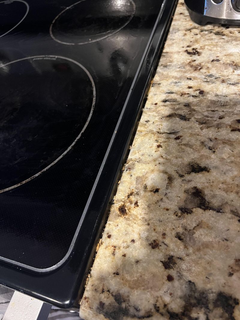
Those drop-in cooktops with the tiny gap between the appliance and countertop create a special kind of kitchen horror that makes designers shudder. This seemingly minor design flaw creates a never-ending battle against crumbs, spills, and debris that inevitably find their way into that narrow crevice.
What makes these particularly frustrating is the impossibility of proper cleaning. Food particles, liquid spills, and cooking residue collect in these gaps, often requiring the complete removal of the cooktop for thorough cleaning. Over time, the accumulated debris can attract pests or create unpleasant odors.
Modern kitchen design strongly favors either completely seamless induction cooktops or gas ranges with proper sealing gaskets that eliminate these collection points. The small additional cost for properly sealed installation pays dividends in reduced cleaning frustration and improved kitchen hygiene.
17. Cluttered Countertop Decor
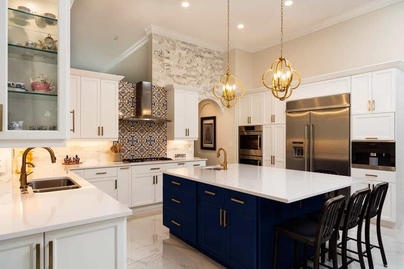
Those countertops overflowing with rooster figurines, decorative oil bottles, and themed canisters make professional designers want to do an immediate clean sweep. This “more is more” approach to kitchen styling creates visual chaos and significantly reduces usable work space in what should be a functional room.
Beyond the aesthetic issues, these decorative items collect cooking grease and dust, requiring frequent cleaning to avoid a grimy appearance. They also complicate daily countertop cleaning, as each item must be moved and replaced a task that often results in homeowners cleaning around objects rather than properly wiping surfaces.
Contemporary kitchen design favors a more restrained approach, with carefully selected items that combine beauty and function. A quality cutting board, a useful utensil crock, or a beautiful fruit bowl provides visual interest without sacrificing the workspace needed for actual cooking.
18. Built-In Microwave Above Stove
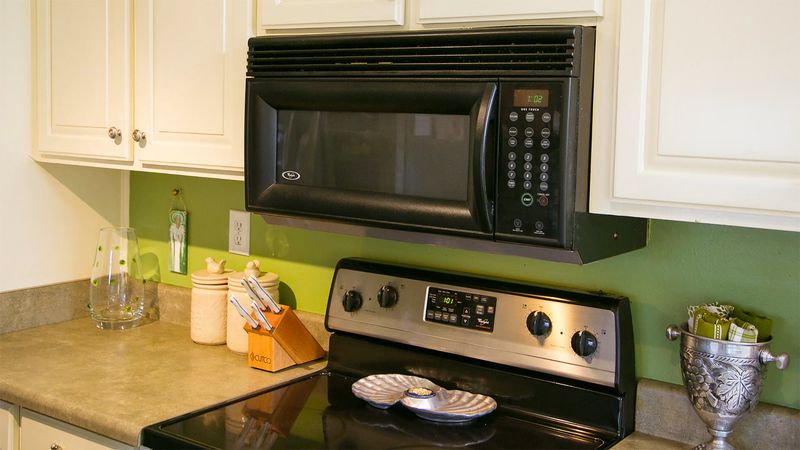
Mounting microwaves directly above cooking surfaces ranks among designers’ most disliked kitchen configurations, despite its persistent popularity in builder-grade homes. This arrangement creates multiple practical problems that impact both safety and functionality in everyday use.
Short users and children often can’t safely reach items in the microwave, requiring dangerous stretching over a hot cooking surface. The heat and steam from cooking can damage the microwave’s electronic components over time, shortening its lifespan. Most critically, this placement typically results in inadequate ventilation compared to a proper range hood.
Modern kitchen design increasingly favors alternative microwave placements—either in lower cabinetry, on a dedicated shelf at counter height, or as part of a built-in appliance wall. These locations improve accessibility while allowing for proper ventilation above cooking surfaces.
19. Trippy Wallpaper
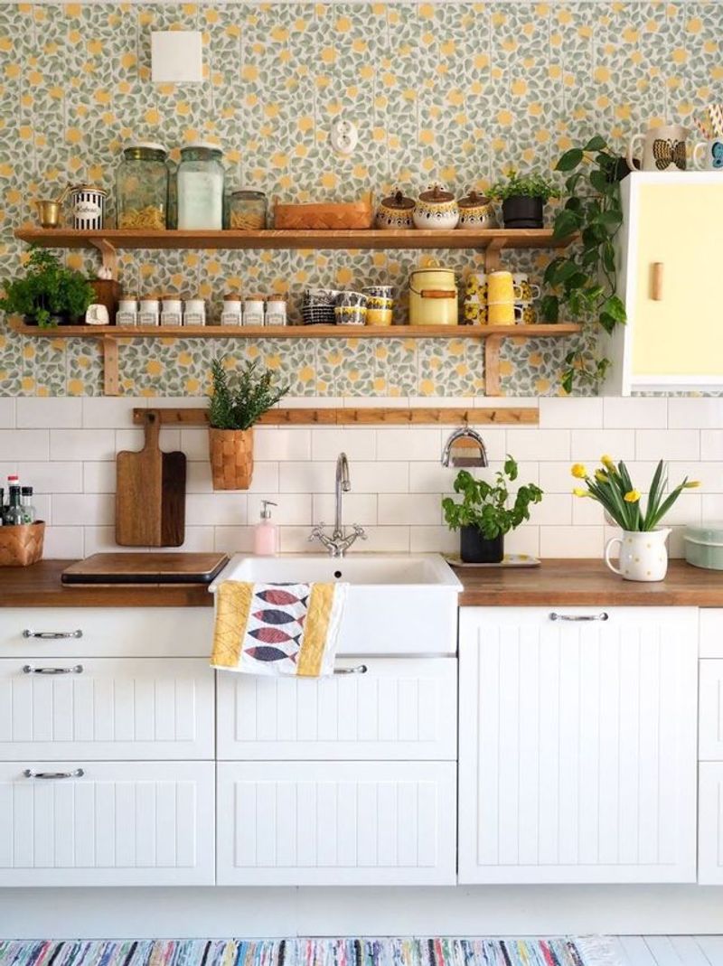
Bold, busy wallpaper with dizzying patterns once dominated kitchen walls, creating visual chaos that’s enough to spoil your appetite. Those geometric prints or wildly colorful florals compete for attention with every other element in the room, making the space feel cluttered even when perfectly organized.
Designers particularly dislike how these intense patterns date a kitchen almost immediately to the specific era when that style was briefly popular. Unlike classic design elements that age gracefully, these bold statements quickly become time capsules of passing trends.
Most problematic is how these wallpapers fare in the kitchen environment. Steam, grease, and splashes cause peeling at seams and discoloration over time, particularly near cooking areas. Modern kitchen design favors more timeless wall treatments like tile, paint, or subtle textured wallpapers that can withstand kitchen conditions.
20. Fixed Booth Seating
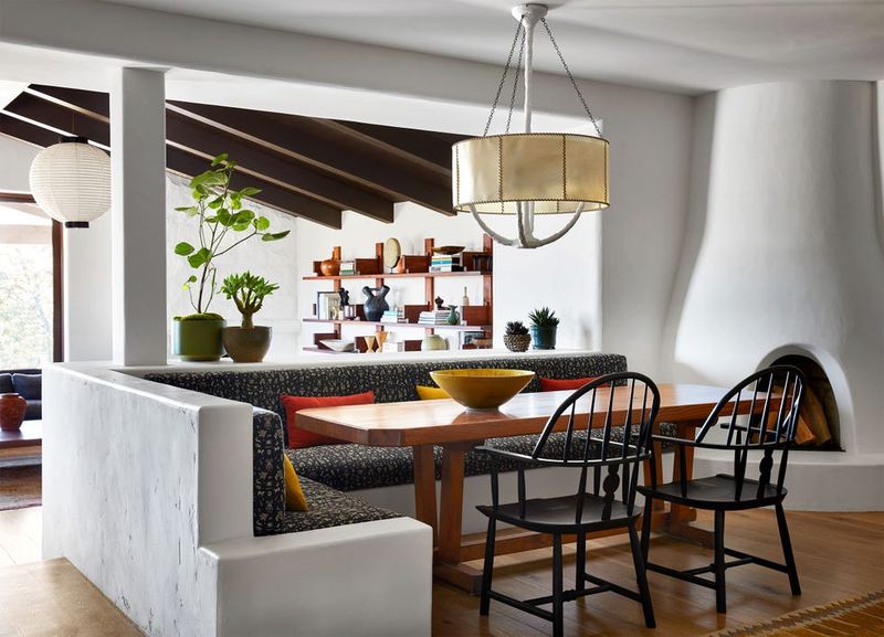
Those built-in breakfast nooks with immovable bench seating might evoke nostalgic diner vibes, but designers consider them impractical space wasters in modern kitchens. The fixed nature of these installations creates inflexible floor plans that can’t adapt as family needs change over time.
Users quickly discover the ergonomic issues with these arrangements the fixed distance between bench and table is rarely comfortable for everyone, and the lack of seat backs on many built-in benches makes extended sitting uncomfortable. The upholstery inevitably suffers from food and beverage spills, with limited options for cleaning or replacement.
Contemporary kitchen design favors flexible seating arrangements using freestanding furniture that can be rearranged or replaced as needed. This approach allows spaces to evolve and adapt rather than being permanently locked into a single configuration.
21. Ornate Cabinet Molding
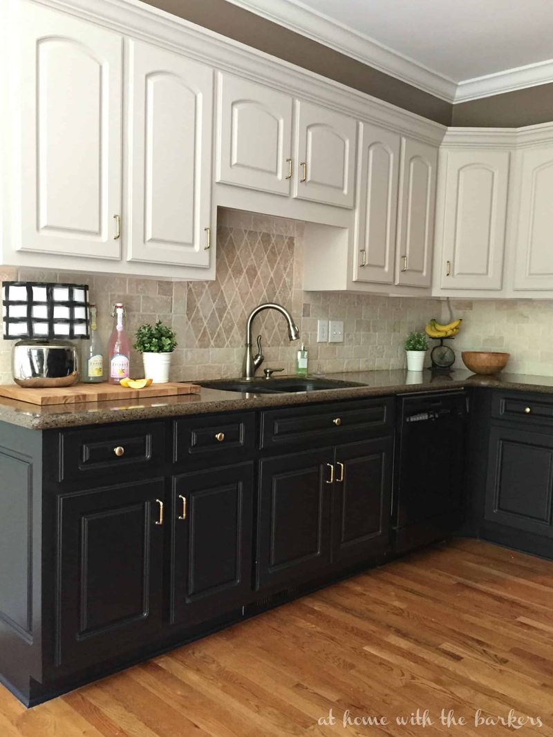
Excessively ornate crown molding and decorative flourishes on kitchen cabinets create dust-collecting nightmares that designers increasingly advise against. Those intricate carvings, scrollwork, and applied medallions might have seemed elegant when installed, but they quickly become maintenance headaches in the kitchen environment.
Cooking grease and airborne particles settle into every groove and crevice, creating a sticky, discolored surface that’s nearly impossible to clean thoroughly. The elaborate details often appear busy and overwhelming in today’s more streamlined interiors, making kitchens feel dated and visually cluttered.
Modern kitchen design favors cleaner lines with perhaps subtle detail work that adds interest without creating cleaning challenges. When ornamental elements are desired, designers now recommend concentrating them on a single focal point rather than applying them throughout the kitchen.
22. Excessive Trim Below Cabinets
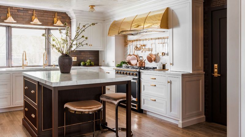
Those fussy decorative valances hanging below upper cabinets serve no practical purpose while creating visual and literal obstacles in the kitchen. Often installed in the 1990s and early 2000s, these ornate wooden trim pieces with scalloped edges or cutout designs interrupt the clean lines of modern kitchens.
Designers particularly dislike how these elements collect dust and cooking grease in their detailed cutouts and crevices. The protruding design often hangs down into the backsplash area, creating awkward shadows and making it harder to use the countertop space below for taller appliances or working with larger pots.
Contemporary kitchen design favors clean, uninterrupted lines between cabinets and backsplashes. When under-cabinet lighting is desired, modern LED strips can be installed discreetly without the need for decorative trim to conceal them.
23. Tile Countertops
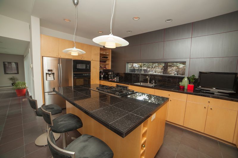
Those ceramic tile countertops with their grid of grout lines create a cleaning nightmare that designers universally reject for modern kitchens. Popular in the 1970s and 80s, these surfaces feature recessed grout lines that become collection points for food particles, bacteria, and stains.
The uneven surface makes working with dough or rolling pastry nearly impossible, and the grout lines inevitably discolor over time regardless of sealing efforts. Small items tip over easily on the uneven surface, and glasses can catch on the edges of tiles when slid across the counter.
Most frustrating to designers is how these surfaces can never be truly sanitized once the grout becomes stained and deteriorated. Modern kitchen design strongly favors continuous surfaces like quartz, solid surface, or even butcher block that provide both visual appeal and practical functionality.
24. Small Single-Bowl Sinks
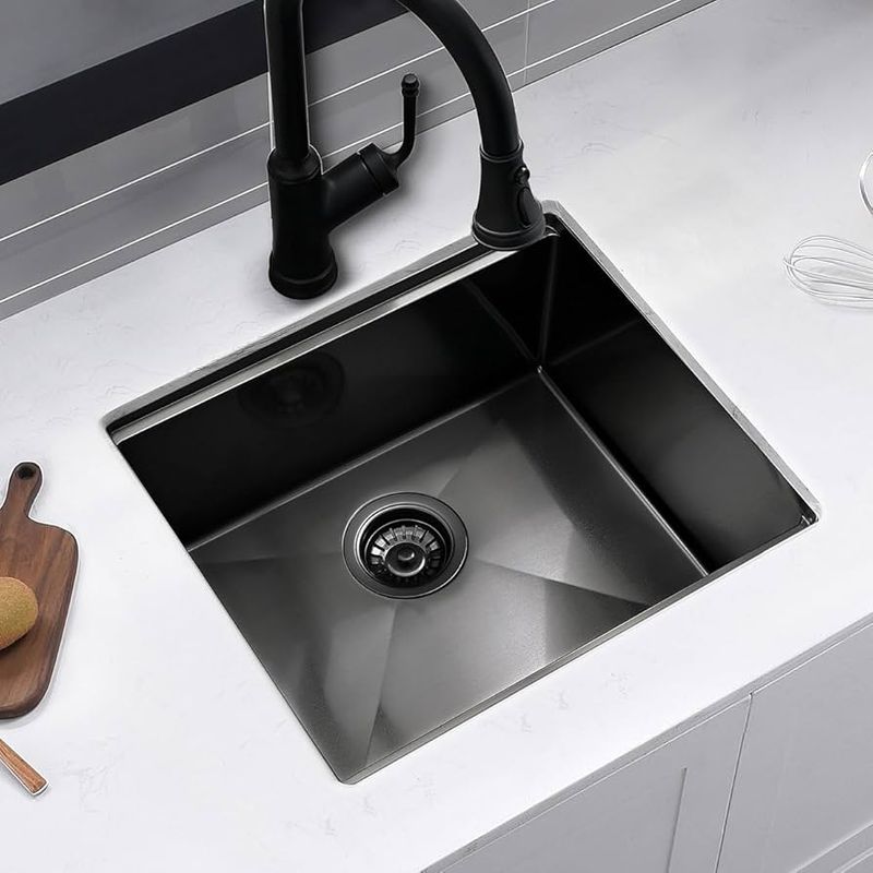
Undersized single-bowl sinks make washing large pots and pans an exercise in frustration and splashing. These compact sinks, often just 22 inches wide and 7 inches deep, might have made sense decades ago when cooking patterns were different, but they’re woefully inadequate for modern kitchen needs.
Designers particularly dislike how these shallow sinks cause water to splash onto countertops and users during everyday tasks like rinsing vegetables or washing dishes. The limited size means cookie sheets and large cutting boards can’t lie flat, making proper cleaning difficult.
Contemporary kitchen design strongly favors larger, deeper sink configurations either a generously sized single bowl at least 30 inches wide and 9 inches deep, or a thoughtfully designed double-bowl arrangement with one larger basin. This evolution reflects changing cooking habits and the reality of how people actually use their kitchens.
25. Ceramic Knobs on Cabinets
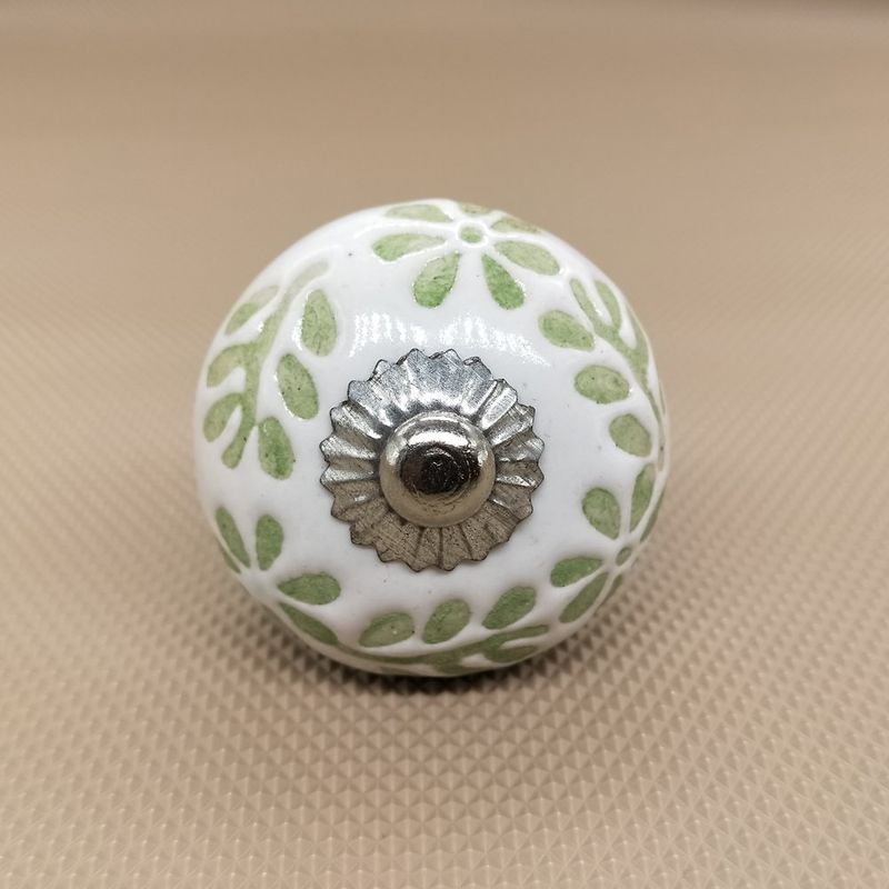
Those painted ceramic knobs with country motifs or cutesy designs make kitchen designers wince on sight. Once popular in country-style kitchens of the 1980s and 90s, these decorative hardware pieces quickly look dated and break easily when subjected to daily kitchen use.
The painted designs often chip or fade with repeated handling, leaving unsightly bare spots that can’t be repaired. Their rounded shapes can be difficult to grip with wet or greasy hands, making them less functional than more ergonomic hardware options.
Most frustrating to designers is how these small elements can single-handedly date an otherwise updated kitchen. Hardware functions as the “jewelry” of cabinetry, and these novelty pieces rarely stand the test of time stylistically. Modern design favors more timeless hardware in quality materials like brushed nickel, brass, or matte black that complement rather than dominate cabinet fronts.
26. Corner Window Fashions
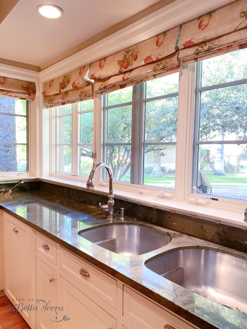
Those fussy, fabric-heavy window treatments at kitchen corner windows create both practical and aesthetic problems that make designers cringe. Often featuring swags, jabots, and multiple valance layers, these ornate treatments collect cooking grease and food odors in their abundant folds and pleats.
Beyond being difficult to clean, these heavy treatments block natural light in a room where good visibility is essential for safe food preparation. The elaborate fabric arrangements often encroach on valuable counter space, limiting usability in an already busy area.
Modern kitchen design strongly favors simpler window treatments that combine functionality with clean lines. Options like washable Roman shades, streamlined blinds, or even no treatment at all (when privacy isn’t a concern) allow maximum light while maintaining a fresh, uncluttered appearance that works with contemporary kitchens.
27. Ornate Ceiling Medallions
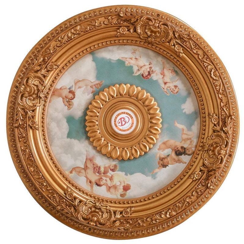
Elaborate ceiling medallions with intricate floral or scrollwork designs create a serious disconnect in kitchen spaces. These ornamental features, borrowed from formal dining rooms and parlors, feel jarringly out of place in working kitchens where simplicity and cleanability should be prioritized.
Designers particularly dislike how these dust-collecting details become magnets for cooking residue in kitchen environments. The intricate carvings and crevices trap airborne grease particles and gradually develop a sticky, discolored appearance that’s nearly impossible to clean thoroughly without specialized equipment.
Contemporary kitchen design approaches ceiling details with more restraint, perhaps incorporating subtle coffers or simple recessed details that add architectural interest without creating cleaning nightmares. When statement lighting is desired, designers now let the fixture itself provide visual impact rather than pairing it with competing ceiling ornamentation.
28. Mini Fridges in Main Zones
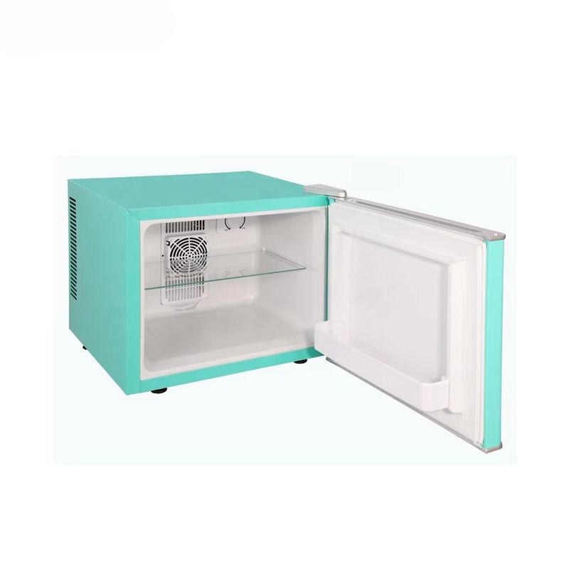
Those small, inefficient refrigerators awkwardly wedged into main kitchen work zones waste valuable space while providing minimal storage. Often installed during partial renovations when moving plumbing for a full-size refrigerator seemed too costly, these compromise solutions create more problems than they solve.
Designers particularly dislike how these undersized appliances force homeowners to maintain a second refrigerator elsewhere, creating inefficient workflows and food storage confusion. The compact size means frequent bending to access contents, and the limited capacity results in overcrowding that makes finding items difficult.
Modern kitchen design strongly favors properly sized refrigeration appropriate for the household, thoughtfully integrated into the overall layout. When space truly constrains options, designers now recommend drawer refrigerators or column refrigeration that maximizes storage efficiency rather than compromising with poorly placed mini units.
29. Heavy Dish Racks
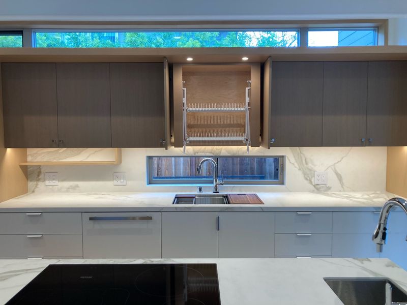
Massive, permanent dish-drying racks that dominate counter space represent a distinctly European feature that rarely translates well to American kitchens. These built-in racks, often installed above sinks with cabinets modified to accommodate them, consume valuable upper storage while creating a perpetually cluttered appearance.
What makes designers particularly skeptical is how these permanent fixtures force a single function onto precious counter space that could otherwise serve multiple purposes. The racks frequently collect dust when not in use, and water dripping from dishes can cause damage to countertops not designed with this feature in mind.
Contemporary kitchen design favors flexible solutions quality dish racks that can be stored when not needed or dishwashers with specialized drying capabilities. This approach maintains the clean lines and multi-functionality that modern kitchens require while still accommodating the occasional need for air-drying.
30. Appliance Garages
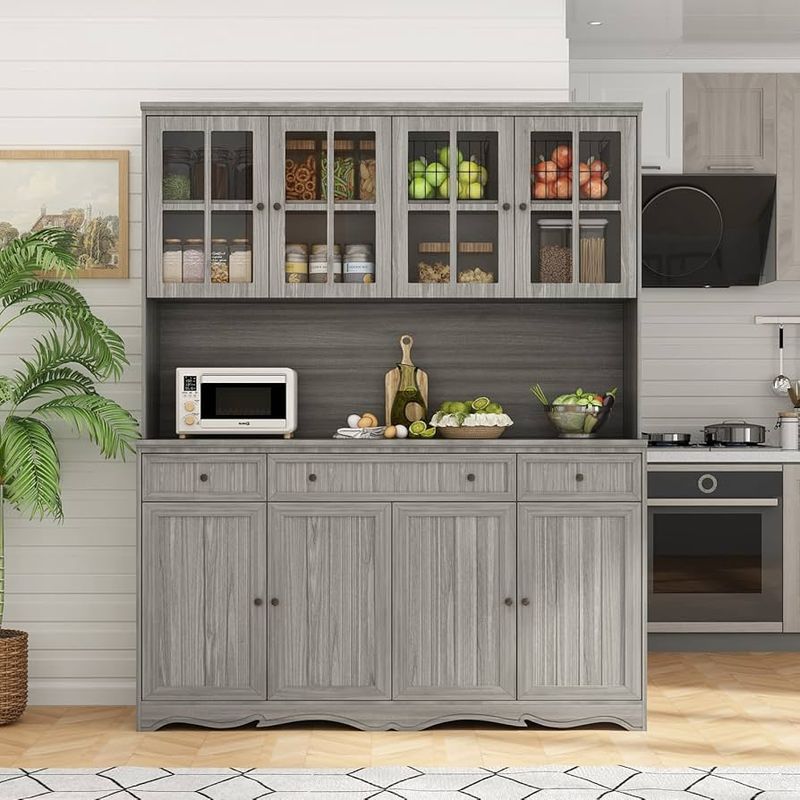
Those curved-door cabinets designed to hide countertop appliances represent a well-intentioned but deeply flawed solution to kitchen clutter. Popular in the 1990s, these “appliance garages” consume significant counter and cabinet space while creating awkward access to the items stored inside.
Designers particularly dislike how the curved doors with their special hardware frequently break down over time, with tracks that stick or rollers that jump their guides. The recessed interior creates dark shadows that make seeing stored items difficult, and the curved opening restricts access to items placed deep inside.
Modern kitchen design addresses appliance storage more effectively through dedicated interior cabinet storage, appliance lifts, or thoughtfully designed pantry spaces. When counter space is limited, designers now recommend prioritizing which appliances truly deserve permanent counter placement rather than attempting to hide them all in these problematic cabinets.
31. Ornate Range Hoods
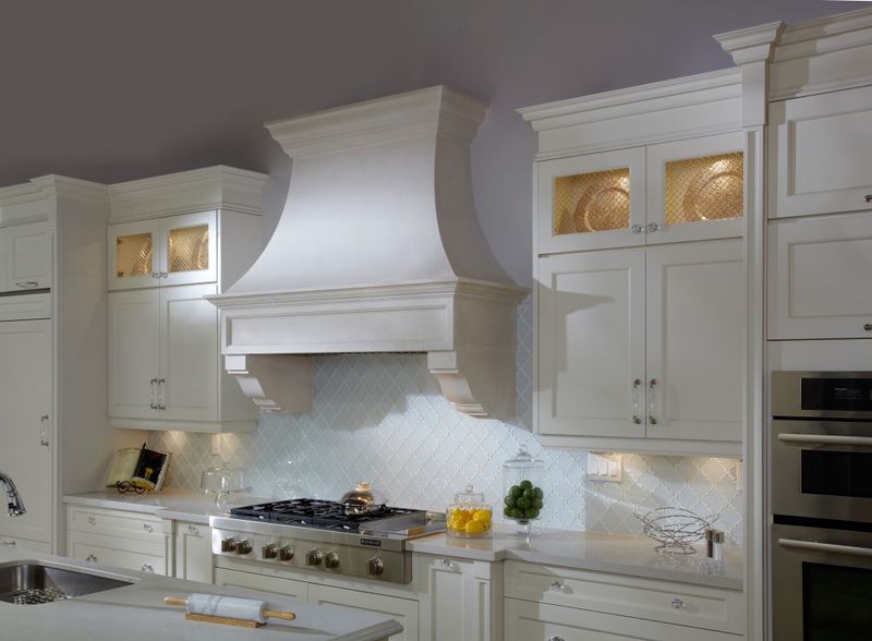
Massive, ornately decorated range hoods with scrollwork, applied moldings, and faux-finished surfaces create cleaning nightmares in the highest-grease area of the kitchen. These statement pieces, popular during the Tuscan kitchen trend, collect cooking residue in every carved detail and crevice.
Beyond their impractical surfaces, these oversized hoods often dominate the visual space, creating top-heavy kitchens where your eye is immediately drawn to this single overwhelming element. The elaborate details frequently clash with other kitchen elements, making cohesive design difficult.
Contemporary kitchen design favors range hoods that balance form and function either streamlined models that disappear into the overall design or thoughtfully designed focal points with smooth, cleanable surfaces. This evolution recognizes that the area above a cooking surface needs particularly careful consideration for both aesthetics and practicality.

