North Carolina Designers Say These 12 Couch Tones Are Past Their Prime
Time to give your living room a glow-up! North Carolina’s top designers have weighed in, and some couch colors are officially on their way out.
If your sofa’s rocking one of these shades, it might be sending the wrong vibe, think “blast from the past” instead of “fresh and fabulous.” From dull neutrals to awkward hues, these 12 couch tones are begging for a stylish upgrade.
Stick around as we dish out the colors to ditch and the looks to love. Say goodbye to tired tones and hello to a living space that truly pops!
1. Navy Blues: Sailing Into Retirement
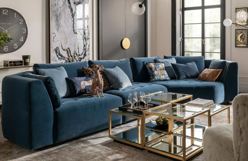
Once beloved for its nautical charm, navy is slowly drifting out to sea. This once-versatile tone now feels a little too predictable, especially when paired with white or brass.
While it’s still a classic, it can make a space feel stiff instead of relaxed. Designers are steering clients toward inky indigos, deep greens, or even denim-inspired blues that offer more depth and flexibility.
If you’re still on board the navy train, anchor it with layered neutrals and cozy textures. Just don’t let your sofa be the captain of a sinking ship.
2. Sage Green: A Soft Shade That’s Lost Its Edge
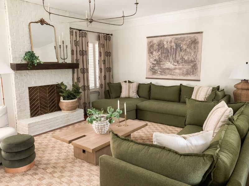
Sage had a moment during the farmhouse and cottagecore waves, but that moment has mellowed out. The once-fresh pastel now reads more washed-out than calming, especially when overused.
Its subtlety can fade into the background, making your living room feel flat. Designers now prefer greens with more personality, like olive, eucalyptus, or even deep forest tones.
These bring a richer sense of nature without blending into the walls. If you’re hanging on to sage, balance it with contrasting textures and bolder accents.
3. Cool Gray: Chill To A Fault
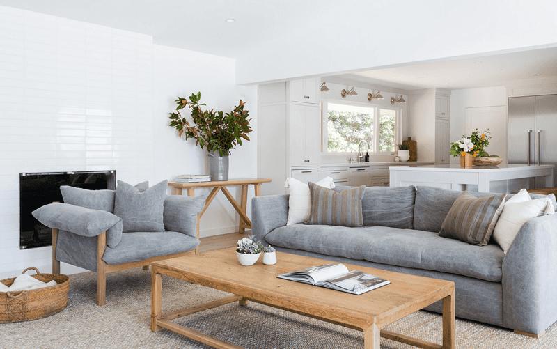
Ever walk into a room and feel more like you’re in a dentist’s office than a cozy Carolina retreat? Cool gray might be to blame.
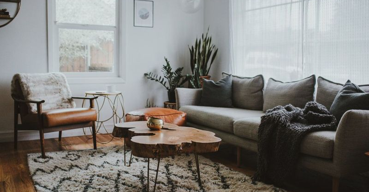
After ruling the design scene for over a decade, this frosty favorite is finally losing its grip, especially in North Carolina homes where charm and comfort are key. In spaces with limited natural light, cool gray can feel sterile and unwelcoming. It doesn’t play nice with Southern staples like warm wood, leather, or brass either.
Today’s Tar Heel trendsetters are leaning into softer neutrals like greige, taupe, and mushroom, tones that actually feel like home.
Still holding on to that chilly gray sofa? Try layering in rust, camel, or blush for warmth… or consider giving that icy seat the sweet tea sendoff it deserves.
4. Beige & Greige: Playing It Too Safe
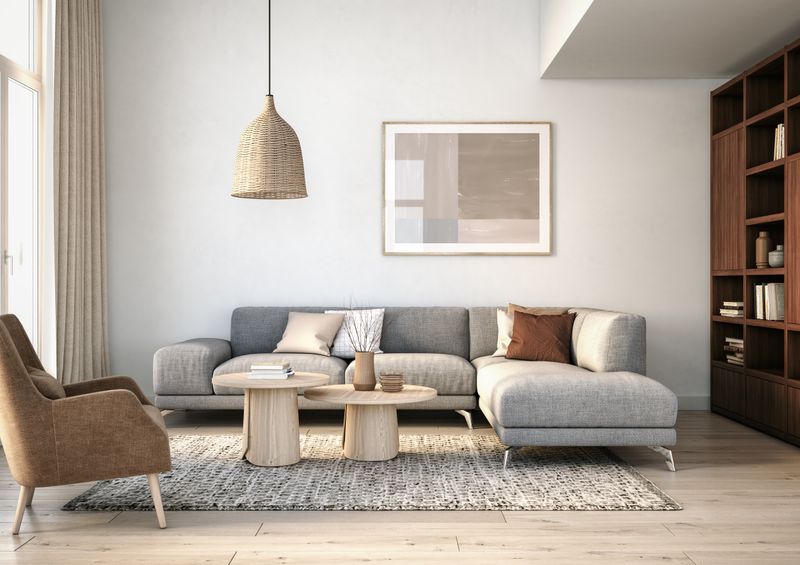
Beige and its more modern cousin greige once dominated the neutral scene, but now they feel like the background noise of design. These colors often fade into the room without making any real statement.
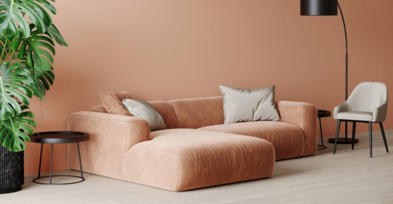
While neutrals will never disappear, today’s homeowners want warmth and personality mixed in. Think creamy tones with peachy undertones or rich neutrals like sand and clay.
If you’re stuck with a beige couch, it’s nothing a few bold pillows and an eye-catching rug can’t fix. But in 2025, beige for beige’s sake is a hard pass.
5. Cream: The Color That Fades Into Everything
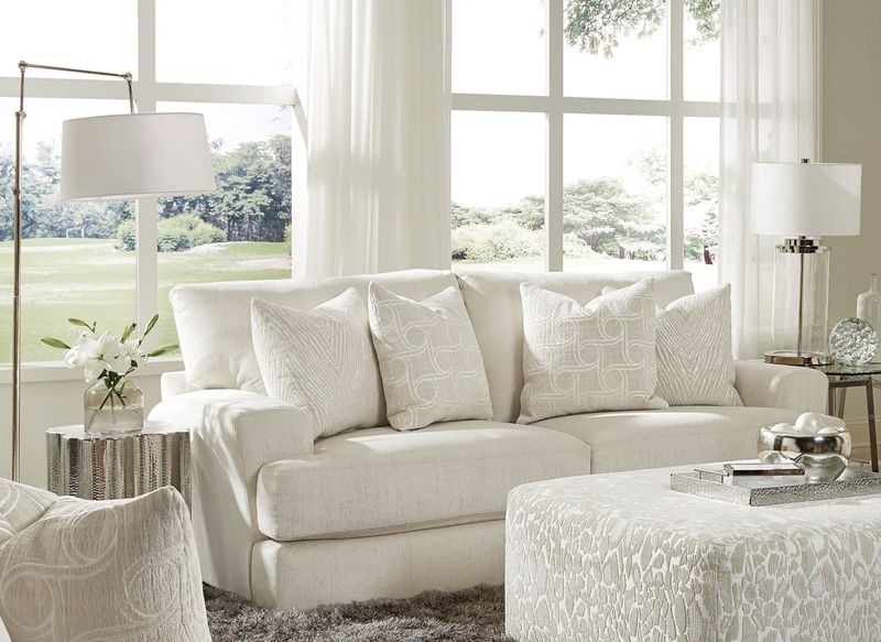
Is your sofa serving soft elegance, or just soft serve?
Cream is like vanilla ice cream, it’s fine, but rarely anyone’s favorite. This ultra-soft shade can lack visual interest, especially in a room full of similar tones.
Without texture or contrast, cream sofas tend to feel flat and uninspired. Designers are now playing with contrast, mixing in wood, black accents, and deeper hues to bring balance.
If you love light neutrals, go for one with a bit more personality, like almond or warm linen. Because even quiet colors deserve a little flair.
6. Red: The Color That Can’t Sit Still
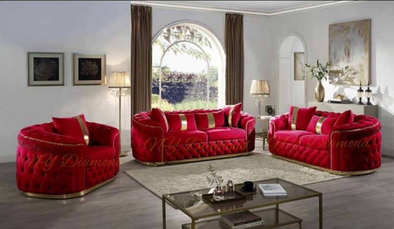
Few colors demand the spotlight quite like a blazing red sofa.
It’s bold, sure, but not exactly the picture of relaxation. Red commands attention whether you want it to or not, often clashing with modern minimalism and classic charm alike.
It’s a tough one to tone down, making the rest of your room work overtime to keep up. Designers are now favoring more nuanced shades, think merlot, burnt sienna, or warm desert reds that feel rich, not loud.
Deep rust or copper tones still bring the heat, just with a little more sophistication. More cozy campfire, less five-alarm fire.
7. Soft Gray: Pleasant, But Forgettable
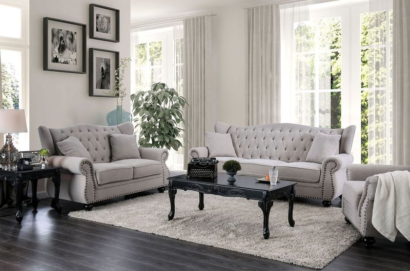
Here is a great question for you, is your sofa setting the mood, or just blending into the background?
Soft gray is like white noise, it’s there, but does it really do anything? This once-popular neutral doesn’t offend, but it doesn’t inspire much either.
As homes shift toward layered warmth and personality, soft gray is struggling to stay relevant. Designers are nudging clients toward mushroom, oat, or even slate for more grounded vibes.
You don’t have to go bold, but your sofa shouldn’t disappear entirely. A little contrast goes a long way.
8. Pastel Blue Damask: Charming, But A Little Too Sweet
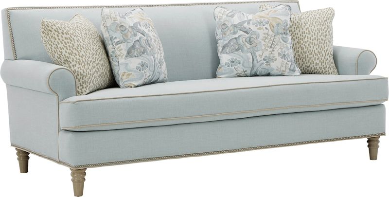
Remember those perfectly preserved living rooms where no one was actually allowed to sit? Yeah, these sofas were the stars.
Once the crown jewels of formal Southern parlors, damask-patterned couches in baby or powder blue were all about projecting elegance and tradition. But today’s tastemakers see them more as museum pieces than must-haves.
The combo of ornate pattern and sugary pastel feels less refined and more grandma’s formal sitting room.
Blue still has a seat at the table, but now it’s navy, indigo, or slate, dressed in sleek silhouettes and durable fabrics that don’t require a velvet rope.
9. Mauve And Gray Stripes: Subtle, But Snooze-Worthy
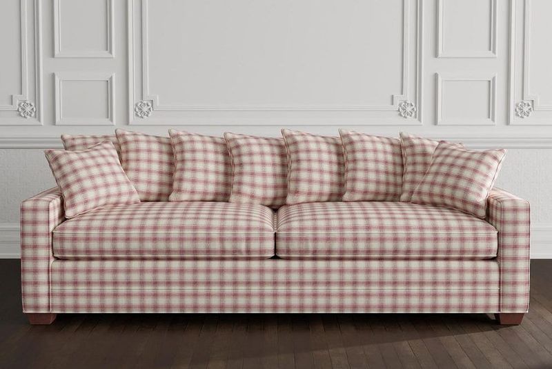
The 80s and early 90s brought us couches featuring mauve and gray striped patterns that seemed sophisticated at the time. This dusty pink-purple paired with gray was practically the unofficial uniform of sofas in professional waiting rooms and model homes across North Carolina.
Today’s design pros flag this specific color combo as an instant age accelerator for any space. The muted, somewhat gloomy palette misses the mark in homes that now embrace vibrancy and warmth.
Ever notice how these couches always came with those brass-and-glass coffee tables? That’s a double design offense right there!
10. Mustard & Ochre: Retro Without The Revival
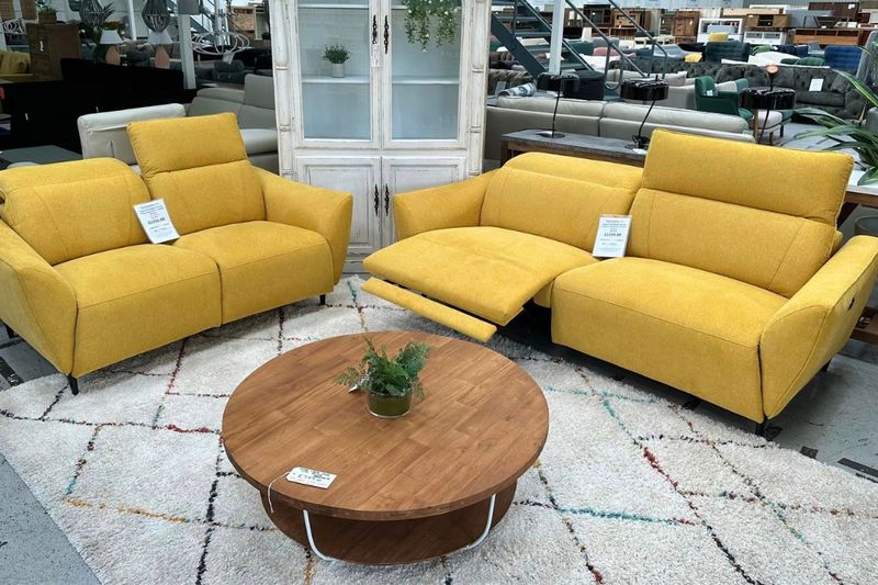
These mustard and ochre couches had their moment during the mid-century revival of the 2010s. What started as a fresh take on vintage quickly became oversaturated in the design world.
North Carolina designers note that this specific shade of yellow in velvet now reads as a trendy choice that didn’t stand the test of time. The bold color that once seemed daring now feels like a statement piece that’s shouting last decade’s trends.
While rich, saturated fabrics are still having a moment, this particular mustardy yellow has slipped out of style. Remember when Instagram was drowning in these sofas in every influencer’s apartment?
11. Jewel-Toned Velvet: From Crown Jewel To Costume Drama
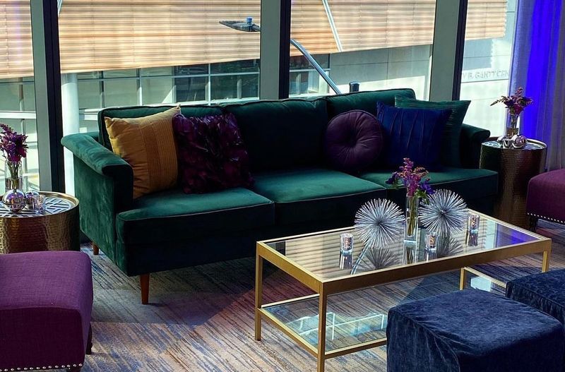
Rich velvets in emerald, sapphire, and amethyst once ruled the room, but now they can feel more costume party than chic. These deep tones are intense and often feel too formal or moody for today’s relaxed interiors.
Plus, they’re tricky to style and show wear more than you’d expect. Designers are still loving velvet, just in updated hues like warm rust, muted olive, or dusty rose.
It brings luxe texture without the visual drama. Your sofa can still feel royal, just maybe without all the jewels.
12. Charcoal Gray: The Unexpected Energy Drainer In Your Living Room
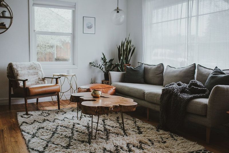
Once hailed as the go-to for sleek, modern vibes, this deep, dark shade has lost its sparkle. It soaks up light like a sponge, often making living rooms feel cramped and gloomy.
Designers say homeowners are craving more brightness and warmth, especially in smaller spaces. Sofas in this heavy tone can also clash with newer trends in wall colors and wood finishes.
For a softer touch, try warmer grays or even clay-inspired neutrals. Or mix it up with textured throws and wooden accents to lighten the look.

