20 Outdated Kitchen Cabinet Styles Designers Say To Avoid
Ever walk into a kitchen and feel like you’ve time-traveled to another decade just from the cabinets alone? You’re not imagining it.
Some cabinet styles scream “retro” in all the wrong ways, instantly aging a space no matter how clean or cozy it is. In today’s world of fresh, functional design, certain looks are begging for retirement.
Whether it’s overly ornate woodwork or faded pastels that never made a comeback, designers agree: these 20 cabinet styles have had their moment. Let’s take a look at the quirkiest, most outdated designs and why it might be time to say goodbye.
1. Honey Oak Cabinets
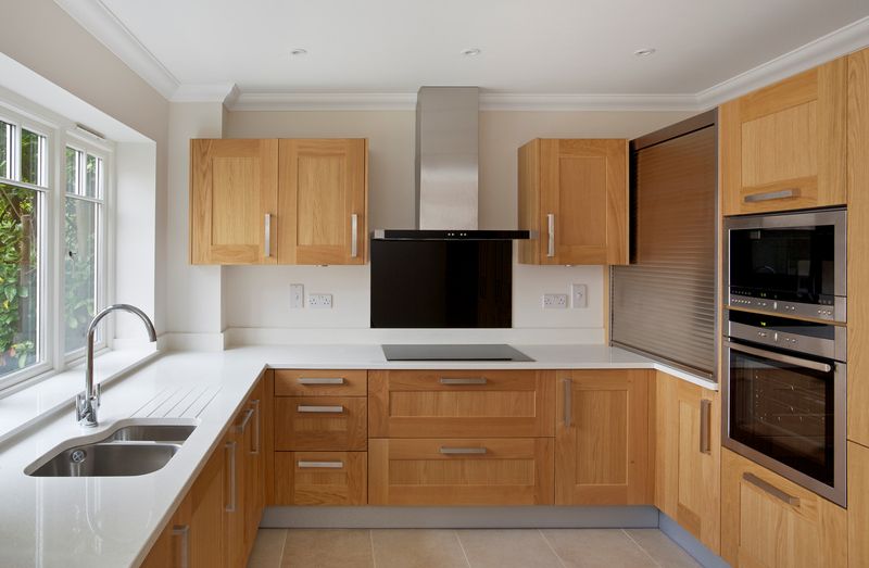
How could anyone forget the wave of honey oak cabinets that swept through homes in the late 80s and 90s? That unmistakable orange-gold hue seems to glow under any light, but not always in a flattering way.
If you love a retro vibe, I get it, but honey oak tends to make kitchens feel tired and stuck in time. The overwhelming warmth can clash with modern appliances and countertops. Many designers say this look instantly dates a home.
Did you know real estate shoppers often spot honey oak first when they walk into a kitchen? That’s how you know it’s time for a change.
2. Raised Panel Doors with Ornate Trim
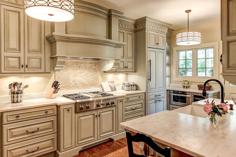
If you crave a kitchen where every detail is shouting for attention, raised panel doors with ornate trim might seem appealing. But designers warn this style can overwhelm even the brightest space.
Where simplicity wins today, these cabinets end up making your kitchen feel fussy and overdone. Elaborate trim collects dust and distracts from other decor elements.
Heavy carving and embellishments were once the height of luxury, but now they’re a visual speed bump in modern homes. I’ve seen people spend hours trying to clean all those grooves!
3. Glazed Finishes
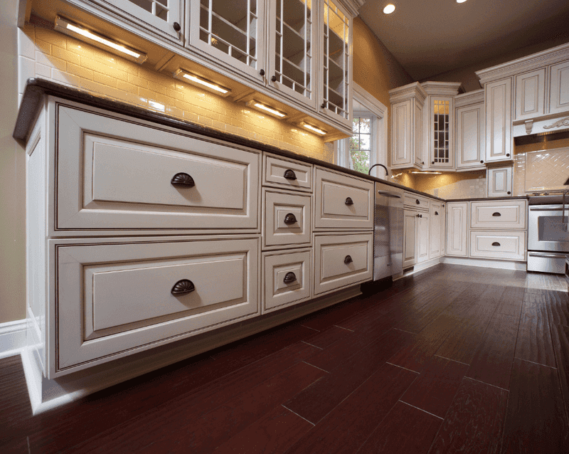
When cabinets sport a glazed finish, there’s a certain old-world charm at play. However, this effect, often seen with a slightly yellowed patina, quickly loses its appeal in contemporary spaces.
If you love a look that’s easy to update, glazed finishes can be a real headache. The style can make even new cabinets appear aged and dull.
A fun tidbit: glaze was originally used to make woodwork look hand-finished, but now it’s one of the first things designers recommend skipping in a remodel.
4. Thermofoil Cabinets
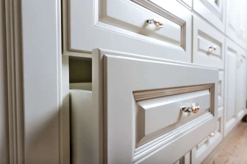
It’s surprising to see how many kitchens still have thermofoil cabinets, despite the pitfalls. Thermofoil was a cost-saving choice, but it’s prone to peeling, bubbling, and discoloration.
If you’ve ever tried wiping a thermofoil door clean, you know the struggle. The outer layer lifts with time, revealing a less-than-lovely core underneath.
How these cabinets became so popular is anyone’s guess, but designers now avoid them, especially since repairs are tricky and replacements often necessary.
5. Distressed or Antiqued Finishes
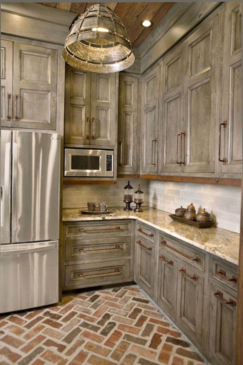
With a taste for the rustic, you might think distressed or antiqued finishes are forever charming. Yet designers say this trend has overstayed its welcome.
If you want your kitchen to feel fresh and clean, faux wear and tear might not be the vibe. The intentional scuffing can sometimes come across as careless rather than cozy.
A twist: while some antiques gain value with age, antiqued cabinets just make people wonder why everything looks scratched up!
6. Two-Tone Upper and Lower Cabinets (with Harsh Contrast)
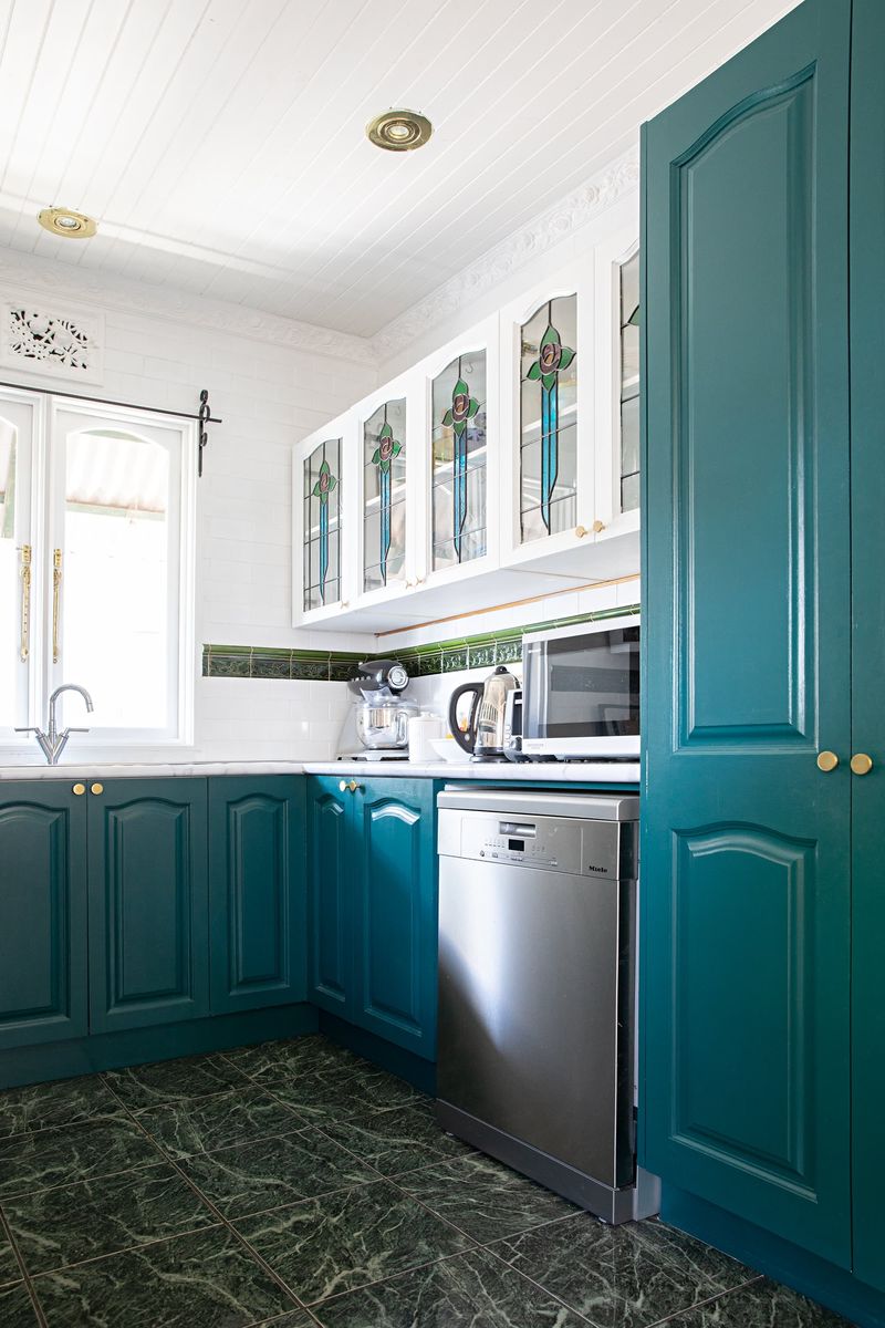
When designers talk about contrast, they don’t mean clashing colors that fight for attention. Two-tone cabinets with harsh contrasts—think black and white or navy and stark white—can create a choppy, disconnected look.
If you’re hoping for a smooth, unified kitchen, strong color splits on cabinets will stand out for the wrong reasons. This style makes small kitchens feel even smaller.
A gentler mix might work, but harsh contrasts stop your eye instead of creating flow. I’ve seen people regret this decision almost immediately after installing!
7. Bright Cherry Wood
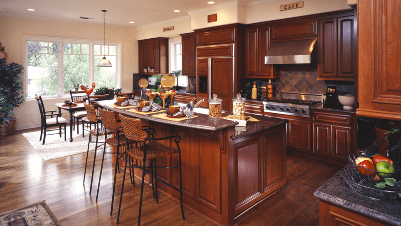
Did you spot cherry cabinets in a kitchen and instantly feel like you stepped back in time? Bright cherry wood, with its bold reddish tones, screams 1990s luxury but not in a good way today.
If you want to update, cherry wood can be tricky to refinish or repaint due to its deep color. The boldness doesn’t blend easily with today’s lighter palettes.
A quirky fact: Cherry wood darkens naturally with age, so those cabinets only get more intense over time. Designers now suggest leaving this dramatic wood behind.
8. Arch-Top Cabinet Doors
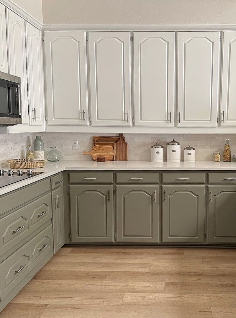
Where some see charm, others see outdated arches. Arch-top cabinet doors once felt elegant, but now they mark a kitchen as stuck in a bygone era.
If you’re hoping for a fresh, versatile look, these curves can limit your decor choices. The distinctive shape draws the eye and quickly reveals a kitchen’s age.
Once a symbol of sophistication, arch-top doors have fallen out of favor with those chasing a minimalist vibe. Trust me, straight lines go further these days.
9. Faux Wood Laminate
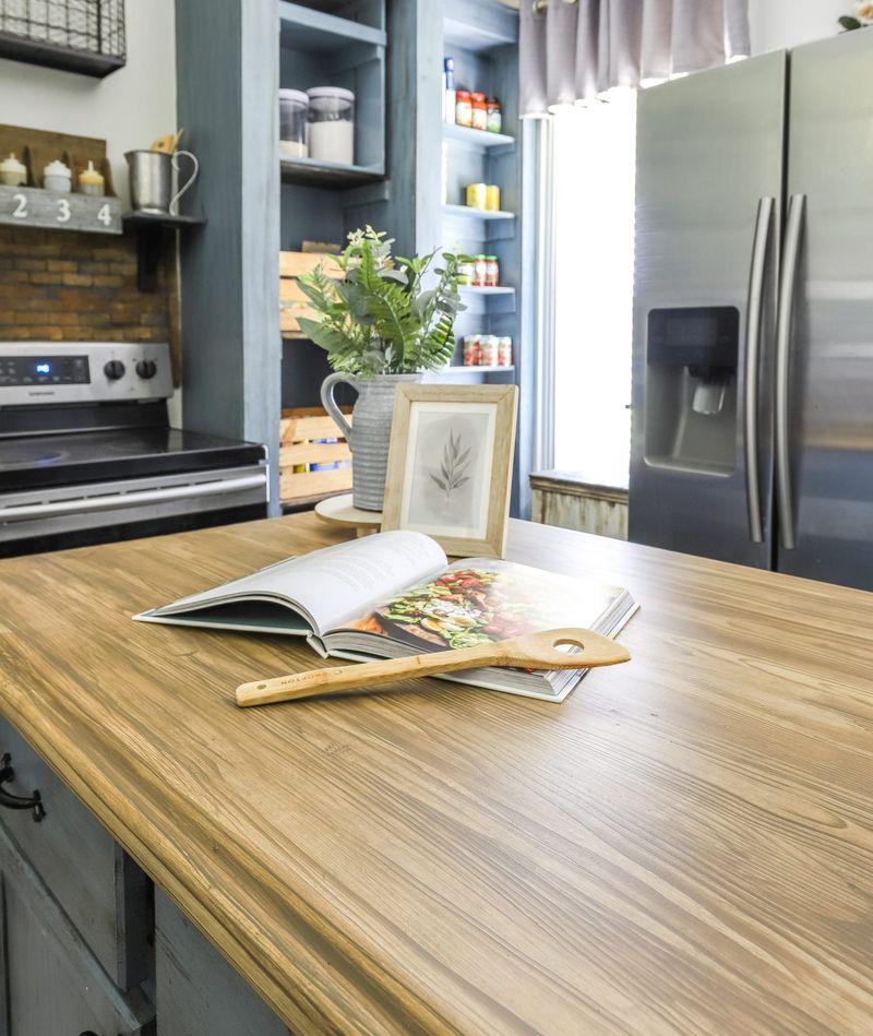
Though faux wood laminate tried to mimic real wood, most people spot the difference right away. The repeating patterns and artificial sheen can give your kitchen a cheap vibe, no matter how tidy you keep it.
If you dream of a cozy, authentic space, laminate falls short. This material tends to peel and chip, showing its age fast.
A fun fact for you: faux wood laminate was wildly popular because it was budget-friendly, but it just doesn’t stand up to the warmth of the real deal.
10. Busy Wood Grain Patterns
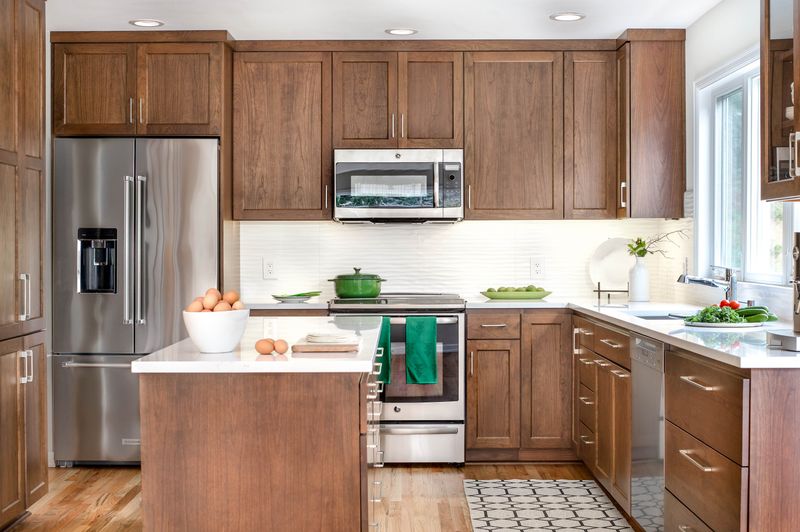
Ever feel dizzy looking at cabinets? Busy wood grain patterns, with their swirls and knots, can make a kitchen feel chaotic instead of calm.
If you want a restful cooking space, too much movement in the grain distracts instead of delights. This style was once praised for being bold, but now it’s just, well, too much!
Fact: Designers favor subtle grains today, letting other details shine. Wild wood patterns belong more in a treehouse than in your kitchen!
11. Overly Glossy Finishes
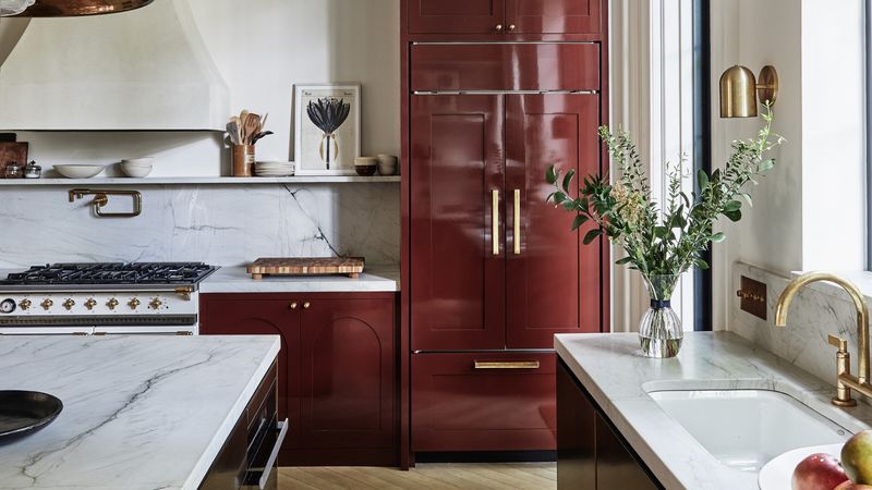
When your cabinets shine more than your countertops, it’s usually a sign of an overly glossy finish. These ultra-reflective surfaces might look high-end at first, but they show every smudge and fingerprint.
If you’re after a lived-in, cozy kitchen, glossy cabinets can feel cold and sterile. Cleaning becomes a constant chore, chasing away any sense of relaxation.
Fun tidbit: High gloss finishes are sometimes used in showrooms to wow buyers, but in real homes, designers say matte and satin finishes are far more forgiving.
12. Knotty Pine Cabinets
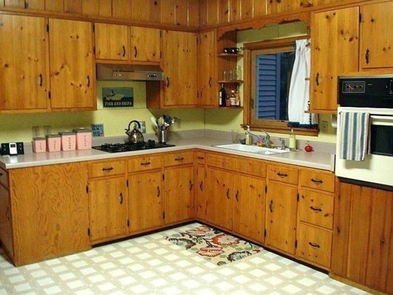
How does a style go from beloved to banished? Knotty pine cabinets, once a cottage staple, now make kitchens feel more like outdated cabins.
If you crave a modern look, those big knots and warm yellow tones just don’t work anymore. The texture can dominate a room, leaving little room for other design elements.
Fun fact: Knotty pine was often chosen for its affordability, but designers now suggest smoother, sleeker woods for contemporary kitchens. Time to retire the rustic!
13. Cabinet Soffits
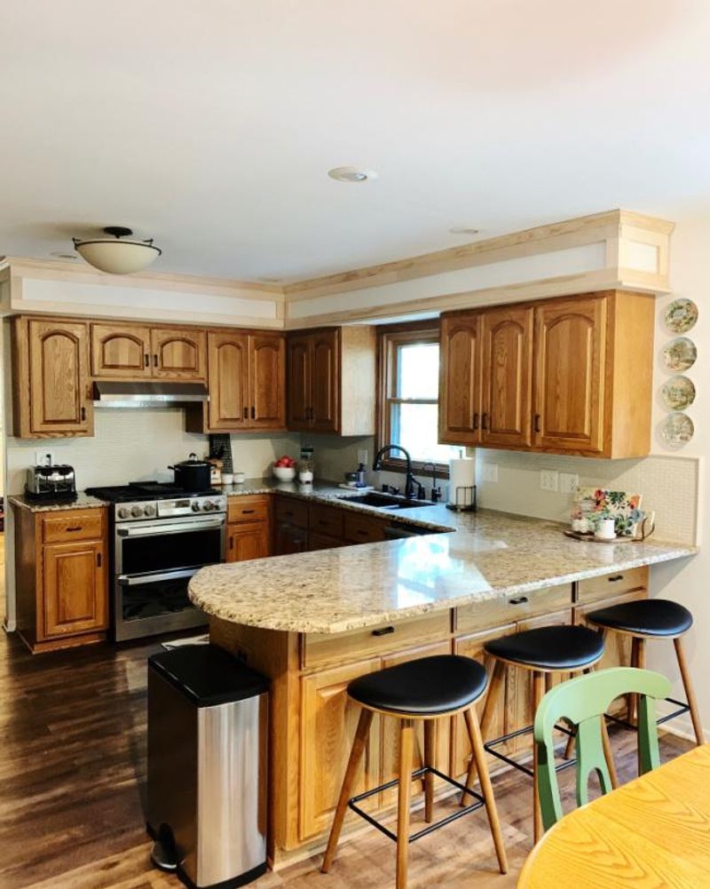
Have you noticed the odd, empty space between cabinets and the ceiling in older kitchens? Cabinet soffits were meant to hide pipes and wires, but now they just waste potential storage.
If you want a seamless, tall look, soffits break up the flow and can make the room feel shorter. Designers recommend extending cabinets to the ceiling for a cleaner effect.
A quirky bit: some people used soffits for fake plants or decorative plates, but that trick definitely gives away a kitchen’s age these days!
14. Heavy Molding and Corbels
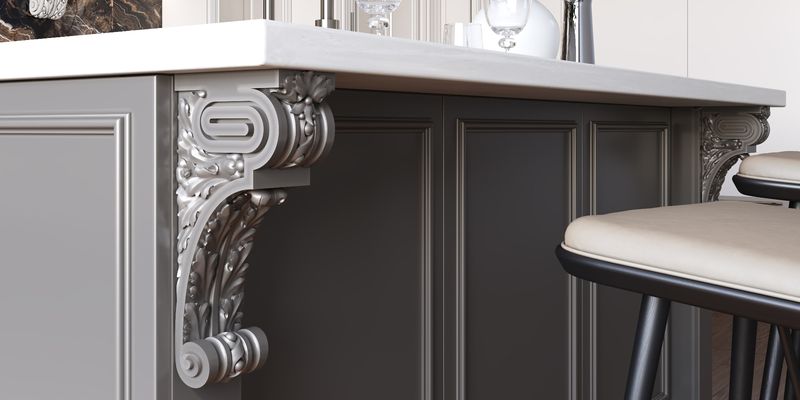
When ornate is too ornate, heavy molding and corbels cross the line. These dramatic details once showed off craftsmanship but are now considered fussy and impractical.
If you seek a streamlined space, chunky moldings and carved corbels create visual clutter. They catch dust and look out of place in contemporary settings.
Fun fact: Corbels were originally used for structural support in old buildings. Today, they serve little purpose and often get in the way of modern minimalism!
15. Frosted Glass Inserts
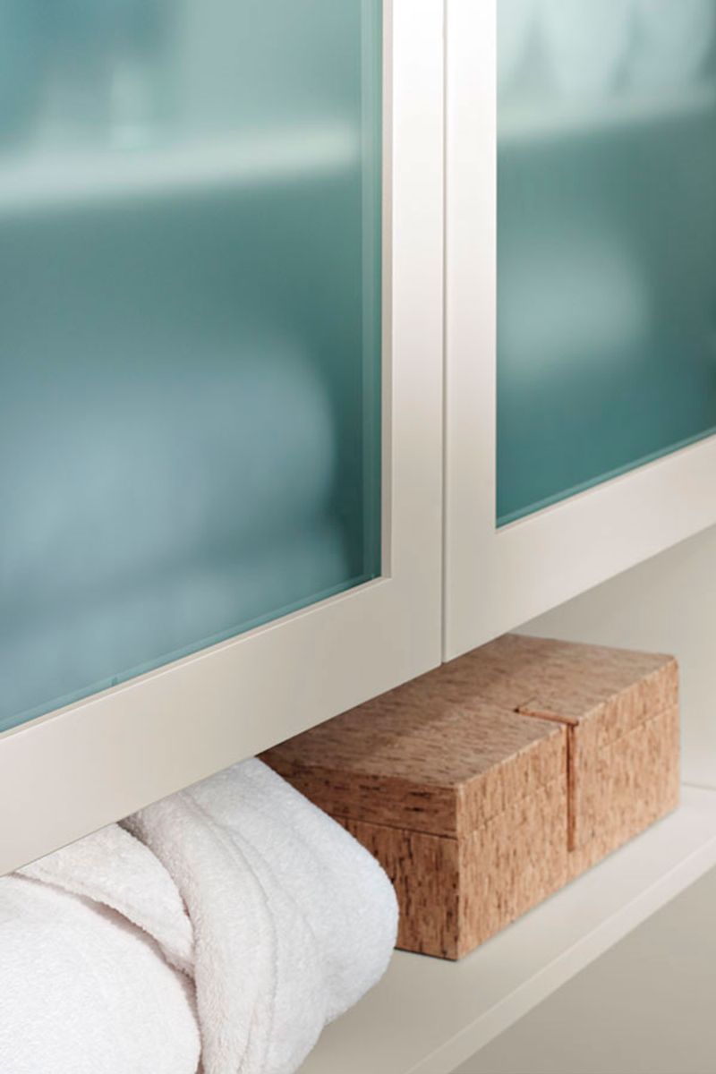
If you ever hid a messy cupboard behind frosted glass, you know the appeal. But these inserts now look dated and fuzzy instead of sleek.
Where clear glass feels open, frosted glass creates a blurry barrier that blocks both light and style. It’s hard to match with today’s open-concept kitchens.
A fun tidbit: Frosted glass was a favorite for hiding clutter without going fully opaque, but designers now prefer crisp, clean lines. Time for a clear change!
16. Yellow-Toned Maple
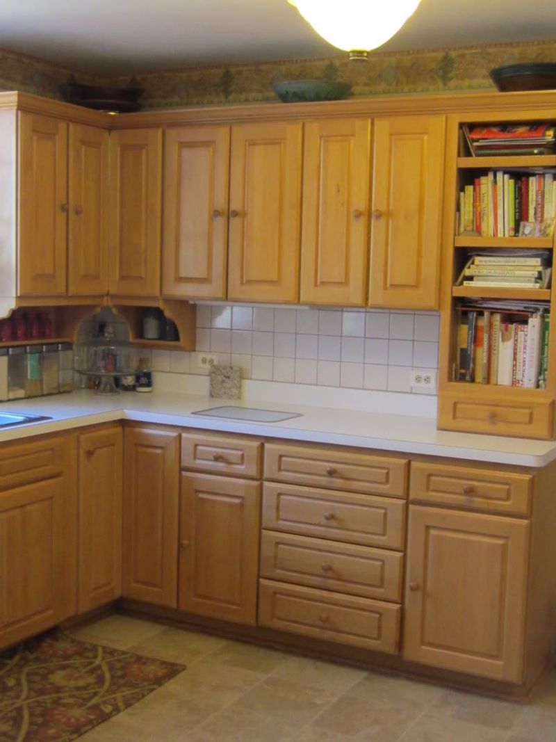
Did you ever walk into a kitchen and feel like the sun was stuck inside? Yellow-toned maple cabinets were meant to brighten rooms, but now their golden shade feels overwhelming.
If you want a neutral, modern vibe, this wood stands out for the wrong reasons. It can clash with today’s cooler color palettes and updated hardware.
A quirky fact: Many suburban homes in the 90s featured these maple cabinets, but designers now say softer woods and muted tones are the future.
17. Colored Cabinet Fronts (like Avocado or Peach)
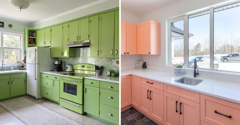
How bold is too bold? Cabinets in colors like avocado green or peach scream retro but can make buyers hesitate. These shades have a nostalgic charm, yet rarely fit with modern design trends.
If you want a kitchen that feels current, strong pastels and earthy greens quickly become a distraction. Neutral or muted finishes age more gracefully, designers say.
Did you know vibrant cabinet colors were a way to personalize kitchens in the 70s? Today, most homeowners stick to classic hues for lasting appeal.
18. Tuscan-Style Dark Wood
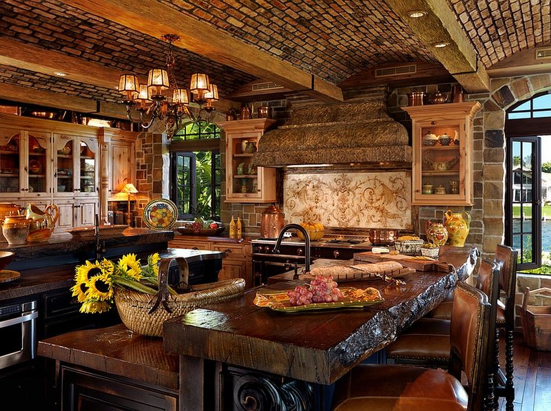
Are you drawn to kitchens that look like old Italian villas? Tuscan-style dark wood cabinets were once the epitome of luxury, but today they often feel heavy and somber.
If you prefer light, airy spaces, these dark finishes can shrink a room and swallow natural light. Designers now favor open, inviting kitchens over moody Old World vibes.
A quirky tidbit: Tuscan kitchens were inspired by countryside estates. Now, homeowners look for styles that reflect modern life rather than distant history.
19. Excessive Open Shelving
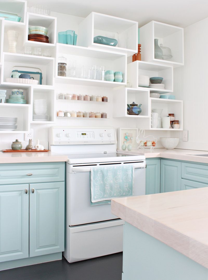
When open shelves go from accent to overload, the kitchen loses function and style. Excessive open shelving means constant dusting and perfect organization, or it quickly turns chaotic.
If you’re not a pro at arranging dishes, this trend can backfire fast. Designers recommend limiting open shelves to a few key spots.
Fact: Open shelving was meant to create airiness, but too much makes even the cleanest rooms look cluttered. Balance is crucial!
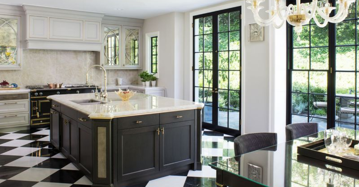
20. High-Contrast Black-and-White Combos (from early 2000s)
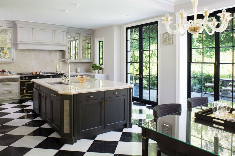
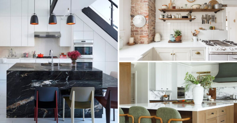
Where dramatic flair once ruled, high-contrast black-and-white kitchens from the early 2000s now feel stark and dated. The sharp division between colors makes the space look less inviting.
If you’re after coziness, these combos create a cold, almost institutional vibe. Warm accents and blended tones are trending in today’s kitchens.
A little trivia: Checkerboard floors and monochrome cabinets hit their peak in the early 2000s, but designers now say it’s time for more nuanced palettes. Soft is the new bold!

