7 Overused Paint Colors Designers Are Ready To Retire
Walking into a freshly painted room can completely transform how a space feels. But just like fashion trends come and go, popular paint colors eventually fall out of favor with professional designers. I’ve noticed certain shades appearing in home after home, creating spaces that now feel dated rather than distinctive.
Here are seven paint colors that design experts are increasingly eager to leave behind.
1. Greige: The Once-Beloved Neutral
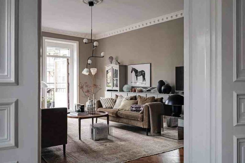
Remember when everyone was obsessed with this gray-beige hybrid? The color that promised to go with everything is now giving rooms a tired, washed-out appearance.
I’ve watched this safe choice become the default in countless homes, stripping spaces of personality. While it once felt sophisticated and modern, today’s designers crave either warmer, cozier neutrals or bolder color statements.
Many clients now specifically request “anything but greige” during consultations, signaling its decline after nearly a decade of dominance.
2. Builder Beige: The Apartment Special
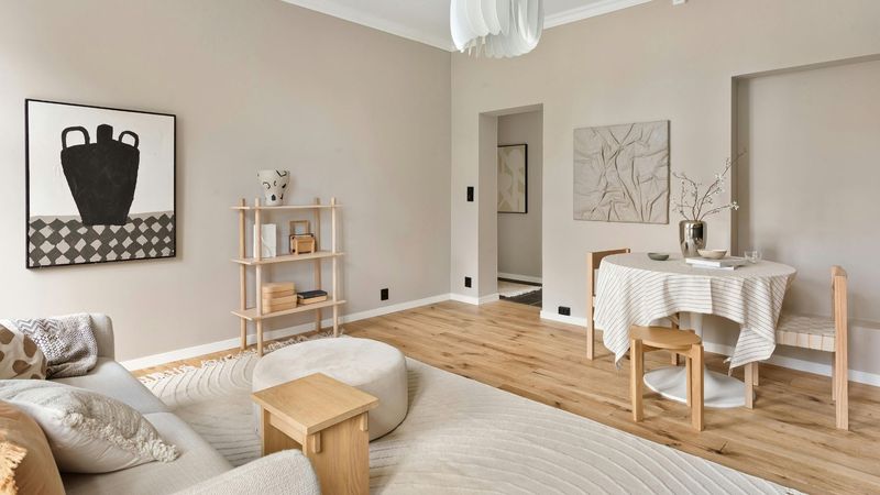
You’ve definitely encountered this ubiquitous yellowish-beige in rental properties and new construction. Property managers love it because it’s inoffensive, but that’s precisely the problem – it lacks any character whatsoever.
The flat, uninspired tone creates spaces that feel institutional rather than homey. I’ve noticed how it absorbs light in all the wrong ways, making rooms appear smaller and more dated than they actually are.
Contemporary designers prefer either crisp whites or actual color choices that make intentional statements about a home’s personality.
3. Burgundy: The 90s Throwback
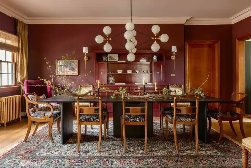
Once the crown jewel of formal dining rooms across America, burgundy walls now scream “time capsule from 1994.” This deep reddish-purple shade dominated homes alongside forest green for nearly a decade.
My clients often point to burgundy as their biggest previous paint regret. The heavy, dark tone creates rooms that feel smaller and more oppressive than intended, especially in spaces with limited natural light.
Today’s rich colors lean toward jewel tones with more blue undertones or earthy terracottas that feel fresh rather than formal.
4. Tuscan Gold: The Faux-Mediterranean Fade
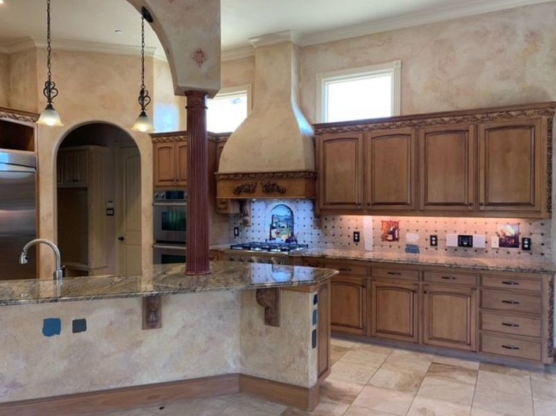
Those yellowish-gold walls meant to evoke Italian villas have lost their luster. Popular throughout the early 2000s, this color was often paired with sponge-painting techniques and Mediterranean-inspired decor.
Walking into a Tuscan gold kitchen today feels like stepping into a time machine. The warm yellow undertones clash with contemporary furnishings and make spaces feel instantly dated.
Even clients who once loved the cozy warmth of these golden hues now request fresher, cleaner colors that better showcase their art and furniture collections.
5. Cool Gray: The Overplayed Neutral
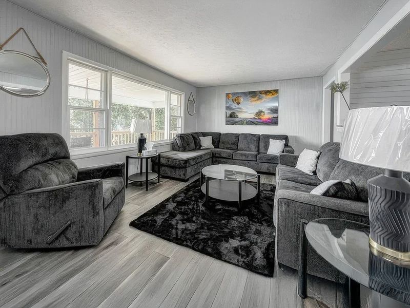
For years, cool gray reigned supreme as the “modern” alternative to beige. Pinterest boards exploded with slate-colored walls paired with white trim, creating the quintessential contemporary look of the 2010s.
The problem? These cool-toned grays have begun feeling clinical and cold rather than sophisticated. I’ve watched clients struggle with decorating around these spaces, as the chilly undertones fight against warmer furnishings and natural elements.
Designers now prefer warmer, more complex neutrals that create inviting atmospheres while still maintaining a clean aesthetic.
6. Teal: The Accent Wall Fatigue
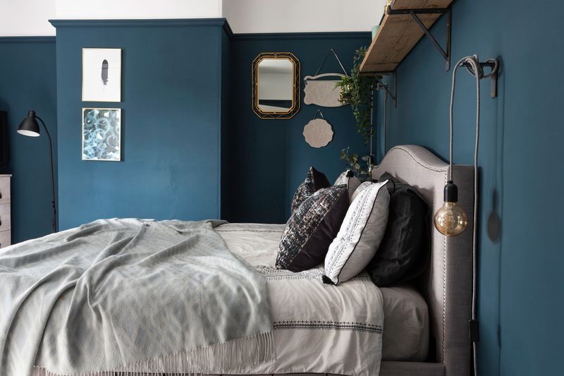
Bold teal accent walls dominated design shows and magazines throughout the 2010s. That specific blue-green shade promised to add personality without overwhelming a space.
Fast forward to today, and these statement walls have become visual shorthand for “I decorated my home a decade ago.” The once-fresh color now feels like a dated attempt at quirkiness rather than thoughtful design.
Current trends favor either subtler, more complex blue-greens or fully committing to color throughout a space rather than isolating it to a single wall.
7. Brown Chocolate: The Den Darkness
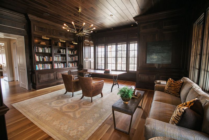
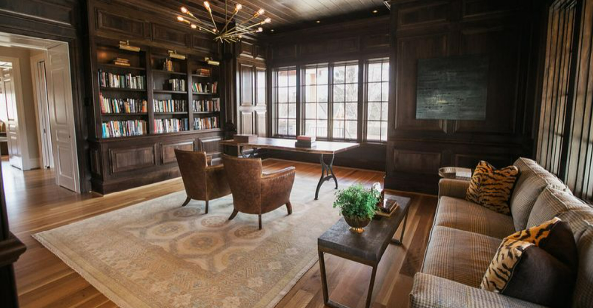
Dark chocolate brown walls were once the go-to choice for creating “cozy” dens, offices, and powder rooms. The rich, deep tone was meant to feel luxurious and masculine.
Unfortunately, these spaces now feel like caves rather than retreats. The overwhelming darkness absorbs light and makes rooms feel significantly smaller and more closed-in than necessary.
Today’s designers opt for lighter, airier spaces with strategic dark elements through furniture and decor rather than committing entire walls to such heavy, light-absorbing colors.
