Still Have These Decor Staples Designers Are Quietly Tossing Them Before 2025
Home design evolves faster than most of us can keep up with. What looked fresh and trendy just a few years ago might now be making professional designers cringe.
As we approach 2025, certain once-popular decor elements are being quietly removed from stylish homes across the country.
If you’re still holding onto these fading trends, it might be time for a refresh.
1. Shiplap Walls
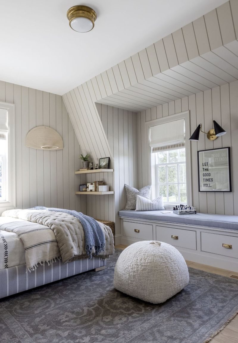
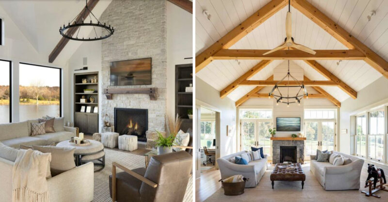
Joanna Gaines made shiplap the darling of farmhouse style, but designers are now backing away from this wooden wall treatment. The horizontal planking that once signaled rustic charm has become too associated with a specific design era.
Many homeowners installed it everywhere without considering if it made sense for their actual home’s architecture. Designers now prefer more timeless wall treatments or using shiplap very sparingly in appropriate settings like coastal homes.
If you’re ready to move on, consider textured plaster, contemporary paneling, or simply well-painted walls with architectural interest elsewhere in the room.
2. Barn Doors in Every Room
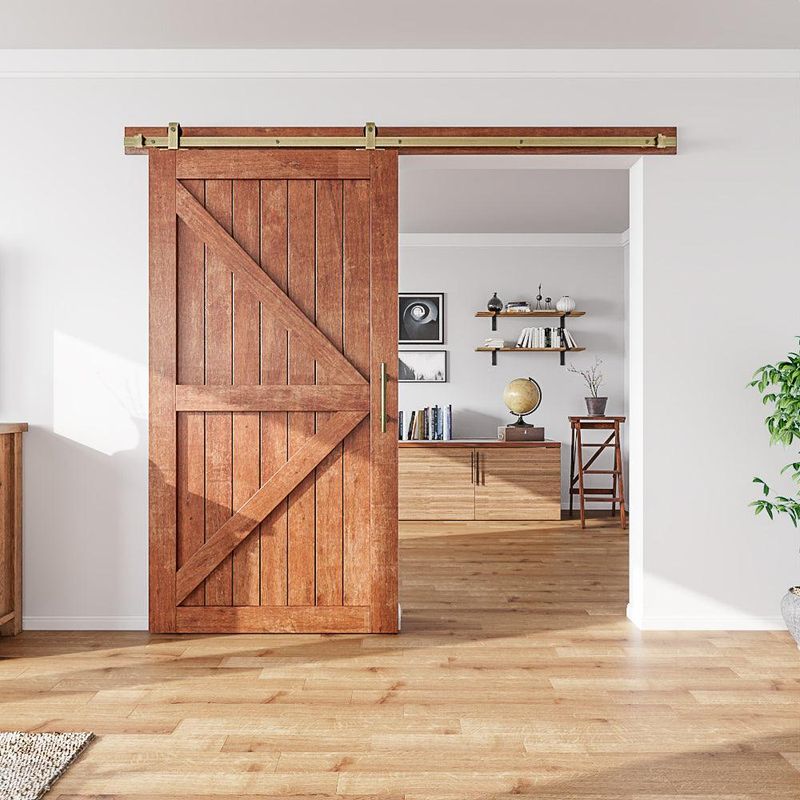
Remember when sliding barn doors seemed like the perfect solution for every doorway? Their popularity exploded because they saved space and added rustic character. Now designers are questioning both their functionality and overuse.
These doors don’t provide proper sound insulation and often don’t fully close, making them impractical for bathrooms and bedrooms. The chunky hardware and large wooden slabs that once felt charming now read as bulky and theme-y.
For space-saving alternatives, consider pocket doors, French doors, or stylish room dividers that offer better privacy while maintaining a more refined aesthetic.
3. All-Gray Color Palettes
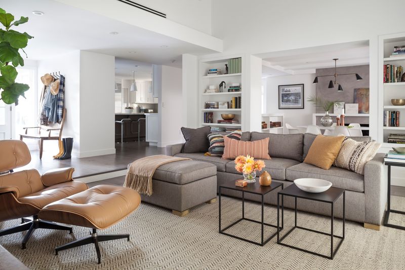
The reign of gray is coming to an end. For years, this neutral dominated everything from walls to furniture, promising a safe, modern look. Designers are now moving away from these cool-toned monochromatic schemes that can feel clinical and lifeless.
Warmer neutrals like beige, taupe, and soft whites are taking center stage, along with actual colors! Spaces with personality incorporate thoughtful color rather than playing it safe with fifty shades of gray.
If your home feels like a gray cloud, introduce warmth through textiles, art, and accessories before committing to repainting. Small changes can dramatically shift the feel of an all-gray space.
4. Word Art Signs
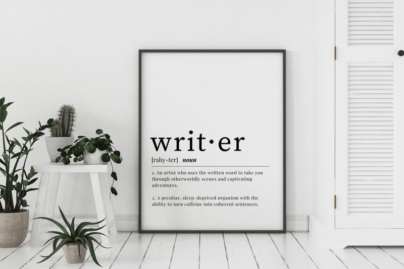
Those wooden signs declaring “Live, Laugh, Love” or “Gather” have become the butt of design jokes. What once seemed like meaningful decor now reads as impersonal filler that states the obvious.
Designers prefer art that expresses personality without literally spelling it out. Mass-produced word art fails to tell your unique story and often cheapens the look of an otherwise thoughtful space.
Instead, invest in original artwork, vintage finds, or family photos that genuinely reflect your life and interests. If you love typography, look for vintage signs or artistic text-based pieces that aren’t straight from a big box store’s farmhouse collection.
5. Overly Distressed Furniture
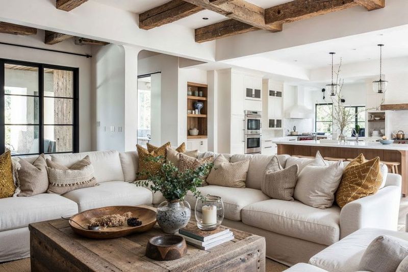
Furniture that looks like it survived a demolition site is losing its appeal fast. The heavily distressed, artificially aged pieces that dominated farmhouse style are being replaced by furniture with authentic patina or clean, contemporary lines.
Designers point out that quality furniture shouldn’t need fake aging to look interesting. Many of these mass-produced distressed pieces also tend to look cheap rather than charmingly vintage.
If you love character in your furniture, opt for genuinely vintage pieces with natural wear or new items with subtle distressing that enhances rather than defines their appearance. The goal is furniture that ages gracefully rather than starting its life pretending to be old.
6. Faux Farmhouse Sinks
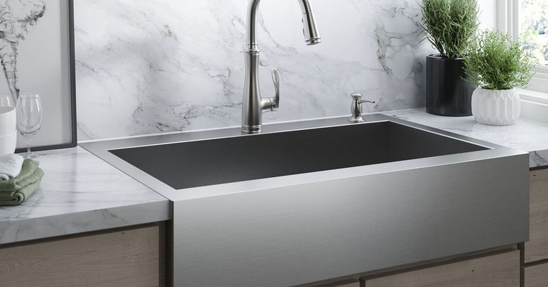
Authentic farmhouse sinks have timeless appeal, but their cheaper imitations are on the chopping block. These faux versions – often plastic or thin fiberglass designed to mimic the real thing – quickly show wear and cheapen kitchens.
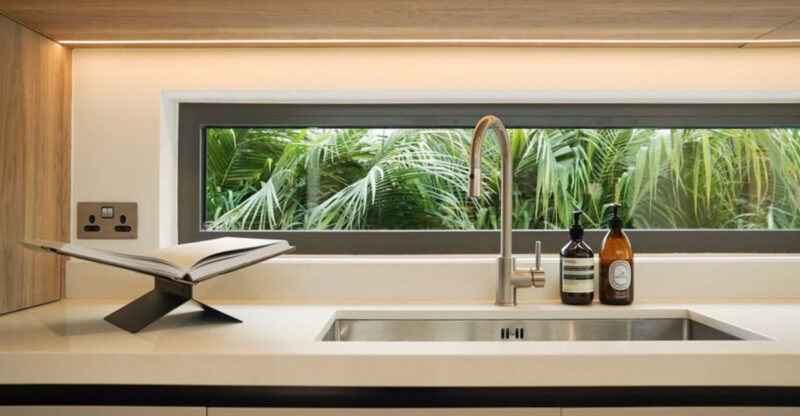
The apron-front look became so ubiquitous that it lost its special quality, especially when paired with obviously non-farmhouse elements. Designers are embracing either genuine high-quality farmhouse sinks where appropriate or moving toward undermount and integrated sink options for a cleaner look.
When remodeling, invest in materials that will stand the test of time rather than chasing a trend with budget materials. Your kitchen deserves fixtures that maintain their beauty through years of use.
7. Mosaic Glass Backsplashes
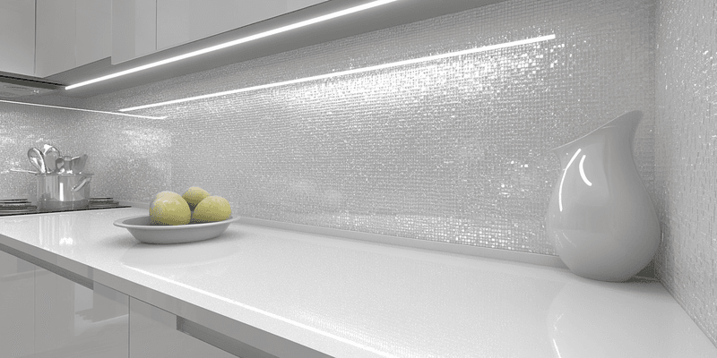
Those tiny glass tile backsplashes in blues and greens had their moment in the early 2000s. Now they’re immediately dating kitchens and bathrooms. The small format creates busy grout lines that collect grime, while the iridescent finishes often clash with today’s preferred natural materials.
Designers are embracing larger format tiles, slabs, or simple subway tiles with interesting installations. The focus is on clean lines and materials that complement rather than compete with the rest of the space.
If you’re stuck with glass mosaic, consider a simple paint color update to surrounding areas or new lighting to minimize its impact while you save for a more substantial renovation.
8. Heavy Brown Leather Sofas
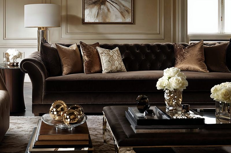
Those oversized, overstuffed dark brown leather sofas that dominated the early 2000s are losing their place as living room centerpieces. Often paired with equally heavy wooden coffee tables, these sofas create a dark, dated atmosphere that feels masculine in an unintentional way.
Today’s leather furniture tends toward lighter colors (camel, tan) and sleeker silhouettes. Designers appreciate leather’s durability but seek pieces with more refined proportions and less bulky detailing.
If replacing isn’t an option, lighten up the space around your dark leather sofa with bright pillows, a new rug, and contemporary accent furniture. Sometimes changing everything but the sofa can transform the entire room’s feel.
9. Matching Furniture Sets
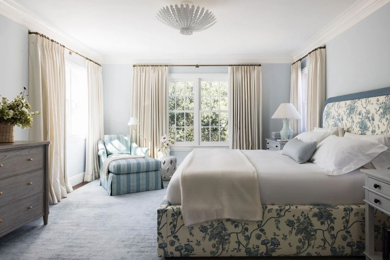
Purchasing an entire bedroom or living room set at once seemed efficient, but designers are firmly against this approach now. Matching sets from furniture showrooms create spaces that feel like impersonal hotel rooms rather than homes with character and story.
Curated spaces that mix complementary pieces create more visual interest and personality. Even high-end matching sets can make a room feel flat and uninspired compared to thoughtfully combined individual pieces.
Start breaking up your matching set by replacing one piece at a time. A different nightstand here, a new coffee table there – gradually creating a more collected look that appears to have evolved naturally over time rather than arriving all at once in a delivery truck.
10. Popcorn Ceilings
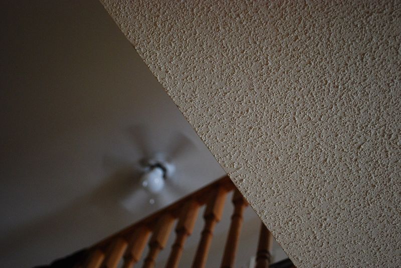
Acoustic “popcorn” ceilings have been on designers’ hit lists for decades, yet they still lurk in many homes. This outdated texture traps dust, creates harsh shadows, and immediately signals that a home hasn’t been updated since the 1980s.
Modern ceiling treatments focus on clean, smooth surfaces or intentional texture like subtle plaster work or wooden beams. Even simple, flat painted ceilings are vastly preferred to the bumpy popcorn look.
Removal can be messy but transformative for your space. If you’re not ready for full removal, consider covering popcorn ceilings with planking or ceiling tiles in appropriate settings. Just check for asbestos in older applications before disturbing any popcorn texture.
11. Chevron Patterns Everywhere
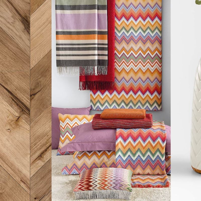
The zigzag chevron pattern dominated the 2010s, appearing on everything from rugs to accent walls. Its bold, geometric nature made it exciting initially, but its overuse quickly turned it into a visual cliché that screams “dated decor.”
Designers are embracing subtler patterns with more staying power or using bold patterns more judiciously. The all-chevron-everything approach now feels like a time capsule from a specific design moment rather than a timeless choice.
If you still love chevron, limit it to one small accent piece rather than making it a room’s dominant pattern. Consider evolving toward herringbone chevron’s more sophisticated cousin which has proven to have more longevity in classic interiors.
12. Tiled Countertops with Grout Lines
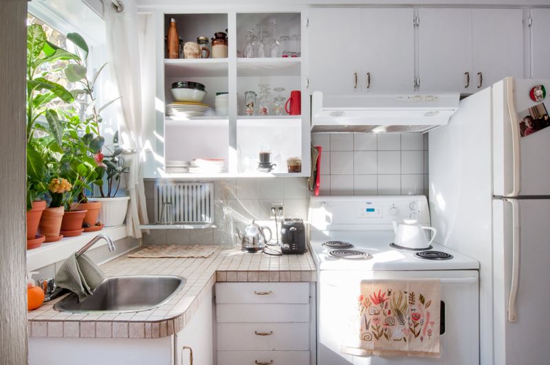
Tiled kitchen and bathroom countertops were practical budget options in previous decades, but they’ve fallen firmly out of favor. The numerous grout lines create cleaning nightmares and uneven surfaces that catch crumbs and harbor bacteria.
Modern countertops prioritize seamless surfaces like quartz, solid surface materials, or large-format porcelain slabs with minimal grout lines. Even budget renovations now typically opt for laminate over tile for its easier maintenance and cleaner appearance.
If replacing isn’t immediately possible, consider temporary solutions like countertop refinishing kits or large cutting boards that can cover the most visible or used portions of tiled counters. These stopgap measures can make daily use more practical while you save for a proper replacement.
13. Wallpaper Borders
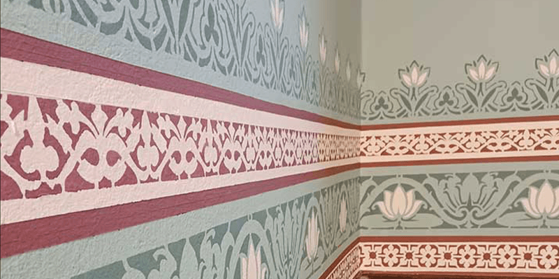
Those narrow strips of wallpaper running along the top of walls were once the height of 90s decorating sophistication. Now they’re instant indicators of an outdated space, creating visual choppiness and often featuring dated motifs like country geese or fruit baskets.
Today’s wallpaper approaches are much more dramatic either covering entire walls with bold patterns or skipping wallpaper altogether. The middle-ground approach of a thin decorative strip satisfies neither minimalist nor maximalist sensibilities.
Removing borders is typically an easy DIY project requiring just water, scoring tool, and patience. Once gone, the walls can be painted a fresh color, or if you love pattern, consider a contemporary full wall covering that makes a more intentional statement.
14. Excessive Open Shelving
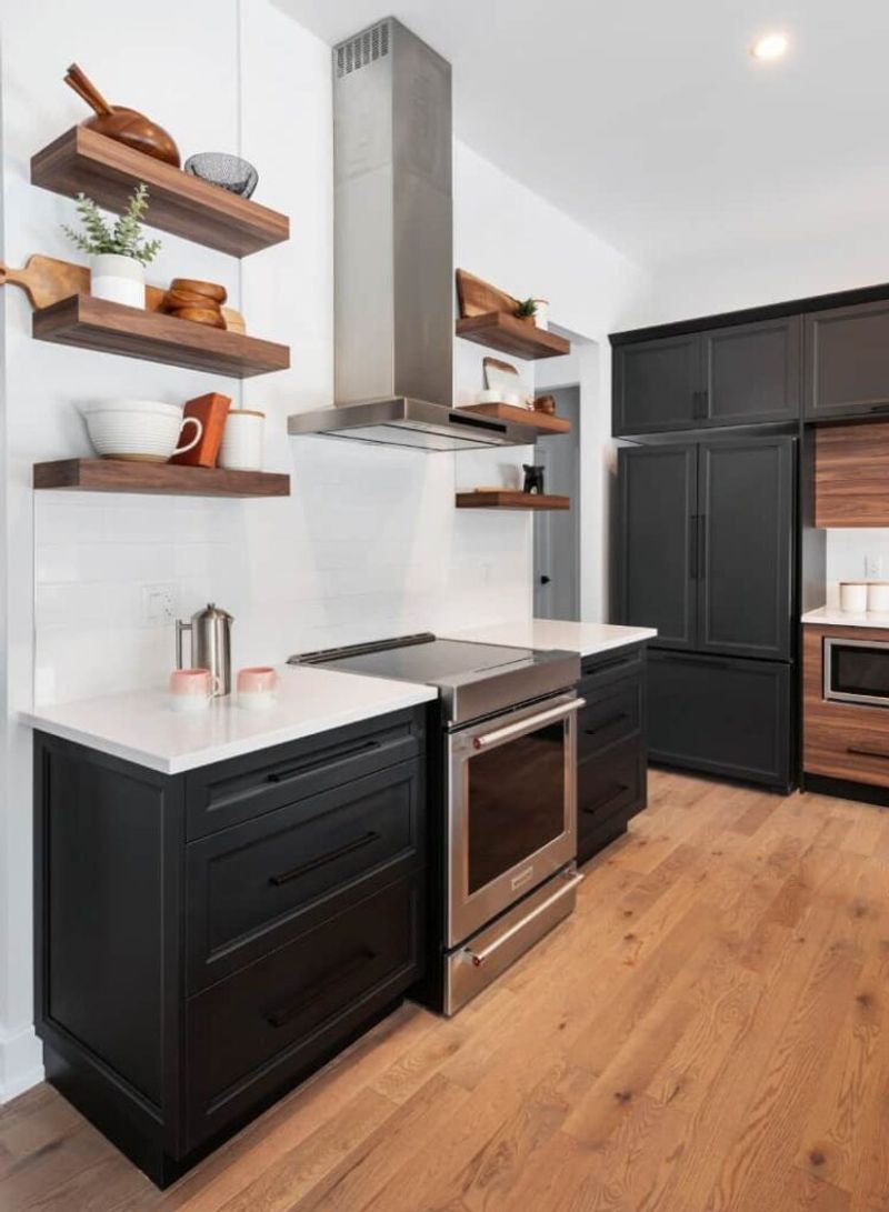
The Instagram-perfect open kitchen shelving trend is facing backlash from designers and homeowners alike. While beautiful in carefully styled photos, these shelves quickly become cluttered catchalls in real life, collecting dust and grease in kitchens.
Many homeowners discovered that maintaining picture-perfect shelves requires either obsessive organization or owning a highly curated collection of attractive dishes. Most people prefer the practicality of closed storage for everyday items.
Designers now recommend a more balanced approach – perhaps one small section of open shelving for display items alongside practical cabinets for everything else. This compromise offers visual interest without sacrificing the functionality that makes a kitchen actually livable.
15. Oversized Rustic Clocks
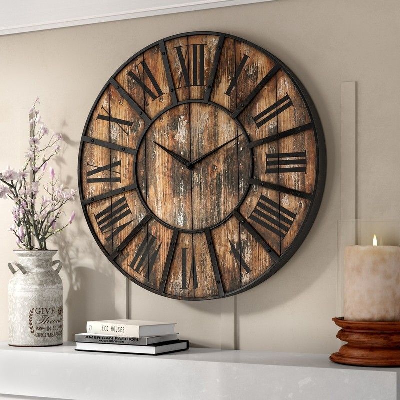
Those massive wall clocks with distressed finishes and oversized numerals have become the poster child for generic farmhouse decor. Often found hovering over sofas or dining tables, these statement timepieces quickly became too statement-making.
Their exaggerated scale and deliberately aged appearance now feel contrived rather than charming. Designers prefer timepieces that blend into decor rather than dominating it, or wall decor that offers more personal significance.
If you’re ready to move on, consider what actually draws you to large-scale wall decor. Maybe a beautiful mirror, an original art piece, or a gallery wall of family photos would better fill that space while reflecting your personal story rather than a mass-produced design trend.

