The Four-Inch Rule: The Tiny Measurement That Transforms Your Living Room
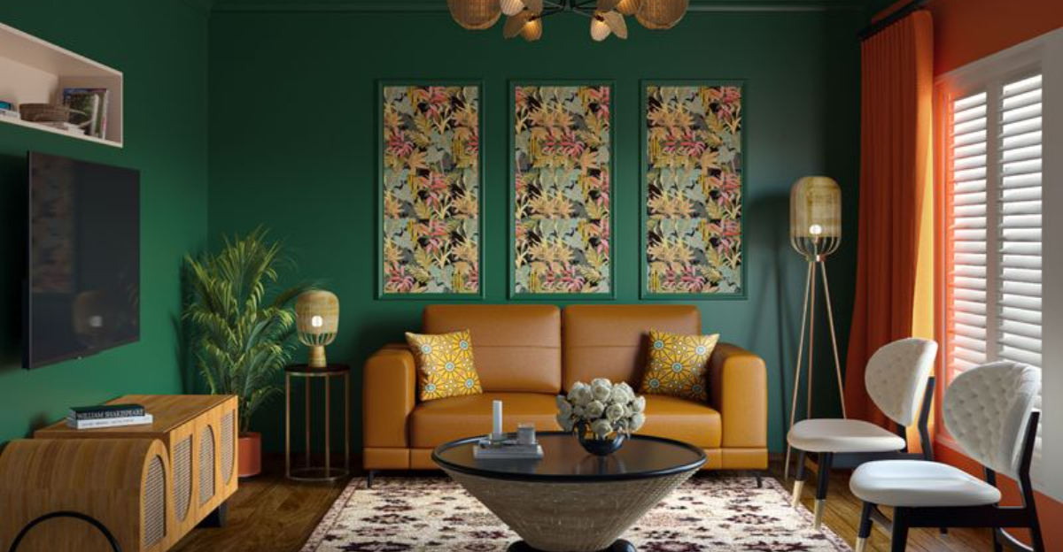
Ever wondered why some living rooms feel perfectly balanced while others seem awkwardly arranged? Professional interior designers often rely on a simple yet powerful guideline called the ‘four-inch rule’ to create harmonious spaces.
This principle helps determine ideal spacing between furniture, walls, and decorative elements, transforming cluttered rooms into welcoming havens with just a few strategic measurements.
1. What Is the Four-Inch Rule?
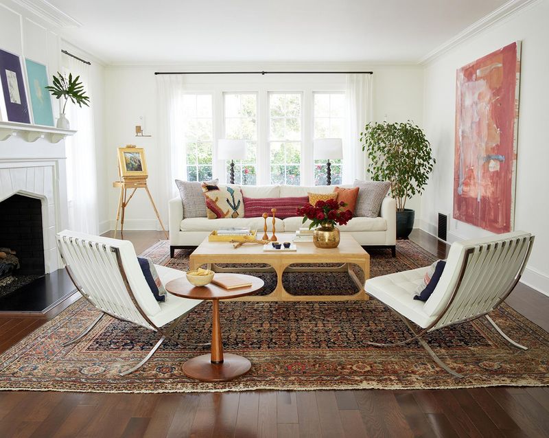
Imagine an invisible buffer zone that gives your furniture room to breathe. This clever design principle suggests keeping a four-inch gap between certain elements in your living space.
The four-inch rule acts as a spacing guideline that prevents furniture from feeling cramped against walls or other pieces. Professional decorators use this measurement to create visual harmony while maintaining practical walkways throughout the room.
2. Why Four Inches Matters In Interior Design

Not too close, not too far – four inches hits the sweet spot of spatial relationships. This magical measurement creates breathing room without awkward gaps that make furniture feel disconnected.
The four-inch rule emerged from designers noticing how this specific distance maintains visual connection between pieces while providing practical spacing. Your brain subconsciously registers this balanced arrangement, making rooms feel more intentional and professionally designed.
3. How The Rule Applies To Living Room Layouts

Beyond the basics, this rule transforms how furniture interacts with walls and walkways. Pull sofas four inches from walls to create an illusion of more space and prevent that institutional, rigid feeling.
For area rugs, maintain a four-inch border of flooring around the edges for visual framing. When hanging artwork, position pieces four inches apart in gallery arrangements to create cohesive groupings that feel intentionally curated rather than randomly placed.
4. Common Mistakes The Rule Helps Avoid
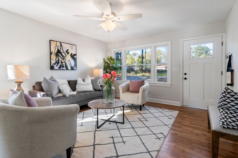
Without proper spacing guidelines, many homeowners push furniture flush against walls, creating a boxy, confined feeling. The four-inch rule prevents this institutional look while maintaining valuable floor space. Floating rugs with no relationship to furniture creates visual confusion.
By applying four-inch measurements between rug edges and furniture legs, you establish purposeful connections. Similarly, artwork hung without consideration for proper spacing often appears randomly scattered rather than thoughtfully arranged.
5. Designer Tips For Implementing The Four-Inch Rule
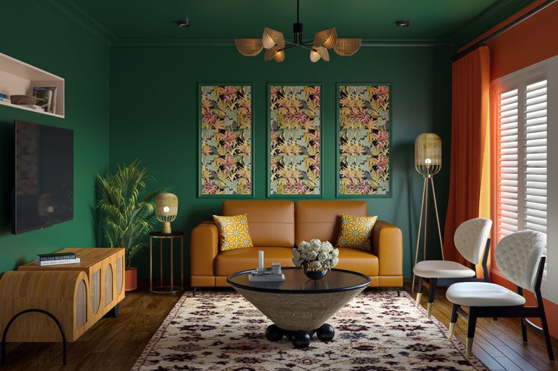
Grab a set of wooden blocks cut precisely to four inches to use as temporary spacers when arranging furniture. This hands-on approach eliminates guesswork and helps visualize the final arrangement before committing.
Digital planners with precise measurement tools allow you to experiment virtually before moving heavy pieces. For artwork, create paper templates and position them with exactly four inches between each piece before hammering any nails, saving your walls from unnecessary holes.
6. When To Bend The Rule For Certain Styles
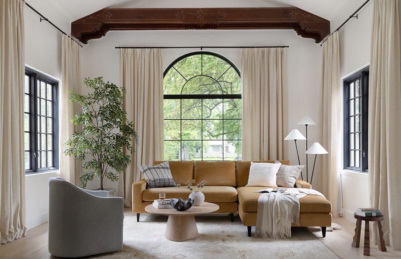
Rules exist to guide, not restrict your creativity. Minimalist designs sometimes benefit from larger gaps – up to eight inches – creating more pronounced negative space that enhances the clean aesthetic.
The four-inch rule can flex in cozy cottage styles where furniture might nestle closer together. Conversely, grand spaces with oversized furniture might require six-inch spacing to maintain proper proportional relationships. Trust your eye while using the rule as a starting point rather than an absolute requirement.
7. Real-Life Examples

Consider the dramatic transformation in the Jensen family’s cramped living area. Before applying the four-inch rule, their sofa pressed against the wall made the room feel smaller despite their efforts to maximize space.
After pulling furniture away from walls and creating proper spacing between their coffee table and seating, the room paradoxically felt larger. My household experienced similar results when I repositioned the gallery wall using four-inch spacing, transforming a chaotic collection into a cohesive focal point.

