15 Insider Styling Tricks Interior Designers Swear By
Ever wondered why professionally designed spaces look so effortlessly perfect? The truth is, interior designers rely on clever tricks that transform ordinary rooms into magazine-worthy showcases.
These styling secrets aren’t just about expensive furniture or rare finds they’re about understanding how to manipulate space, light, and proportion.
I’m sharing the industry’s best-kept styling techniques that can help anyone create a more beautiful, functional home.
1. Layer Rugs for Depth and Texture
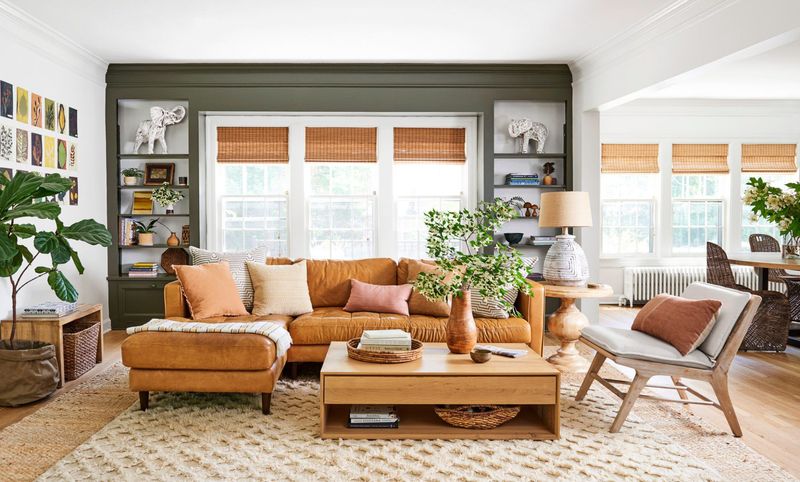
Placing one rug on top of another creates instant visual interest in any room. I love starting with a large natural fiber rug as a base, then adding a smaller, more colorful or patterned rug on top.
This technique defines conversation areas in open-concept spaces and adds warmth to hardwood or tile floors. The key is ensuring the top rug is about two-thirds the size of the bottom one.
My clients are always surprised by how this simple change adds dimension and coziness. Even budget-friendly rugs look luxurious when layered thoughtfully. Plus, it’s perfect for renters who can’t change flooring but want to hide less-than-perfect carpet or tiles.
2. Hang Curtains High and Wide
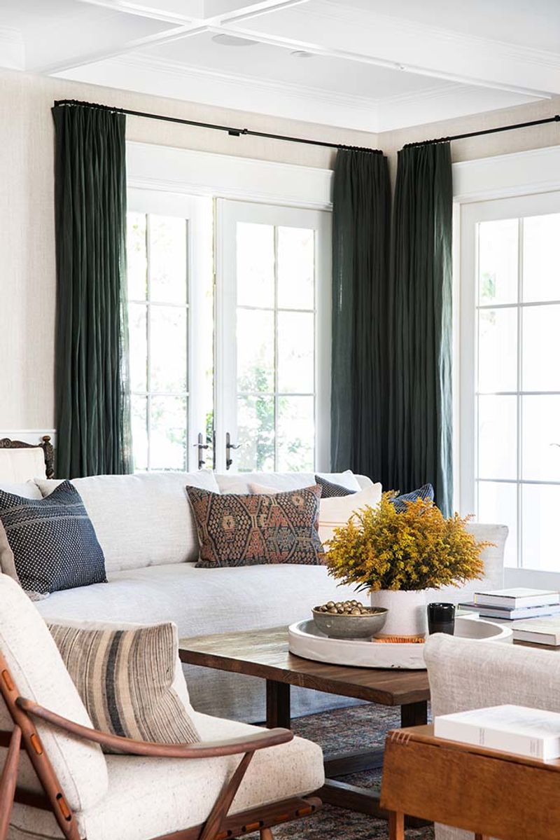
Windows appear dramatically larger when curtains extend beyond their actual frames. For an instant room upgrade, I mount curtain rods 4-6 inches above window frames and extend them 8-12 inches on each side.
This trick draws the eye upward, creating the illusion of taller ceilings and bigger windows. When the curtains are open, they frame the window beautifully without blocking any precious light.
Sheer fabrics work wonderfully with this technique, adding softness while maintaining brightness. The transformation is remarkable—rooms instantly feel more grand and well-proportioned. Even standard-size windows can look like impressive architectural features when dressed properly.
3. Use Odd Numbers for Grouping Decor
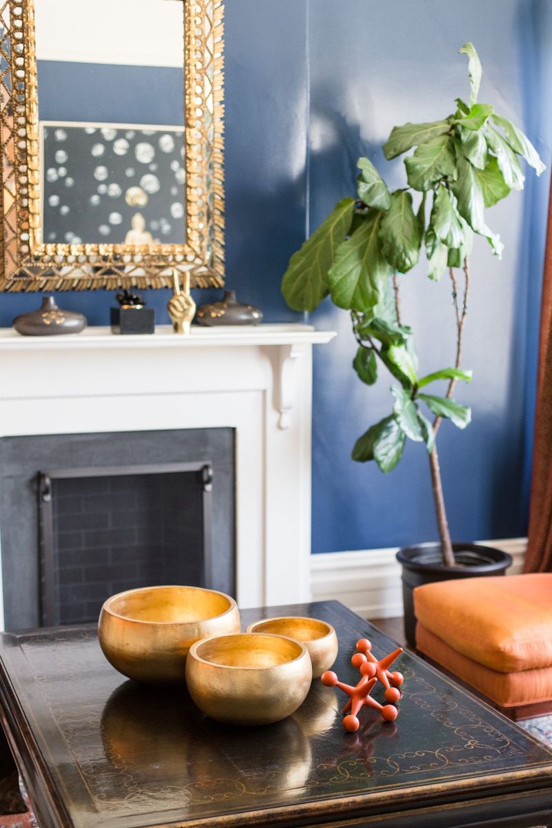
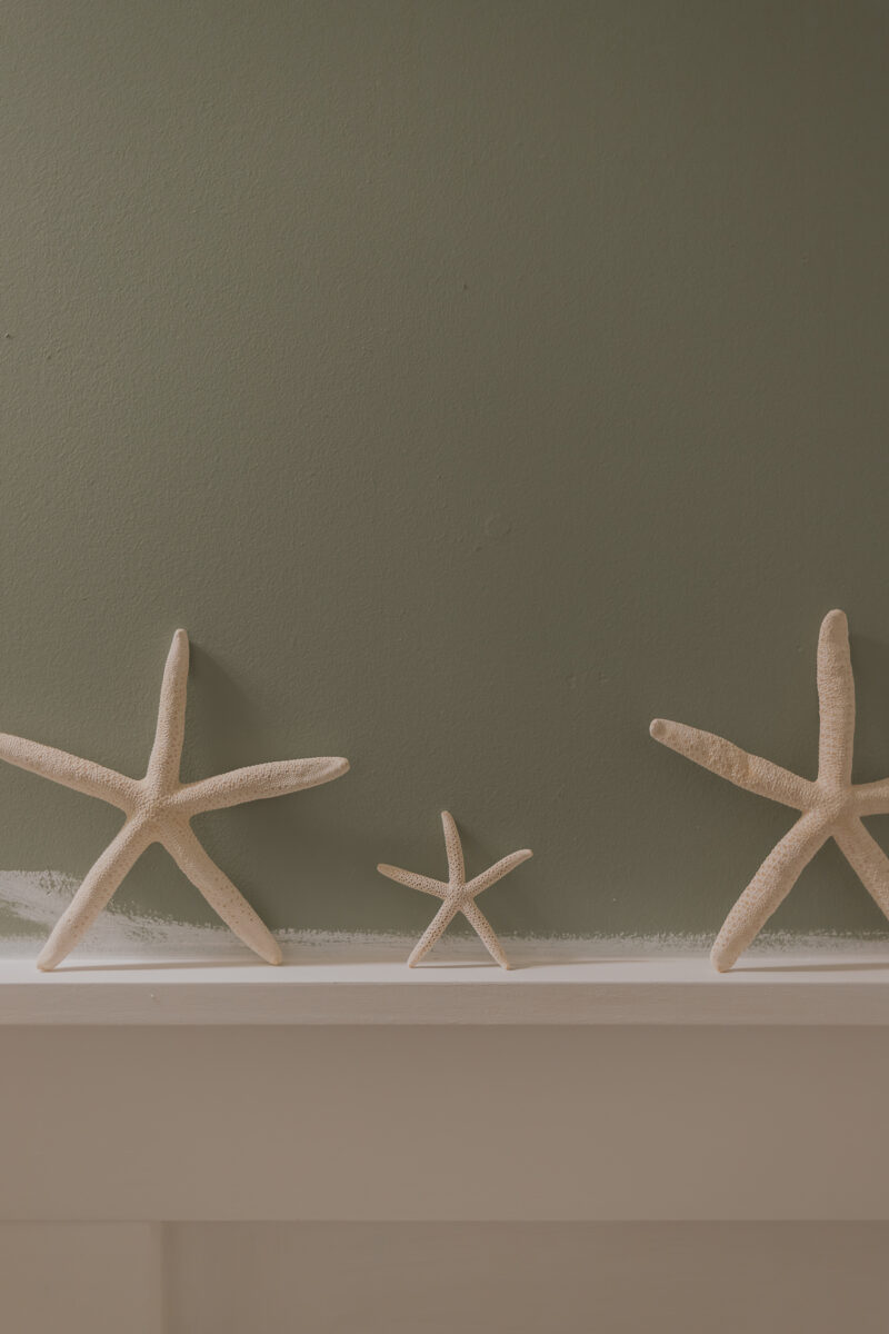
Groups of three, five, or seven items create more visually appealing arrangements than even numbers. This styling principle, called the ‘rule of odds,’ works because asymmetry naturally draws the eye and creates visual interest.
When styling shelves or tabletops, I arrange objects in triangular formations varying in height, width, and texture. The brain finds these groupings more dynamic and engaging than symmetrical pairings.
Try clustering three candlesticks of different heights, or display five picture frames of various sizes on a console table. The magic happens when you include objects of contrasting scales perhaps a tall vase, a medium-sized book stack, and a small decorative box together.
4. Mix Textures to Add Interest
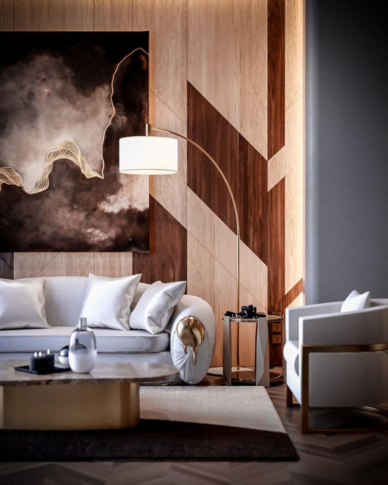
Blending different textures prevents rooms from falling flat, even when using a limited color palette. I encourage combining smooth, rough, shiny, and matte finishes to create a rich sensory experience.
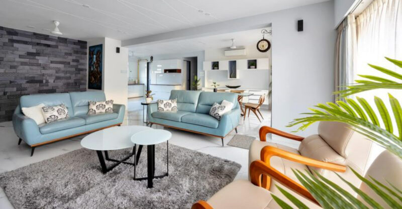
Velvet pillows against a linen sofa, a glossy ceramic lamp on a rough wooden table, or a sleek metal frame against a plush rug—these contrasts create depth that makes spaces feel thoughtfully designed. The secret is balancing textures throughout the room rather than concentrating them in one area.
This approach works especially well in monochromatic spaces where texture becomes the star. Even all-white rooms come alive when you mix crisp cotton, nubby wool, polished marble, and woven rattan elements.
5. Create a Focal Point in Every Room
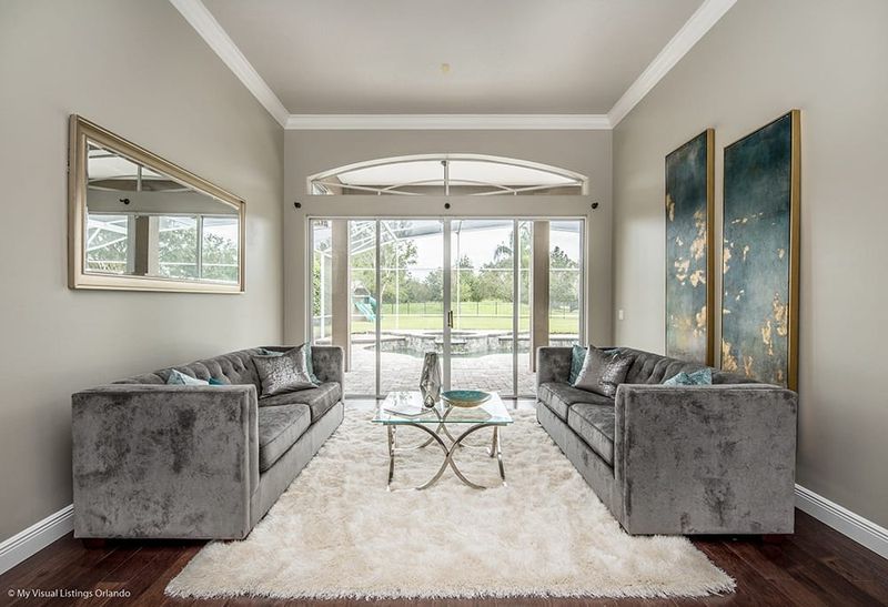
Every well-designed space needs something that immediately captures attention when you walk in. Without a focal point, rooms feel directionless and forgettable.
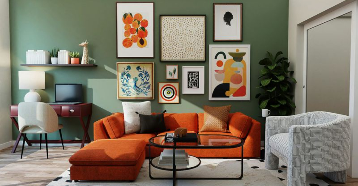
Focal points anchor the space and guide furniture arrangement. This could be an architectural feature like a fireplace or large window, or something you create a stunning piece of art, a bold wallpapered accent wall, or an eye-catching light fixture.
If your room lacks natural architectural interest, try painting one wall in a contrasting color or hanging an oversized mirror or artwork. The best focal points reflect your personality while providing structure to the overall design. Everything else in the room should complement, not compete with, this central element.
6. Float Furniture Away from Walls
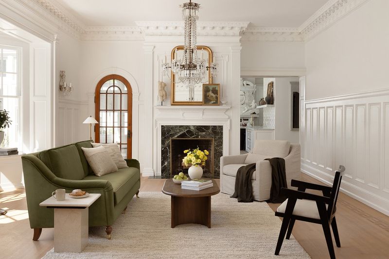
Pushing all furniture against walls creates that dreaded ‘waiting room’ effect. Instead, I pull pieces away to create more intimate, conversation-friendly arrangements.
This approach makes even small rooms feel more spacious and intentional. Try positioning your sofa at least a few inches from the wall, with a slim console table behind it if space allows. In larger rooms, create ‘floating’ seating groups with pieces facing each other, leaving pathways around them.
The breathing room between furniture and walls creates a more sophisticated look while improving flow and function. This technique works wonders in open-concept homes where you need to define distinct areas without physical barriers. Just ensure walkways remain at least 30 inches wide.
7. Balance Scale and Proportion
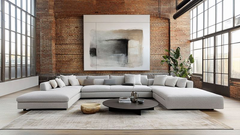
Getting scale right is what separates amateur from professional-looking spaces. Rooms feel uncomfortable when everything is the same size or when pieces are dramatically mismatched in scale.
The trick is creating visual harmony through balanced proportions. A substantial sofa needs equally substantial side tables or lamps tiny accessories will look lost beside it. Similarly, delicate chairs call for smaller-scale accent pieces.
Height variation matters too! Aim for different levels throughout the room—tall bookcases or plants, mid-height furniture, and lower coffee tables or poufs. When choosing art, ensure its size relates properly to the wall and furniture beneath it generally, art should take up 2/3 to 3/4 of the space above a piece of furniture.
8. Incorporate Statement Lighting
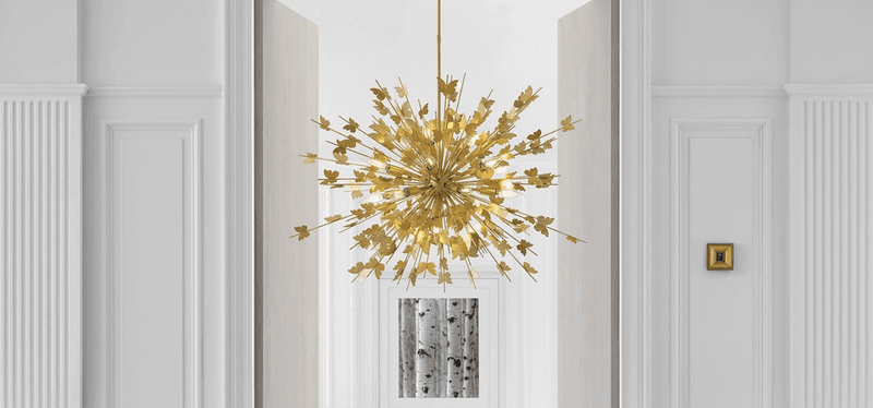
Lighting fixtures aren’t just functional—they’re architectural jewelry that can transform ordinary rooms into extraordinary spaces. I always allocate part of my clients’ budgets for at least one showstopping light.
Oversized pendants or chandeliers create drama above dining tables or in entryways. Even modest homes can handle surprisingly large fixtures that anchor spaces and draw the eye upward. The right statement piece becomes a conversation starter and sets the tone for the entire room.
Don’t just focus on ceiling fixtures though. Sculptural table lamps or unique floor lamps add personality while providing essential task lighting. Remember that dimmer switches are non-negotiable—they allow you to adjust the mood and create different atmospheres for various activities.
9. Style Coffee Tables with Books and Objects
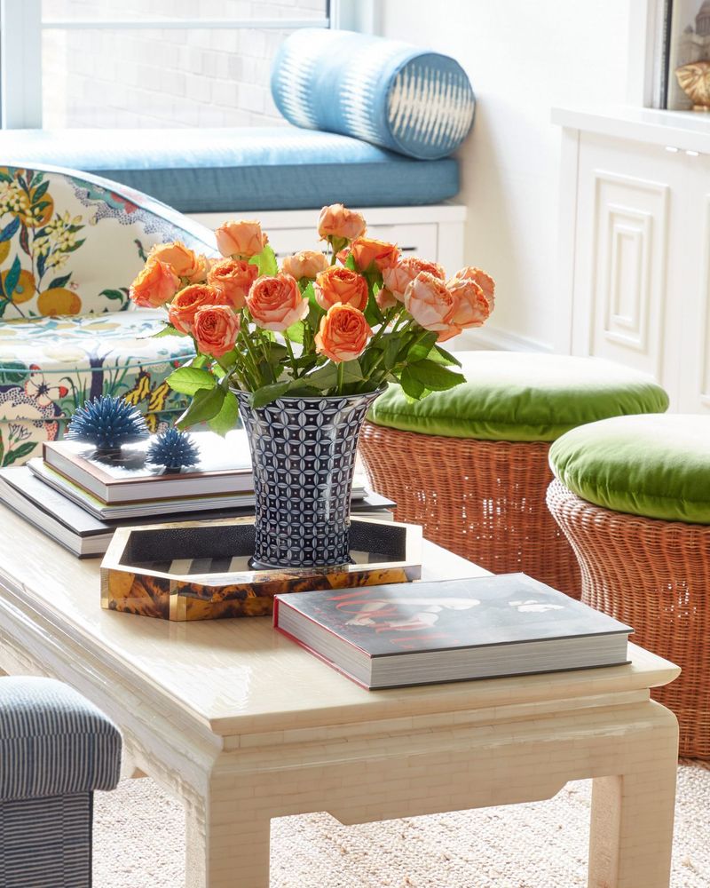
Coffee tables should never be left bare they’re prime real estate for showcasing your personality through carefully curated items. I follow a simple formula: books + botanicals + something personal + something with height.
Start with a stack of interesting coffee table books they provide color, texture, and conversation starters. Add something living like a small plant or fresh flowers for vitality. Include a personal object that tells a story (perhaps a souvenir or family heirloom).
Finally, incorporate something with height like a tall candle or sculpture to create dimension. The arrangement should look effortless, not cluttered, so edit ruthlessly. Leave enough empty space for practical use, and consider using a tray to corral smaller items into a cohesive grouping.
10. Add Greenery for Freshness

Living plants breathe life into interiors in a way no other accessory can match. Even the most perfectly designed room feels incomplete without something green and growing.
For plant-challenged clients, I recommend easy varieties like snake plants, ZZ plants, or pothos that thrive with minimal care. Strategic placement makes all the difference—try clustering small plants in odd-numbered groups, placing tall specimens in empty corners, or using hanging planters to draw the eye upward.
If maintenance is still a concern, high-quality faux plants have come a long way and can be surprisingly effective. Just dust them regularly! The beauty of greenery is that it works with every design style, from minimalist modern to traditional, adding that final layer of freshness that makes a space feel complete.
11. Use Mirrors to Expand Space
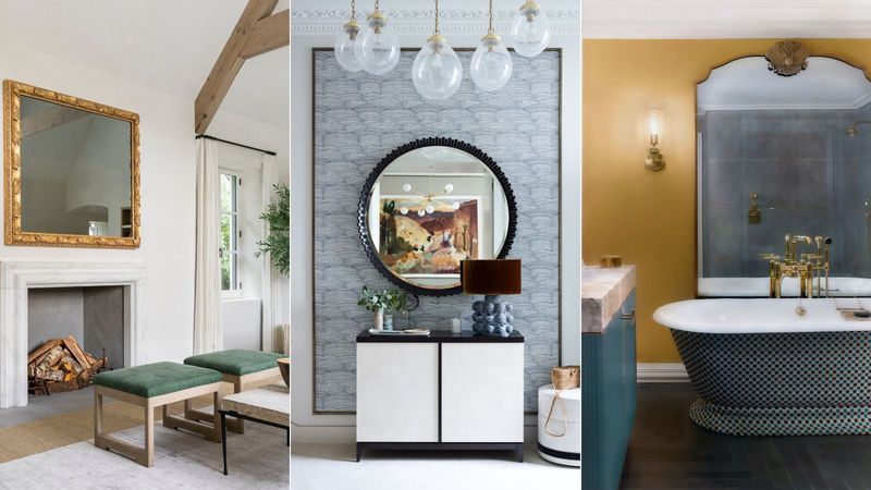
Mirrors perform magic in interior design, doubling visual space and multiplying light. I strategically place them opposite windows to bounce natural light throughout the room or across from architectural features I want to highlight.
Large floor mirrors leaned against walls create dramatic impact in bedrooms or entryways. For dining rooms, a mirror centered above a buffet reflects candlelight during evening gatherings, creating instant ambiance.
When choosing mirrors, consider their frames as important design elements that should complement your overall style. Grouping smaller mirrors gallery-style creates an artistic focal wall while still providing the space-enhancing benefits. This trick works wonders in narrow hallways, tiny bathrooms, or any space that feels confined—instantly creating the illusion of more square footage.
12. Keep Color Palettes Cohesive
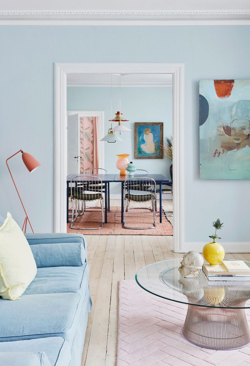
Amateur decorators often make the mistake of treating each room as a separate entity, resulting in homes that feel disconnected. Professional designers create flow by carrying a consistent color story throughout the entire space.
This doesn’t mean every room should be identical! Instead, I select a core palette of 3-5 complementary colors that repeat in different proportions from room to room. Perhaps navy is dominant in the living room while appearing as just an accent in the adjacent dining area.
The trick is ensuring you can stand in one space and see elements of its palette continue into the next room. This creates a subliminal sense of harmony without being obvious or boring. Pay special attention to transition spaces like hallways, which should contain elements from both connecting rooms.
13. Play with Contrast in Colors and Materials
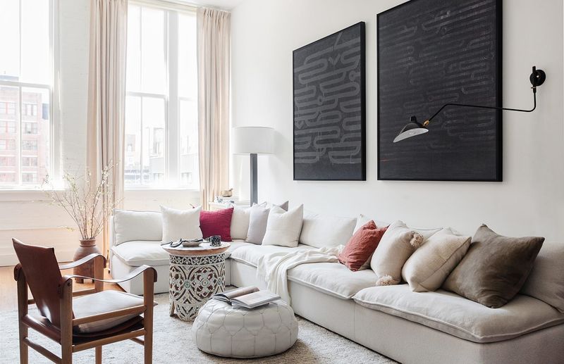
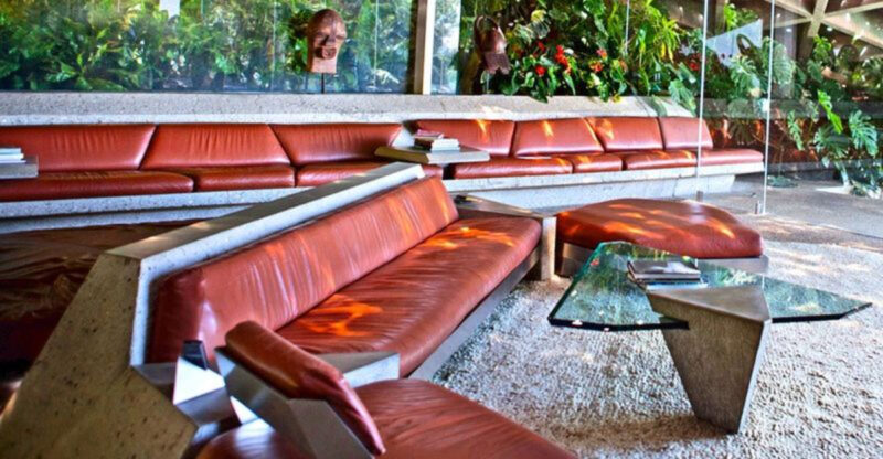
Rooms without contrast quickly become forgettable. The most visually striking interiors always incorporate deliberate opposition light versus dark, rough versus smooth, antique versus modern.
I love pairing a sleek contemporary sofa with a distressed vintage coffee table, or hanging a crystal chandelier above a rustic farmhouse dining table. These juxtapositions create tension that keeps spaces interesting and prevents any one style from dominating.
Color contrast works similarly consider how a few black accents can anchor an all-white room, or how a vibrant pillow pops against neutral upholstery. The magic happens in these contrasts. When everything matches perfectly, rooms feel flat and lifeless. Aim for balanced opposition rather than perfect coordination, and you’ll create spaces with depth and personality.
14. Edit and Declutter Regularly
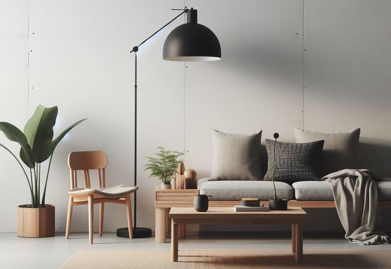
The most beautifully designed spaces share one critical quality: restraint. Professional designers know when to stop adding and start editing.
I advise clients to regularly assess their spaces with fresh eyes, removing anything that doesn’t serve a purpose or bring joy. This doesn’t mean embracing minimalism—it means being intentional about what deserves display space. Group similar items rather than scattering them throughout a room, which creates visual noise.
The breathing room between objects is as important as the objects themselves. Negative space gives the eye places to rest and helps important pieces stand out. Remember that styling isn’t a one-time event but an ongoing process. Seasonal edits keep spaces feeling fresh and prevent the gradual accumulation that leads to cluttered, chaotic rooms.
15. Personalize Spaces with Meaningful Items
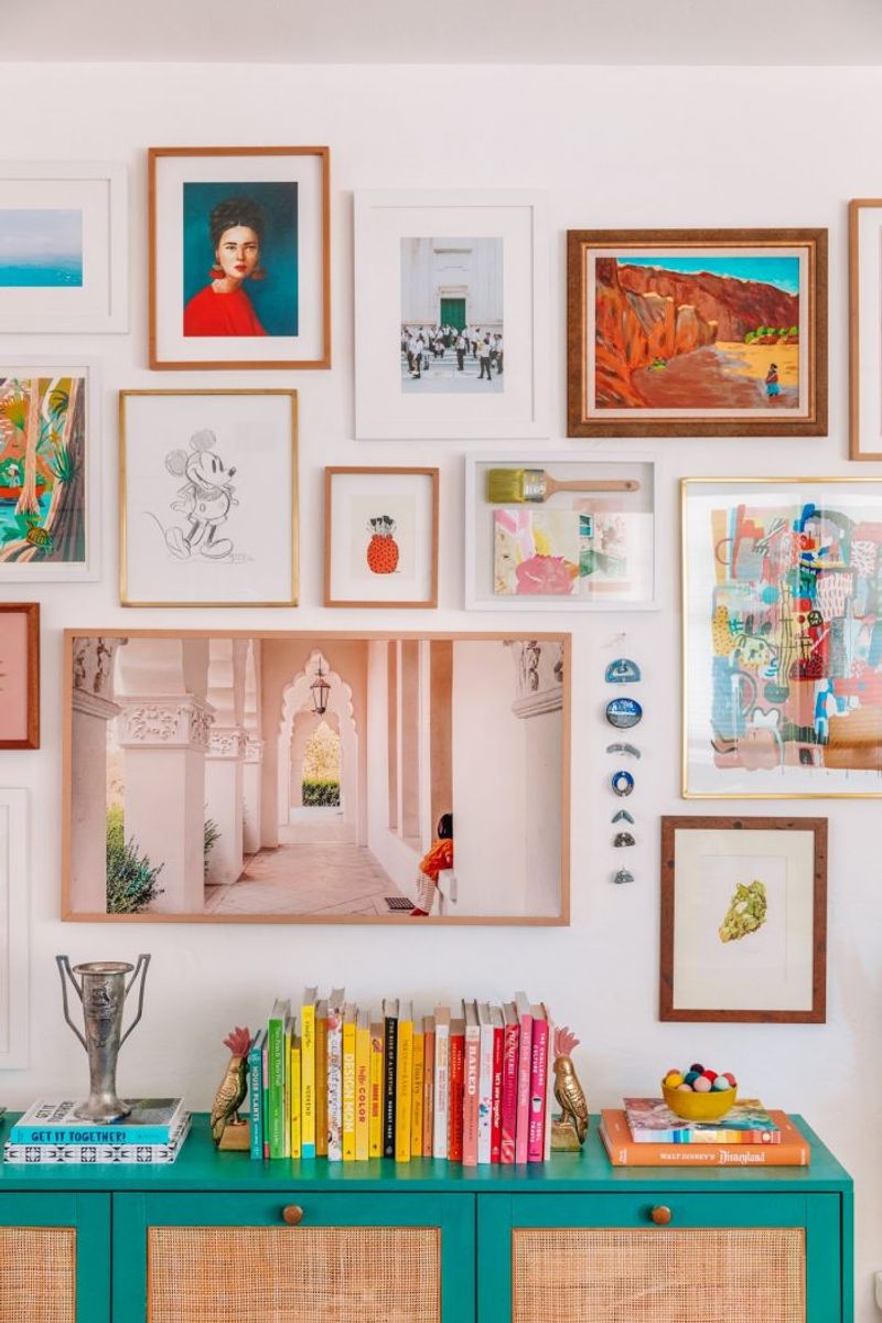
Houses become homes when they tell your unique story. The most memorable interiors always contain personal elements that reflect the inhabitants’ lives, travels, and interests.
I encourage incorporating items with history family heirlooms, travel souvenirs, or pieces with sentimental value alongside newly purchased decor. These personal touches become natural conversation starters and prevent rooms from feeling like catalog displays. Display collections thoughtfully rather than scattered throughout the space.
Frame children’s artwork in quality frames, showcase inherited items in modern settings, or repurpose vintage pieces in unexpected ways. The magic happens in this mix of old and new, personal and purchased. Your home should feel collected over time rather than decorated in a weekend creating a space that couldn’t possibly belong to anyone else.
16. Vary Heights for Visual Rhythm
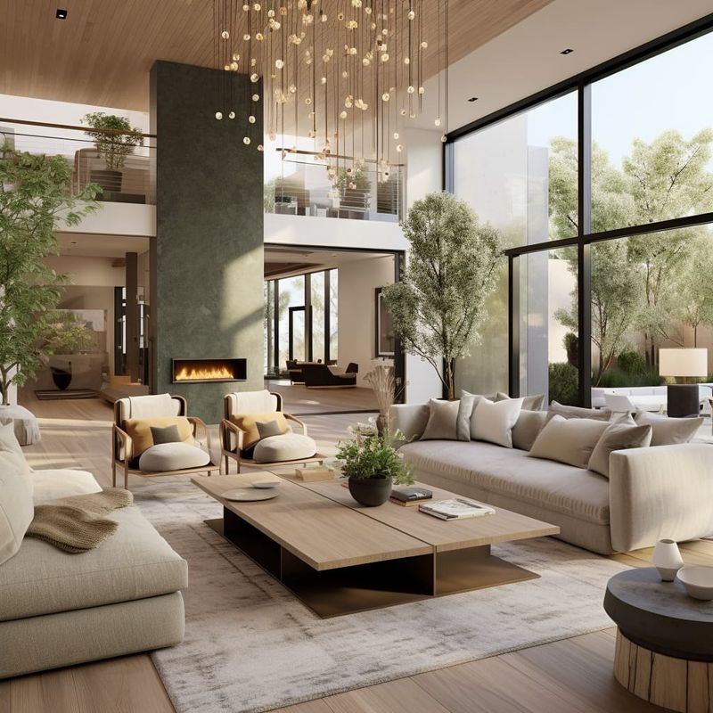
Flat, one-dimensional arrangements are the hallmark of amateur decorating. Professional designers create dynamic visual rhythm by varying heights throughout a room.
When styling shelves or tabletops, I arrange objects at different levels—tall, medium, and short—to create movement that draws the eye through the space. This principle applies to furniture arrangements too. A room with all low-slung seating feels unbalanced, while mixing a tall bookcase, mid-height sofa, and low coffee table creates pleasing vertical diversity.
If your room lacks architectural interest, create height with floor lamps, tall plants, or floor-to-ceiling curtains. The goal is avoiding a flat horizon line where everything sits at the same level. Strategic height variation prevents visual monotony and makes spaces feel more three-dimensional and professionally designed.
17. Master the Art of Asymmetrical Balance
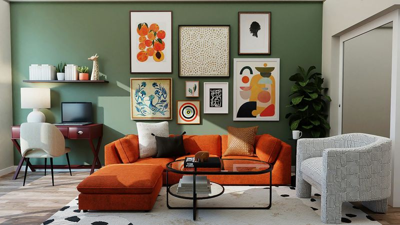
Perfect symmetry can make spaces feel formal and static. Most top designers prefer asymmetrical balance—a more sophisticated approach that creates dynamic, lived-in environments.
Instead of matching everything in perfect pairs, asymmetrical balance distributes visual weight evenly while using different elements. For example, a large sofa on one side of a room might be balanced by two smaller chairs on the opposite side. Or a substantial piece of art could be balanced by a collection of smaller framed pieces across the room.
This technique requires a good eye, but the results feel more natural and less contrived than strict symmetry. Think of it as creating equilibrium rather than mirroring. The space should feel balanced when you stand in it, even if the elements on either side aren’t identical twins.

