How to Paint Two Tone Walls that Look Perfect
This post contains affiliate links, which means we may earn a small commission if you purchase through them — at no additional cost to you. Please see our policy page for more details.
An easy step by step tutorial for painting two tone walls.
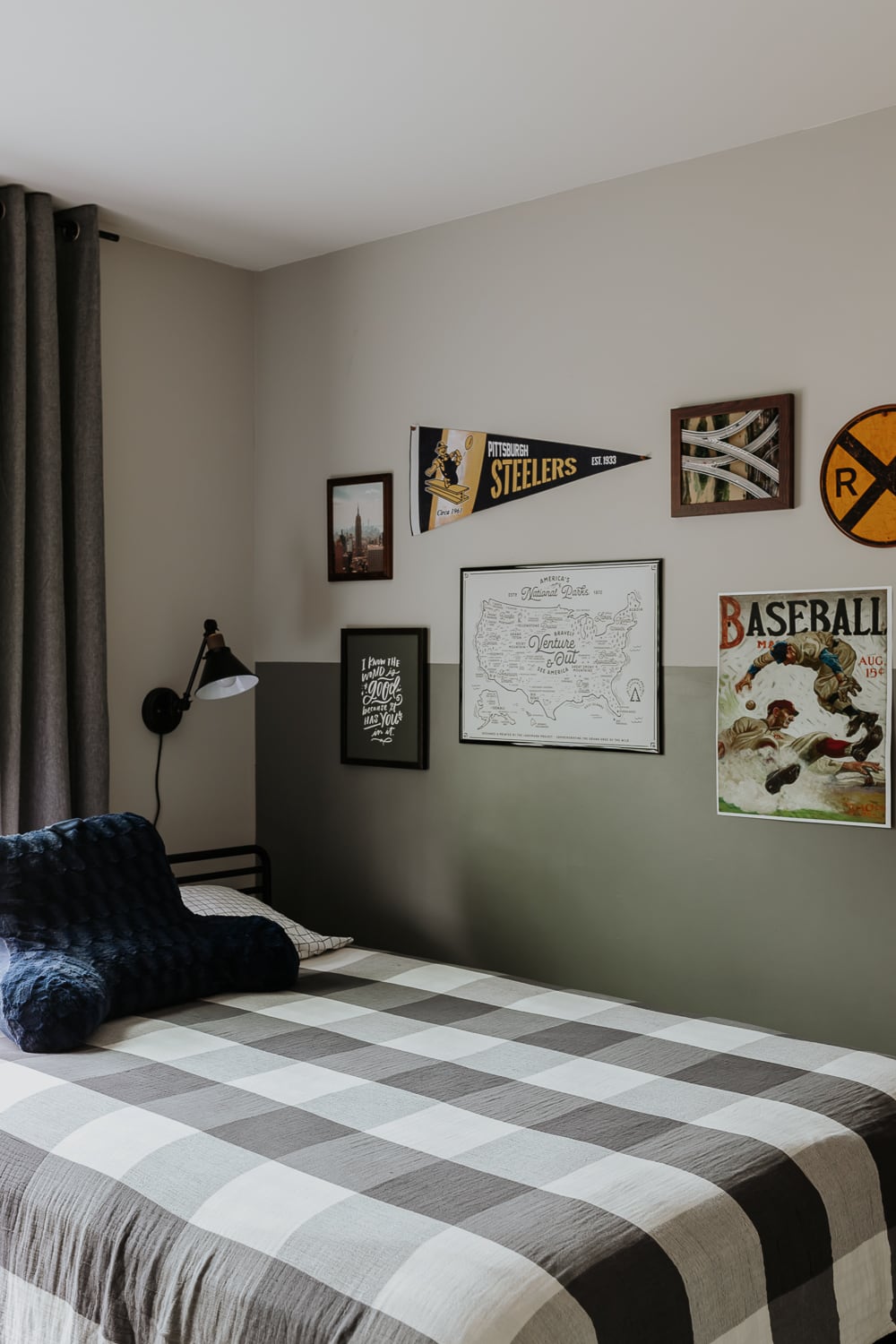
I have some great tips in this post for how to paint two tone walls. I just recently completed this two tone wall in my son’s bedroom. I started with a gallery wall plan but it was lacking something, and this two tone wall was just the punchy look I needed.
Here’s a quick before. I started with a template on Canva (read how to make a mood board), then I used some painter’s tape on the wall as an outline for the size artwork I wanted.


Why paint two tone walls?
Here’s a few reasons why you might want to consider it.
- Two tone walls add dimension and character to a room without molding.
- If you paint a darker color on the bottom and a lighter color on top, it helps your rooms look taller.
- You don’t have to choose between two favorite paint colors.
things you’ll need
- Painter’s tape
- Tape Measure
- Level
- Pencil
- Paint
- Paint Roller
- Paintbrush
- Old putty knife or credit card
Not all painter’s tapes are created equal
I’ve tried a bunch and to my surprise, not all of them are perfect. Some have even ripped paint off the wall which is just nuts considering this is supposed to be gentle tape made for your walls. My favorite is FrogTape Delicate Surface Painter’s Tape. It’s gentle on walls but still gives me crisp paint lines without bleed.
how to paint two tone walls

Step by Step instructions for how to paint two tone walls.
Total time: 1 day
-
Determine Your Wall Divide
Determine where you want your two paint colors to meet. Is it halfway up the wall? Is it ¾? With your tape measure, measure from the floor to this point and make a mark on the wall. Repeat at regular intervals across the wall.
-
Paint lighter color first
Paint the lighter wall color first, overlapping your wall line a bit. Allow it to dry completely before moving on to the next step. My walls were already painted, so I could skip this step. If you are in the same boat, then skip to the next step with me.
-
Mark walls

Take your level and hold it up to the mark you made in the first step. Ensuring the level is straight, make a longer line with your pencil across the wall. Continue your line all the way down the wall, connecting your marks from step 1, and ensuring the line is straight using your level. If you have to, you can use a smaller level at smaller sections of the wall.
You can also use a chalk line, but I found it just as easy to do this with the level and I didn’t have to get the messy chalk out.
-
Cover line with painter’s tape

Place painter’s tape at the dividing line all the way around the wall. Make sure your painter’s tape is secure to avoid paint bleeds. Run an old credit card or plastic putty knife over the tape after you have applied it.
-
Get a Perfect Line by doing this
To get the crispiest paint line ever, Paint a thin coat of the lighter paint color over the painter’s tape where it will meet the other paint color. This helps to cover any areas where the tape isn’t totally on the wall and will prevent bleed lines from the darker paint color. This is a weird tip but it really works and doesn’t take that much extra time.
-
Paint darker color

Now we will paint the darker color up to the painters tape. Make sure you don’t go over the painter’s tape or we will have to start over. You can use a smaller paint brush around the tape to ensure a more accurate paint job here.
-
Remove Painter’s Tape

Before the paint fully dries, carefully (SLOWLY) remove the painter’s tape. It helps to avoid the old peeling paint issue.
And that’s it! You now have perfect two tone walls.

Colors used: Light French Gray by Sherwin Williams and Geddy Gray by Benjamin Moore. My son is into cities, sports and highways so that’s where the inspiration for this wall started from.

I think it makes the gallery art just pop a little more; what do y’all think!?

Some of the art was purchased online, like the Steeler’s Pennant and Railroad sign. The “I know the world is good” sign is from Lindsay Letters. She has lots of cute typography art. When I saw it, I just had to have it. What a great little reminder.

The National Parks Poster was bought from a local shop near me, but can be found here. I found the smaller pictures online from Unsplash, then just had them printed in a matte finish and framed them.
Finally, that baseball picture is a vintage print I found online and will put in my art shop soon!

Thanks for reading today and talk soon.
Shop the Post
[show_boutique_widget id=”1141729″]
xo Karen

