12 Common Kitchen Decor Choices Designers Say Hurt Georgia Homes
Georgia kitchens should feel like sweet tea weather in design form warm, gracious, and easy to live in.
Yet some once-hot decor choices now drag spaces down, from Atlanta condos to Savannah bungalows.
Over the years, styles shift while certain finishes and features stay stuck in place.
What once felt fresh can slowly start to feel dated without anyone realizing why.
Designers say the good news is that most of these issues are easy to fix.
Simple swaps and thoughtful updates can dramatically change how a kitchen feels.
Georgia kitchens often benefit from changes that balance warmth with simplicity.
Too many decorative extras can overwhelm a space meant for daily use.
Lighting choices play a larger role than many homeowners expect.
Materials that once felt sturdy can end up reading as cheap over time.
Color decisions also influence whether a kitchen feels timeless or tired.
Designers focus on cohesion rather than trends when making recommendations.
Fixing these issues does not require tearing everything out.
It usually starts with identifying what no longer serves the space.
If your kitchen feels colder than a January morning in Blue Ridge or fussier than a Buckhead boutique, this list will show you exactly what to tweak.
Stick with me and you will turn dated trends into smart, timeless upgrades that boost daily joy and long-term value!
1. All-Gray Everything
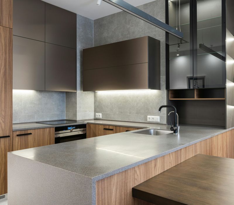
All-gray kitchens once whispered chic, but in Georgia’s golden light they can read flat and stormy.
Cool grays fight our warm sunshine, muting beautiful flooring and washing out stone.
If everything from walls to cabinets to floors sits in the same chilly family, the room loses depth, and resale appeal quietly slips.
The fix is easy: rebalance gray with warmth.
Try creamy paint on upper cabinets, then add soft clay or sand tones on walls.
Oak, hickory, or heart-pine accents bring back that inviting Southern glow, while woven shades, textured runners, and butcher-block boards layer organic comfort.
Do not toss your grays entirely, though!
Ground them with matte white quartz, unlacquered brass or warm nickel hardware, and linen Roman shades.
Bring greenery to life with a rosemary pot or fern, and let that Georgia light do the rest.
2. Open Shelving Overload
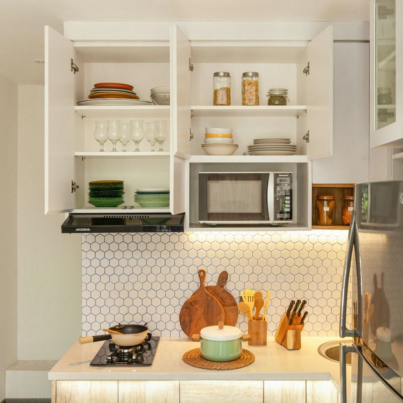
Open shelves look airy on Instagram, but in real life Georgia pollen and kitchen steam turn them into dust traps.
Daily clutter also creeps in, and suddenly your breakfast bowls feel like store displays.
Buyers see maintenance, not charm, and the room reads messy even when you clean.
Instead, treat open shelving like jewelry, not a uniform.
Keep one or two short runs for pretty pottery, cutting boards, or a plant, then switch the rest to closed doors.
Glass-front uppers offer depth without the dust, and fluted or reeded inserts lend texture that hides fingerprints.
Organize what stays on display by color and function.
Use lidded baskets for snacks, lazy Susans for oils, and under-shelf lighting to spotlight only the lovely.
Your counters breathe again, and your mornings get calmer.
3. Busy-Pattern Granite

Those swirly brown-and-gold granites had a moment, but their visual noise dominates a room.
In Georgia light, the movement can feel frenetic, clashing with patterned rugs and lively tile.
The result is a kitchen that ages itself and distracts from lovely millwork or views.
Switch to quieter counters with a soft vein or a solid, honed finish.
Creamy quartz, Taj Mahal quartzite, or soapstone balances busy family life while inviting touch.
Pair with a tuck of understated backsplash so materials harmonize instead of argue.
If replacing stone is not in budget, calm the backdrop.
Paint cabinets a gentle putty, add broad-edge cutting boards to break up pattern, and layer linen runners to soften glare.
Update hardware to warm nickel for cohesion, and suddenly the counter feels intentional.
4. All-White Sterility

An all-white kitchen can sparkle, but too much white turns sterile, especially against Georgia’s warm skies.
When walls, cabinets, counters, and tile all match, the eye has nowhere to rest.
It feels clinical rather than crisp, and families crave comfort.
Introduce a whisper of color and texture.
Paint lowers in a muted sage or river-blue, then keep uppers soft white to bounce light.
Choose a handmade-look tile with gentle variation, and add woven stools for warmth that nods to coastal and cottage traditions across the state.
Layer natural elements like wood bowls, terracotta planters, and a striped runner.
Swap cool bulbs for warm LEDs, and install dimmers so dinner feels cozy.
Your white stays clean and bright, but the room finally exudes welcome.
5. Overly Themed Decor
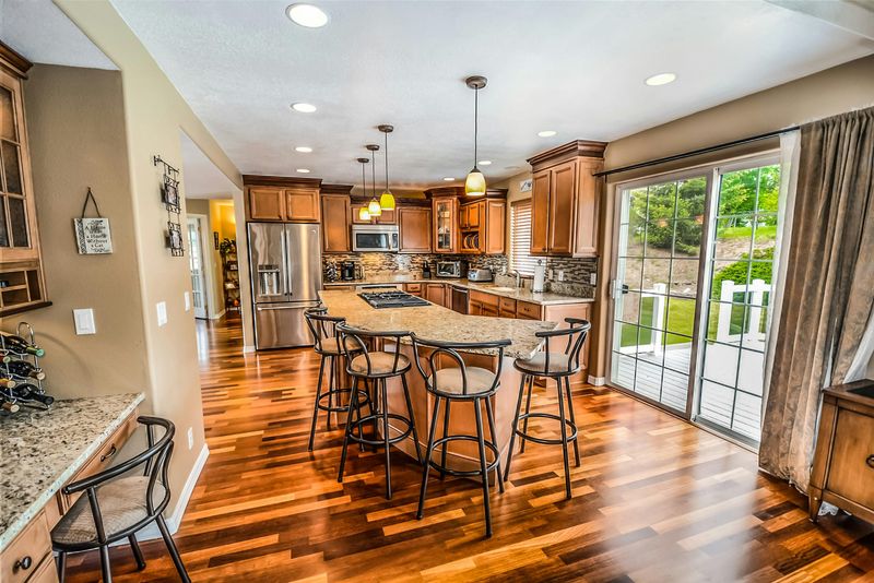
Leaning hard into one theme turns charming into costume.
Farmhouse overload, nautical everywhere, or pure industrial can feel like a set, not a home.
In Georgia, where architecture spans bungalows to brick traditionals, rigid themes limit buyers and date quickly.
Blend styles with restraint!
Keep the bones classic, then weave in a few nods you love.
Maybe a vintage landscape, a turned-leg island, and a single pottery collection.
Balance with modern lighting and streamlined stools so the look feels collected, not copycat.
When editing, ask what earns its spot.
Replace slogan signs with original art, trade gimmicky hardware for timeless knobs, and use texture linen, wood, caning to carry character.
The kitchen will feel personally Southern and flexible, not themed.
6. Exposed Microwave Eyesore
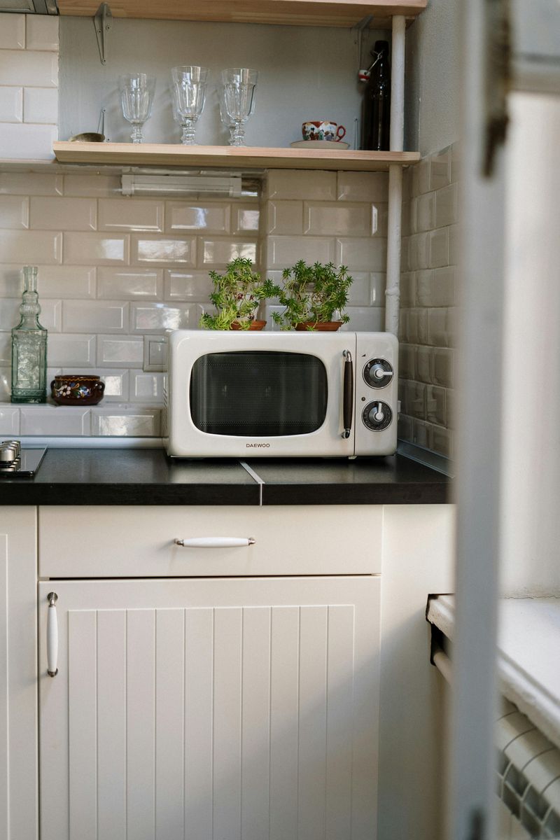
A bulky microwave on the counter chops up sightlines and instantly cheapens a polished kitchen.
Wires dangle, vents hum, and precious prep space disappears.
Buyers clock it within seconds and assume storage is lacking.
Integrate it.
A microwave drawer in the island keeps faces clear and ergonomics friendly.
Or tuck a built-in behind a cabinet door with proper ventilation.
Over-the-wall ovens, a tall pantry cabinet, or a coffee zone can hide it while keeping daily use easy.
On a tighter budget, create a dedicated shelf inside a pantry with an outlet, then free the counter.
Add a tray to slide it forward safely, install task lighting, and run heat-safe trim.
The kitchen looks streamlined and instantly more considered.
7. Matte Black Overload
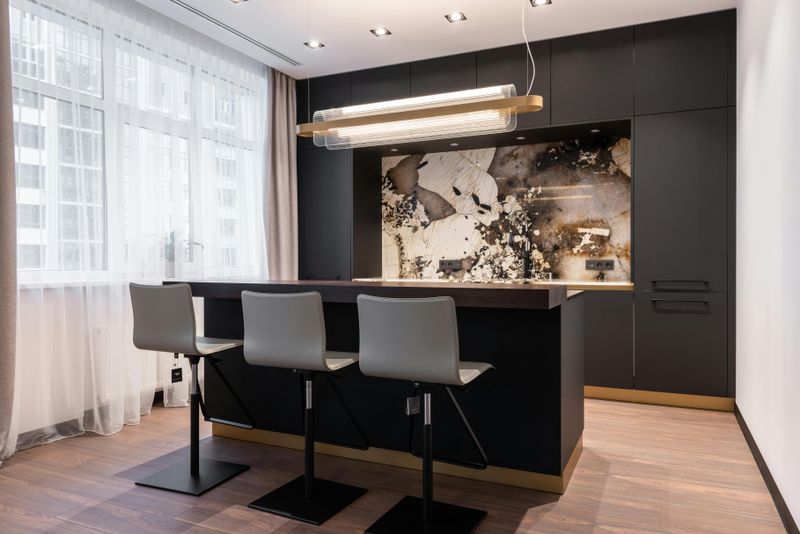
Matte black is striking, but when every knob, hinge, faucet, and light goes black, the room can feel harsh.
In Georgia’s softer, sunlit spaces, that weight reads severe.
Too much contrast also highlights fingerprints and dust.
Mix metals to add nuance.
Keep the faucet black if you love it, then shift hardware to warm nickel or aged brass.
Anchor with a black pendant or two, but balance using lighter fixtures elsewhere.
The interplay feels layered rather than loud.
Let finishes echo, not match.
Repeat each metal at least twice so it looks intentional.
Bring in wood tones and creamy paint to soften the edges, and your kitchen gains dimension without losing edge.
8. Waterfall Island Fatigue
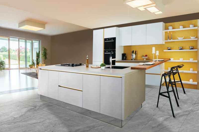
Waterfall islands once telegraphed luxury, but they now feel expected and heavy in many homes.
In cozier Georgia kitchens, the chunky slab can hog visual space and bruise shins.
It also limits seating flexibility and future styling options.
Try a furniture-style island with tapered legs, rounded corners, or bead detail.
Consider a thinner profile top with eased edges, or mix materials butcher block for the prep zone and honed stone for cleanup.
Adds soul, saves knees, and invites lingering.
If you already have a waterfall, lighten the look.
Paint the base a contrasting hue, add upholstered stools with open frames, and soften with pendant globes.
A runner with subtle pattern breaks up the mass and brings movement back.
9. Double-Basin Sink Hassle
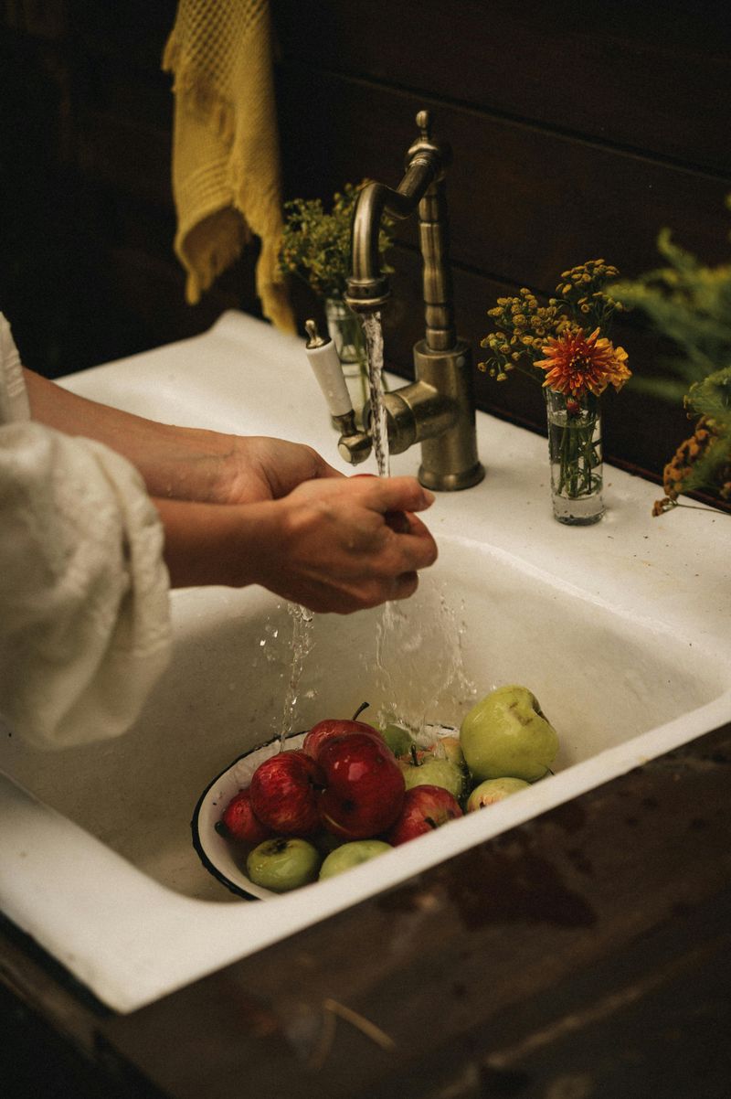
Double-basin sinks squeeze pans and make cleanup fussy.
The divider robs space just when you need to soak a sheet tray or ice down produce after a farmers market haul.
They also signal older plumbing layouts to buyers.
Swap for a generous single basin, either a classic apron-front or a deep undermount in stainless or fireclay.
Pair it with a pull-down sprayer, in-sink colander, and bottom grid.
Suddenly everything from pasta pots to collards rinses easily.
While upgrading, add a garbage disposal switch at the counter and a filtered-water tap if you like.
Keep the surrounding backsplash simple to spotlight that beautiful sink.
Everyday life gets smoother, and the kitchen looks current.
10. Glass-Arched Hood Trend
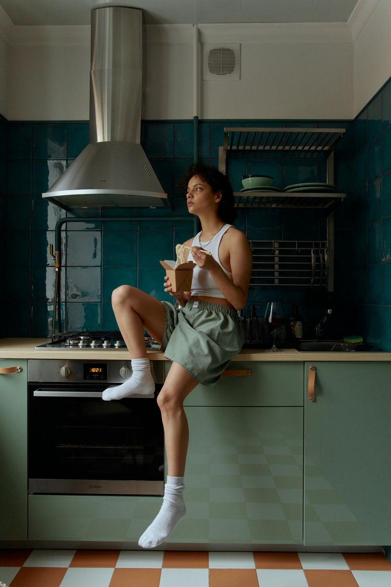
Glass arched hoods glow like billboards and collect smudges you notice from across the room.
The curvature feels fussy against shaker lines, and the reflection competes with pendants.
In Georgia homes with open layouts, that glare spreads.
Choose a plaster hood with soft edges or a wood-clad design painted to match cabinets.
Add a gentle reveal or trim for shadow play without shine.
Venting performs the same, but the look turns tailored and serene.
Already own one?
Tone it down with matte film, adjust under-hood lighting to warm settings, and simplify the backsplash behind it.
The range area becomes a calming focal point, not a mirror.
11. All-Brass Everywhere
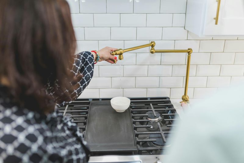
Wall-to-wall brass can feel like costume jewelry.
Shiny surfaces bounce light in a way that skews yellow, especially in Georgia’s afternoon sun.
The result is glare and a one-note palette that dates quickly.
Keep brass, but vary the finish and company it keeps.
Use aged or satin brass on hardware, then pivot to warm nickel on the faucet.
Ground the blend with bronze details at lighting or a cabinet rail.
The mix reads collected and sophisticated.
Echo metals thoughtfully.
Repeat each finish at least twice, and let wood accents absorb warmth so metals do not scream.
With restraint, brass becomes a supporting actor rather than the whole show.
12. Subway Tile Saturation
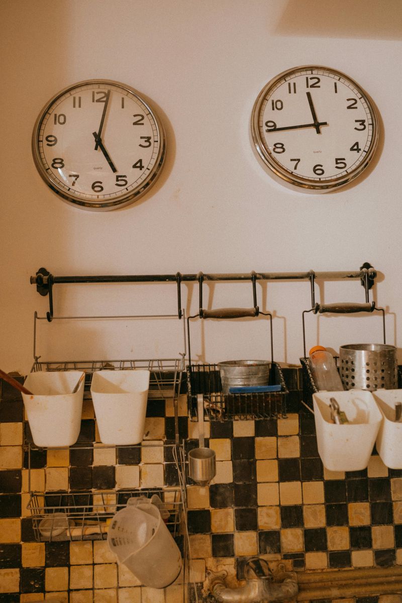
Classic white subway tile is fine, but entire walls of it can feel builder-basic now.
The flat finish and predictable pattern lack the nuance many Georgia homes deserve.
When everything else is neutral, it falls short on personality.
Upgrade the field with movement and texture.
Try zellige in soft cream, stack skinny tiles vertically, or choose a subtle checker in two similar tones.
Even a simple square with a hand-glaze adds soul and light play.
Keep the grout thoughtful.
Color-match for calm or slightly contrast for rhythm, then run tile to the ceiling for height.
Your backsplash transforms from placeholder to poetry.

