10 Designer-Approved Kitchen Cabinet Color Ideas Plus 10 Colors To Avoid
Picking the right color for your kitchen cabinets can make or break your entire kitchen vibe.
The perfect cabinet color ties your whole kitchen together, while the wrong shade can make your space feel outdated or overwhelming.
I’ve gathered expert advice from top interior designers to help you navigate this important design choice. Let’s explore the cabinet colors that designers love and the ones they recommend steering clear of.
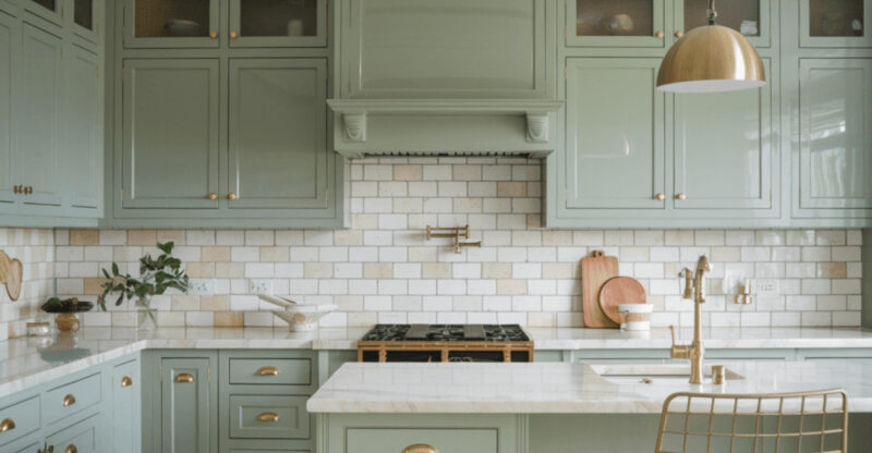
1. Soft Sage Green
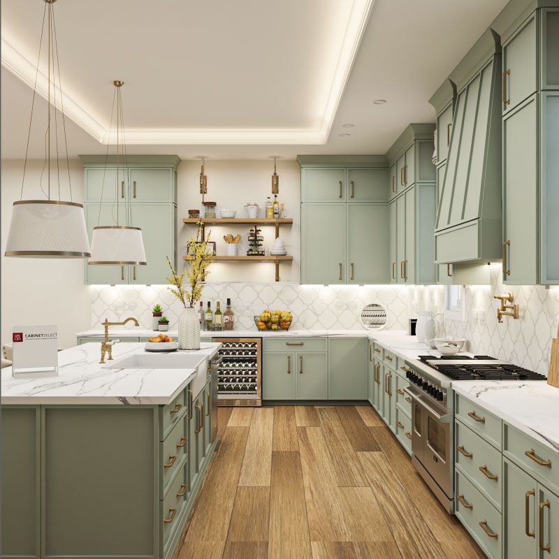
Soft sage green cabinets bring the peaceful feeling of nature indoors. This versatile, muted green works beautifully in both modern and traditional kitchens, creating a soothing atmosphere that never feels overwhelming.
I’ve noticed sage green pairs wonderfully with brass hardware for a touch of warmth, or with matte black for a more contemporary look. The color complements various countertop materials, especially white marble or butcher block. Many of my clients who choose sage report feeling more relaxed in their kitchens.
It’s subtle enough to age gracefully through changing trends while still offering more personality than neutral options. Perfect for those wanting a gentle pop of color without committing to something bold.
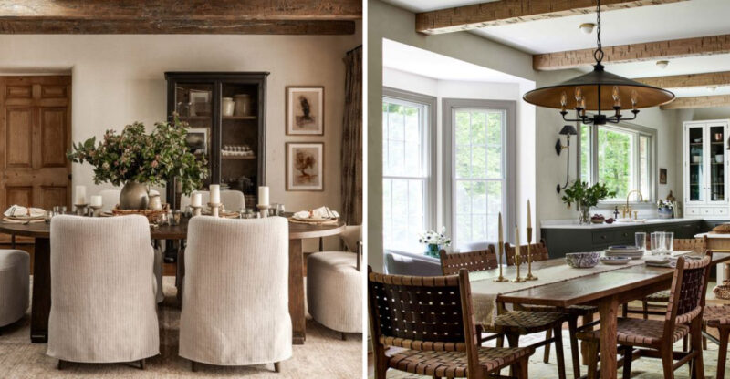
2. Warm Taupe
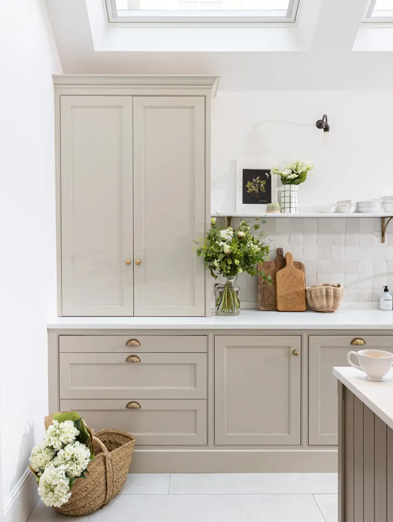
Warm taupe cabinets create an inviting, timeless kitchen that feels both sophisticated and cozy. This versatile neutral sits between gray and beige, offering depth without overwhelming your space or clashing with other design elements.
My design clients love how taupe provides a softer alternative to stark white while still maintaining brightness. It works beautifully with nearly any accent color, from navy blue to emerald green, giving you flexibility with accessories and wall colors.
Did you know taupe actually derives from the French word for ‘mole’? The earthy quality makes it perfect for kitchens aiming for that lived-in, comfortable feel while still appearing fresh. Taupe’s subtle warmth also helps disguise minor wear and tear, making it practical for busy families.
3. Classic Navy Blue
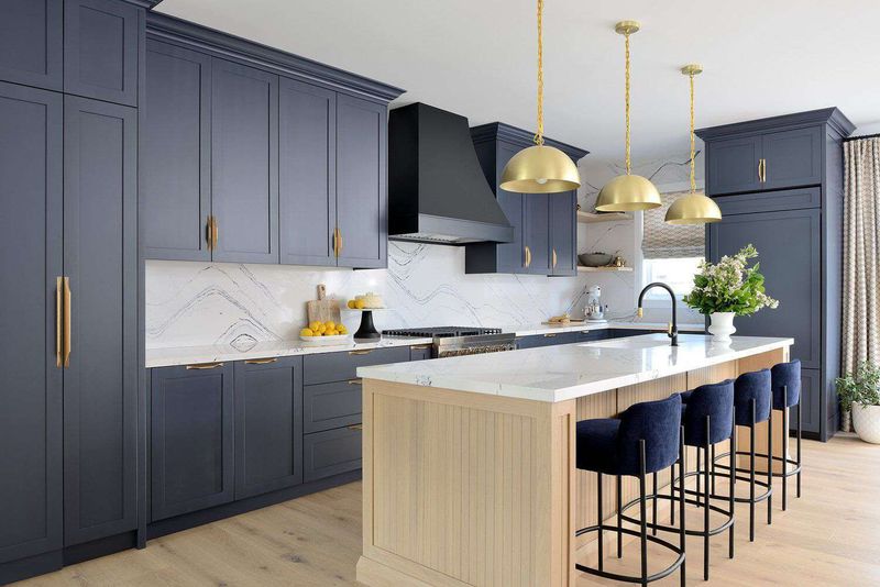
Navy blue cabinets bring timeless sophistication to kitchens while offering more personality than neutral options. This rich, deep color creates a striking backdrop that somehow manages to feel both bold and classic simultaneously.
When I use navy in kitchen designs, I typically pair it with brass or gold hardware for a luxurious contrast that never fails to impress. Navy works exceptionally well in spaces with plenty of natural light, preventing the color from feeling too dark or heavy.
Historically, navy blue has nautical associations, bringing a subtle coastal elegance to interiors. The color’s versatility allows it to complement many styles from traditional to transitional to modern making it a safe yet interesting choice for homeowners wanting something beyond basic white or gray.
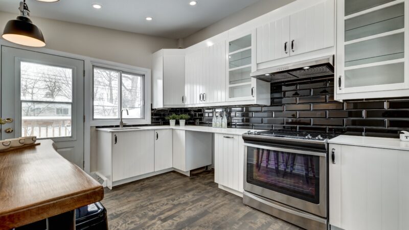
4. Crisp White
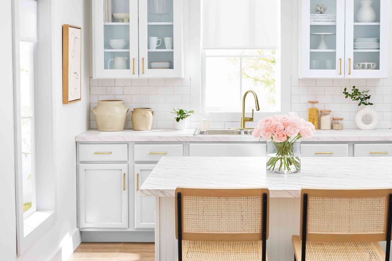
Crisp white cabinets remain the most popular choice among my clients for good reason. They instantly brighten any kitchen space, making even the smallest rooms feel more open and airy. White creates a clean canvas that allows other elements like countertops or backsplashes to shine.
I’ve found white cabinets offer unmatched versatility when designing kitchens. They complement virtually any style from farmhouse to ultra-modern, and they’ll never clash with changing wall colors or accessories as your taste evolves.
The timeless quality of white cabinets also significantly boosts resale value. While pure whites work beautifully in modern spaces, consider softer whites with subtle undertones (like cream or off-white) for traditional homes to avoid a sterile feeling. Just remember that white does show dirt more easily, requiring regular cleaning.
5. Charcoal Gray
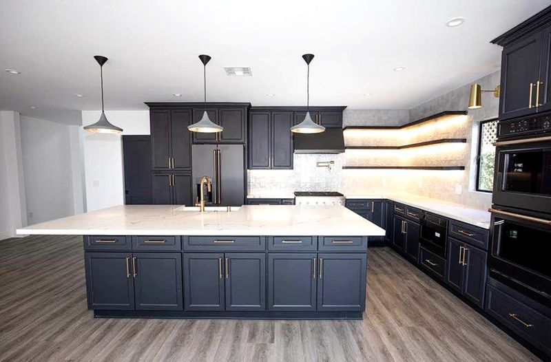
Charcoal gray cabinets offer sophisticated drama without the harshness of pure black. This rich, deep neutral creates a grounded, contemporary feel that works beautifully in both modern and transitional kitchen designs.
I particularly love pairing charcoal with white marble or quartz countertops for that striking contrast that feels both timeless and on-trend. The depth of charcoal also makes brass or gold hardware pop brilliantly, adding warmth to balance the coolness of the gray.
Many homeowners worry dark cabinets will make spaces feel smaller, but when balanced with proper lighting and lighter elements, charcoal actually creates wonderful dimension. This sophisticated shade also hides fingerprints and minor messes better than lighter options, making it surprisingly practical for busy households looking for low-maintenance elegance.
6. Dusty Blue
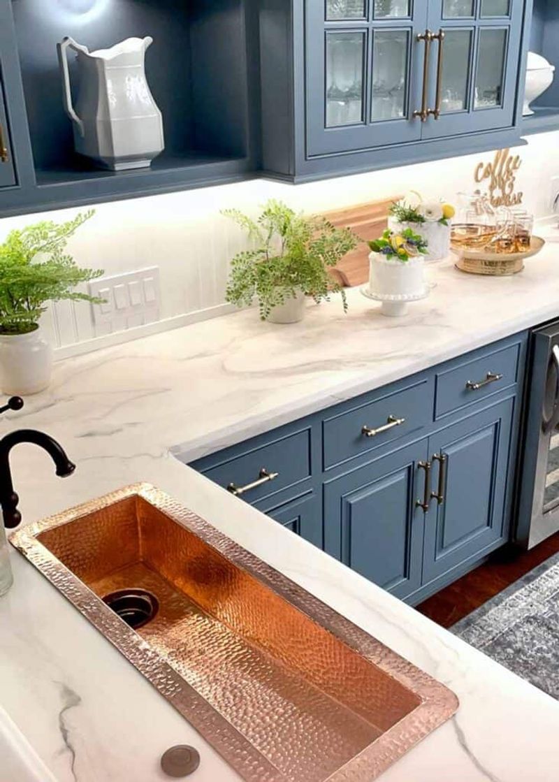
Dusty blue cabinets create a serene, refreshing kitchen atmosphere that feels both current and timeless. This soft, muted blue has gray undertones that keep it sophisticated rather than childish or overly themed. I’ve noticed dusty blue works especially well in kitchens with lots of natural light, where the color shifts beautifully throughout the day.
It pairs wonderfully with warm woods, white countertops, and brass or bronze hardware for a balanced, cohesive look. Homeowners who choose dusty blue often tell me their kitchens feel like a calming retreat.
The color has enough personality to stand on its own while still functioning essentially as a neutral. Unlike trendy blues that quickly date a kitchen, this subtle shade has staying power that will keep your kitchen looking fresh for years.
7. Light Greige
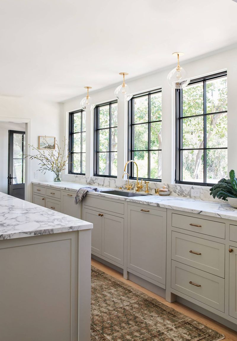
Light greige cabinets offer the perfect middle ground between cool grays and warm beiges, creating versatile kitchens that feel both contemporary and welcoming. This chameleon-like neutral adapts beautifully to different lighting conditions, appearing slightly warmer or cooler depending on your space.
When designing with greige, I love how it complements nearly any accent color or material. The subtle warmth prevents the clinical feel sometimes associated with pure grays, while still maintaining a fresh, updated appearance that pure beiges can lack.
Homeowners appreciate how greige hides minor dirt and fingerprints better than white cabinets without feeling dark. This practical yet sophisticated color creates kitchens that feel current without being trendy a perfect choice for those wanting longevity from their cabinet color while still moving beyond basic white.
8. Pale Blush
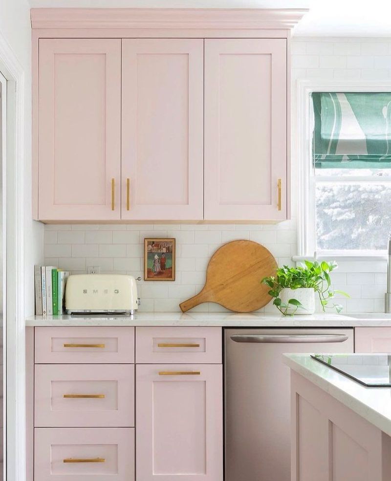
Pale blush cabinets add unexpected softness to kitchens while functioning surprisingly well as a sophisticated neutral. This barely-there pink creates spaces that feel fresh, light, and subtly playful without becoming overly feminine or trendy.
I’ve found blush works beautifully when balanced with contrasting elements think matte black hardware, concrete countertops, or natural wood accents. The key is choosing a blush with gray undertones rather than a saturated pink, keeping the look refined rather than childish. My clients who choose blush cabinets consistently report how the color creates a mood-boosting environment that feels both elegant and unique.
The subtle warmth flatters most skin tones and food presentations, making the kitchen genuinely more pleasant for both cooking and entertaining. Perfect for homeowners wanting something distinctive yet timeless.
9. Deep Forest Green
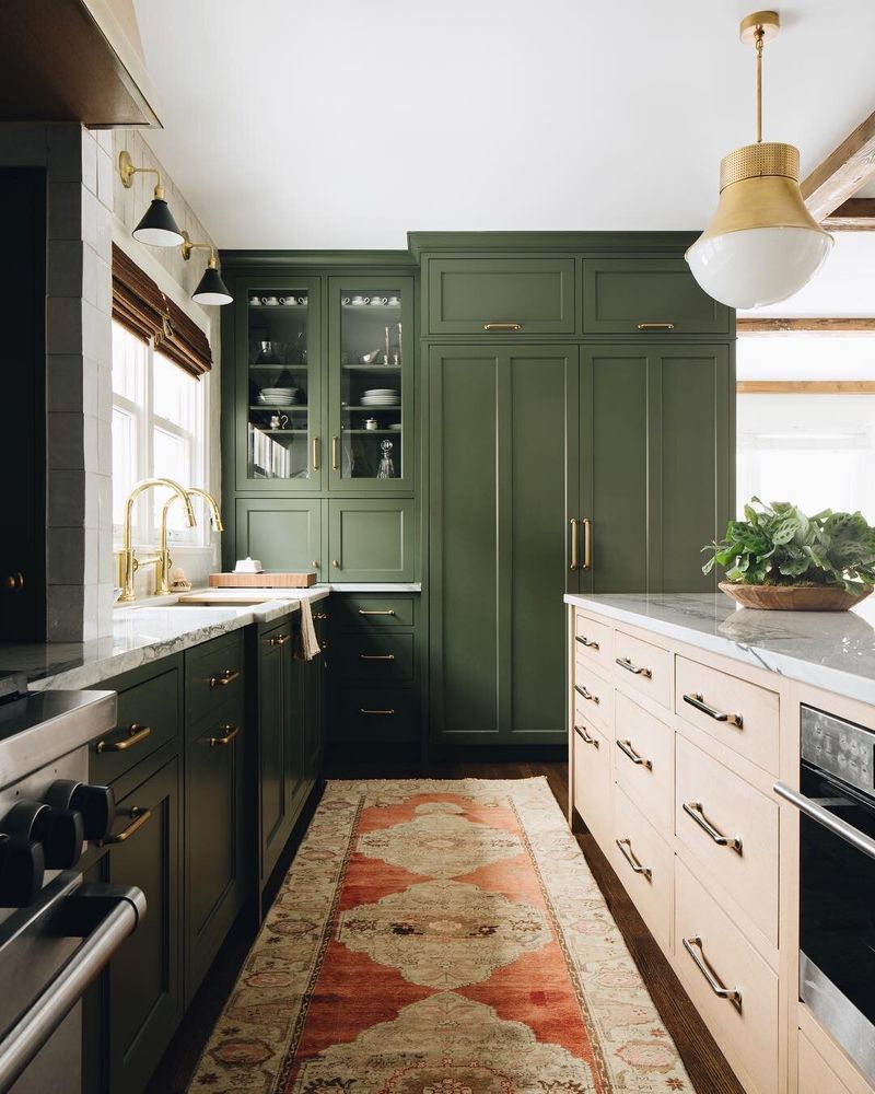
Deep forest green cabinets bring dramatic sophistication to kitchens while maintaining a timeless connection to nature. This rich, saturated color creates a luxurious feel that works beautifully in both traditional and contemporary spaces.
My design clients are often surprised by how versatile forest green can be. It pairs magnificently with brass hardware for old-world elegance or with sleek stainless for more modern applications. The depth of color also complements many countertop materials, from classic white marble to warm butcher block. Forest green has historical roots in classic design, giving it staying power beyond typical trends.
The color also hides minor marks and fingerprints better than lighter options, making it surprisingly practical for busy households. For balance, I always recommend incorporating plenty of light elements elsewhere to prevent the space from feeling too dark.
10. Soft Black
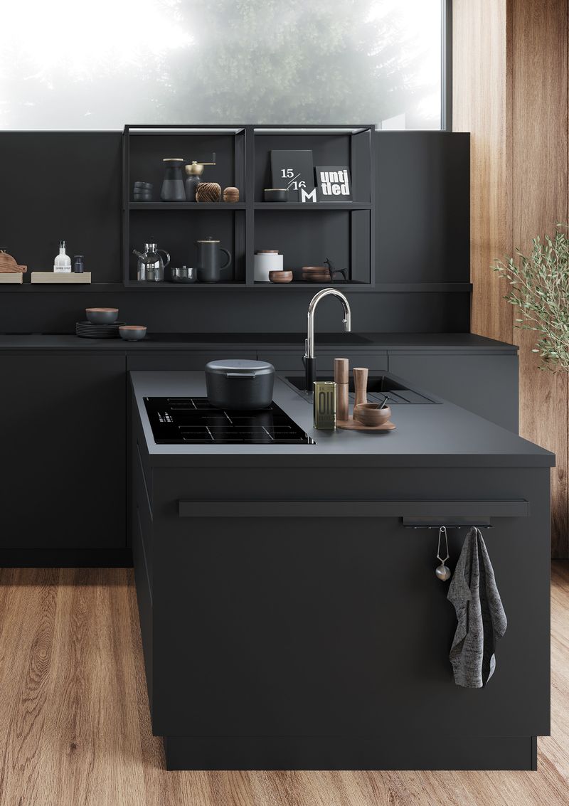
Soft black cabinets create kitchens with undeniable drama and sophistication that never feel harsh or overwhelming. Unlike pure black, soft black has subtle undertones (often blue or green) that add depth while feeling more livable and less stark.
I love recommending soft black to clients who want a statement kitchen that will stand the test of time. The color creates a perfect backdrop for showcasing beautiful hardware, whether brushed brass for warmth or chrome for a more contemporary look. Contrary to what many believe, dark cabinets can actually make smaller kitchens feel more intentional and designed.
The key is balancing with lighter countertops and proper lighting. Soft black also hides everyday kitchen messes better than lighter colors, making it surprisingly practical for busy households seeking low-maintenance elegance.
11. Neon Green
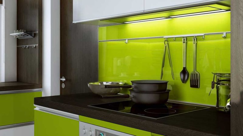
Neon green cabinets create kitchens that feel immediately dated and visually overwhelming. This intense, artificial color creates spaces that are nearly impossible to live with long-term, quickly leading to renovation regrets.
I’ve had clients who initially wanted something “bold and different” only to realize that surrounding yourself with such an intense color during daily activities becomes genuinely stressful. The harsh brightness reflects onto countertops and faces, casting an unflattering green glow throughout the space.
Beyond the visual fatigue, neon green severely limits your design flexibility, clashing with most countertop materials and wall colors. It also dramatically reduces resale appeal, potentially costing thousands in lost value. If you crave green, consider more sophisticated options like sage, olive, or forest green that provide character without the visual assault.
12. Bright Purple
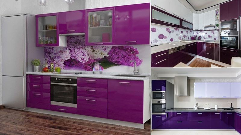
Bright purple cabinets create kitchens that feel immediately theatrical and difficult to live with. This bold color quickly becomes visually exhausting in a space where you spend significant daily time preparing meals and gathering with family.
I’ve witnessed homeowners who chose purple cabinets struggling to find complementary countertops, backsplashes, and accessories that don’t clash terribly. The color’s intensity makes the kitchen feel smaller and creates odd color reflections on food and faces. From a resale perspective, purple cabinets severely limit your home’s appeal to potential buyers, often necessitating expensive replacement before selling.
If you genuinely love purple, consider incorporating it through easily changeable elements like bar stools, dishware, or small appliances instead. This approach lets you enjoy the color without the commitment and visual overwhelm of purple dominating your kitchen.
13. Fire Engine Red
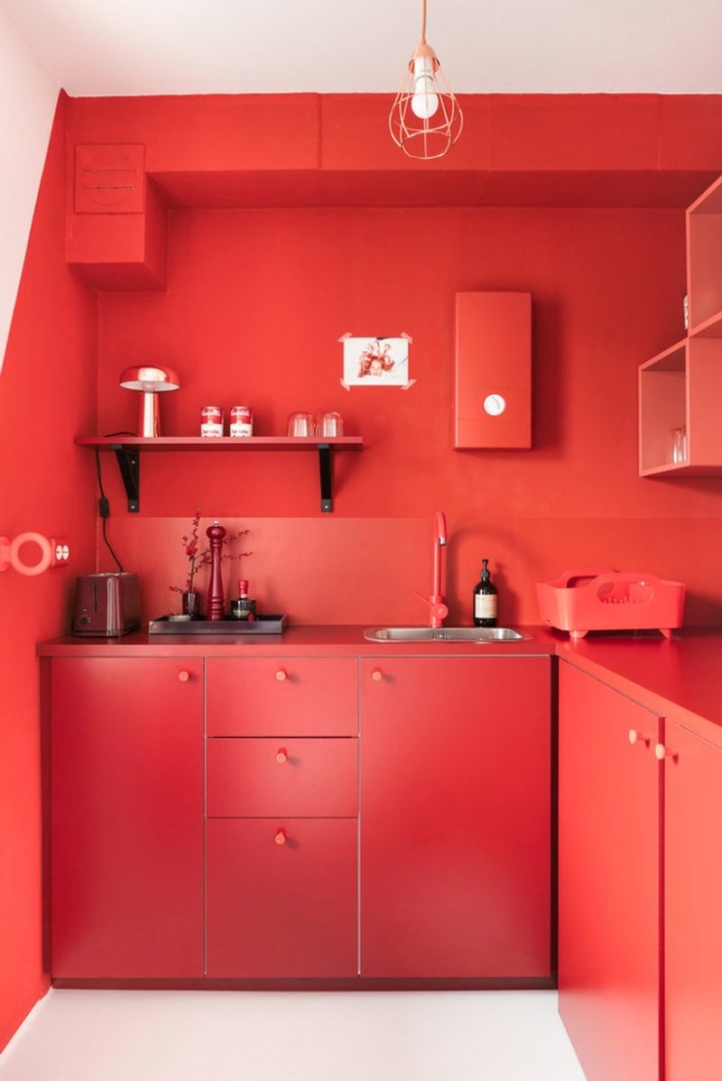
Fire engine red cabinets create kitchens that feel aggressively stimulating rather than welcoming. This intense, saturated color literally raises blood pressure and stimulates appetite not ideal qualities for a space where you’re trying to prepare meals calmly or maintain healthy eating habits.
I’ve had clients who initially loved the idea of red cabinets but quickly experienced color fatigue after installation. The vibrant hue dominates the space, reflecting red tones onto countertops and making food preparation visually confusing. Beyond the psychological effects, bright red quickly shows every fingerprint, food splash, and water mark, requiring constant cleaning to maintain its appearance.
It also severely limits your ability to change other design elements as most colors either clash with or are overwhelmed by such a dominant red. For those craving warmth, consider terracotta or brick tones instead for a more livable alternative.
14. Sunshine Yellow
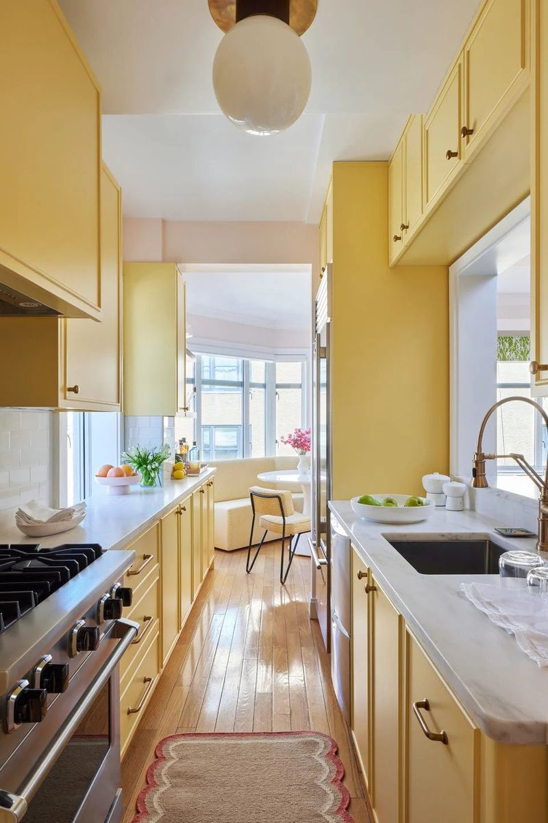
Sunshine yellow cabinets create kitchens that feel instantly dated and visually exhausting. This intense color might seem cheerful initially, but quickly becomes overwhelming in daily use, creating a space that feels more like a fast-food restaurant than a comfortable home.
I’ve consulted with numerous homeowners desperate to replace their yellow cabinets after living with the color for just a few months. The bright hue reflects onto countertops and faces, casting unflattering yellow tones throughout the space and on food making even fresh ingredients look unappetizing.
From a practical standpoint, yellow shows every spot and fingerprint, requiring constant cleaning. It also severely limits your design flexibility with other elements. If you crave warmth, consider softer alternatives like warm whites, taupes, or even a muted mustard on a small island rather than committing all cabinets to this challenging color.
15. Bubblegum Pink
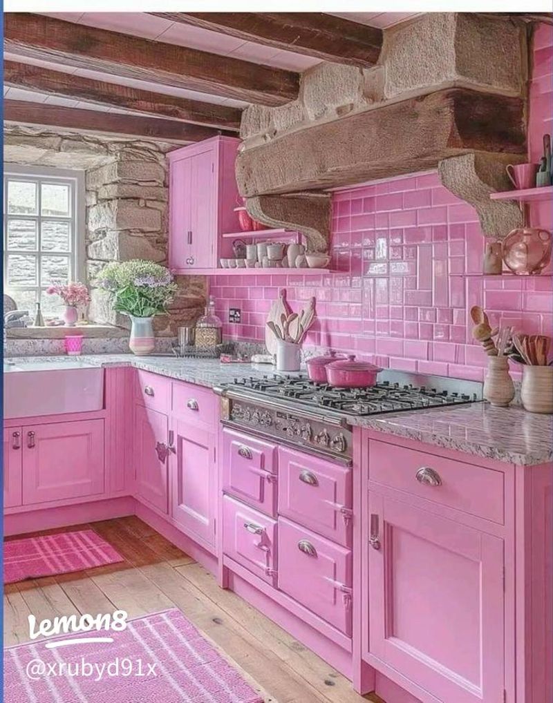
Bubblegum pink cabinets create kitchens that feel instantly childish and thematically limiting. This saccharine color transforms what should be a sophisticated cooking space into something resembling a child’s playhouse rather than a functional adult environment.
I’ve worked with clients who initially loved the playfulness of pink only to quickly tire of its overwhelming presence. The color casts an unflattering pink glow onto everything from countertops to food to faces making the space feel artificial and visually confusing. Beyond the immediate visual issues, bubblegum pink severely restricts your ability to update other design elements as few colors complement such a specific hue.
From a resale perspective, it’s also one of the most limiting cabinet colors, potentially reducing your home’s value significantly. If you love pink, consider incorporating it through accessories or a single accent piece rather than committing all cabinetry to this challenging color.
16. Orange Sherbet
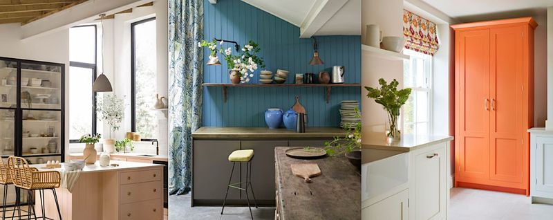
Orange sherbet cabinets create kitchens that feel instantly dated, evoking unfortunate 1970s design choices rather than timeless elegance. This artificially bright color quickly becomes visually overwhelming, making your kitchen feel smaller and more chaotic than it actually is.
I’ve consulted with homeowners who initially thought orange would feel “warm and inviting” only to discover it creates a space that feels perpetually unfinished and amateur. The color reflects an unflattering orange cast onto everything countertops, food, and even faces making the entire space feel artificial.
From a practical standpoint, orange shows every fingerprint and grease mark, requiring constant cleaning. It also severely limits your design flexibility with other elements and dramatically reduces resale appeal. If you crave warmth, consider terracotta or rust tones instead, which offer similar warmth with much more sophistication and longevity.
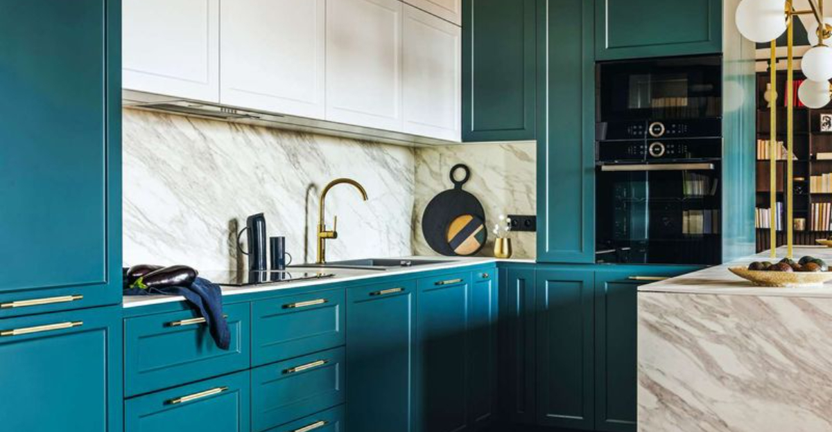
17. Bright Teal
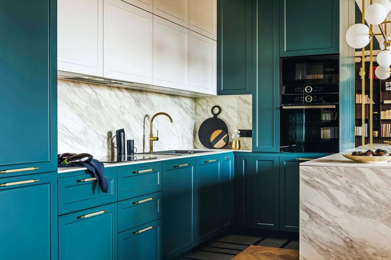
Bright teal cabinets create kitchens that quickly feel overwhelming and difficult to live with long-term. This intense blue-green hue might seem fun initially, but rapidly becomes visually exhausting in a space where you spend significant daily time.
I’ve had clients who chose teal cabinets only to find themselves struggling with unexpected design challenges. The color reflects onto countertops and faces, casting an artificial aquatic glow throughout the space that alters how food appears not ideal for meal preparation. Beyond the immediate visual issues, bright teal severely limits your design flexibility with other elements, making future updates challenging without complete cabinet replacement.
From a resale perspective, it’s also one of the most polarizing colors, potentially reducing your home’s appeal to buyers. If you love teal, consider incorporating it through easily changeable elements like bar stools or accessories rather than permanent cabinetry.
18. High-Gloss Black
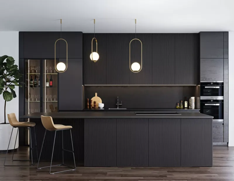
High-gloss black cabinets create kitchens that quickly become maintenance nightmares while feeling visually harsh. Unlike softer matte black finishes, high-gloss shows every fingerprint, water spot, and dust particle, requiring constant cleaning to maintain its appearance.
I’ve worked with frustrated homeowners who initially loved the dramatic look but quickly regretted the practical realities. The reflective surface creates distracting glare from windows and lighting, making the kitchen feel more like a nightclub than a comfortable home environment. The extreme shine also dates quickly compared to more subtle finishes, often looking trendy rather than timeless.
From a design perspective, high-gloss black creates harsh visual boundaries that can make spaces feel smaller and more chopped-up. If you love the drama of black, consider matte or satin finishes instead, which provide sophistication without the maintenance headaches and harsh reflectivity.
19. Avocado Green
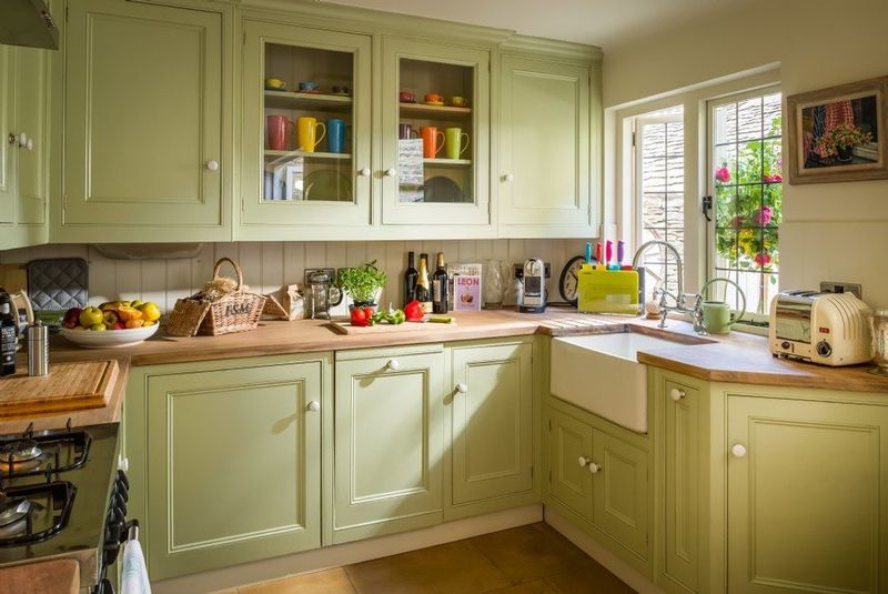
Avocado green cabinets immediately transport kitchens back to the 1970s in the worst possible way. This muddy, yellowish green creates spaces that feel instantly dated rather than retro-cool, evoking memories of harvest gold appliances and shag carpeting.
I’ve consulted with numerous homeowners stuck with avocado green kitchens who struggle to find any modern elements that coordinate well with this challenging color. The murky tone creates a dingy atmosphere that can make even the cleanest kitchen feel perpetually dirty. Beyond aesthetics, avocado green severely limits your design flexibility with countertops, backsplashes, and flooring.
From a resale perspective, it’s also immediately off-putting to most buyers, potentially reducing your home’s value significantly. If you appreciate green, consider modern interpretations like sage, olive, or emerald instead, which offer the natural connection without the dated associations.
20. Mustard Yellow
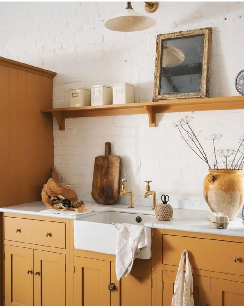
Mustard yellow cabinets create kitchens that feel immediately dated and visually heavy. This muddy, brownish yellow evokes unfortunate 1970s design choices rather than contemporary style, making your kitchen feel stuck in a time warp regardless of other modern elements.
I’ve worked with homeowners who initially thought mustard would feel “warm and inviting” only to discover it creates a space that feels perpetually dingy. The color casts an unflattering yellowish tint throughout the kitchen, making even the freshest ingredients look unappetizing during meal preparation. From a practical standpoint, mustard shows every fingerprint and grease mark, requiring constant cleaning.
It also severely restricts your design flexibility with countertops and backsplashes, limiting future updates without complete cabinet replacement. If you crave warmth, consider light wood tones or warm whites instead, which offer timeless appeal without the dated associations.
