8 Paint Color Ideas That Can Visually Expand A Small Kitchen
Small kitchens can feel cramped and crowded, making cooking less enjoyable. The right paint color can work magic, making your tiny space feel bigger without knocking down walls.
Paint is one of the most affordable ways to transform a room, and in a small kitchen, the right shade can create an optical illusion of spaciousness.
Results can vary depending on lighting, layout, and décor, so it’s best to test colors in your own space before committing.
1. Crisp White Magic
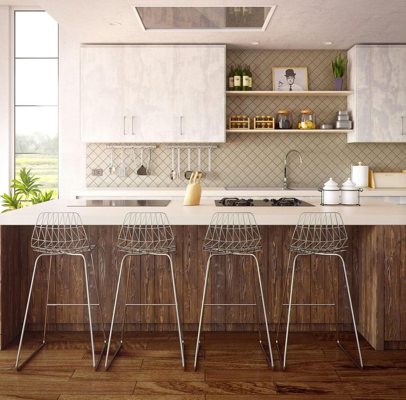
White reflects light better than any other color, instantly brightening up your kitchen and making walls appear to recede. The clean canvas effect creates an airy, open feeling that’s perfect for tight spaces.
Choose a pure white like Benjamin Moore’s ‘Simply White’ for maximum light reflection. For warmth, try an off-white with subtle creamy undertones.
Adding white to your cabinets and trim creates a seamless look that eliminates visual boundaries. Matte finishes can make white look chalky, so opt for eggshell or semi-gloss.
2. Soft Sky Blue Horizon
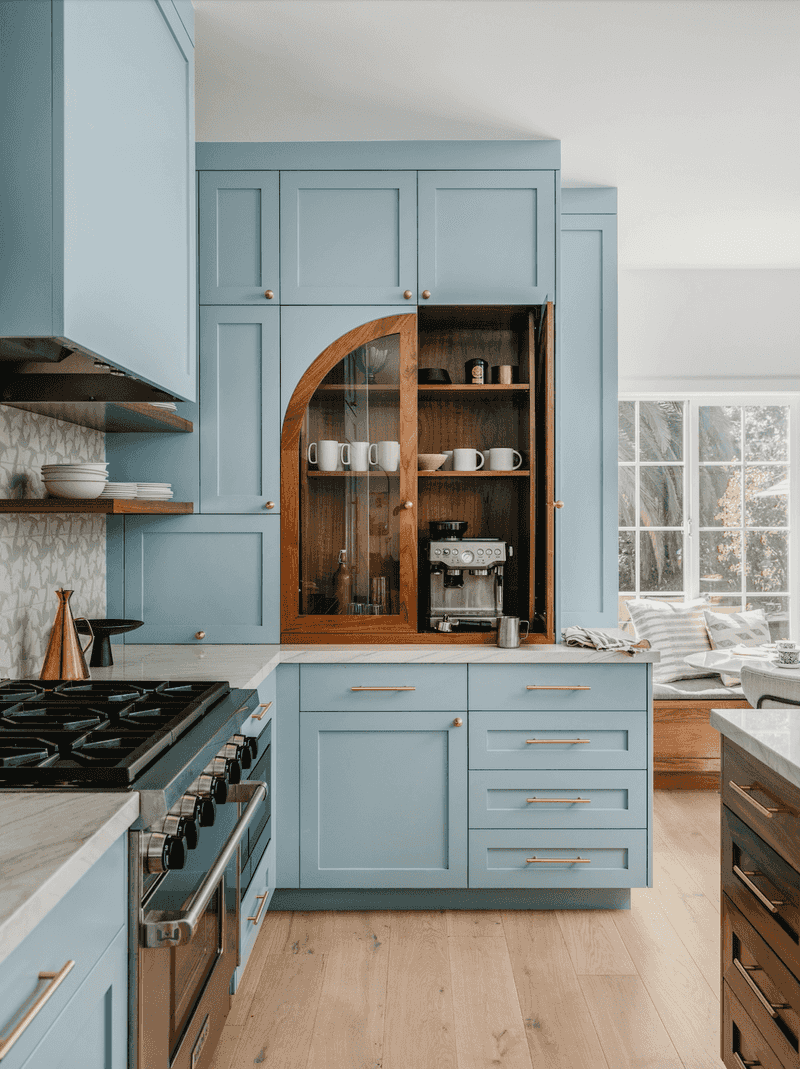
Sky blue creates an expansive feeling reminiscent of the boundless outdoors. This gentle hue tricks the eye into seeing more space, especially when paired with white trim or cabinets.
Light blue tones like Benjamin Moore’s ‘Breath of Fresh Air’ or Sherwin Williams’ ‘Rainwashed’ evoke a sense of airiness. The cooler undertones make walls visually recede, opening up the room’s dimensions without feeling cold or clinical.
Many homeowners report that blue kitchens feel calmer and more organized. The color’s association with open skies subconsciously translates to a feeling of spaciousness in even the tightest galley kitchen.
3. Pale Greige Balance
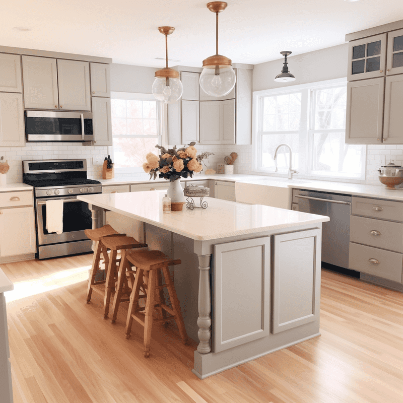
That perfect blend of gray and beige offers sophistication while maintaining neutrality that helps small spaces breathe. Unlike stark white, greige adds warmth without the visual heaviness of darker colors.
Sherwin Williams’ ‘Agreeable Gray’ or Behr’s ‘Silver Drop’ provide that perfect middle ground. Chameleon-like colors shift subtly throughout the day, creating visual interest without overwhelming the space. The versatility makes greige an excellent backdrop for any kitchen style.
The slight gray undertones create depth while the beige aspects add warmth, preventing the clinical feeling some neutrals can create in compact spaces.
4. Soft Sage Serenity
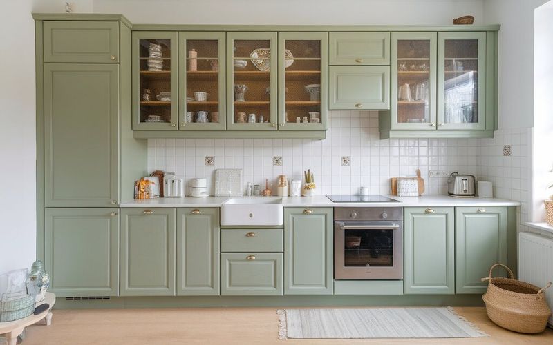
Sage green brings the outdoors in while visually expanding your kitchen’s boundaries. Muted, nature-inspired hue creates a sense of calm that makes compact spaces feel less confining and more intentional.
Colors like Benjamin Moore’s ‘Saybrook Sage’ or Farrow & Ball’s ‘Cooking Apple Green’ add subtle color without overwhelming. The earthy quality connects with natural light beautifully, making mornings in your kitchen feel especially spacious and fresh.
Sage particularly shines in kitchens with plants or herb gardens. It creates a cohesive indoor-outdoor connection that extends the visual space beyond your walls.
5. Pale Yellow Sunshine
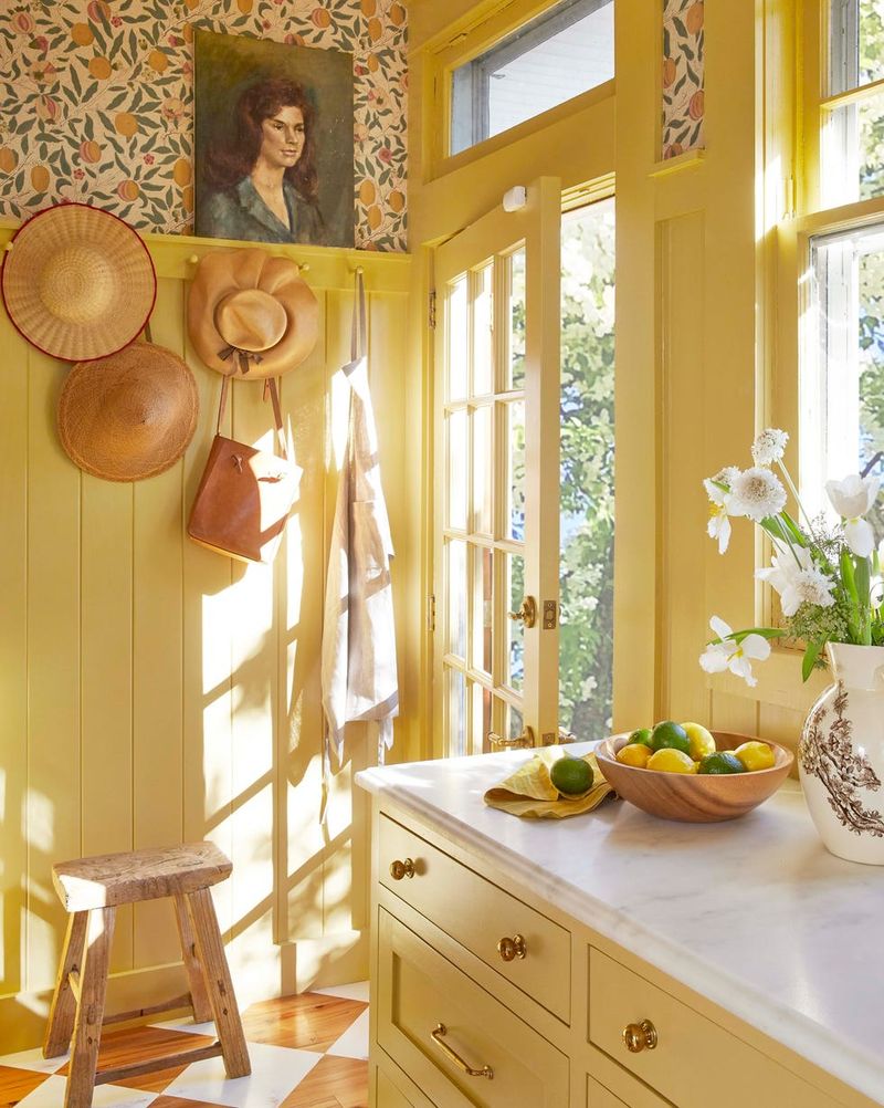
Soft yellow infuses small kitchens with cheerful energy while visually pushing walls outward. The warmth mimics sunlight, creating an illusion of more space even in windowless kitchens.
Butter-soft shades like Benjamin Moore’s ‘Hawthorne Yellow’ or Sherwin Williams’ ‘Daybreak’ brighten without overwhelming. Yellow works particularly well in north-facing kitchens that lack natural light, compensating with its inherent luminosity.
Some research shows yellow stimulates appetite and conversation-perfect for kitchens! Just stick to pale, creamy yellows rather than bright variants that can feel claustrophobic in small spaces.
6. Misty Gray Expansion
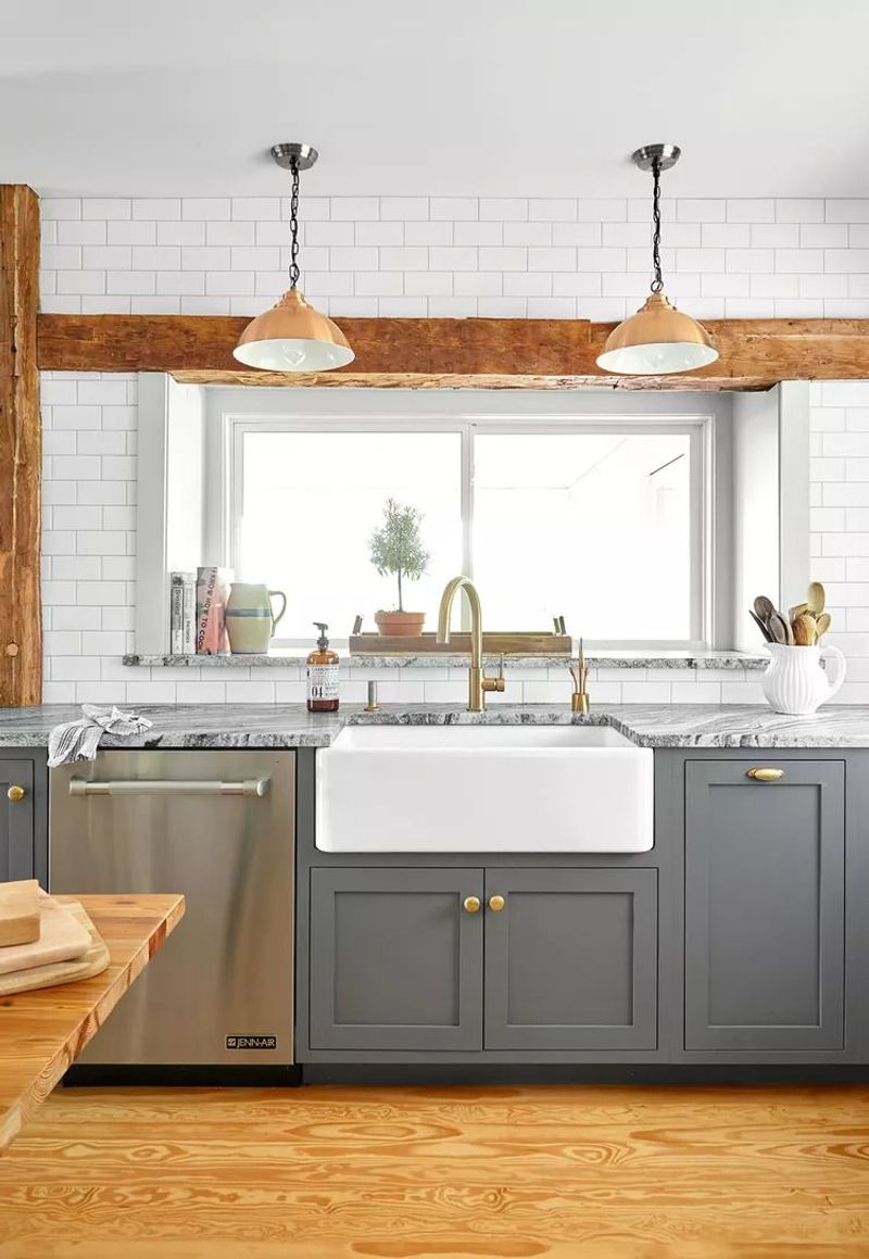
Light gray creates sophisticated depth while maintaining an airy quality that helps small kitchens breathe. Unlike darker grays that absorb light, pale grays like Benjamin Moore’s ‘Gray Owl’ or Sherwin Williams’ ‘Repose Gray’ reflect it.
The subtle chameleon quality of gray means it shifts beautifully throughout the day. Cooler grays with blue undertones particularly excel at making walls recede visually.
Gray provides a perfect backdrop for colorful accessories or appliances, allowing them to pop without competing for attention in limited space. The neutrality creates a cohesive look that eliminates visual choppiness.
7. Monochromatic Magic
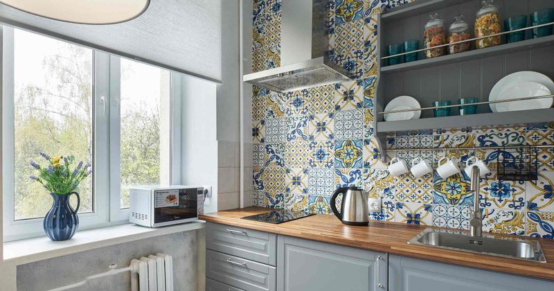
Painting walls, cabinets, and trim in varying shades of the same color eliminates visual boundaries that can make small kitchens feel choppy. This seamless look creates flow that extends the eye’s movement throughout the space.
Try Benjamin Moore’s ‘White Dove’ on walls with ‘Simply White’ on trim for subtle dimension without contrast. The lack of stark transitions between surfaces creates an uninterrupted visual plane that expands perceived space.
The monochromatic approach works with any light color, soft blues, pale greens, or gentle grays all create this expansive effect. The key is keeping the value (lightness/darkness) similar while varying undertones slightly for subtle depth.
8. Ceiling Color Strategy
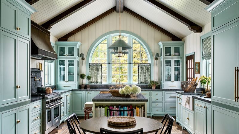
The ceiling, often called the ‘fifth wall’, offers untapped potential for visually expanding your kitchen. Painting it a shade lighter than your walls creates the illusion of height and airiness in compact spaces.
For dramatic effect, try a pale blue like Benjamin Moore’s ‘Breath of Fresh Air’ on the ceiling with white or light neutral walls. This mimics the sky, psychologically lifting the ceiling higher.
Alternatively, extending your wall color onto the ceiling eliminates the visual stop-point where wall meets ceiling. Glossier finishes on ceilings reflect more light downward.

