13 Features That Make A House Look Outdated Even If It’s New
Ever walked into a brand-new house that somehow feels like a blast from the past? Builders and homeowners sometimes include features that were trendy decades ago, instantly aging even the freshest construction.
These design elements can make your shiny new home feel outdated before you’ve even finished unpacking.
Let’s explore the biggest culprits that might be secretly aging your space.
1. Popcorn Ceilings
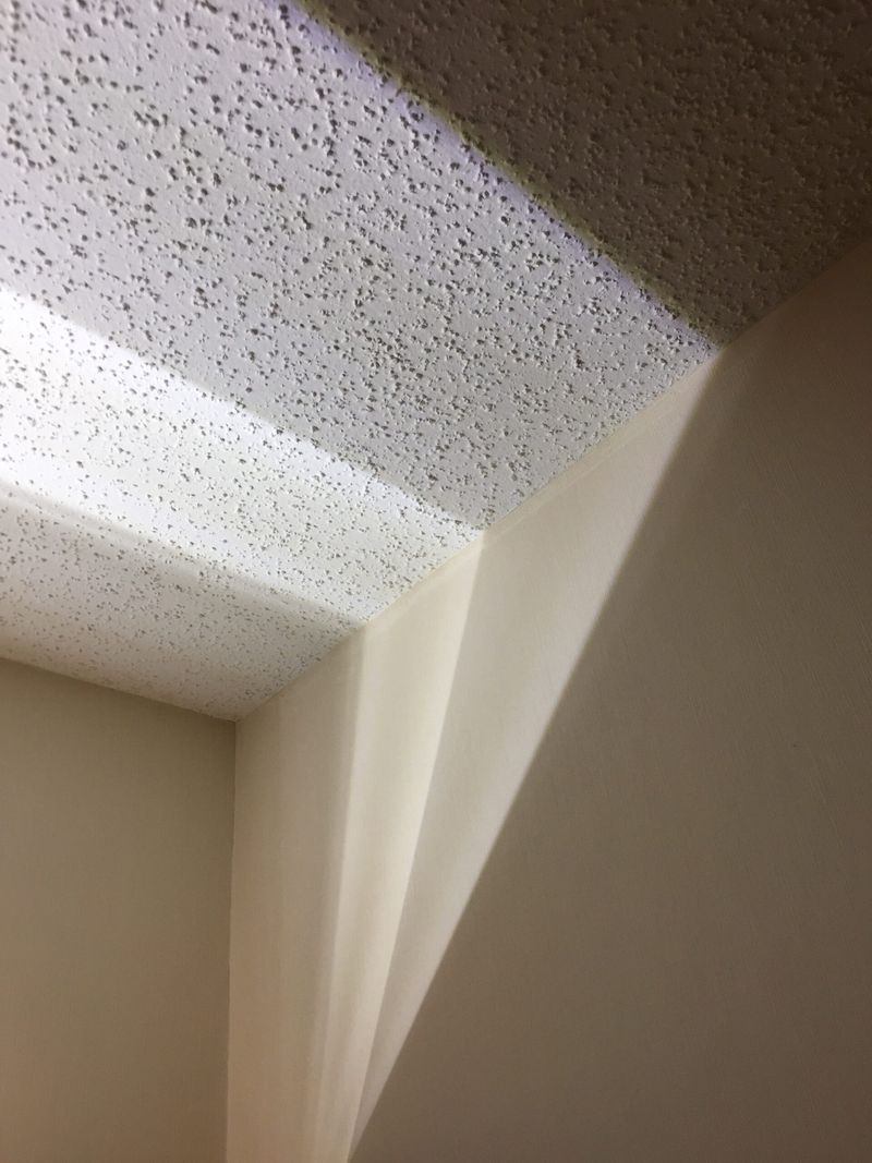
Remember those bumpy, cottage cheese-like ceilings from grandma’s house? They’re still sneaking into new builds despite being relics of the 1970s. Contractors love them because they hide imperfections easily, but designers universally cringe at the sight.
Beyond looking dated, these textured nightmares collect dust, are nearly impossible to clean, and create harsh shadows that make rooms feel smaller. When one inevitably needs repair, good luck matching the pattern!
Modern homes deserve smooth ceilings that create clean lines and reflect light beautifully. If you’re house hunting and spot these textured monstrosities, factor in the cost of scraping them away – your home’s contemporary vibe depends on it.
2. Overly Ornate Light Fixtures
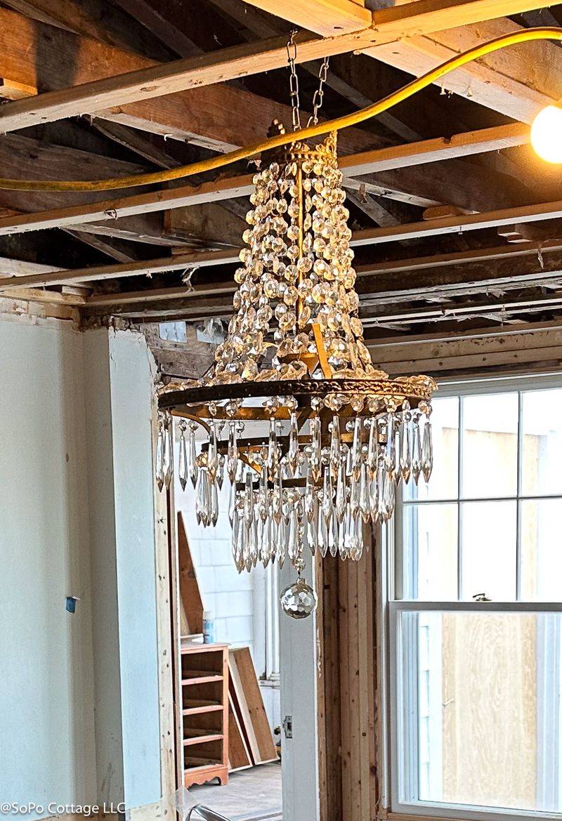
Massive chandeliers dripping with crystals or Mediterranean-inspired iron monstrosities scream early 2000s McMansion, no matter when your house was built. These oversized statement pieces instantly transport visitors back twenty years, especially when paired with brand new construction.
The disconnect between contemporary architecture and these ornate fixtures creates visual confusion. Scale matters tremendously with lighting – fixtures that are too large or too elaborate for the space create an immediate impression of outdated taste.
Today’s design sensibility favors clean lines, mixed materials, and sculptural simplicity in lighting. If your new home features lighting that would look at home in a castle or 1990s Tuscan-themed restaurant, consider swapping them for something with more restrained elegance.
3. Busy Mosaic Backsplashes
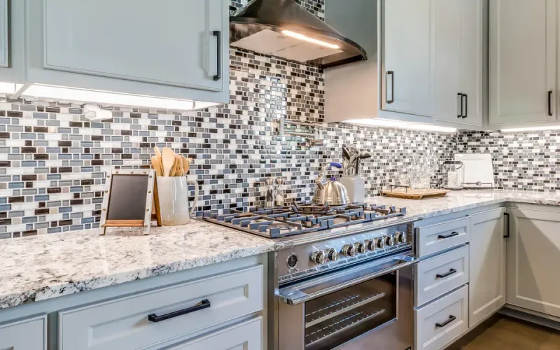
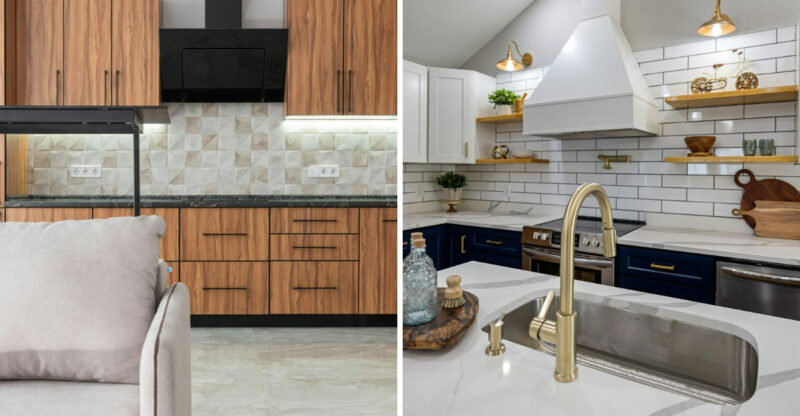
Those tiny, multi-colored glass tile backsplashes that exploded in popularity during the early 2000s renovation boom continue appearing in new constructions, instantly aging kitchens.
The combination of different colors, iridescent finishes, and busy patterns creates visual noise that fights with everything else in your kitchen. What builders don’t tell you is how quickly these trendy tile choices look dated. The small tiles also mean more grout lines to clean and maintain, turning what should be a practical surface into a maintenance headache.
Current kitchen design embraces simplicity with larger format tiles, continuous materials like quartz running up from countertops, or classic subway tiles in updated proportions. When backsplash trends change every few years, simpler is always smarter for longevity.
4. Faux Tuscan Paint Finishes
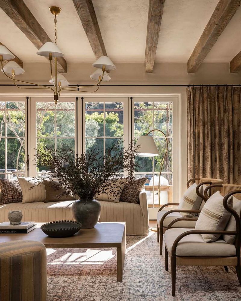
Walking into a brand-new home with sponge-painted walls or faux Tuscan finishes feels like time-traveling back to 1998. These textured paint techniques – with their mottled oranges, yellows and browns – were once considered sophisticated but now read as immediately outdated.
Homebuilders sometimes still offer these finishes as ‘upgrades,’ hoping to appeal to buyers who associate texture with luxury. The reality? They’re difficult to touch up, nearly impossible to match if damaged, and create a heavy, artificial atmosphere.
Today’s interiors favor clean, flat paint finishes in sophisticated neutrals or carefully chosen color statements. If your new construction features walls that look like they belong in an Olive Garden restaurant, factor in repainting costs before moving in – it’s the quickest way to bring your home into the current decade.
5. Heavy Drapery with Valances
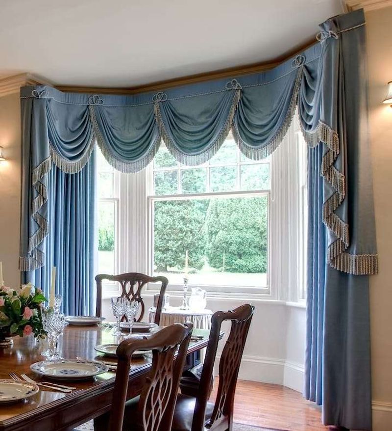
Heavy, puddling drapes topped with stiff, structured valances instantly transport a room back to the 1990s, especially when they feature damask patterns or tasseled tiebacks. This window treatment approach screams formal outdatedness, even in newly constructed homes.
The layered, fussy window coverings block natural light and collect dust. They also visually shrink rooms by adding unnecessary bulk around what should be clean, architectural elements. Contemporary window treatments embrace simplicity with clean-lined panels, natural materials, or minimalist blinds that complement windows rather than overwhelm them.
If your builder is still installing swag valances and heavy drapes, consider it a red flag that other dated design choices might be lurking throughout your new home.
6. Beige-on-Beige Color Schemes
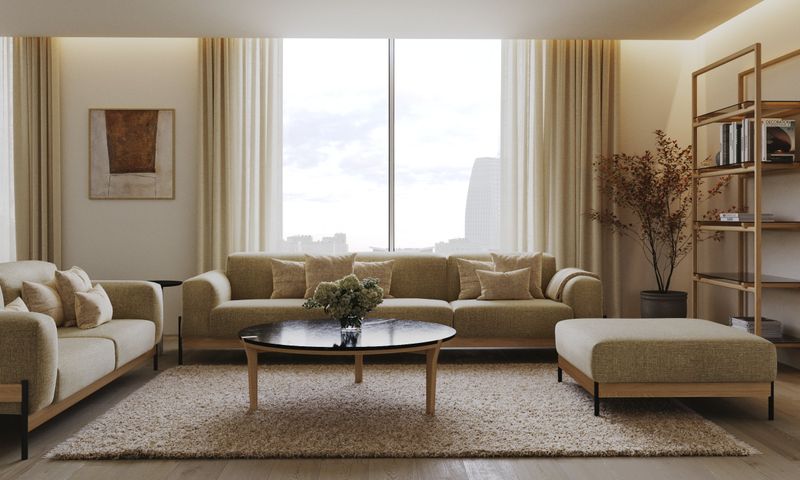
The infamous builder beige palette – with its flat, uninspired tones covering everything from walls to carpets to countertops – instantly dates a house, regardless of when it was built. This monochromatic approach was a safe choice for mass-market appeal in the 1990s and early 2000s but now reads as lazy and uninspired.
Without contrast or thoughtful color selection, these spaces lack personality and dimension. The uniform beige creates a flat, lifeless environment that feels immediately outdated compared to today’s more sophisticated neutral palettes.
Modern interiors embrace intentional color whether through carefully selected neutrals with subtle undertones or strategic pops of color that create visual interest. If your new home feels like you’re living inside a cardboard box, consider it prime for personalization through paint and textiles.
7. Glass Block Windows
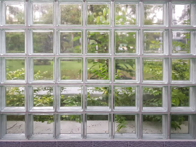
Nothing screams ‘1980s mall bathroom’ quite like glass block windows in residential spaces. Yet somehow, these chunky, visibility-obscuring blocks continue appearing in new construction, particularly in bathrooms and basements.
While they do provide privacy and light, they do so at the expense of style and flexibility. The thick, distorted glass creates an institutional feel and prevents the clean sightlines that modern architecture embraces. Today’s homes feature sleek privacy solutions like frosted glass, smart glass that changes opacity, or strategically placed windows that maintain privacy without sacrificing aesthetics.
If your builder suggests glass blocks anywhere in your new home, politely decline unless you’re specifically aiming for a Miami Vice aesthetic that will forever anchor your home to decades past.
8. Arch-Top Niche Cutouts
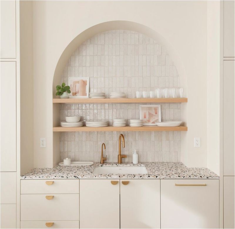
Those small, arched wall cutouts meant for displaying knickknacks were everywhere in 1990s homes. Amazingly, they’re still appearing in new construction, instantly making freshly built houses feel decades older than they are.
These architectural afterthoughts often appear in random hallway locations or awkwardly placed in living areas. Too small for practical storage and too specific in shape to be versatile, they quickly become dust-collecting curiosities that homeowners struggle to style effectively.
Contemporary interiors favor clean walls or purposeful built-ins with straight lines and functional proportions. If your new home features these dated display nooks, consider having them drywalled over during construction or prepare to explain to visitors why your 2023 home has these distinctly 1995 features.
9. Wall-to-Wall Carpeting in Main Areas
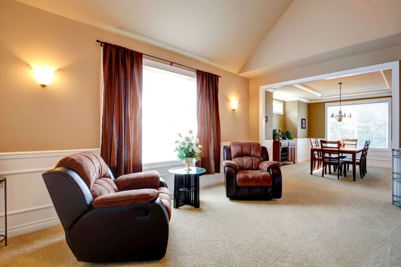
Wall-to-wall carpeting throughout main living spaces instantly ages even the newest homes. This flooring choice, especially in beige or builder-grade varieties, recalls an era when carpet was the default rather than a thoughtful design decision.
Beyond looking dated, wall-to-wall carpet collects allergens, stains easily, and typically needs replacement far sooner than hard surface alternatives. It’s particularly problematic in dining areas and high-traffic zones where spills and wear are inevitable. Modern homes embrace hard surfaces like engineered hardwood, luxury vinyl plank, or tile for main living areas, reserving carpet for specific comfort zones like bedrooms.
If your new construction still features wall-to-wall carpeting throughout, you might be looking at a significant update sooner than you’d expect from a fresh build.
10. Oak Cabinets with Orange Stain
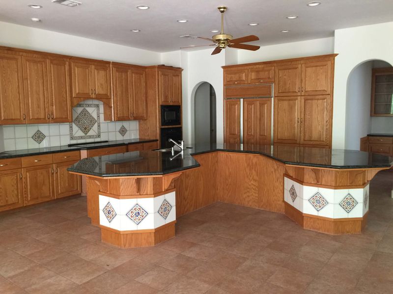
Despite being firmly associated with 1990s kitchens, those honey-oak cabinets with their distinctive orange undertones continue appearing in new construction. This particular wood finish instantly transports a brand-new kitchen back several decades, regardless of the appliances or countertops paired with it.
The warm, yellowish tones fight with most contemporary color schemes and materials. Even worse, the distinctive grain pattern of oak combined with these orange-tinted stains creates a busy visual effect that dominates the entire kitchen.
Today’s kitchen designs favor either painted cabinetry in sophisticated neutrals or wood cabinets with cooler, more natural finishes. If your builder is still installing orange-toned oak, consider it a red flag that they’re working from outdated design playbooks rather than current trends.
11. Tile Countertops with Grout Lines
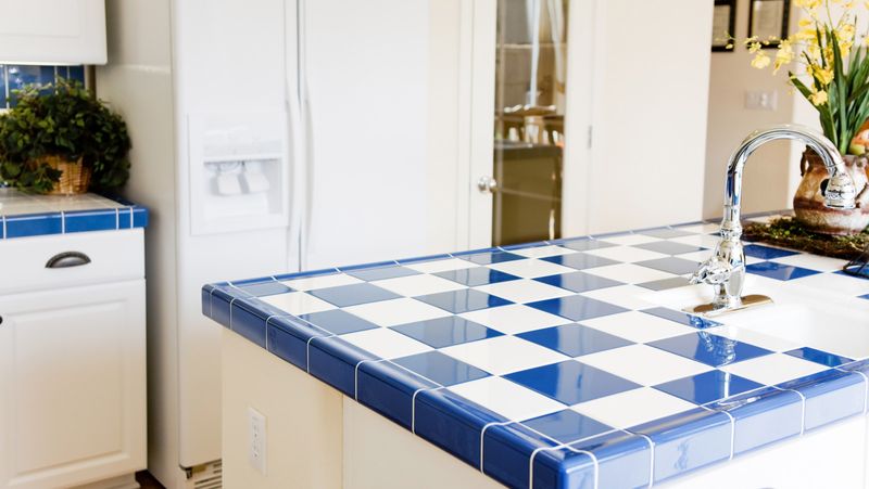
If your brand-new home features tiled countertops with visible grout lines, you’re essentially looking at a 1980s kitchen wearing modern clothing. This countertop choice, once practical and affordable, now reads as immediately outdated regardless of the tile style.
The functional problems are obvious grout lines collect dirt, harbor bacteria, and create uneven surfaces that make food preparation frustrating. Coffee, wine, and tomato sauce stain these porous surfaces almost immediately, making them look worn even when new.
Contemporary kitchens embrace seamless surfaces like quartz, solid surface, or large-format porcelain that provide both beauty and practicality. When builders install tile countertops in new construction, they’re prioritizing initial cost savings over long-term value and modern aesthetics.
12. Brass Fixtures in Outdated Styles
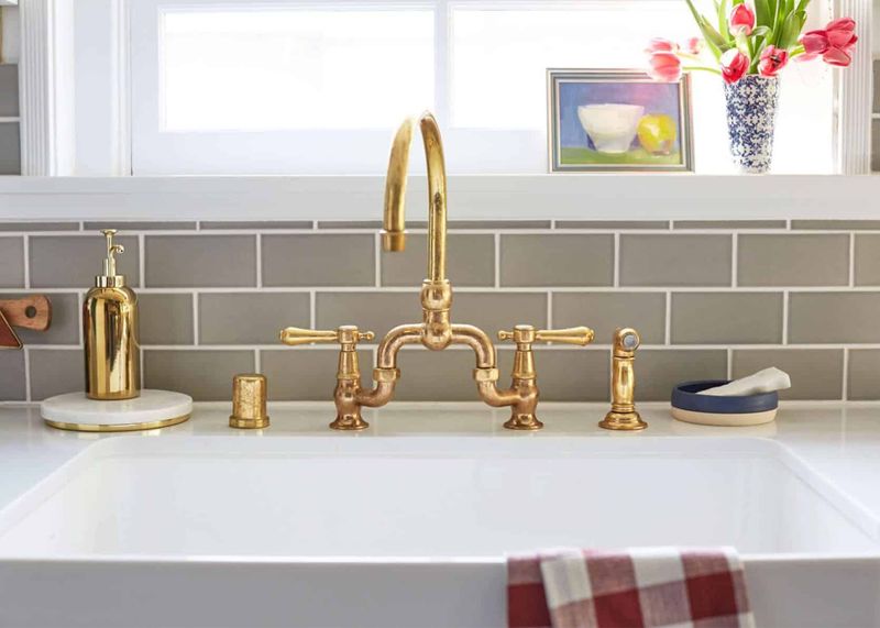
Not all brass is created equal. While modern brushed brass with clean lines feels fresh and contemporary, those shiny, lacquered brass fixtures with ornate, fussy details immediately transport a new home back to 1992.
The problem isn’t the metal itself but the specific finish and design. Highly polished, yellow-toned brass in dated silhouettes especially when featuring faux-Victorian details or overly ornate handles – clashes dramatically with contemporary design sensibilities. Today’s metallics embrace warmer tones with matte finishes or mixed metals with streamlined profiles.
If your new construction features doorknobs and light fixtures that look borrowed from your grandmother’s house, consider a hardware upgrade to instantly modernize your space without major renovation.
13. Word Art Wall Décor
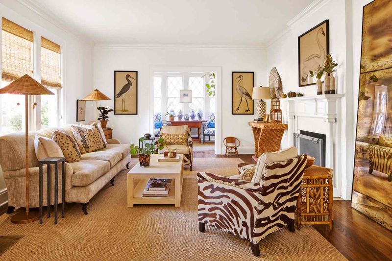
Those giant “Live, Laugh, Love” signs and similar word art pieces instantly make even brand-new homes feel like time capsules from the 2010s. This trend, which exploded with the rise of farmhouse style, has become the ultimate signal of outdated decorating sensibilities.
The problem goes beyond just being trendy these pieces often feature fonts and messaging that feel generic and impersonal. They’ve become visual shorthand for “I decorated my house based on what was popular at big box stores five years ago.”
Contemporary homes showcase more personal art choices whether original paintings, photographs with meaning, or sculptural pieces that add dimension. If your builder stages model homes with word art everywhere, it might indicate they’re not keeping up with current design trends in other areas as well.

