11 Curtain Colors You Might Want To Skip In 2026
Choosing the right curtain colors can completely transform your living space. As we look ahead to 2026, some previously popular curtain hues are falling out of favor with interior designers and homeowners alike.
Whether you’re planning a home makeover or just replacing worn window treatments, knowing which colors to avoid can save you from an outdated look that you’ll regret later.
These tips are for general guidance-preferences and trends may vary.
1. Millennial Pink
Once the darling of Instagram interiors, millennial pink has finally reached its expiration date. The dusty rose shade that dominated the late 2010s now reads as dated rather than daring.
Interior designers note that this color has become too closely associated with a specific era, making any room instantly feel like a time capsule. For those still loving pink tones, consider deeper berry or coral shades instead.
2. Bright Turquoise
Remember when tropical-inspired interiors were everywhere? Bright turquoise curtains are now creating visual fatigue rather than vacation vibes. The intensity of this color tends to overwhelm most spaces and clashes with evolving neutral palettes.
Many homeowners report growing tired of this bold choice within months. If you still crave that ocean feeling, softer seafoam or muted teal options provide a more sustainable aesthetic for the coming years.
3. Chocolate Brown
Dark chocolate brown curtains, popular during the early 2000s, are making an unfortunate mini-comeback that designers predict will be short-lived. These heavy, dark drapes tend to absorb light and create a cave-like atmosphere in most rooms.
The color also shows dust readily and can fade unevenly in sunlight. For a similar cozy feel without the downsides, warm taupe or soft caramel tones provide depth while maintaining brightness and contemporary appeal.
4. Chevron Patterns
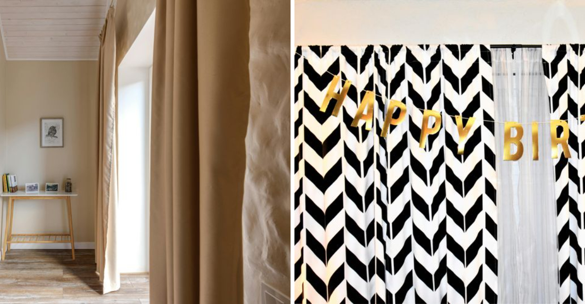
While not a single color, the black and white (or gray and white) chevron pattern that dominated the 2010s has reached definitive saturation. These zigzag curtains have become the ultimate design cliché, immediately signaling a dated interior.
The busy pattern tends to create visual noise and competes with other elements in the room. Pattern lovers would be better served by exploring more timeless geometrics like subtle stripes or small-scale organic prints that won’t feel tired within a season.
5. Electric Blue
The vibrant cobalt blue that made a splash in maximalist interiors is rapidly falling from favor. This intense, almost artificial-looking blue creates a jarring visual effect that quickly becomes tiresome to live with day after day.
The color’s intensity tends to dominate a room, making it difficult to change other decor elements without also replacing the curtains. For blue enthusiasts, navy, slate, or dusty blue options offer similar impact with much greater staying power and design flexibility.
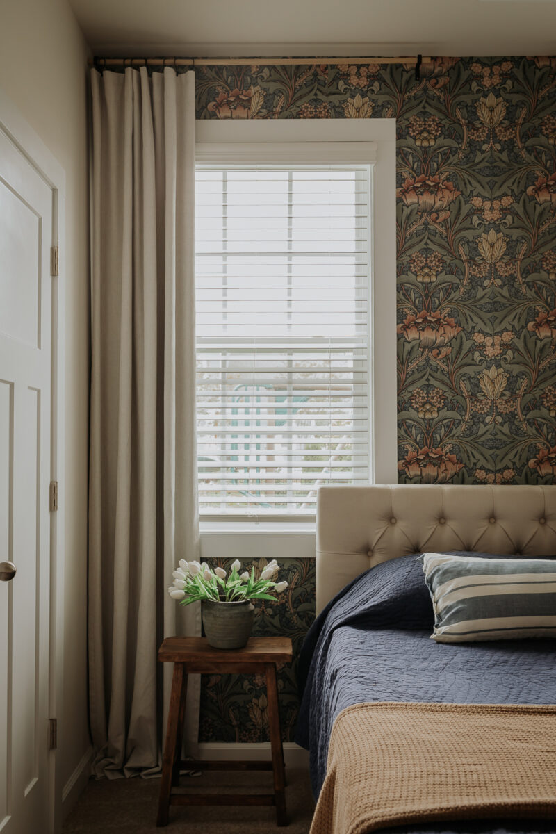
6. Beige-On-Beige
Surprisingly, the ultra-safe choice of beige curtains that perfectly match beige walls has become a design red flag. This monochromatic approach, once considered foolproof, now signals a lack of imagination and creates flat, lifeless spaces.
Without contrast, rooms lose dimensional quality and appear bland rather than sophisticated. Even neutrals need some variation! Consider off-whites, greiges, or taupes that complement rather than match your wall color for a more thoughtful approach to a neutral palette.

