10 Living Room Color Mistakes Common In Georgia And What To Choose Instead
Georgia homes often fall prey to living room color choices that don’t quite hit the mark.
Whether influenced by outdated trends or simply playing it too safe, these color missteps can make spaces feel unwelcoming or imbalanced.
I’ve noticed these common mistakes while working with homeowners across Atlanta, Savannah, and other Georgia communities, and I’m excited to share some easy fixes that will transform your living space.
1. Dark Maroon Walls – Try Soft Peach Instead
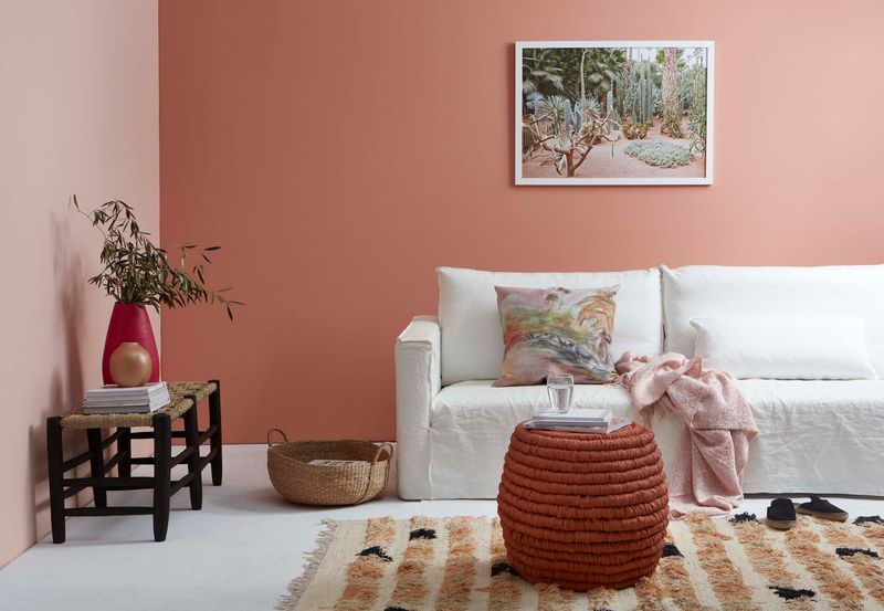
Dark maroon walls have dominated Georgia living rooms for years, creating spaces that feel smaller and more formal than intended. This intense color absorbs light rather than reflecting it, making rooms appear darker during Georgia’s already humid, overcast days.
Soft peach offers a refreshing alternative that brings warmth without the heaviness. It captures the golden Georgia sunlight beautifully and creates an inviting atmosphere that complements both traditional and contemporary furniture.
When paired with cream accents and natural wood tones, soft peach creates a living room that feels both sophisticated and relaxed – perfect for those famous Southern gatherings where comfort matters most.
2. Mustard Yellow Overload – Choose Warm Beige Instead
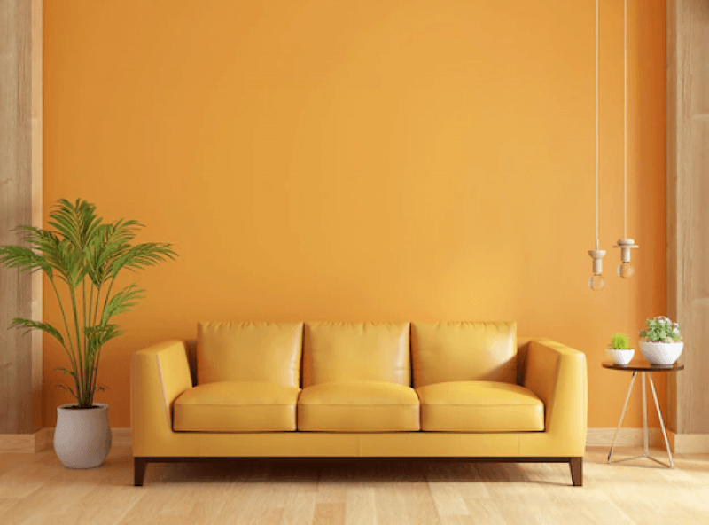
Many Georgia homeowners embrace mustard yellow with too much enthusiasm, covering walls, furniture, and accessories in this bold shade. Though meant to feel sunny and cheerful, the effect often becomes overwhelming and dated, especially in traditional Southern homes.
Warm beige provides a more balanced foundation that still captures that golden Southern light. It’s versatile enough to work with both modern farmhouse styles popular in North Georgia and the more traditional aesthetics of Savannah homes.
Did you know? Warm beige pairs beautifully with actual mustard accents, giving you the pop of color without the commitment. This combination honors Georgia’s love for warmth while maintaining visual harmony throughout your space.
3. Olive Green Everywhere – Opt For Sage Green Instead
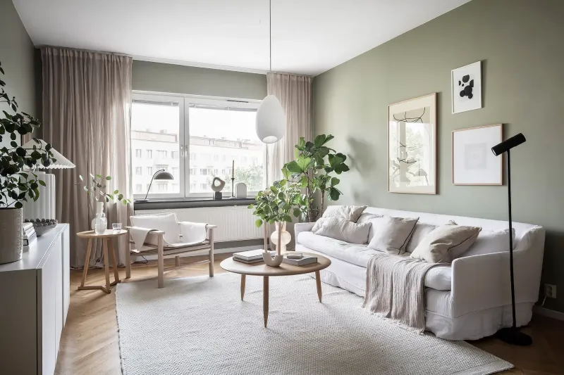
Olive green has saturated many Georgia living rooms, creating spaces that feel military-inspired rather than naturally elegant. The yellowish undertones often clash with the lush greenery visible through Georgia windows, creating a disconnect between indoor and outdoor spaces.
Sage green offers a softer, more atmospheric alternative that better reflects Georgia’s natural landscape. This gentle hue creates a peaceful backdrop that enhances both contemporary and traditional furnishings while maintaining that connection to nature Georgians love.
I’ve found sage particularly effective in homes near wooded areas or with garden views, as it creates a seamless transition between indoor comfort and outdoor beauty – something essential in a state where indoor-outdoor living is so important.
4. Heavy Brown Tones – Use Creamy Taupe Instead
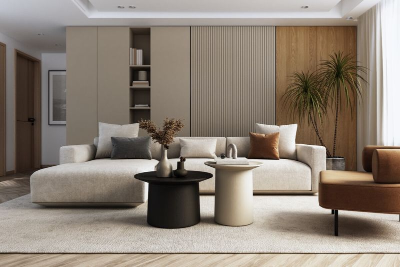
Heavy brown tones dominated Georgia living rooms during the Tuscan trend years, leaving many spaces feeling dark and dated. These chocolate and espresso shades absorb light and create a cave-like atmosphere, especially problematic during Georgia’s humid, overcast days.
Creamy taupe delivers the warmth without the heaviness. It’s light enough to brighten spaces yet warm enough to create that cozy Southern comfort we all crave in our homes. The subtle gray undertones make it incredibly versatile with both cool and warm accent colors.
Where browns can feel oppressive, taupe opens up possibilities. It’s particularly effective in traditional Georgian homes with architectural details you want to highlight rather than hide behind dark, heavy colors.
5. Neon Accent Walls – Pick Muted Coral Instead
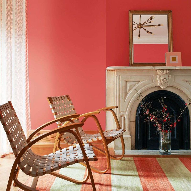
If you’ve toured Georgia homes recently, you’ve likely spotted those jarring neon accent walls – a misguided attempt to add personality that ends up creating visual chaos. These high-intensity colors fight with everything else in the room and rarely reflect the elegant Southern aesthetic Georgia is known for.
Muted coral offers that perfect middle ground distinctive without being distracting. This softened hue brings warmth and character while honoring Georgia’s connection to peach tones and sunset colors.
I recently transformed a client’s Atlanta bungalow by replacing a shocking neon orange accent wall with muted coral. The room instantly felt more cohesive, and the color beautifully highlighted their collection of local artwork rather than competing with it.
6. All-Gray Interiors – Switch To Greige Instead
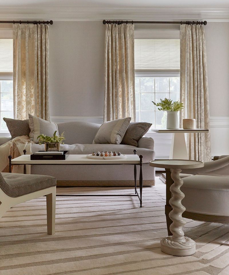
The all-gray trend hit Georgia hard, leaving countless living rooms feeling cold and lifeless despite our warm Southern climate. These cool-toned grays often create a disconnected feeling in homes where warmth and hospitality are cultural touchstones.
Greige (that perfect gray-beige hybrid) offers the contemporary feel of gray with essential warmth. It bridges traditional Southern comfort with modern sensibilities, creating spaces that feel current without feeling clinical.
When working with historic homes in Savannah or craftsman bungalows in Atlanta, I’ve found greige particularly effective at honoring architectural character while updating the feel. It’s the chameleon of colors – sophisticated enough for formal spaces yet relaxed enough for everyday Southern living.
7. Deep Navy In Small Rooms – Try Airy Powder Blue Instead
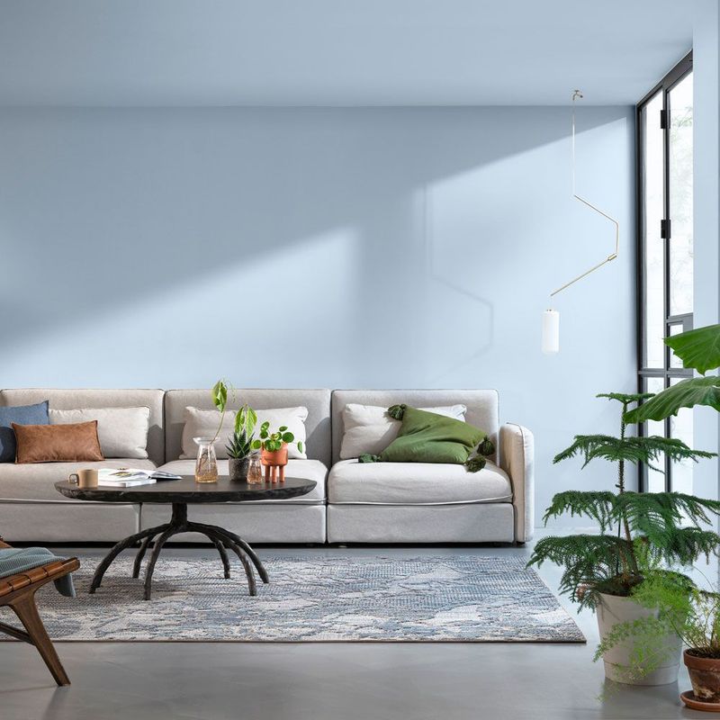
Many Georgia homeowners have embraced deep navy in their living rooms, hoping for sophistication but ending up with spaces that feel cramped and cave-like. This is especially problematic in older Georgia homes where living rooms tend to be compartmentalized rather than open-concept.
Airy powder blue delivers that blue palette connection while visually expanding your space. It captures the essence of Georgia’s beautiful skies and creates a refreshing atmosphere that works wonderfully with traditional Southern furniture pieces.
I recently helped a client in a historic Macon home replace their navy living room with powder blue. The transformation was remarkable architectural details suddenly popped, heirloom furniture looked refreshed, and the room finally had that perfect balance of Southern tradition and airy comfort.
8. Bright White Walls – Select Warm Ivory Instead
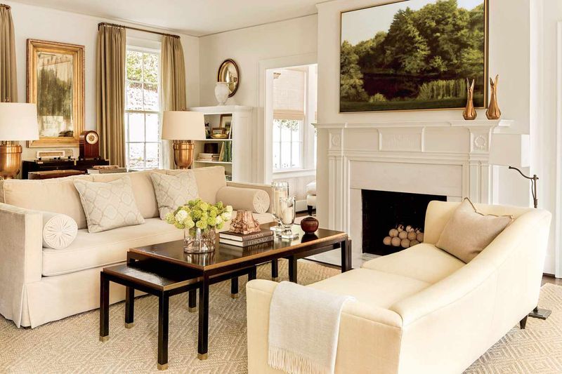
Stark bright white walls have become trendy in Georgia homes, but they often create harsh, clinical environments that fight against our state’s natural warmth. These stark whites can feel particularly jarring against the rich tones of Georgia’s traditional architecture and furnishings.
Warm ivory offers that clean backdrop many homeowners desire without the sterile feeling. It softens the light in a room and creates a more welcoming atmosphere that honors Georgia’s tradition of hospitality and comfort.
The subtle warmth of ivory also better showcases Southern antiques and wood tones that are staples in many Georgia homes. I’ve found it particularly effective in homes with original hardwood floors, as it complements rather than competes with those beautiful natural elements.
9. Burgundy Furniture With Matching Walls – Choose Neutral Linen Tones Instead
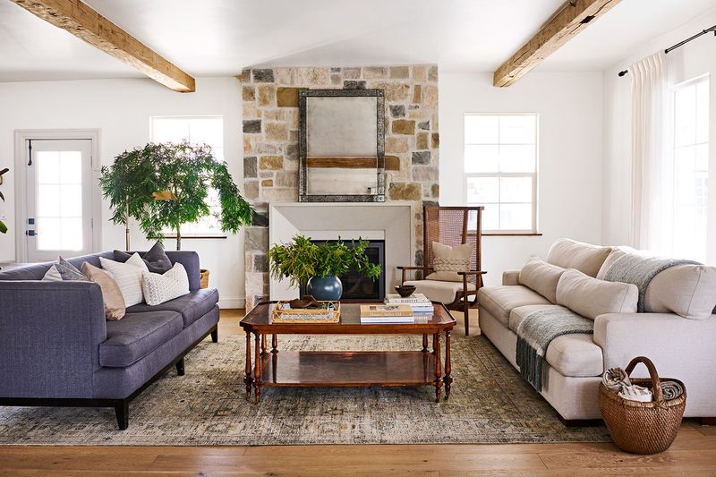
The matching burgundy furniture and walls combination remains surprisingly common in Georgia homes, creating spaces that feel like they’re stuck in the 1990s. This monochromatic approach makes rooms feel smaller and eliminates the visual contrast that creates interest.
Neutral linen tones for walls provide the perfect backdrop for statement furniture pieces. They create breathing room in your design while still offering warmth and texture that cold whites can’t deliver.
If you’re attached to your burgundy furniture (perhaps family heirlooms?), linen walls will actually make those pieces look more intentional and sophisticated. The contrast highlights quality craftsmanship and creates that layered, collected-over-time look that defines elegant Southern interiors.
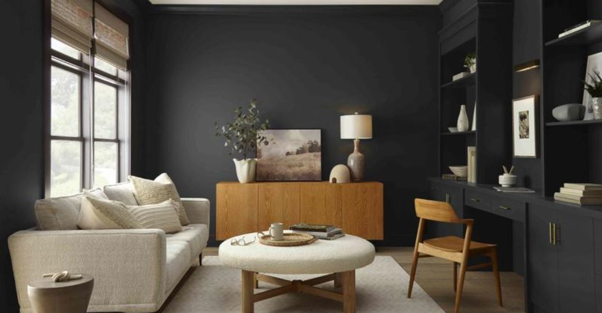
10. Overuse Of Black Accents – Go For Soft Charcoal Instead
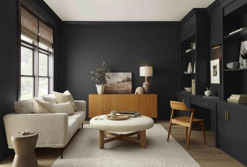
Many Georgia homeowners have embraced black accents with too much enthusiasm, creating stark contrasts that feel harsh rather than sophisticated. These pure black elements often fight with the natural materials and warm tones that define Southern style.
Soft charcoal delivers depth without severity. It provides that grounding element many rooms need while maintaining harmony with other elements. Unlike harsh black, charcoal has subtle undertones that help it blend beautifully with Georgia’s preferred color palettes.
I recently helped a client in a Buckhead home replace black picture frames, lamp bases, and accent furniture with soft charcoal alternatives. The space immediately felt more cohesive and relaxed while still maintaining the contemporary edge they wanted – proof that sometimes subtle shifts make the biggest difference.

